Oh, I just realized we wouldn’t really need to choose between combinations of render engines. workbench is “solid” mode, eevee is “material” mode, and cycles is “rendered” mode, and we choose the final output in the properties editor. I can’t believe I didn’t realize this sooner.
ok, details that matter & are worse than in 2.79 (from my perspective & experience) repeated for the forth time
- User Preferences (upper left corner, floating window, diminishes response, impossible to have it within UI)
- Render Display (upper left corner again - simply throw the Rendering stuff in one pool)
- Tool options (now 3 different options and positions + a sticky floater on top)
- autohide & UI animations (scrollbar needs an option to set thickness, animated UI option off/on, bring back thin (single pixel) line width, thick has now become useless piece of fat&spam)
- hidden GPU/CPU switch… why?
… loosing will to continue here
anyways, i saw too much plans and not enough time to test & experience UI/UX for real (ideas are fine but human workflow experience takes lot more time than anything else - in global collective, think of it a level higher than designing a corporate/brand identity)
IMHO at least one last official 2.79.5 build should be made for Blender’s own sake and longer transition/development time
a small idea:
a “toolbar/panel size lock” to prevent accidentaly resizing the panels using the stylus (shift+middle click resizes it, also zooms the viewport. one slip to the side and you screw your T panel.
Imagine that you are only doing sculpts for 3D printing.
You may use a matcap to present your work and never need EEVEE or Cycles proerties in your workspace.
yes of course. matcaps are available under cycles and eevee.
I think you kind of missundertood me…
Why an extra special option if it is the same as under cycles and eevee already??
Hiding stuff you dont need for your special task… isnt your example something more for the 101 project.
Thank you. Its need to copy the text to a text editor? If so, then he writes an error.
It’s now under the performance tab - which kinda makes sense imo.
1 Like
101 project is not a non official separated branch. It is part of 2.8 project.
You need a customizable and flexible UI in default 2.8 release.
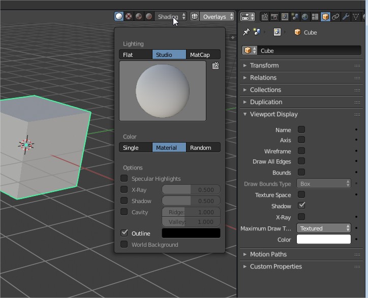
Single color, Texture and Material (viewport diffuse+ viewport specular) are views of Workbench that Cycles and EEVEE UI are re-using.
But lookdev and rendered displays are not used by workbench.
It would be stupid to remove one choice of engine in a menu for all workflows, just because it is not obvious to everybody that it can potentially remove four tabs of settings superfluous for modeling workflows.
Maybe properties header should become dynamic to remove empty tabs in this UI.
I agree it makes more sense.
Choosing between GPU only and GPU+CPU will be guided by project scene.
We should have a GPU+CPU choice in that tab too, instead of modifying user preferences.
“Workbench” will not be a render engine in the end, but more of a detail of how the 3D view display modes work internally. There was this notion in early 2.8 development to equate engines and draw modes, but this didn’t work very well and it’s being abandoned.
The way to think of a “render engine” as it was in 2.7 and will be in 2.8 is as the output target you are creating content for. This could be Cycles, Eevee, an external renderer, a game engine, or even a 3D printer. These output targets can show relevant information in the UI, and you wouldn’t switch between them often.
For a case like 3D printing it may be useful to have a None output target if you are not interested in Cycles or Eevee settings. Though even if you are creating a model for 3D printing you are likely to render it at some point, so I’m not sure the settings are so irrelevant. Perhaps ideally there would be a 3D printing output target, that might have a material system based on the physical materials that can actually be printed, with an accurate preview in the viewport of what the printed model would look like.
3 Likes
In a 3D printing output, it would probably be more pertinent to have export or slicer settings than rendering ones. A photo of a print is probably more expected than a 3D render in that domain.
It was just an example.
If your task is just to model something and don’t do any shading/rendering work that would be done by somebody else, why bothering yourself with shading/rendering properties ?
Will Tabs be a good option to add ? ![]()
I heard you liked tabs, so I added tabs underneath your tabs, so you can tab through all the tabs. 
3 Likes
I fully agree I think what people fail to see that this are tests
they make builds so we can test it
based on feedback the UI is getting refined
this aint that hard
2.8 looks so much better than 2.7x
4 Likes
It really does. Even after only a little bit of poking around in 2.8, returning to 2.79 feels like a big step back on the UI front.
2 Likes
I think there has always been a contingent here who HATE any change to Blender that they did not have a direct effect on. I think it’s unfortunate but I don’t see that ever changing.
Personally, I see this whole UX thing as a work in progress. You throw something against the wall and see what sticks. Some of the things aren’t always good ideas. Some things are really great ideas. But right now, not everything is finished.
One thing I wish was possible is for Devs to wait and get the whole idea running before committing it to Master. For instance, the presets for the individual rollouts of the properties panel has the potential the revolutionize the way we work. In my head you could have all the rollouts closed and just see the names of the presets and you’d know exactly what was going on inside the rollout. Once you find the right combination of settings, you save a preset. This seeeeems like a brilliant idea. But right now it’s not even close to complete. There’s just little stars that you click on to bring up a popover and you can’t see the name of the preset until you click on it. And it’s only on a few of the rollouts. Right now it doesn’t really seem that useful and is not much different from what we had before. But… This is because they haven’t had a chance to rewrite the preset system yet. All that comes later. But right now, like many other things, it’s not done.
In my mind, the best thing we, as testers can do is continue the conversation but remember that it’s an ongoing dialog with a back and fourth. Not “Make it work how I want it to work! RIGHT NOW!” Or, “I really hate how things are going!” Those kinds of comments don’t really sever to change things for the better.
TL;DR: Be specific, be patient, be optimistic, be understanding, But most of all, if you don’t like something, make sure that the way it exists now it how it’s actually intended to work.
9 Likes
I also wanted to comment on this whole “Wasted space” argument with the single column layout because it’s really strange to me. Since when was cramming everything into tiny spaces the better UX? I understand that some people don’t like the single column layout but please don’t try to convince people that it’s bad design because there is wasted space. Study after study has shown that visual destiny diminishes readability. It’s not called wasted space, It’s called “Breathing room.”
Most 3D programs have a single column layout. Even Max, is mostly singe column and lets not forget Modo who used to get design awards has always been single column. A lot of you guys have brought up C4D as your example of what other 3D programs do. But, after using Maya, Max, Modo, XSI, and yes even C4D (I was a beta tester long ago) I can assure you that it’s not the norm at all.
As far as too much scrolling goes, I don’t know what to say guys, we use the scroll wheel for all kinds of things and no one has complained before. We scroll all day in our web browsers, code/text editors, properties panels, Zooming in and out, etc. I don’t see how this is actually a problem. However, I will concede that maybe we may need to think more about how we might be forcing to much into a single tab. We might simply need more tabs or a better arrangement of data in the tabs we have.
I truly think that the main issue is that the new layout breaks your muscle memory and now Blender seems like a new/different program. It’s not bad or wrong, it’s just different and therefore disorienting.
My advice is to take some time and see if you really can’t get used to it.
16 Likes
i agree 100%!
I agree with your first post.
But I disagree with the second one.
Readability is one thing. A goal that anybody have to reach. Nobody will complain that things are too readable.
But Direct Access to tools and properties is another goal to reach. Nobody will complain that UI is too fast.
If you don’t have to scroll and open a panel and subpanel to click on a value, but just to click on displayed value : you are working faster. It is not more complicated to understand.
So complaints about not being able to display lots of properties is as valid as complaints about unreadable settings.
You can not set properties in Blender and texts in web-browsers on same level.
Reading text is main business you have with a text. A text is ordered to be scanned from left to right, from top to bottom. Text is the reason why scrolling exists.
But it does not changed the fact that organizing a text into columns have always been considered as a help to read it efficiently.
Grouping of properties is done to be meaningful.
But having settings next to each over does not make a sentence.
Scrolling a properties editor from top to bottom does not develop a thesis or tell a story.
And when you are writing a text, you don’t scroll. You are using shortcuts to find occurrences of a word, to jump to previous/next word, to jump to a specific line, to jump to previous/next paragraph, to jump to a specific page…
You are also going back and forth when you are editing properties. You are not setting all values in one panel and then set-up next one and go-on like that.
So, in absence of shortcuts to cycle through panels, to call on top of editor a specific one, UI is slow.
And no matter how many shortcuts are added to properties editor.
Nothing will be faster for a specific task than having all required properties for it, directly accessible.
I am not against single column layout readability.
I am against the misconception that user need to read a label of a property to modify it.
If he creates a workspace and get used to it, having a property at a specific position of screen will become an habit like placement of keys on a keyboard.
I am not against subpanels and grid layout.
I am against the misconception that solves the problem for dense properties tabs. It does not.
Subpanels are adding a row per subpanel header, potentially taking away others interesting panels.
And it adds a click reducing direct access to settings.
Grid layout is not taking into account panels headers rows. It is making ridiculously stretched panels, made of 2 or 3 rows, between panels made of an arbitrary number of columns. It is less readable and less efficient than columns of panels using single column layout. This fact have nothing to do with the unfinished state of the feature. It is related to the concept of monopolizing a whole row of a large properties editor for a panel header. That is a waste of space.
It is the reason why User Preferences UI is just one panel with an hidden header and tabs in it.
If Tabs in User Preferences window would be panels, you will be complaining about an unbearable scrolling in this window like anybody.
I will concede that maybe we may need to think more about how we might be forcing to much into a single tab. We might simply need more tabs or a better arrangement of data in the tabs we have.
In my opinion, adding tabs with panels is not a solution. It adds one click to split same area of interest without removing other panels and subpanels extra-clicks.
I think that having an alternative floating window for render tab organized in 3 tabs (output/performance-quality/post-processing) and several columns like preferences would be more efficient.
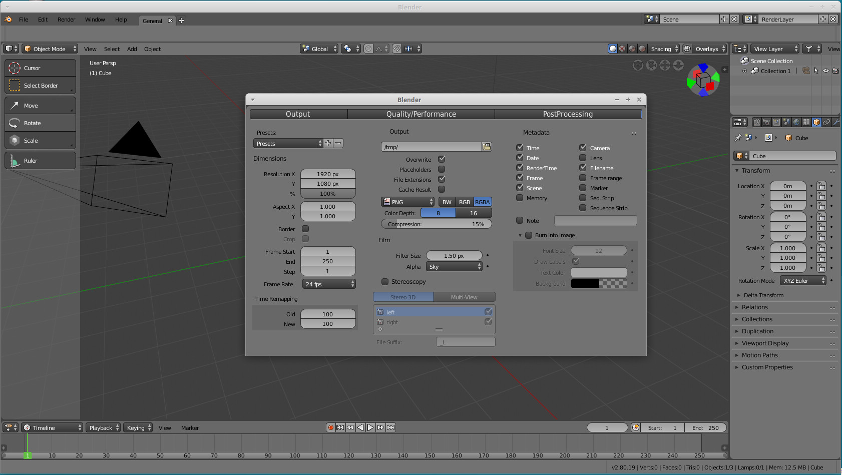
Mock-up is not perfectly aligned. It is less readable but not unreadable. But access to many more settings is quicker, more direct.
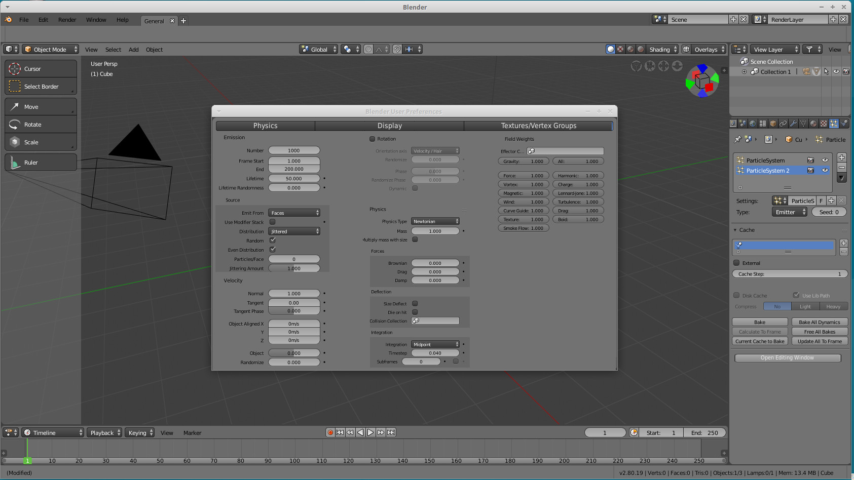
A dedicating window for particles could probably benefit of some kind of layout 3 tabs (physics/display/textures-vertex groups) with several columns in each.
1 Like