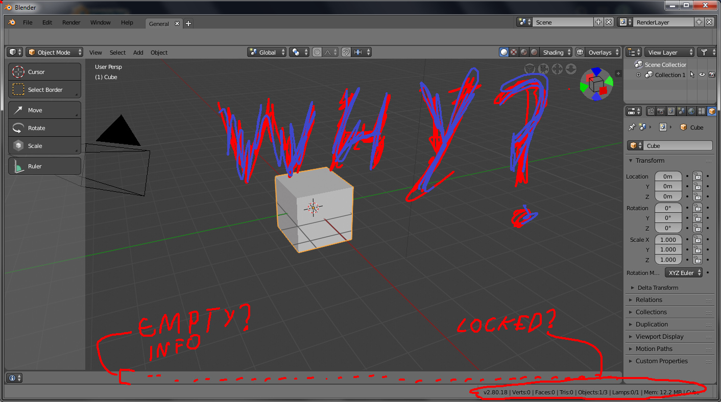
Properties > Object > ViewportDisplay should per object, I don’t know if all the options are working at the moment.
1 Like
Regarding Indie’s second post. The point to be made here is that while we don’t want the various UI buttons and fields crammed together like in 2.4x, there are some smaller UI components like the checkboxes which can be packed more tightly due to how little space they use (ie. packed with fields or two in a row).
There is a balance to be a had with information density (not really high, but not super low either).
1 Like
Standardization is the key to solve the top area of blender…
Love the expressionistic direction in this one.
4 Likes
User changed timeline into Info editor.
Same way, he could hide header of Info editor and have more space for its content.
Now, that here is a new topbar with tabs, we are no more forced to have an info editor taking the whole width of window.
We could imagine addition of buttons to instantly convert a selection of last used operators into a macro, to go back to first line of an error message, search and or filters fields, etc…
That’s somewhat out of date, since the more recent versions only have one empty bar down there, not two.
Though even with that still remaining, I’m pretty sure they’re not gonna leave even that single, nearly empty space hog as-is. Everything’s constantly being jostled around and moved about, and a lot of the wasted space we’re seeing now is likely just placeholders meant to be filled later.
That’s why I’m so reticent to criticize some of the things concerning the UI at the moment. It’s all very much a work in progress.
1 Like
Yeah, I posted because it was fun to see the reaction.
The bar at the bottom could be removed easily and I hope they will remove it and put the info elsewhere.
OK !
But there are still weird changes, choices that should not be kept.
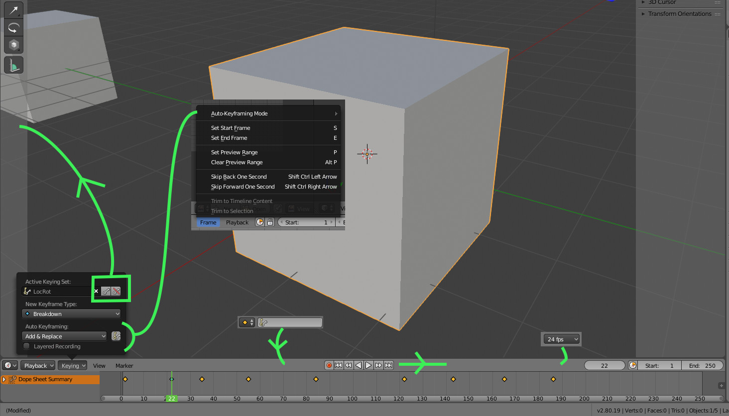
For instance, Keying popover in timeline. A popover made exclusively of buttons.
I can understand testing of attempt to reduce menus, UI separators, the wish to make a beautiful distribution in timeline header.
But seriously, buttons (that are not booleans) to add and remove keyframes inside a popover ?!!
These buttons could move to 3DView toolbar.
But active keying set field suits better in an header.
If active keying set is no more visible in timeline, this info had to be displayed elsewhere.
Now, that timeline is able to display keyframe type. Choice of this type goes to a popover ?!!
Start and End buttons in Playback popover are not booleans buttons, too.
IMO, Frame menu was more useful. It was communicating shortcuts for these items.
And its content was helpful timeline operators that user can no longer discover.
Automatic keyframing mode was set into this menu.
I think that removing sync mode and shrinking current frame/start/end space was a sufficient move to make timeline header less cluttered.
I think that even after restoring active keying set in header; there would be space to add frame rate.
2 Likes
27 posts were merged into an existing topic: Understanding new layer render system, collection and workspace
Using the daily builts i wonder why a lot of options are now horizontally distributed in 3d view, which looks ugly, makes the mouse travel longer ways and makes the ui looks more cluttered. Look at those resulting steps. Now its hard to tell to what those shading icons belong. If they are arranged as in 279 its much more clear at least for beginners imo.
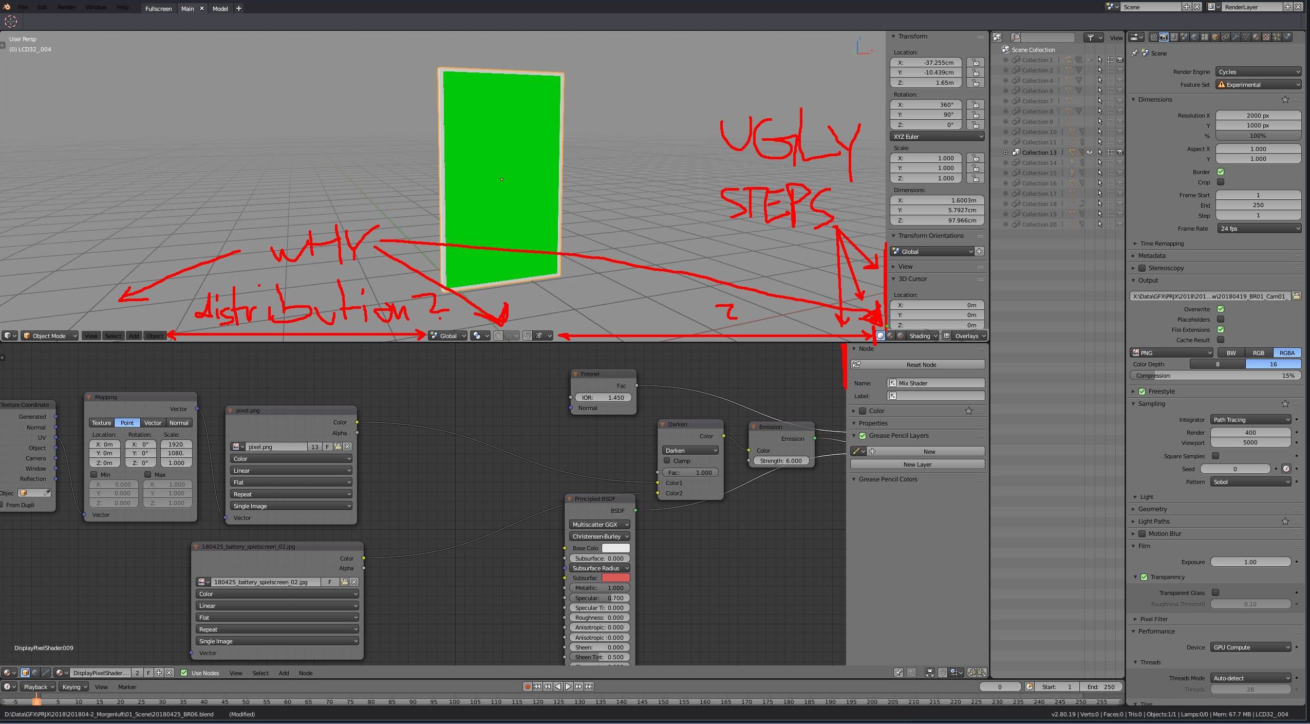
We read from left to right so why those ugly big gaps between?
Is there a way to turn off this popup entirely?
If it doesn’t already, perhaps the popovers should collapse into a small handle attached to the nearest window edge (but prioritizing the top and bottom ones)?
It might be a simple solution to get them out of the way temporarily when they are not needed.
I’d rather never see it. Once the new tool properties becomes functional, there’s no need for this panel for me…
*I’m waiting for this:
I like my viewport as clean as possible.
Hope it gets sorted out.
2 Likes
Concerning the distribution on the header/footer bar, I’d consider that decent UI design. It gives you a clear division between the three different categories you have immediate access to in the viewport, and it’s collapsible, so you’ll still have that division no matter how large or small your window is.
Unless you are working in FullScreen mode which i like to do. Having nothing on screen but a floating panel when needed is the way to go for me.
But don’t be concerned, i am pretty sure either way will be possible, which is the whole idea behind this.
The floating panel will be optional.
1 Like
If you use shortcuts you can keep pressing it to cycle through the tools (brushes in this case) within the same category.
I go fullscreen only when it’s truly necessary. I prefer to work with lots of interface, it’s way more efficient. Many people don’t realize how many fps they lose by working in fullscreen all the time. 