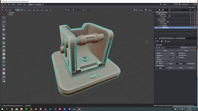
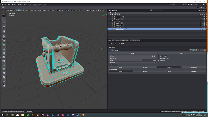
Its the opposite for me. When i model, i don’t need any UI distractions, i am trying to use 100% shortcuts so i don’t need anything else.
If your computer slows down while in Fullscreen, get a better computer… 
my main concern at the moment is that after clicking on the overlay tab, the viewport is not resposive, infact you must click or perform an action to make the 3d view be responsive again.
You know that there are many workflows, and yours is not the better and the faster for everyone, right?
i see full screen as a less distracting workflow for beginners or specific detailed works
once advanced, those who can handle chaos (find order within complexity - as myself) simply prefer more info with fast response
it’s just different ways of doing same thing and yes, from my experience, ‘chaos’ (complexity) with an advanced user handling it holistically, is faster
I never said that my workflow is the better or the faster, but one thing is for sure, working with lots of interface is for power users, fullscreen is not… Besides, Blender and most 3d apps are not designed to work in fullscreen, and I think people should stop moaning about fullscreen workflows since it’s a very specific way of work.
LOL yeah for shure ![]() using fullscreen and just shortcuts especially while modeling is not for powerusers…
using fullscreen and just shortcuts especially while modeling is not for powerusers…
is this irony??
[quote]and I think people should stop moaning about fullscreen workflows since it’s a very specific way of work./[unquote]
for modelling, texture/vertex painting and sculpting full screen is heaven…
for animating, rigging, compositing, material editing etc maybe not so much.
You repeatedly forgot to add “imho”.
In Blender we can Shift+Space to go back and forth fullscreen/own-layout, which is fast for power-users as well as for newbies. And, imho, working fullscreen can fasten specific jobs as modeling, sculpting, and even wiring nodetrees. You probably do stuff that doesn’t require much room on screen, or maybe you’re a lucky owner of a 27" or bigger screen
You just did, in the same sentence where you deny it. ![]()
Exactly, that’s why the function to work in Fullscreen is there and always was there in all DCCs.
Often called professional / expert mode.
Is there, or was there any plan to remove info panel in 2.8? I heard something months ago but I can’t remeber exactly…
a few pixels between or a frame around will last to make it clear. for a clear division their is no need to seperate them so wide. Look at my “drawing😋” how is it clear now to what those shading icons belong to? was it unclear the way it was arranged before?? the window size doesn’t matter 279 vs 280 in this particular ui design case…
It is because of this that I asked Spirou4d for specific popups in EZ Paint add-on so that I could paint in full screen without needing to bring up the tool bar panel all the time, or having a properties editor open all the time when I just needed the vertex group or slots, brush settings, etc.
It was this reason I kind of liked the new top bar drop downs , imagining that they would be easy to access in full screen view.
Is there any news about the presence of Jacques Lucke in Amsterdam ? I disn’t see any code change from him, was it just talking with about the future of Blender ? About everything node ? Does someone knows ? 
At the risk of being lynched for going against the traditional idea of “use shortcuts and avoid clicking on the interface as much as possible”, what about slightly bigger icons to use the extra space we’re getting in these changes?
It’s sortakinda like Mac UI design. You look at some of the apps that follow Apple’s guidelines, and you’ll see that most of them have a few icons along a big header at the top that can be crowded close together when you have the app sized to a small window, and are widely spaced apart when you’re running the app maximized.
I like that kind of setup. Everything’s organized and easy to find, it looks tidy, and it’s flexible enough to allow you to scale the viewport farther without having to cut off options on the header like you would back in the old 2.5 layout.
Though the header does expand to fill up some of that space depending on what mode you’re in. Like when you’re in edit mode, it’ll add the face/edge/vertex menus right there along the top, easy to find. It exposes a little more of the niceties that were previously hidden behind hotkeys, while removing/moving some of the stuff you won’t use as often in one particular mode.
Personally, I like it.
…though they still need to do something with that big topbar in edit more, cuz right now all it’s doing is taking up space.
Good timing ![]()
You can drag up and away on the lower edge of the top bar to hide it.
Yeah, I know. It’s not that the bar itself bothers me much, it’s that I want to see it filled with lots of useful settings, like how it is in sculpt mode. I’m hoping they won’t just leave it as-is while in edit.
On another note, I really like how the operator panel pops up and disappears whenever it’s needed or not. Way, way back in the day, I remember asking someone here if there were a way I could get Blender to do exactly this with the old UI. The only option I had was to hit F6, and deal with it. Now, after all these years, I’m finally getting what I wanted. 

