Ah. I found why mine were thicker than xrg’s and rawalanche’s. There’s actually a Line Width setting right under the Display Scale setting. I had it on thick, because the UI looked better to me like that. I assumed the lines in the UI were all that this affected. Apparently it affects wireframe thickness too.
There’s really no reason these two unrelated settings should be connected.
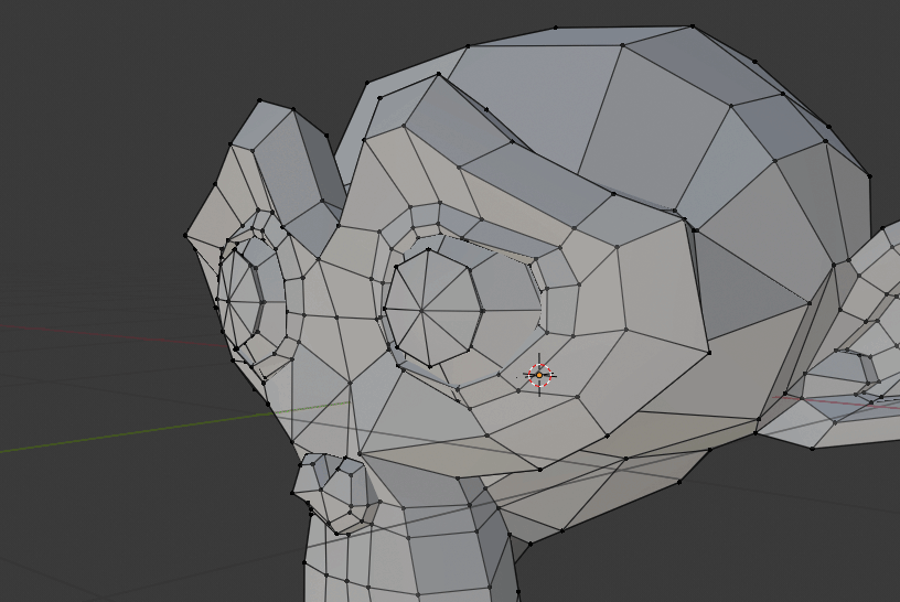
That said, after setting the lines to “thin”, they’re still way too thick in edge mode for my taste. I’d really like them slightly thinner than in vertex mode, which looks slightly chubby.
Are you sure that configuration affects viewport? I had understood that this is only for GUI.
Here comparing with the same mesh, lines seem thicker in 2.8. Maybe this should be customizable from Theme configuration (like outline and vertex size)
Well, the wires get thinner or thicker when i change it, so, yes, quite sure.
I also understood it’s only for the UI, but apparently not. Actually, when I saw it I wondered why there’s a setting for UI line width at all, but I changed it to thick, saw it looked nice and left it alone. Didn’t suspect it changed wireframe drawing.
See, this is what happens when you replace jargon (“wireframe”) with vague terms like “lines”.
Mmm, you’re right. I think that edge thickness should be a Theme configuration (like outline, vertex, face dots, etc), and that configuration in user preferences only affect interface (like mouseover info points) and not viewport.
Anyway, comparing side by side with 2.79, lines in 2.8 seems a little thicker with the same configuration.
I just tested it - it indeed does affect the viewport. I agree - this should really be a decoupled setting from any viewport option. I’m not a fan of the thick lines (even in thin setting), either. Dense meshes can become very difficult to handle too easily.
It makes any scene with lamps of any kind extremely messy to look at. These lines should be:
a) adjustable
b) way shorter by default. Like 2 meters, which is a nice neat number, coincides with the height of the default cube and covers most of the distance from the ceiling to the floor in an average interior.
c) have three drawing modes: On, Selected and Off, where On means always drawn, Selected means it’s only drawn when the lamp is selected and Off means it’s never drawn. Selected should be the default mode.
I understand the lines on Sun and Spot lamps were useful for shadow culling in BGE and Blender Render, but we don’t have either of those any more.
The lines are particularly pointless for area lights which never cast shadows in the first place in BGE, and still don’t in Eevee. That said, with the lines removed, the area light widgets may need a little tweak to differentiate them better from a Point lamp near a transparent plane.
Definitely. This is especially painful when using area lights as portals in the windows of interior. You have a nice small interior scene that’s like 6*3 meter room, and then if you hit “zoom to fit all” key, it zooms way too far to make a room for f*****g 50 meter long area light lines
seriously this, I was following the conversations going on about the viewport and now am sitting here having to read around post to get to the right ones
Stupid question: Where is actually the best place to propose functionality requests?
We discuss in this thread and on a lot of things people actually agree as well but how do we actually make ourselves heard best to the core developer team if we’re no developer ourselves?
For example - I’d love to make a proposition for the retopology shader but even if it was a good idea in the current state of 2.8 (which it isn’t as things still are too heavy under development) - I am just no developer myself.
Yet all this agreeing or disagreeing will probably go nowhere if it remains in this thread, no?
Do the devs read this at all? Is there even incentive to listen to the community or do they have more of a separate agenda that is only accessible by actualy joining the development?
If you want to propose something you want to develop yourself you can ask some help on devtalk forum, I think most of it is read by the devs.
This thread is maybe visited sometimes by the devs, they are probably aware of what is going on, some are reporting stuff from here to developer.blender.org
Hey - thanks for the links.
I knew about RightClickSelect but wasn’t sure whether it would be frequented by actual developers. I’ve heared a few times now that it’s more or less a collection of things people want but won’t get much attention. It’s probably still a good idea to propose an idea on multiple channels.
You can adjust the pie radius in the user preferences:
A few months someone developped this gradient for proportional editing, it is too bad to be so close from something finished, if you hear me dev of the functionality could you please at least share the code haha.
@the_motionblur The thing is, it is probably really hard for the devs to take into a account the enormous amount of proposals coming from the community, so I think their is like a natural thing happening when someone propose a feature, if it is a lot supported by the rest of community, it will be brought forward and the developpers will hear about it, if is not supported then the devs won’t develop a feature that is requested by a few only
Yes, I am aware of that. I’ve been following Blender on/off since 2006, already. At least its become much easier to reach the developers now with all the social media advancements, since then.
I still would want to at least apply any idea or designproposal to the best place possible instead of discussing somewhere the chances are even less likely to get noticed.
Indeed I just realized that it would be really beneficial to being able to set the size of visible vertices as well. Especially if there is going to be a topology setup some time in the future. Currently vertices are rather big if the mesh becomes dense.
Regnas
(• I don't speak English "by default", so... )
528
Hi.
You mean some kind of adaptive size? Vertex size is configurable from Theme options, but it is fixed.
About what we had discussed here before, Brecht has clarified here about why that option affects all lines in Blender:
But if users are mistakenly choosing that option looking to achieve more visible dividing lines or contours in UI, perhaps it is because a similar option is being necessary for UI. Anyway I have not investigated yet if this is possible from Theme configurations.


 could you please at least share the code haha.