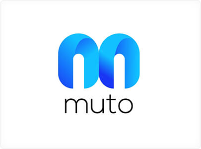
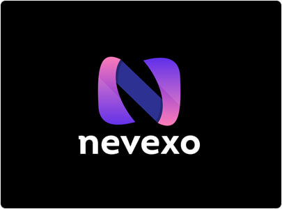
Is only a comentary, but looking a the logo trends on 2021 we see 2 strong trends: mix of 2d turning 3d, and mix of gradients of colors. Examples.
Being Blender itself a 3d product it would be more logic.
I dont know if i’m the only one to do this, but a lot of times i only chose an app on the playstore simply by the good look of the logo, and usually works. Bad apps have bad logos, and good apps have good logos.
