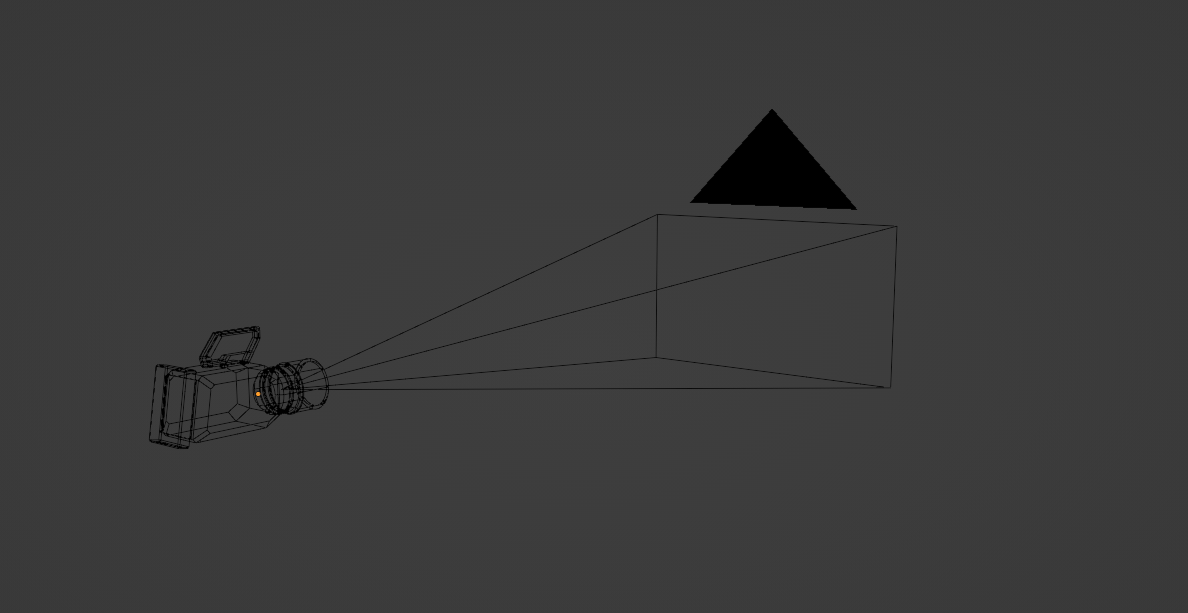
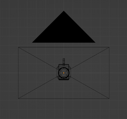
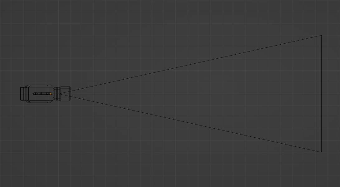
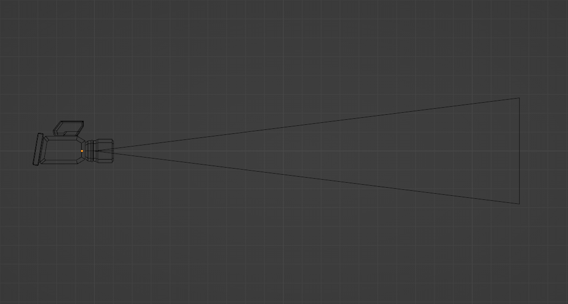
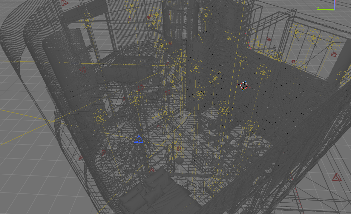
so i was sitting and thinking about how blender camera look on the viewport and found it odd that it’s only 4 lines emerging to a single point with a rectangle as the frame
and i know every other 3d software has a dedicated camera shape and decided to mockup one and it looked good
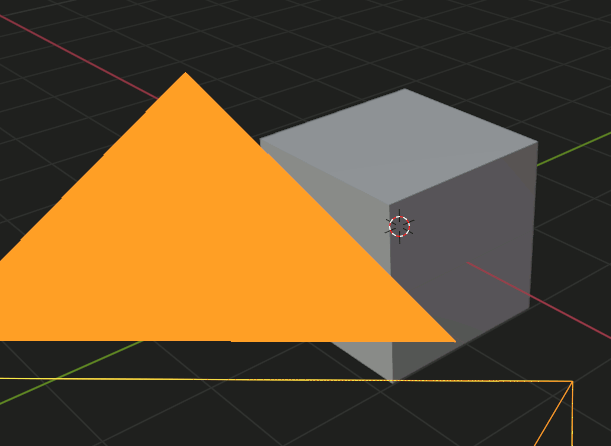
it’s based on the black magic URSA mini idk if that’s okay to do or not but they can alter the design if needed
and it can be as an option u can enable and disable if u want
maybe a checkbox that says “visible camera body” or something
wanted to try and do it but i guess i have to mess with the source code and i am not a dev so yea maybe someone can
I personally consider anything more than what we’ve got to be bloat.
I wouldn’t mind seeing that solid triangle turn into something less solid, though.
But I don’t think there is anything keeping you from changing the shape (using a proxy). I’m pretty sure I actually just saw a post somewhere because someone created an add-on that did just that — gave the camera some super powers to do camera stuff more easily. I cannot seem to find it now, though…
yes i hate the black triangle it blocks view and is so wide and my suggestion is just to add it as an option that u can turn on and off which give more customization for the user
I am really puzzled as to why you would look for problems where there are none. It’s not supposed to be pretty. It’s not only fine as it is, I think it would be wrong to try to make it pretty. It serves a function and that’s it. If you need a visible camera, you can parent any geometry that you want to the camera object for it to show in renders and if it doesn’t show in renders then it has no purpose. Well, actually it does have a very specific purpose - to identify a camera object, its direction, orientation and field of view and the current object does all that flawlessly.
What next, will you want decorations on vertices when they are displayed?..
It’s really all one could want from a camera object in my view… Anything else is just noise that interferes with work in a busy scene. That’s quite serious. I wouldn’t want noise to make my life harder…
It’s really awesome that it’s actually possible to get useful information from all that mess just by looking at it. The current object shape works. There is no need to dream about ruining that. At least that’s what I think.
With that logic we should all be living in caves without any fancy hand prints or buffalo on the walls. Works perfectly with no problems.
The default camera is kind of ugly. And that big triangle does block the view annoyingly.
I do like that the default camera does exactly what it is supposed to do. But if I were to think really hard about it I am sure I can imagine ways to upgrade its presentation and function — I just don’t think it needs to be a complex object that looks like a IRL camera just because. The current camera is nice because it doesn’t get in the way (mostly. Except for that obnoxious solid triangle.)
Point is, there is nothing wrong with wanting a prettier world. It took me a while to warm up to Blenders UI improvements but now I can’t imagine not having the usability it has brought and it is much more pleasing on the eye to load the beast up. Pull up an old copy of 1.8x and see how long you last before wanting back the current iteration.
So… be nice
EDIT: I see your edit and raise you mine: nicely put. I absolutely agree about the noise. (And is what I mean about bloat)
Well, if there is anything that can be added to the current object to make functionality better, sure why not? I just cannot think of anything.
I think the triangle serves its purpose. Shows orientation, shows if it’s active or not. Not really sure what you mean about blocking view. If those functions can be done some other way, sure… Although it’s hard to think of something that would function better. But what do I know, maybe it’s possible. It just doesn’t seem like the OP is thinking about function at all.
There is really no need to justify the value of aesthetics to me, I am a designer after all. That’s what I care about a lot and I am all for it 100%. Pretty things make our lives more enjoyable. That’s important. This is not the right place for it though. Especially not as the primary goal.
It is just the way you word things sometimes. OP isn’t looking for problems. OP just wants the world he interacts with to be prettier. That alone is not wrong.
I regularly have scenes that are complicated enough without having a heavy camera object in the way, much like your picture — so I absolutely agree with you about the role of the camera object.
I like how yours are wireframed in red. Imma have to mess with my preferences to do that too. Brilliant!
If it were up to me I’d remove the fill in the camera triangle. That has bothered me since somewhere in the mid-2000 when I first picked up Blender.
Just no need to swing the hammer when someone opines what they would think is nice. Suggest a way for them to play with it and let them have at it.
That triangle indicates if the camera is active though which is a really useful and needed feature. It would need to be done some other way then. It’s not filled when the camera is not active. They are very large by default, maybe that’s the issue. I usually scale viewport display to 0.1 or 0.2 and never have this problem.
Maybe that might be a logical idea - to make default cameras logical scale. Now they are around 1.4 meter in size. Although… Some might animate city or planet sized objects… So… Maybe there is no one correct scale. But cameras are usually not 1.4 meters in size in the real world, so that could be a strong argument as well.
Yeah, I often have multiple cameras in view. Outside of a double border or something IDK either. It is annoying, but I really don’t actually care enough to do anything about it, lol.
I would actually like cameras to be more visible in the viewport, and more easily identifiable as cameras, so I’m all for your idea. I would settle for a simpler shape though, this one looks too busy imho.
I frequently work on shots with several cameras, as few as 3 is already difficult to read : I see a mess of converging lines. Like others said, the filled triangle is also problematic. What I need from a camera shape :
easily identified as a camera. I would intuitively go for an old-style double film canister camera as it’s an established shape
but with the bare minimum geometry so that it doesn’t confuse further already busy viewports
another way to indicate the active camera. Perhaps make that filled triangle screen-space, so it never appears too big, or add some decoration on the new shape
Perhaps something similar to Bones could be applied here with a mesh proxy object used to display the camera, and perhaps that Triangle could be drawn as alpha overlay, showing what is behind.
i was gonna try to make it look like that but i wanted something special and a bit modern tbh when i modeled it it looked ugly and the whole point is to make identifiable and pretty
I don’t find some of these issues problematic. I disable selection in the 3D View (so they don’t get in the way of selecting the stuff in my scene) and just pick the one I want from the Outliner. It is still technically selected so I can easily switch to it with the usual Ctrl+NK0 in the 3D View.
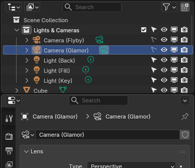
I also typically put my cameras in a collection named “Lights & Cameras” or whatever is most useful, sometimes with sub-collections as appropriate.
I also name my cameras something useful (a habit every Blender user should have ingrained — create object, name object, name the data block the same thing!) so it is never difficult finding the camera I want.
This basic organization makes managing the cameras in a scene stupidly easy, and (File > Append|Link)ing anything I want a breeze.
I’m not a fan of overly “realistic” cameras for UI. They usually get in the way for me.
I like Blender’s camera UI except (as others mentioned) the big triangle does block the view sometimes. Since scaling doesn’t even do anything for the camera, it would make sense IMO to have cameras be entirely screen-space scaled. It’s can actually a little confusing to have the ability to scale the camera where it looks like it would be changing the zoom or something but it’s not doing anything.