Hey, just wanted to get some crits on my new theme, howz it look? 

post a pic of your theme!
what is the best place to DLD themes but with different icons ? 
thanks , ya , good one here dude .
nice theme.
Changing the icons is actually quite easy. Download some icon sets and put them in a directory named Icons in Blender/.blender.
Then, when you open Blender, pull down the Preferences Window, and go to Themes. If you are acting upon the default theme, press New Theme and continue, if you’re acting upon another theme, change the “theme area” menu to UI and Buttons (by default it is on 3D View). Next change the “interface element” menu to Icon File (by default it is on Outline). From there you can choose your favorite icons. Press Control U to save your settings.
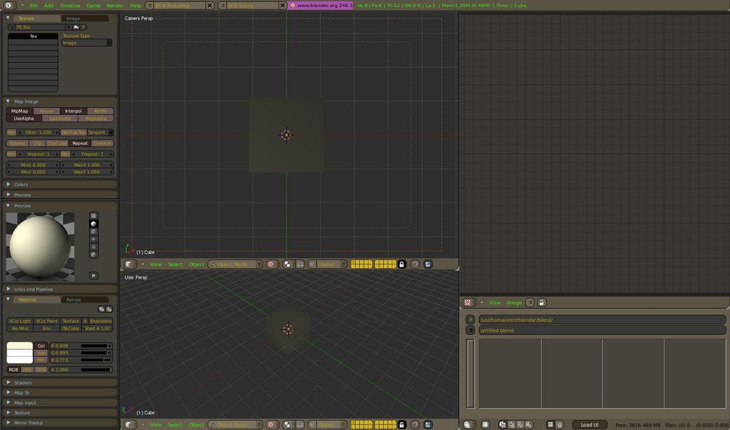
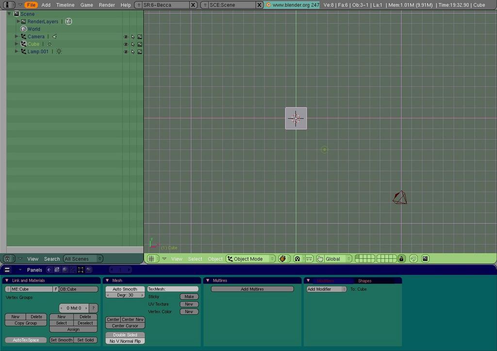
I have a question, when setting up the different layouts, like scripting, modelling, animating, etc, How can I get the little window thingys (with the tabs on them in the button menu) to be strait vertical, like in the material layout. I’m trying to make a layout for texturing etc… I can post a screen if you don’t understand, lol.
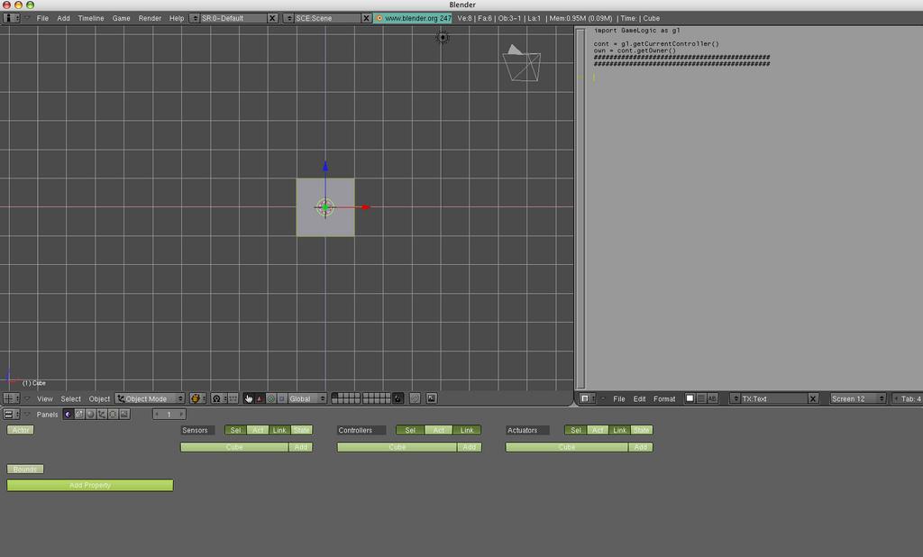
Do you mean for the UV texface window thing?
Right click in the Buttons Window and choose Vertical.
edit: wierd… double posted… see below
wow… thank you. I feel really dumb now. :(.
hey, I’d like to see other peoples themes, anyone got a cool one they found/made? or any icon sets, or window layouts?
Here is my window layout for texturing:
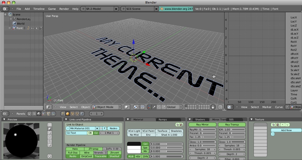
heres mine… thanks to killer  he left the script on a game he posted. thats my default screen. yours is cool. It was hard for me to change to a “darker” theme. the default was kinda bright
That’s probably because your theme has multiple things done wrong. In general, it’s harder to look at light gray lines at a dark gray background. Also, white text on light green buttons isn’t really working well either.
Try to make both the text and grid lines darker or almost as dark as their background colors, and things will probably become much better (and look nice, of course… gray + green = good).
As for the topic starter, you might want to get rid of the green text, it really doesn’t fit in very well with the rest of the theme. Plus perhaps a little darker color for the buttons.
Aside from that, I really like it ![]()
As for me, I’m old school when it comes to themes.
If you want to work with colour, your theme should be neutral. That’s why all the pro apps (including blender) have grey themes.
You can’t colour correct in an app that has a Hawaiian shirt colour scheme!! Are you listening Cinelerra devs?
… no, I guess not…
I don’t like themes that make it impossible to read the buttons…
So I kept mine fairly simple… (I’m pretty sure I’m using these icon)
I’m using dark_theme by mr_bomb I think, thats what the file name said, ‘dark_theme]mr_bomb].py’.
I still have the file for it so I can post it if anyone wants it.