You would have to edit the python file for that
There’s news
You would have to edit the python file for that
There’s news
Holy crap. We actually get a sane curve creation and edit tool. What wonderful news! I missed this one somehow.
Thanks for bringing attention to it Hadriscus. 
Now that appears to be a proper edit curve tool with adding points, drag and delete points on the fly. Congrats to developers.
I totally agree.
Personally I like using the delete popup and find it very useful.
As for discoverability, if the popup was not there, many new users would not realize that there are different delete options. I tend to learn software by clicking on every option I can see to find out what it does, if I can not see it I would not click it!
For me it is better that the popup is enabled by default, both for my workflow and new users.
I have more concern about options that are hidden under little arrows!
If you do, then you’d know that holding down the SHIFT key while snapping to grid increments will snap to these too in perspective mode.
you mean shift + ctrl. Did not know that, good to know. Weird that it works differently when not in top down view.
Good to know.
And @NeOmega could save himself hitting the CTRL-S key all the time by reducing the Auto Save timer to a lower interval in that same preferences area.
I dont have to. Devs already corrected for it to work properly by default. Autosave sucks for almost everything in any program besides games.
I would argue that in this particular case (delete option in mesh edit mode) is implemented well, and nicely configurable and adaptable to any user’s preferred workflow.
I would disagree. It’s a pain in the ass. They never should have changed it.
many new users would not realize that there are different delete options.
hamper longtime users for the sake of new users? I switch between face, edge and vertex constantly. And to have to then re-pick what delete I meant every time is exasperating. Newbies can read the manual to “discover” other delete methods. Dont punish me every time, for the rest of my use of the program so newbs can “discover” something once. Hundreds of thousands of extra clicks and seconds lost so a newb can “discover” something.
Well, with deleting the questions is always what the user wants to delete. Dissolve the faces? Remove them altogether? What if you are in vertex mode and the user wants to delete faces only and leave the edges and/or vertices in place?
In face mode, when you delete the face, the vertices and edges remain anyway if they are connected to other faces. If you want to dissolve, you dont press delete, you press ctrl+ X. Learn the hotkey, and avoid the traffic jam, not traffic jam so people can learn the hotkey. That’s Akwrsbacd
Used to be, Blender was a hotkey racetrack based on context, did what you wanted based on where you were, no questions asked. Now its a pop-up speed-bumped parking lot with widgets and tons of other useless junk in the way.
As far as designers intentions, I watched in horror as forumers continued to rail on Blender for the way it was 10 - 15 years ago. I was the guy defending Blender for the way it was… …but people kept coming to the Blender forums and complaining Blender was not Maya and 3DS, wishing it had widgets and pop-ups and dropdowns everywhere, couching it in “more intuitive”, which really meant “more like the software we are used to”
And slowly but surely, over the decade, Blender started to take on the same archaic design philosophies, and abandoning its original philosophy of “learn the hotkeys and become a 3d speed demon”. The Maya and 3DS people won.
And please tell me, why the buttons keep getting moved around? What is the reason? There is no reason. It’s garbage. And it happens all the time in software dev, people have a big long discussion about why this button group should actually be over there, instead of where it was, and always was. And just wait, they’ll do it again. And people who use Blender every day may adapt well, but people like me who only pop in every 3 or four months, or return after a year, suddenly find all youtube tutorials are out of date, and everything is switched around, when there is no good reason for it. The icons are changed too, for no good reason. By the way, I did not just guess the designers intentions on changing the icons, it said so in one of the releases they did it “to look more modern”. Then, not only do I have to look up how to do the simplest of things, I also have to re-train my muscle memory built up over 17 years.
And I really despise the “you do know you can just remap your keys, right” line. Why should I have to remap everything? Why am I being punished for poor software engineering decisions? Why make the longtime users have to switch everything up to make it back to the way it was? It’s ridiculous, and its rampant across all software design.
And I know what comes next, “Just use the old version if you don’t like the new versions”. NO! That’s a cop-out for poor software engineering! How about just keep the original layout in newer versions? What’s the reasoning?
The size of the curves’ handles and points can be changes with the Vertex Size setting in the Themes/3D Viewport themes setting.
Blender’s curve drawing and editing workflows differ from commonly used conventions in design software. Personally, I like this workflow, but many users prefer the ’ industry standard ’ approach.
Addons such as this one:
may be helpful.
There’s one addon that introduces an Illustrator like curve editing workflow as well, but I can’t seem to find it. Perhaps someone else knows ?
Ah yes, sorry - forgot about the CTRL key. Kinetic fasle memory! ![]()
It’s always going to be a trade off. In earlier days Blender couldn’t work with N-gons, and deleting geometry was pretty straightforward. With the introduction of B-mesh things got more complicated.
For example, hitting delete in polygon mode: do we want to dissolve? Or remove the polygons? Or leave the verts? Speaking for myself, I use all three options plus dissolve all the time in a modeling session, as well as removing faces but leaving the verts in place.
And what to do when the user activates multi-mode editing (editing verts, edges, and polys simultaneously) and selects three polygons? Delete the edges, or the verts? Or the polygons?
That said, I agree with you that things could be improved. It’s always going to be a tradeoff. Can’t please everyone, nor should we try.
In any case it takes three clicks to add a different shortcut.
And I understand and am emphatic with you how Blender changed throughout the years.
Unlike you, I didn’t mind the changes in B, and I adjust shortcut keys to my liking. I work in other DCCs as well, and switch mindsets. But then, I use all software every week, most days, and I understand you a couple of times a year. Yeah, it must be disorientating.
I experience the same in Zbrush: hardly use it, and every time I have to (once or twice a year) I get lost and frustrated. It just doesn’t stick.
It is what it is, I guess.
Consistency is one of the reasons. It is far away from being great in my opinion, but way better than ever before.
It is not unusual that things like key bindings get cluttered and inconsistent over time. This makes it unnecessarily hard for beginners to learn it. On the other hand when it is reworked, people who have to relearn it are complaining. Sometimes there is no solution to satisfy everyone, but with progress, there is sometimes no way around changes which are uncomfortable for some people.
There are old key bindings available for people like you. Maintaining two kinds of layouts would be a ridiculous amount of work.
You could always just stick with the old version.
Early versions were nothing but poor ui decisions on top of more poor ui decisions. Blender has best in class key remapping because nearly everyone wanted to remap nearly everything.
well we are talking about literally the “poorest” program of this type that still has users.
Because some things have been scientifically proven to suck. Most importantly the cash from 18,000 long time users is nothing compared to the cash from the 956,000 new users who mostly approve of the new initial UI experience even after being long time users of other programs, this includes MANY long time (8 hours a day 8 days a week for 80 years) blender users.
But things cannot be improved for this user if they reject all forms of change.
You should check out Silo. I heard it has barely changed over the last 10 years.
Because some things have been scientifically proven to suck.
Most importantly the cash from 18,000 long time users is nothing compared to the cash from the 956,000 new users who mostly approve
must admit, this forum sure has an easy UI. I never used ignore, and it even lets me choose forever!
Unfortunately, I’ll never see these non-existent scientific studies about sucking and polls about mostly approving. But sling them words around more champ like they exist. Try more "literally"s and “actuals” and “factuals” next time to bolster your claims. It might work on those willing to read it.
Regarding the initial issue i also agree that the pop up should be ON initial, but there should be an option to dismiss it right away and not return back.
And it was a good and necessary decision, Blender should not be a niche, instead should be easy from professionals to casual users. Family father that has another job wants to do a 3D print. Blender is here.
I and many others could have come to Blender 10 years ago. I did not because how unfriendly it was.
More than 15 years ago the standard of modelling simple forms was Sketchup. I learned Sketchup in one morning. By afternoon i was recreating a traditional European street for a job. Then i was doing 2 complex facade and roof in a day.
You can be a speed demon either way.
Consistency is one of the reasons. It is far away from being great in my opinion, but way better than ever before.
How is changing things consistency? How is moving tool bars from the bottom to the top consistency? It’s not just that they move them around, they also change the icons, so you can;t even recognize the icons, you specifically have to look up what happened to everything, and where did it go.
Im just going to be real here. I hate N-gons with a passion too.
The reality of most of my frustrations is Blender chose to go with Movie and hi-res modeling, and game modeling has been shafted at every turn because of it.
That is the core of my problem with the mesh editing workflow.
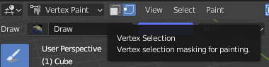
In fact, I came here to see if they brought back the function to select vertices and assign them a color in vertex paint. They haven’t. For some reason they tossed that after 2.79. And why not? 99% of users will never notice its gone, but I sure would like it back.
Oh also, i think I mentioned this, but i HATE N-gons.
Thank you for your measured response. Class act. (not sarcasm)
For example, hitting delete in polygon mode: do we want to dissolve? Or remove the polygons? Or leave the verts?
That’s for context. Set the context, then do the work. Not have it ask you for context every time you enter a command. If you want to leave the verts, be in face mode, if you want to delete the verts, be in face and vertex mode. (combined modes was a nice addition they added many years ago). If you want to dissolve, thats what Ctrl+x is for.
at some things. If it doesn’t matter, and you are throwing together all the objects in the world, and just want things to look right and render nice and pretty, yeah, I am sure you can be a speed demon. But in other workflows, there are problems.
Consistency among the different modes in Blender…
I can’t find the article at the moment but Adobe invested a lot of time and money on research before they switched to a darker UI and decided to use their own user interface library on all platforms for consistency instead of relying on the native OS UI system.
Thing is though that the line between game and film models blurred through the years, and it is only going to become fuzzier as technology progresses.
When N-gons were finally introduced in B I was elated. No more work-arounds required compared to the other DCCs.
Anyway, things change. Run with it, or not. Suggest alternative workflows to the devs. Or start your own Blender branch: that’s what the BfArtist person did.
At least the software and code is open source, and it might actually be an interesting project to create your own low poly game asset variant of B ![]()
Actually, I just downloaded the latest 2.93 Bforartists release, and tested the modeling for you: you’ll be happy to know that deleting stuff is dependent on the work mode. So in vertex mode it deletes a vertex, in face mode a face. No pop-ups.
Perhaps that version is more to your liking?
PS
select your verts, select a colour, hit SHIFT-K.
Done.
Yes, aware of that. He asked for a quick method, and mentioned to prefer shortcut keys. The Paint menu lists the same option.
If I understood his question, of course.
For someone who only started using Blender since 2.79, I appreciate the new UI every day and night. I get it. People have preferences, and I respect them. I just want to say 2.8+ is indefinitely better than 2.79 for me personally. If Blender’s UI stayed as 2.79, I would probably have switched to other programs.
I really don’t get what the person above means. The new UI means Maya and 3Dmax people won? Learning from other software means we lost? What is it, a football match?
Your instructions didn’t work for me until I turned that on.