I used 2.79 for a few hours a day for about 3 months. Then I was using both 2.79 and 2.80. Did many 2.80 tutorials in 2.79 and did some pre-2.79 tutorials in 2.80 (https://www.youtube.com/watch?v=BUYs63dMEsk&list=PLm7eGz6yyJo3MjSUyB0IqzS0OOOlDRyy3&index=201) In my opinion they are similar enough that you can do simpler things just as fast and easy in both of them. If 2.80 is preferred there’s about 10 minutes of changes that need to be done in 2.79 and then save the startup file. I’ve helped a few people who can’t use 2.80 well on their ancient macs get comfortable in 2.79.
CAD software for 10+ years. And yes, when you sign up for such software you get an educational package and I’m aware they operate in a slightly different budget bracket than Blender… still, there’s so much low-hanging fruit in Blender and such an explosion in dev funding that the developers really don’t have any excuses, imo.
Disable confirmation… dialogs… in the keymap… that sounds like something I should put on my list… ![]()
(Looking at it after you’ve told me, I can see that it makes sense, but again for power users. A normal user would not expect to look there, nor need that fine granularity. And again, if the Blender devs would care about beginners, they’d put a few global confirmation toggles amongst the regular preferences and then leave the individual toggles/overrides to the power users who can very much dig around for them themselves…)
Ahhh… look, a micro rant! It did make me feel better (especially when there’s zero expectation that any developers will ever read or care about this)! ![]()
No, that is unfortunately not constructive at all, and they’ve said as much (which is why I’ve stopped posting to that site… it was a waste of time and venting here is much more cathartic).
Re: deleting:
Since I very much doubt the devs are going to go backwards on this, they could HELP by making the current selected p/e/f mode the DEFAULT Delete option in the dialog, iow the one that is immediately under the mouse cursor.
So, if you’re in FACE mode, “Faces” is right under the mouse. Similarly for points and edges. Multiple selection (ie P+E+F) defaults to …whatever. Faces, I’m guessing.
At least it would be faster. Less mouse travel=more speed.
I think that a user preference to contextualize or not would be better.
I would definitely use the menu myself, but I do understand that we do not all have the same preferences.
The dialog is going to be there, either way. One way is faster.
Oh yeah, Panel management is a nightmare. You cant just right click on a panel and say “begone”. And the whole pulling down from the corner thing to make new panel or pulling up from the corner to join panels is not cool at all, and I cant imagine anybody thinking “this is how all 3d programs should do it” because it is so labyrinthine and wonky. It’s the worst panel system I’ve seen in any software.
Not being able to close a panel is quite annoying indeed. Otherwise, panels work quite well for me.
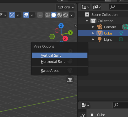
Corner pulling is very old and obscure method that shouldn’t even be taught to new users imo, these days you can do all area management by right clicking on area edges and choosing stuff from menu:

3.0 is gonna make area management even more simple by allowing users to join different sized areas:

Thanks for showing that. I wasn’t aware of those changes. That’s indeed an improvement. However, it still feels like puzzle solving to get rid of certain panels.
What you’re describing are areas (the rectangular zones that house editors such as the 3DView). Here is a handy guide for interface lingo : https://docs.blender.org/manual/en/latest/interface/index.html#window-system
With 3.0 you can now just right-click any area’s header and select “Close Area” to get rid of it.
Seriously! Give me some time to complain 
That’s awesome 
Current list of 3.0 UI changes. https://wiki.blender.org/wiki/Reference/Release_Notes/3.0/User_Interface
Blender’s UI drives me happy, literally. This is like the cursor debacle, some will always hate the cursor and some will always love it to death. Most of the complaints here seem to be emanating from the personal choices.
Don’t touch cursor … or else 
There needs to be a flood of tutorials all in one week explaining only the beauties of the 3d cursor and the way you work with panels and multiple windows. I was one who hated those things too until I stumbled onto a good tutorial explaining them properly. 2 of the best things about the program should really be explained BEFORE anything else. How to use the 3d cursor meme should replace the delete default cube meme.
Maybe post the tutorial here so others learn from it as well without wading through the tons of bad tutorials on YT.
I think it was the start of the 2.79 version of the Donut tutorial. Doesn’t seem to be online anymore.
Technically speaking, this approach predates the corner pull methodology and was around in Blender much longer. It just wasn’t available between 2.5 and 2.8 (IIRC).