Hey guys,
recently I’ve been writing down some bedtime-stories I have been telling my kid and as a present for him, I’d like to have it properly printed and bound, which obviously requires a cover.
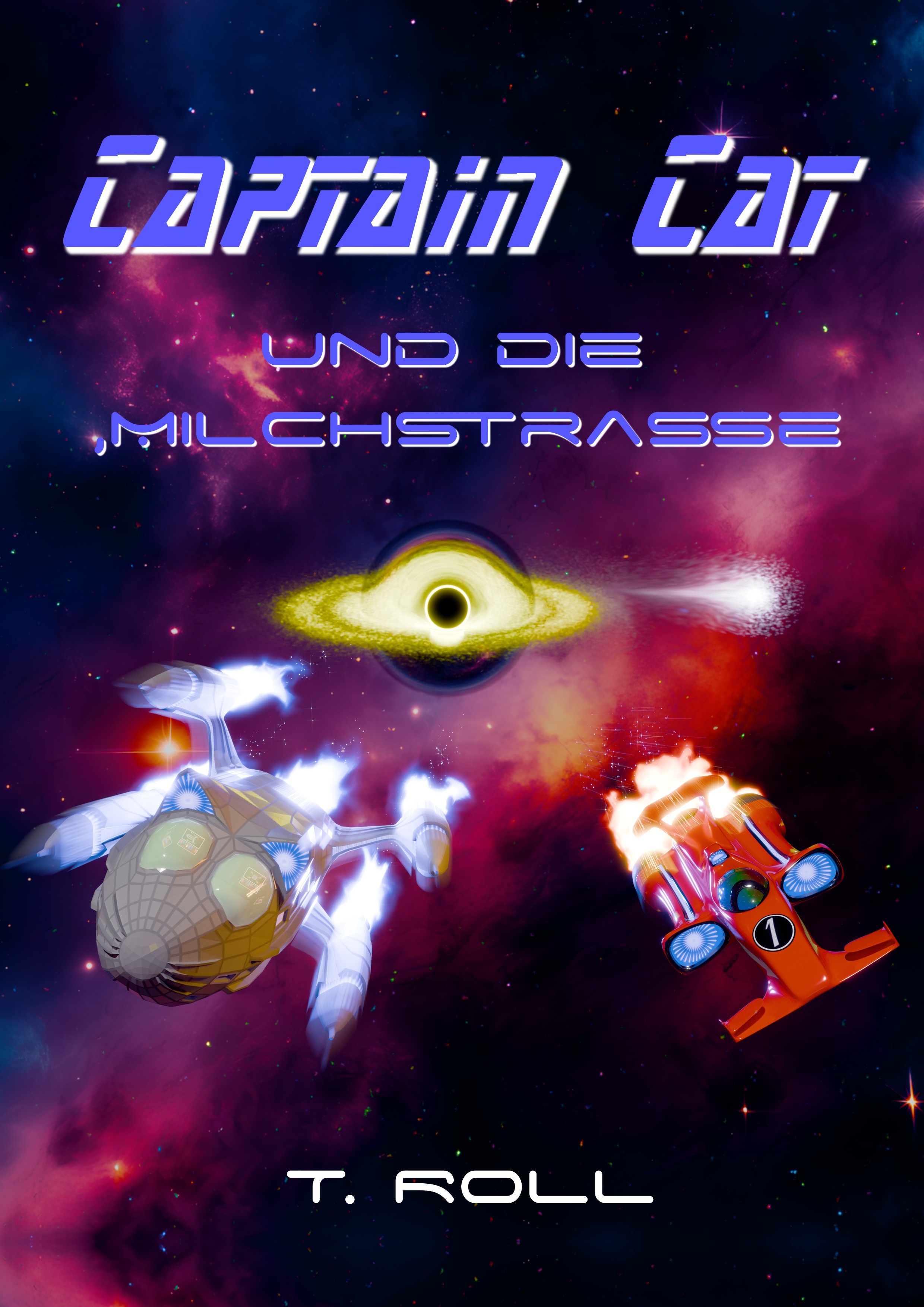
Here now is how the artwork turned out. I’m pretty happy with it, but still sure that there is room for improvement, which is why I ask for your kind suggestions! I’m particularly interested in suggestions regarding compositing, color and “special effects”
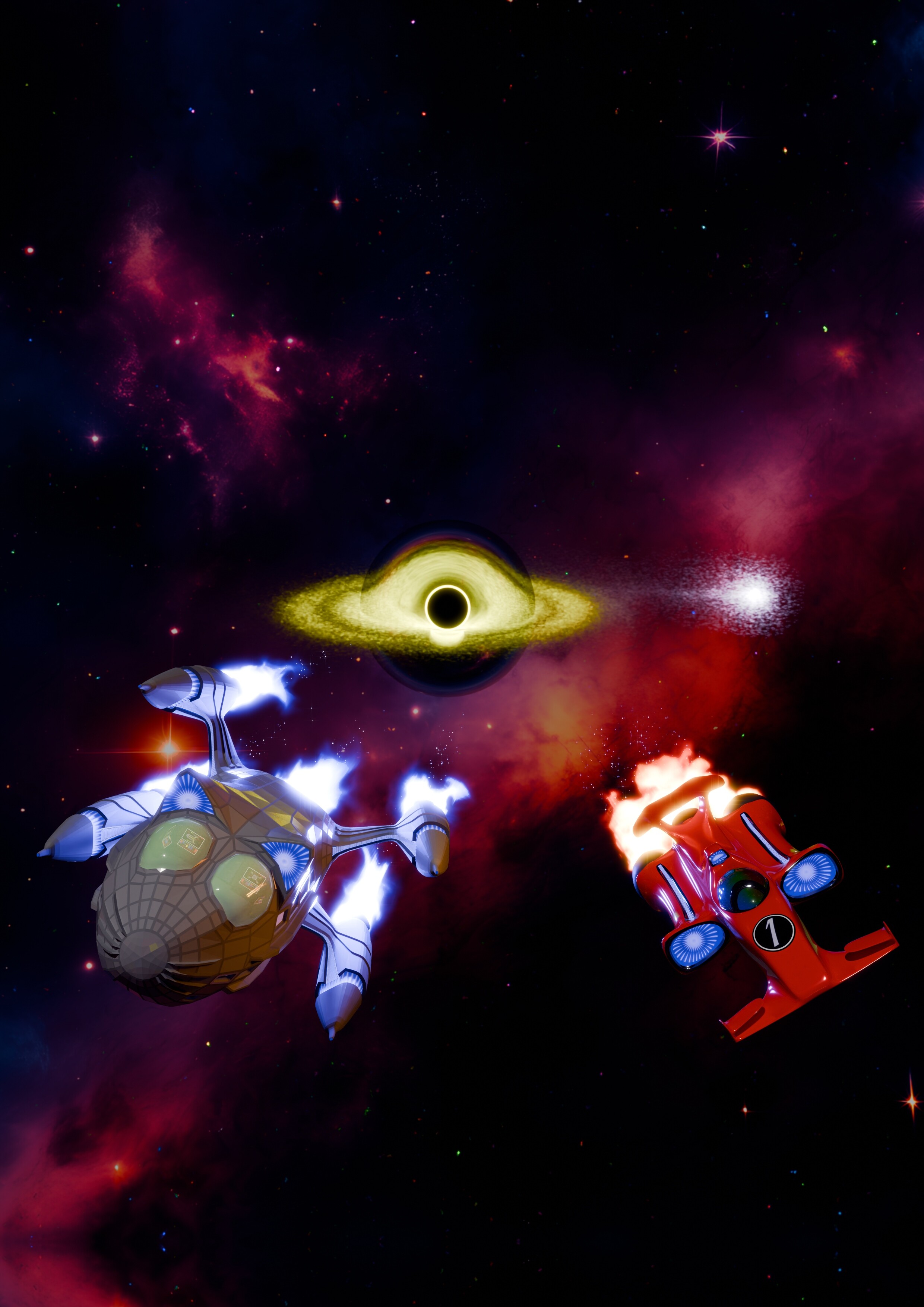
Some backstory: The book will be titled “Captain Cat and the Milky Way” and the scene depicted on the cover is a race between Captain Cat and her crew against the Tigerflyer (the most dashing pilot in the galaxy!) around a black hole.
Some technical details: All models, materials and textures are done by myself, with the following exceptions: The nebula in the background is AI generated and the black hole is done following the tutorial from Iridesium
So, what do you think? Thank you in advance ![]()