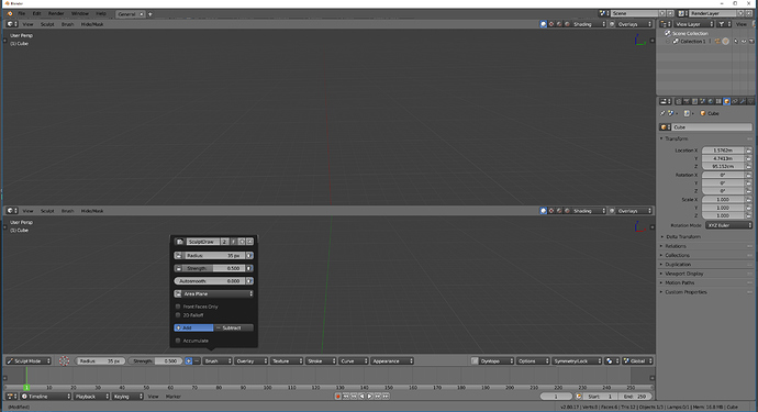
I was expecting more work on UI before a call for content.
Ability to flip topbar, to flip redo panel region, vertical header for properties, smaller redo region or ability to have this panel in tool settings tab, a working asset browser, etc…
It is also contradictory to explain that addons will help to customize workspaces and make a call of content for workspace before the one for addons.
I guess it is to show some workspaces for siggraph.
Well the call is for workspaces for default Blender; I would think logically they don’t want any of the default layouts to be reliant on addons that users may not have or want.
According to the title of Blender Today’s live of tonight, the new workspaces should ba added today
Here it is :
https://developer.blender.org/rB444934632a8d8e239bc0c6d79a638ec0943152a6
We also have a new set of HDRI from HDRI Haven :
https://developer.blender.org/rB9600b23eaa9b0f078ee031d2dee055701db15737
So bad luck for all those who were used to always working with the main editor at the bottom of the interface. Poor customization of Topbar position makes it no longer comfortable to work that way anymore.
I love Blender developers, but here clearly there is a step backwards regarding the possibilities of GUI configurations to which we were accustomed.
We can still hide it, and let’s see what happens with the topbar in the futur  But I think the new workspace system is great, I might start using them (I was one of those who never used them, because I’d rather make my own on the fly)
I’m not against TopBar, but I want that bar concept available to everyone. See here mockup by “pistol ioan”:
From here:
https://developer.blender.org/T55386#511818
Because this problem:
Yes I agree with that, at the moment the topbar is only usefull in a “one editor mode”. But honestly I think the devs are aware of that, as it has been told to them a few times, they probably come up with a solution. And this problem will be more and more obvious as the topbar is being polished and filled with all the tools settings. Maybe we could drag and drop the top bar in the editor we what it to be. Just flipping is probably not the way to go I think, if we split the view vertically 
But anyway I definitely agree with that … Let’s wait for the Beta in about two month, to have a feature complete Blender 2.8
Hi!
a very partial workaround can be to use this option to keep a topbar in another view :
windows ->new main window
then place the windows as you wish.
but it wil be the same top bar for both at this moment (no sculpt topbar in one, and vertex paint in another by example)
But agree it’s not exactly what we want for now.
Quite disappointed with the new workspaces… they went for consistency instead of flexibility… 
lol, the poor poor cube in the default startup.blend has been triangulated  Looks like that slipped through with the workspaces checkin.
personnaly, I really don’t care, I never used the default workspaces ^^
Me neither, but 2.8 is supposed to be more intuitive and easy for new users, so…
Also, the new default workspace (modeling) without the timeline makes no sense… I don’t know what they are doing…
But yeah, I’ll probably never use those workspaces, but the new users are screwed.
I always remove the timeline, no need in modeling
expecially for beginners.
Pablo just said in Blender Today - some Options have not been saved in the Startup file yet. For example the selected Properties Tabs. So there are still advancements to be expected.
that’s the point… modeling workplace can’t be the default.
a default workspace needs to contain the essentials…
But when the user launch Blender for first time, there are 12 workspaces tabs visible.
If he really need a timeline, he will intuitively probably activate 3D animation tab.
It would probably not be weird to use 3D animation workspace as default.
Me too, I will not use thoses. Simply, because I have 2 screens.
I will use main window/subwindow ability.
Again, a discussion that should be into Workspaces thread instead of Viewport one.
It was suppose to be simple:
- Upgrade Blender for faster and more advanced, complex works
- Advanced users cater to new users with 101 version
Never start supplying the ignorant “hungry for eyecandy” crowd first
It’s really important to have a “generic” non-focused default layout, just like every other 3d software… Too bad some people can’t see that…
Blender already suffers from a major lack of identity, and stuff like this will just make things worse unfortunately.
The problem is in amateurish approach - one cannot lead, if it already follows others (Max, Maya, C4D…). As i stated at the start of this fiasco: “Learn only from their mechanics!”.
CUT THE CORD!
But everybody wants to feed own pretty eyes.
BTW
Fact is - all new users are ignorant and no sane, experienced person would invest own future to those who know nothing about anything. Also, 101 plan was proposed to cater for these aspiring homo ignoramus but got mixed and lost with all the inexperienced thoughts of idealistic wishes.
Such inconsistency is Blender’s trademark.


