hello,
I am a professionalism logo maker. you can pm me.
Select the type of brightness you want.
Compare it in full size(click on the image), the image in small size here deletes some detail.
The second brighter one is better. I like the arc also, maybe a tiny bit less curve on the C and the e. Can the lettering be a bit larger compaired to the coin? Not too much though What kind of texture is that? Is that from a fire light source onto a solid color? Looking good.
DavCorn
Thanks, the changes look great. The texture is ok… Can I get you to try a range of others and then show me a few samples of what you see looking good. Nit-picky me, The C is a little too close to the o abd there is too much shadow to the left side of the C and the right side of the r and e. Maybe a little brighter over the whole word wold help that. Can I see it without the coin and with a transparent background, so a .png file. Thanks again, great, fast work.
Where do you live? and what is your occupation. May I let people know that you do contract work for me / CoinFire? I am looking for investors and possibly going to create a crowd-funding campaign, and the more people I have “on board” with CoinFire the better. I like your work.
DavCorn - David Cornwall - Orem, UT USA
Sure ,i’ll show different textures,will make the changes tomorrow.
Here are the samples:-
and tell me in which sizes do you want the picture in for your final order?
Sorry for the delay. I took on a part time job (finally employed again) this week. I like the 2nd and the 6th images of the samples you gave. Probably the 2nd one most of all. The o and the r are rotated too far since the C and e had been adjusted back a bit. Again, the logo can be by itself without the flaming coin. I’ll put those together manually through layering. The logo does need a transparent background, probably in .png format. We can go into more detail later when I ask for the flickering logo with the flaming coin. The font is not quite right yet (want something more modern and progressive), but I can’t find the one I like right now, so what you have is great. Could I get two sizes, 400 and 1600 pixels horizontal, vertical as needed for the render. Again, I like what I am seeing Sorry for the delay in reponding.
OK, this below logo has transparent background, is in PNG format(Download it and see for yourself), tried to rearrange the curve and the logo now without the flaming coin in 400x400 and 1600x1600.
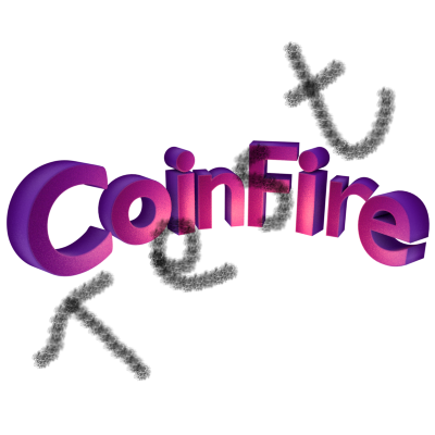
For the font,
Please check through this few sites and also search for any font you like and tell me the name,
I can immediately change the font.
http://www.1001freefonts.com/modern-fonts.php
http://www.1stwebdesigner.com/freebies/52-really-high-quality-free-fonts-for-modern-and-cool-design/
I am liking this font: http://www.exljbris.com/diavlo.html The r especially and the o are still not lining up on the virtual arc of the rest of the word. The r it backed away from the rest of the word. If you’re working in a 3d environment you should be able to see what I mean from a top down view, that might help get all of them lined up easier. The face of the C and some of the o are too dark (a bit.)
Thank you! Cool font sites.
DavCorn
the font had further 5 fonts in the zip file. so here you go:-
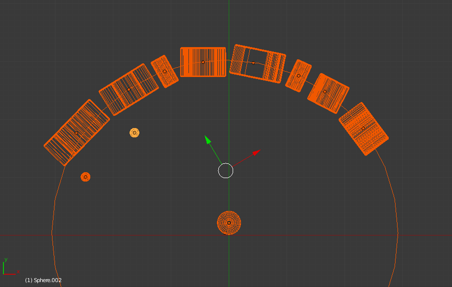
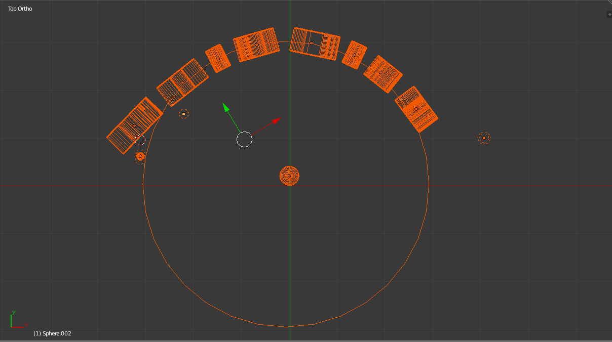
and here is the top down view of the curve
the c is further away(the first letter) as curving it causes the letter to become perpendicular to the camera.the small spheres are the light sources.
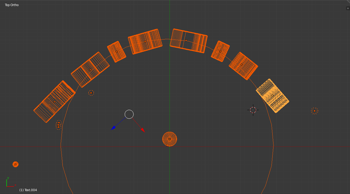
I think I like the last image/font best. Can the letters be slightly further away from each other and the POV angle slightly lower. Thank you for the extra light source for the ‘Co’. Looking at the top down does show a little of what I’ve been talking about. The first i needs to be moved back to be in line with the others and turned slightly clockwise, the n needs to turn counter clockwise a bit, the r needs to turn clockwise a bit, and the e needs to move slightly back and then turn slightly counter clockwise (like the C.) Basically the front edges of the letters should line-up. Sorry I am so picky, the logo is pretty important to look just right. Good thing that the tools make changes fairly easy to do. Thank you, I appreciate your turn around time and your work on this.
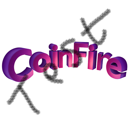
OK, here is the logo,space increased between words, and POV angle slightly lower.
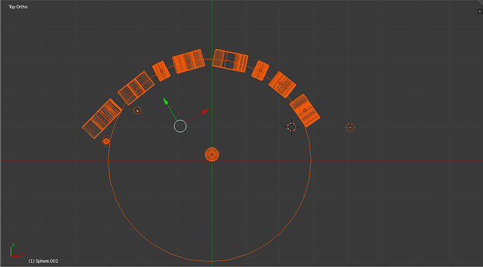
and here is the arrangement, all faces are now lining up(the dotted circles you see are also light sources called as point light.)
Much better, the r and the e need to be turned slightly counter clockwise (from the top down perspective), with the e positioned like the C, the r adjusted accordingly. Not sure why but the picture doesn’t look like the top down with the ‘ire’. I measured the letter widths and ‘Coin’ is around 1/7th wider than ‘Fire’. Is the rendered POV turned a bit towards the Coin? The center point (as I see it) should be just to the right of the center of the n. If I’m getting too nit-picky let me know. Could be where we need with this done.
.Changes made.POV adjusted again.
If E is positioned exactly like c then e gets drifted off far.
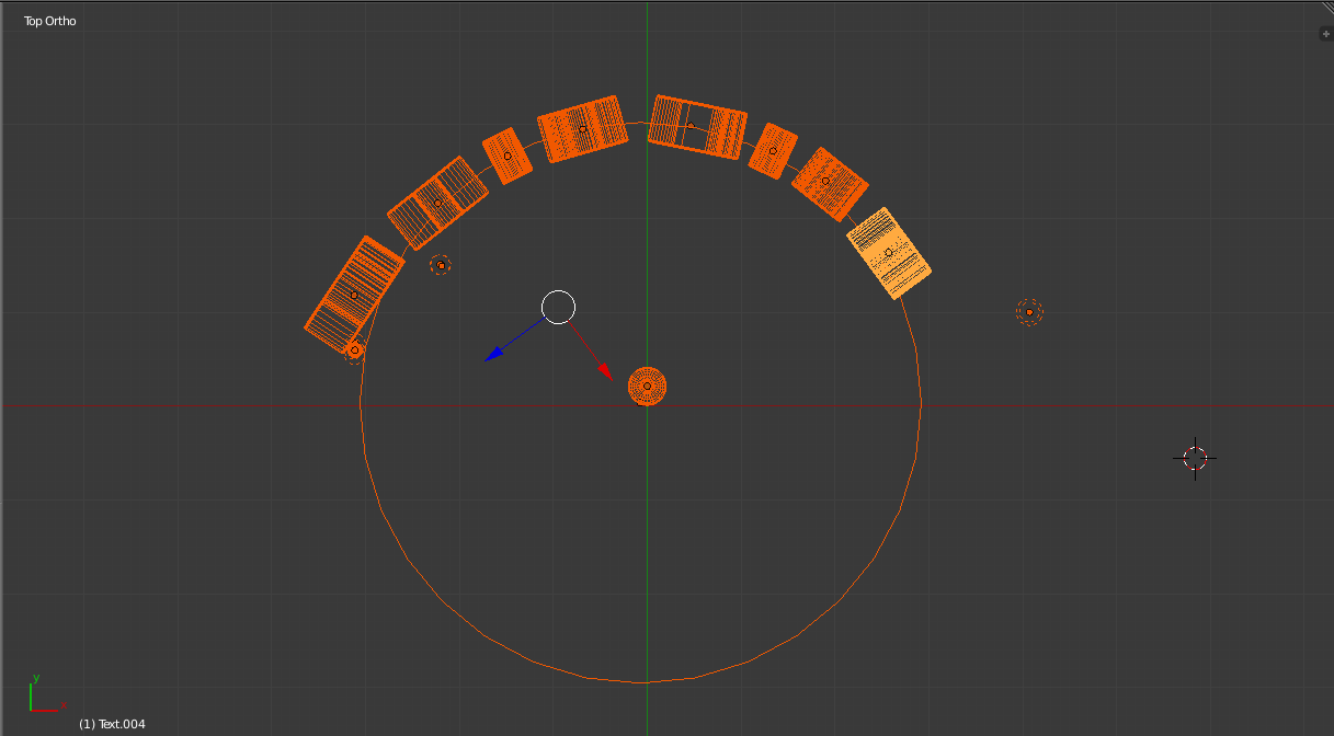
see next post.
Looking at the top down you can see a great curve on Fire, but a much lesser curve on Coin. Can you move the ‘Co’ forward a bit in the curve, or the ‘re’ back a little, or a little of both so there is symetry on both sides. From the view used (which is great) there is a little too much space between the F and the i. If those make sense and you can do that so it looks good to you we should be done. It looks great. This piece was thrown into the last payment, to be used in the next project right? Honestly, is this still working out for you? It seams I am too demanding sometimes. Let me know.
Thank you,
David
check your email. i have send you more samples .

