Some comments to the entries.
Anouar Art: Meeting this guy in the middle of the night would be quite unpleasant. I liked how the skeleton is yellowish, looking old. The blood texture looks a bit strange, specially on the teeth.
LeoBlenderToon: Nice toon effect. The emptiness seems to play an important role here, almost telling a story.
astiero: Very good use of empty space and greyscale. I have no idea how you managed to achieve this drawing effect with blender.
joshwinkler3d: That’s a cute one. Even though skeletons have no skin or muscles, I can totally see his expression of surprise and panic as he discovers that hair is growing out of his skull. I also found the idea of a skeleton taking a shower to be quite funny.
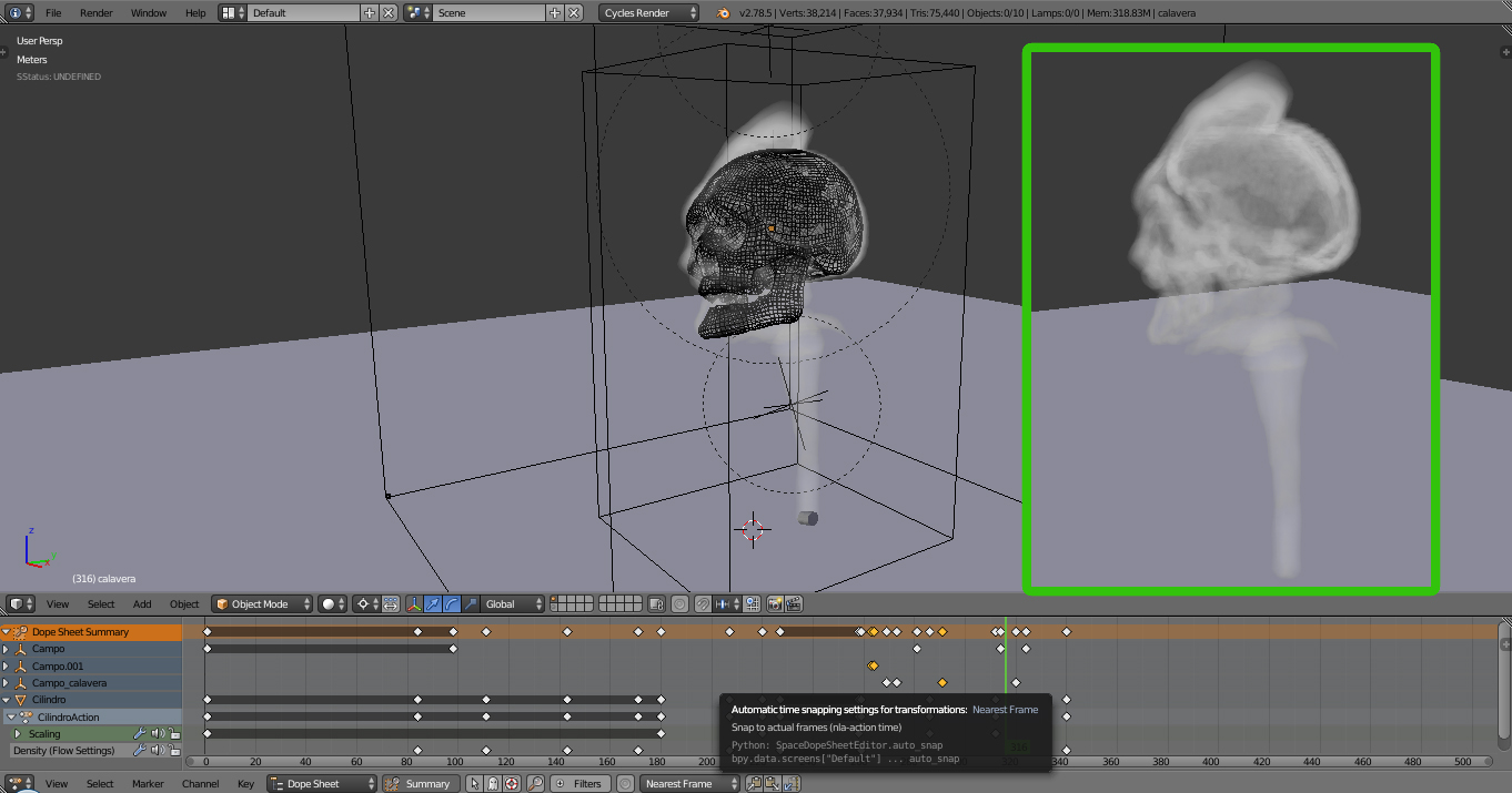
Photox: That’s a cool old skull. It looks like some archaeological finding. I have no idea what that ground is, but it looks cool and that’s all that matters. I just don’t understand why there are two images glued in one. This kind of forces me to compare left and right instead of just looking at one of them.
Hiryuusan: Interesting concept. I wonder what kind of creature would have such a huge skull. I liked the way you used the camp to give us an idea of the size of the skull. I just think this could use some more contrast either in colours or in brightness. There is one bright spot on the top left, but there is actually not much happening there (except for that thing hanging in there which I don’t know what it is. A balloon perhaps?).
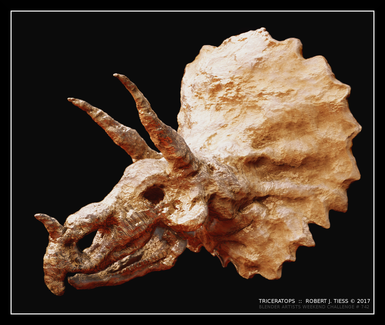
Fulip: A very nice, detailed skull. I like how it is old and dirty, and also the way you made the scene to look like an archaeological finding. I’m just curious about that plate on the skull. I suppose it is part of the archaeology secrets 
Simeneta: For some reason, this makes me think of Monkey Island, and not only because this is the skull of a monkey. I think the shading and lighting give it a friendly look.
fcharr: This is a nice model of a skull, but it seems to be missing the back part. And it is also missing a scene/some environment
robproctor83: Nice contrast between life and death. I like how the skull is broken, being almost consumed by the earth. The dirt was a nice addition, and the plants growing out of it are very well made. The grass on the middleground looks a bit strange, but I think making a close-up of grass is pretty hard. Also, the blurring bothers me a bit. It prevents me from seeing the grave which is almost in the foreground. It is also too obvious where the blurred region begins.
fdo: I don’t know what that guy did in life, but in death he is still useful! Though I suppose bone is not the best material for pinning things…
DM9: A nice interpretation of what a skull is. It is also funny how it looks like a bird.
Miatpi: I liked the metallic teeth on the skull. The light/shadow contrast given by the well is also cool. I just think that the bump texture(?) on the bricks has a rather low resolution. The glitter effect is also a bit strange. It gives the scene a “magical” feeling, but the rest doesn’t, making it look kind of lost there.
OLG: That looks like a nice, friendly skeleton! He is also very classy. I just think the bone material is a bit strange. It looks like some really glossy plastic. The eyes are cool though.
Helge: Really nice use of lighting. The details of the bones are very nice, and I also like how the bones in the front look like swords. Pretty cool idea!

 been smoke free for around 5 years now (hooray!!!)