Congrats @LeighAH on the win.
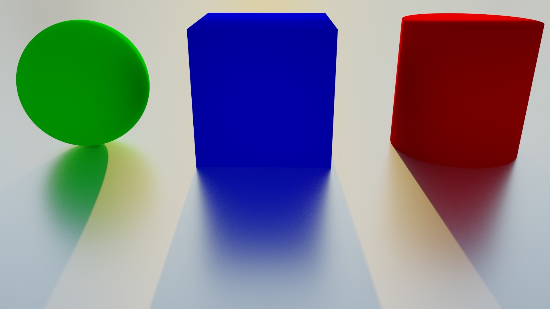
Nitram_2000: Building blocks
This reminds me of artwork you see in museums that sell for $20 million. I like it. It’s simple but well done with the rendering and balance of shadows and reflections. I would make a small change, add a very slight bevel to the cylinder and cube so the light catches the corners to further draw your eye in. Also I can see the faceting in the cylinder, Add a few more subdivisions and smooth it out, because of this your $20 million work of art is now only worth about $5 million.
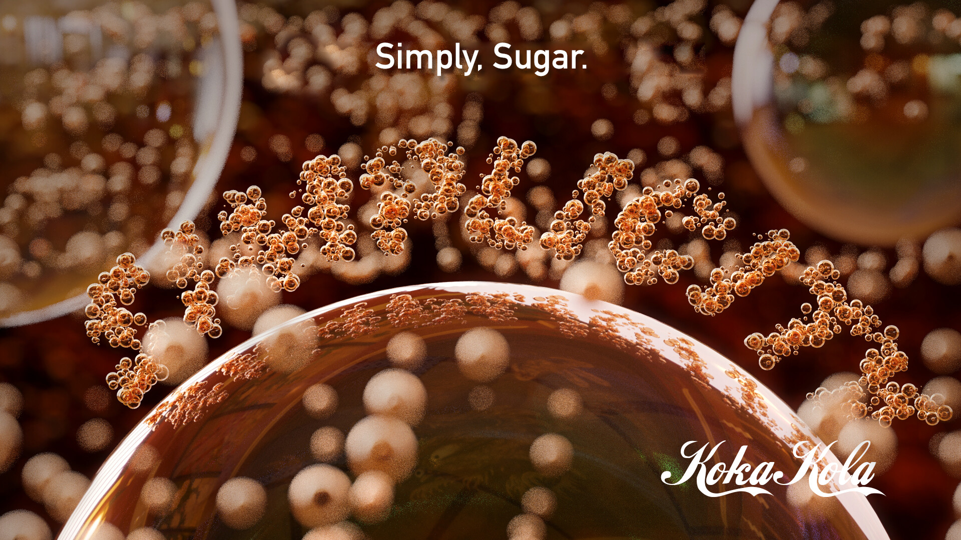
Icyou520: Koka Kola
I see you got off to a rough start, although you do realize the theme was “Simplicity”, you seem to have one of the busiest images this week. Just because you put the word simple does not make your image simple. Thank God you didn’t go with your original idea though, I would have told you I think you need to reevaluate your life. Decent but not great, let’s try to stick to the theme next time.
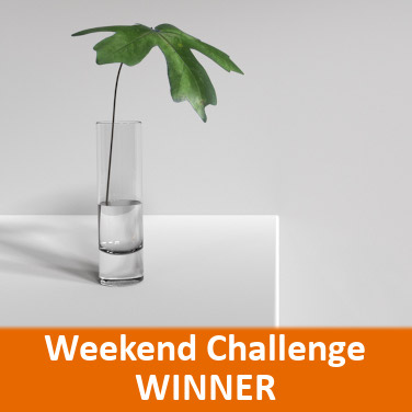
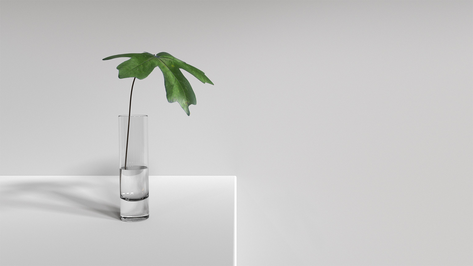
LeighAH: Strength
Fantastic image, It looks very professional to me. I really like the use of negative space. A couple small changes and I think it could be perfect. Something is bothering me about the bottom of the water. It looks like the bottom of the cup is way too thick (or something is off with the refraction). I would bring that down some, also I think the stem needs to be a little thicker and have some SSS added to it. Something else to consider, the leaf seems a little too big, however I kind of like it (great job on the texturing). So if you shrink it a little and it changes the “feel” then just leave (leaf) it alone. HAHA You got one of my votes.
I have an idea for you, after those changes, print it out big on canvas, walk into one of those” healthy” fast food places like Panera Bread , then do this. https://www.standard.co.uk/news/world/teens-thought-mcdonalds-should-be-more-inclusive-so-they-put-up-a-poster-of-themselves-a3927541.html
SystemAgnostic: Simple Juggler
I must admit, I thought I was old but this is before my time. I had to google what this was. I must say, you absolutely nailed it. In fact out of all the Google images, yours is the best one. Perfect execution.
Jachher Distinction:
I really like how you have all the tiles at a different elevation (nice attention to detail). I am not sure if this was done on purpose or if it was a happy accident, but I like how it looks like the white tiles all lead to the red cube. Since you mentioned how you could help the composition, I would just simply move the framing so that the red cube lands on one of the intersecting points on the rule of thirds. Maybe even consider a view from the top looking down. Good job.
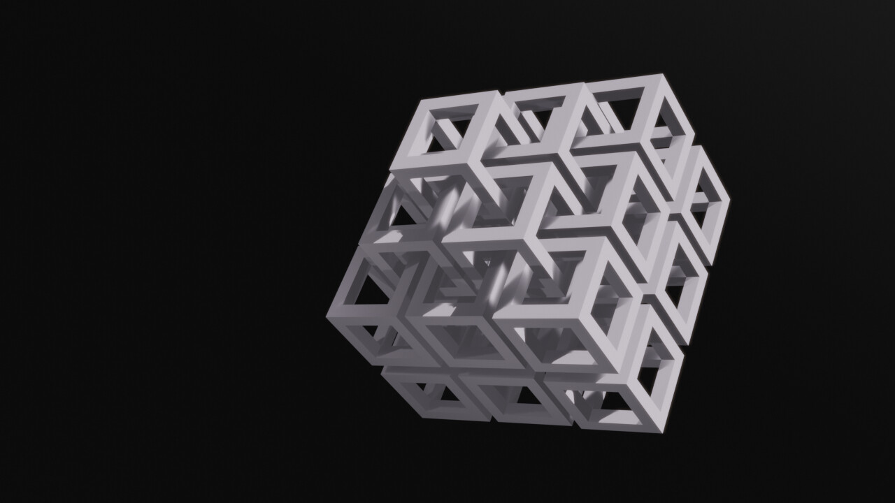
3dnotguru: Simplicity drives complexity
I am so tempted to put my finger in there. I saw a tutorial about linking all the gears with Animation nodes awhile back. It would be awesome to see all those gears spinning in an animation. Not sure if it would show through, but I would like to see a light coming from behind all the gears. Good Job.
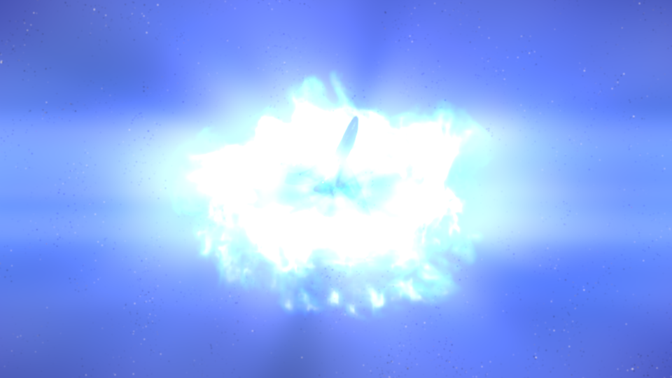
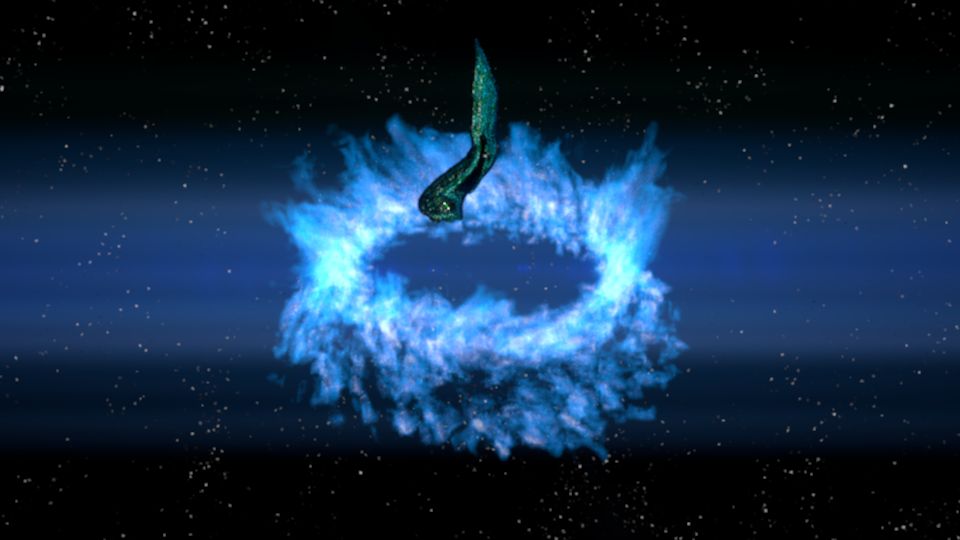
Midnightcpu: simplicity of travel
Great job getting with the unique node set up. It most certainly looks like a magical vortex opening up in the sky. I would like to see what is going in the vortex a little more clear. I can’t tell what it is. Good Job.
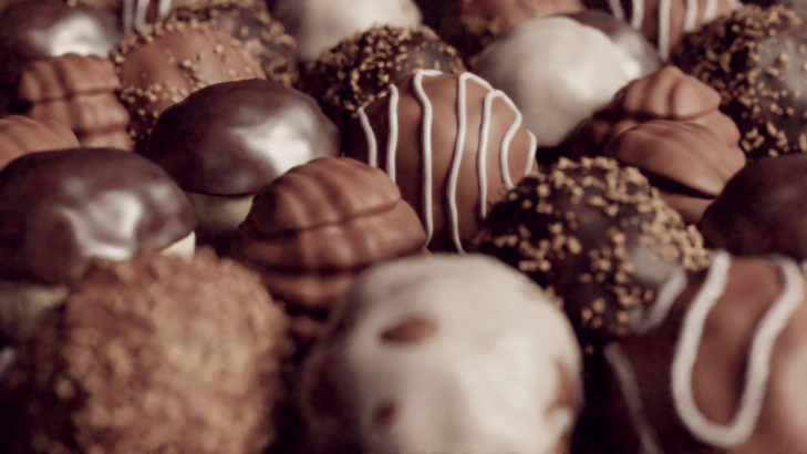
Photox: This is simply not Chocolate
Beautiful render and entry. Looks very professional . You do sweets and snacks very well. I still remember the Oreo image with chocolate vignette (Genius). Great job, could be a clear winner, although not sure how well it fits the theme. You and ICYOU520 are forbidden to deviate to far from next weeks theme.
Sparkwoodand21: Simplicity
Good color choices, Great depth of field and positioning of camera. Not too much to critique. All around good image. Great job.
Gourav_K7: Cubenet
That looks really awesome, I agree with you, it makes a great wallpaper. I would love to see a little bit of texture to it, maybe a point light in the middle to give it a little more depth, and maybe some light volumetrics to have the shadows play with the cube. Otherwise great job.
Fcharr: Memories of White
I really like this image, This is another one that looks like it could be hanging in a museum . I think you captured this theme perfect. Its interesting to look at and still simple at the same time. I normally want to get rid of all noise in an image but in your case I kind of like it. I feel it adds something to it. Great job, you got one of my votes.
Purbosky: Simplistic
Nice clean render, everything looks very good. I like the style of the image and the composition is nice. I really like that red painting with the eye, did you create that? I would buy that and hang it up at my place. I also like how you added the little squares around the painting. Good job.
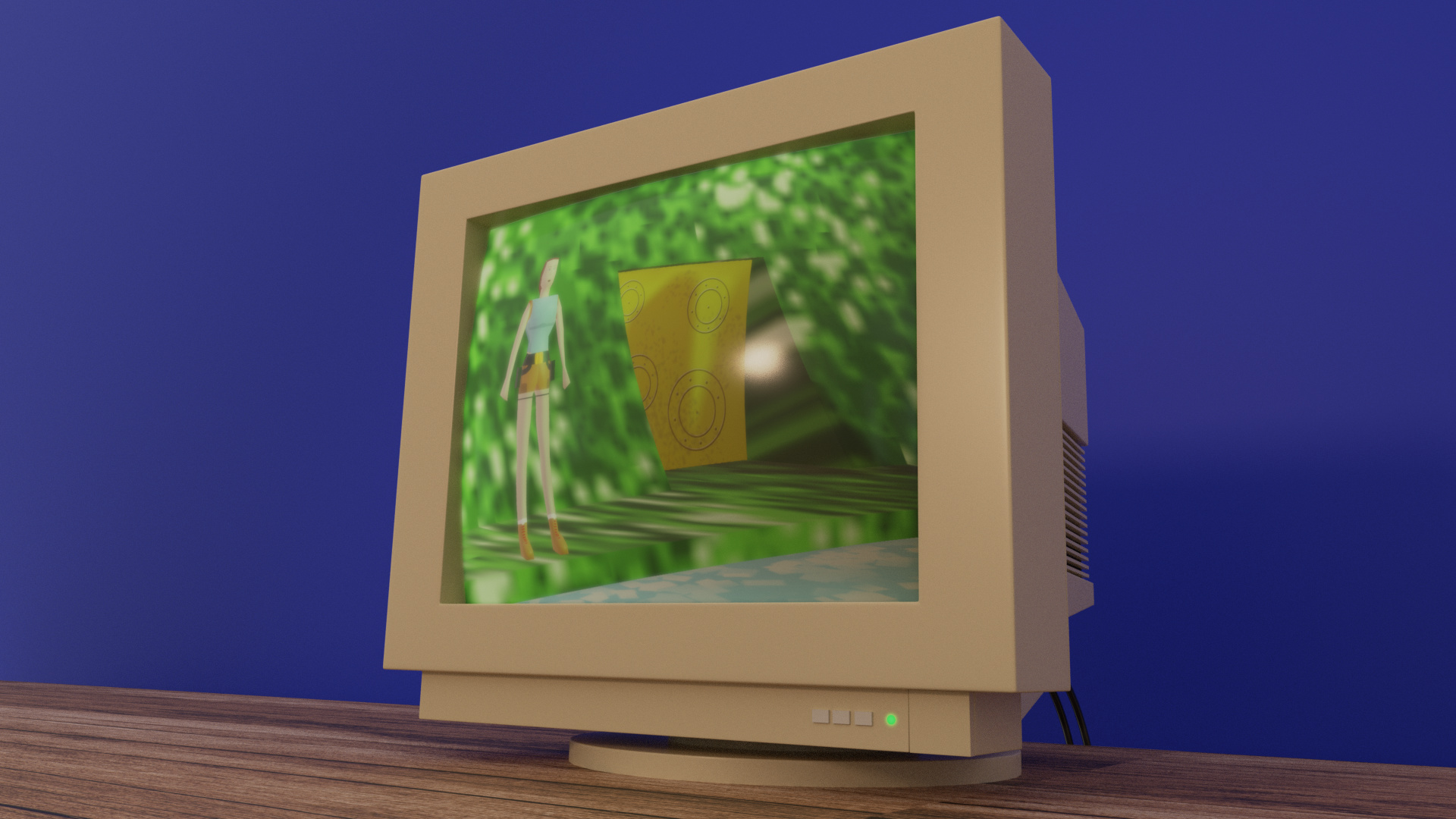
Joshwinker3d: simpler times
Great job with the modeling of the CRT, and bringing back memories. I loved that game on PS1. I know we were all limited on time, however I would of liked to see a mouse and old keyboard just to fill in the picture a little more. Also a nice bump or wall texture for the back wall would of helped. Right now it looks like the CRT was placed in front of a blue screen, so you don’t need to rotoscope. Good job.
TimFox: Dangerous Breakfast
Oh my, that is a very dangerous breakfast. Great modeling and render. Looks very clean. I would of liked to see more of the story, Did someone die? Did a chickens head get cut off? Maybe someone’s finger? Whatever happened it was nice of them to fully clean up the kitchen then stab a dried up bloody knife in the cutting board. Nothing technical to critique, just would like a little more insight to the story.
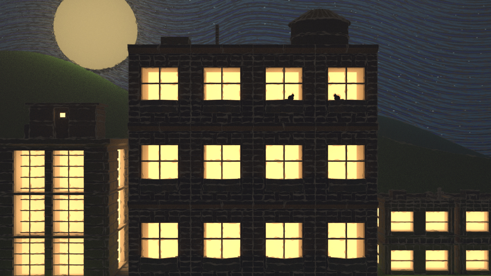
David. Speer: Moonlight city
I love it, I have nothing to critique, it would look awesome printed on canvas, with a real light box behind it so all the building lights actually light up the painting. Great touch with the cats in the window. You got one of my votes.
Milani: Breaking Complexity
You always find the most creative idea’s for themes. I am curious of your thought process when deciding what image you are going to do. It’s always very clever and well done.
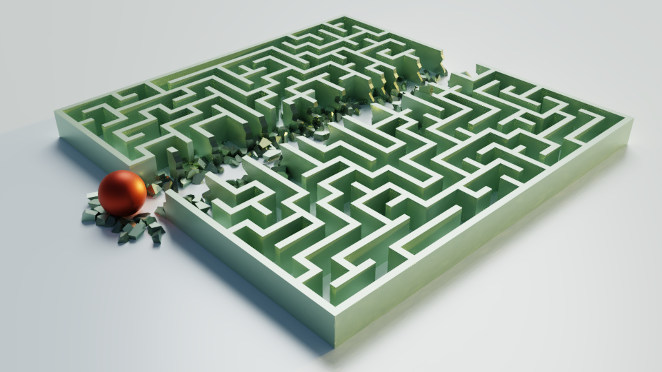
Parcilte: Shortcut
HAHA I love that idea. Just bulldoze through everything, who needs to deal with that maze. I want to see it animated. I believe I read you did some python scripting for the maze. Great job. I am currently dipping my toes into python. So you get extra brownie points for that. Great job.
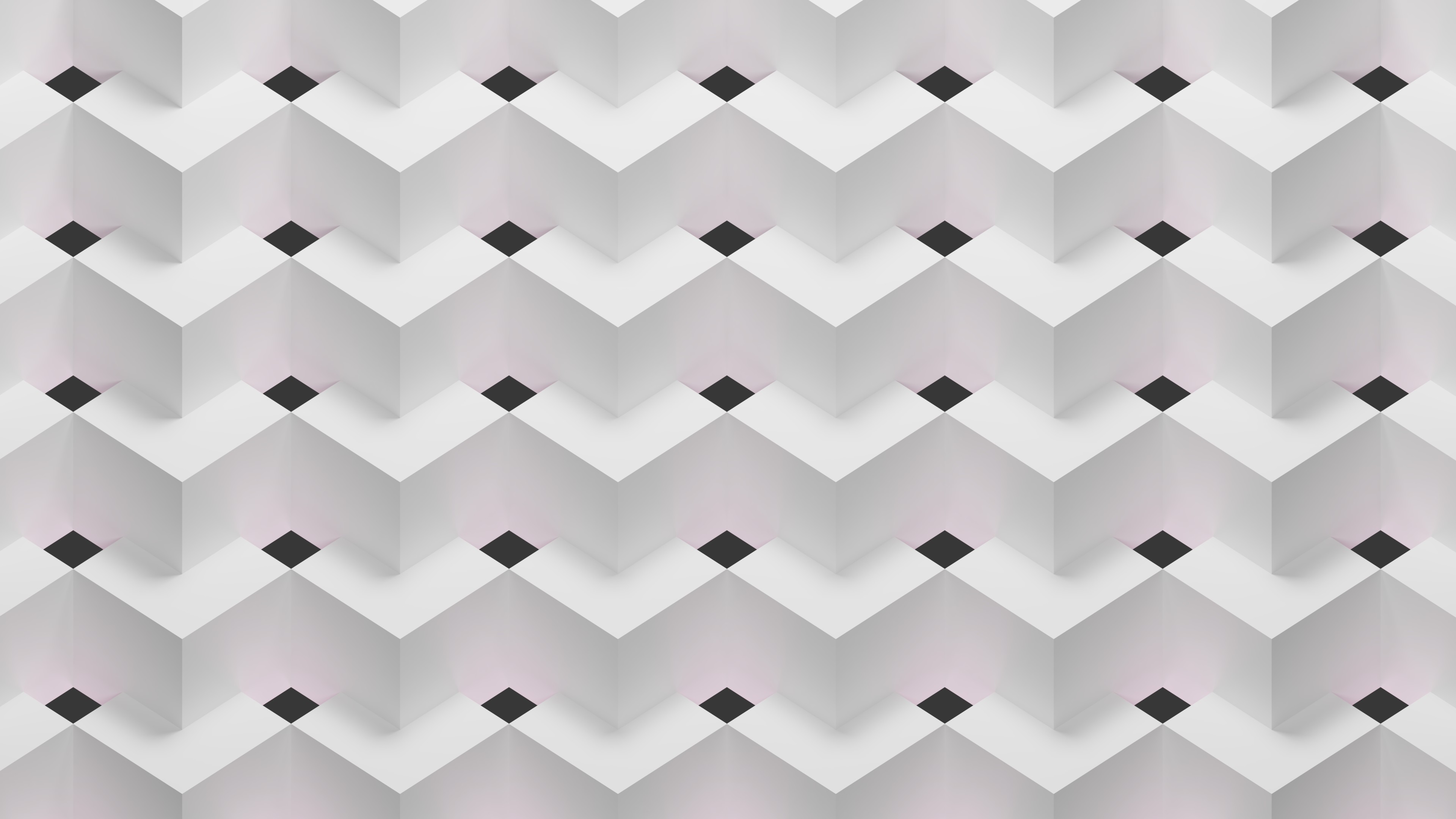
ARC9: Minimalistic Wallpaper
Great job, this makes a wonderful wallpaper. I like the subtle red lighting coming from the black diamonds. One minor change I would like to see, make one of the black diamonds (holes) a different color (maybe red) and put it somewhere following the rule of thirds. Just to give a focal point. Other than that great job.
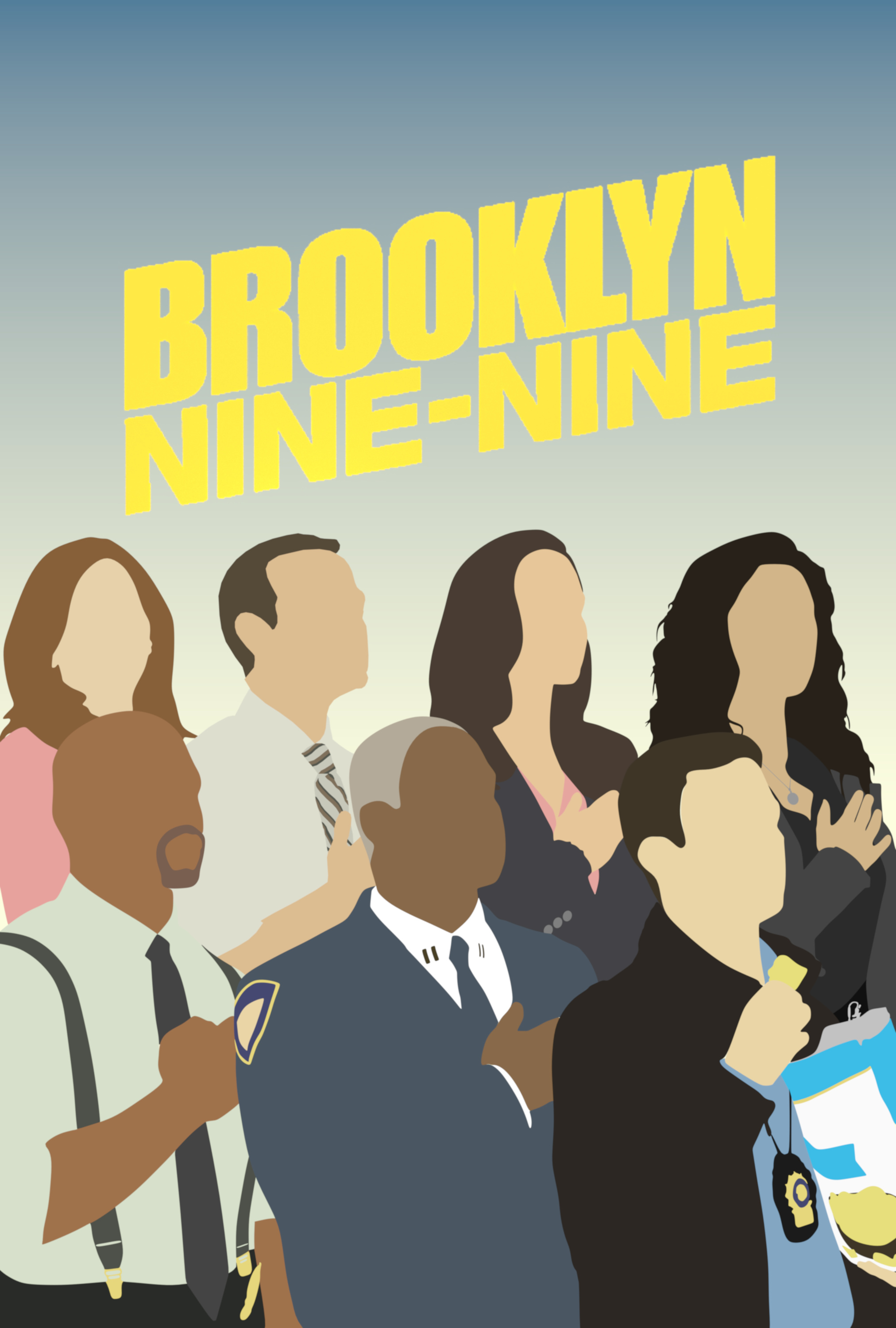
Ansaar13: Brooklyn 99 minimalist poster
I have never seen the show, but I love your poster. I think everything is very well done. Was this done with grease pencil? Nice color theme and I really like that back gradient. If I was a fan of that show (or even knew what it was) I would buy that as a poster. Great Job.
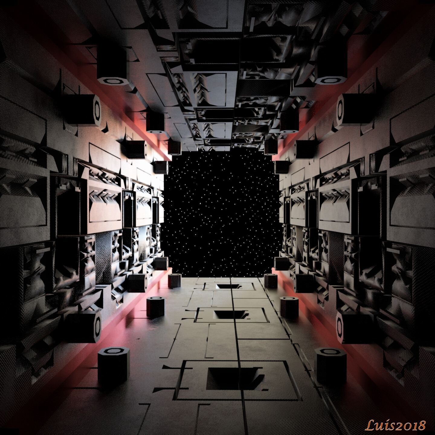
OLG: Dreadnaught Spaceship
Man, your image really messes with my eyes. I swear those stars are moving sometimes. I am curious what comes out of the cargo area? I hope no one has to walk out there, so many tripping hazards (even if you float fall). A hatch door or window at the end would be a nice touch. Great render and modeling.
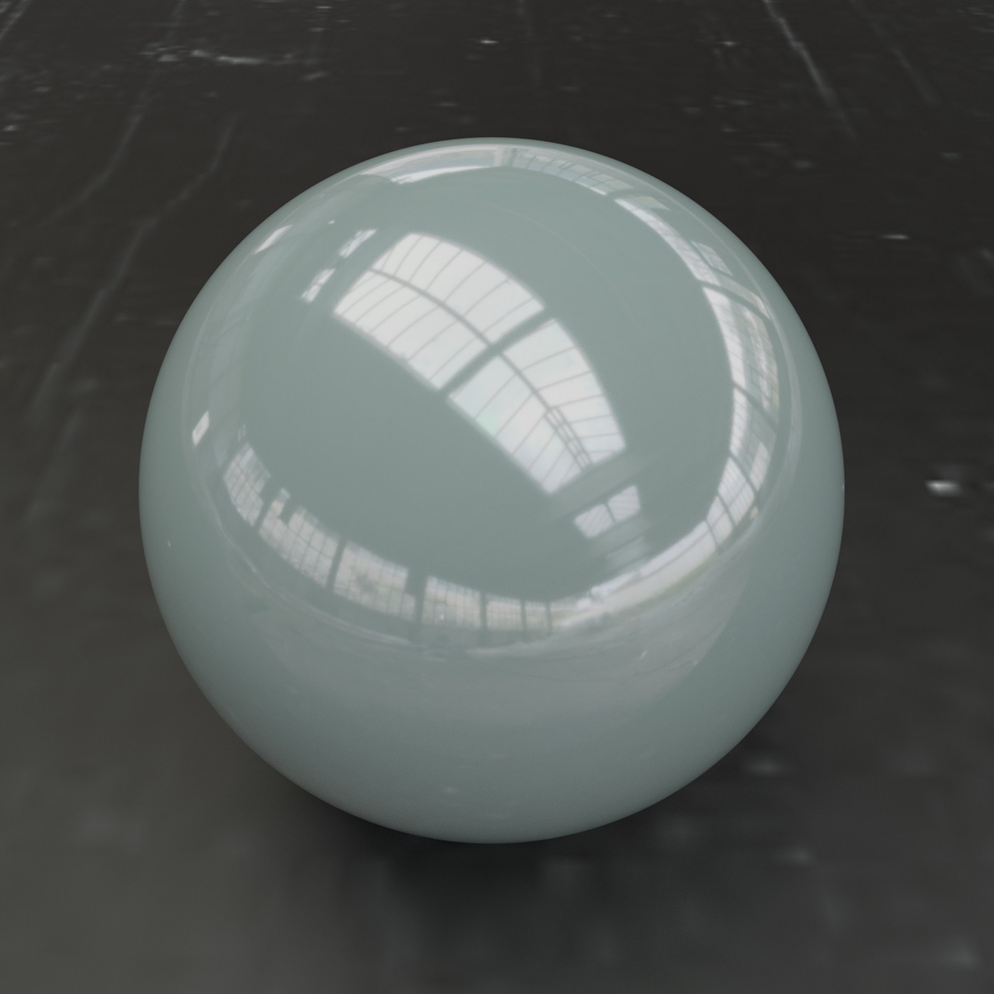
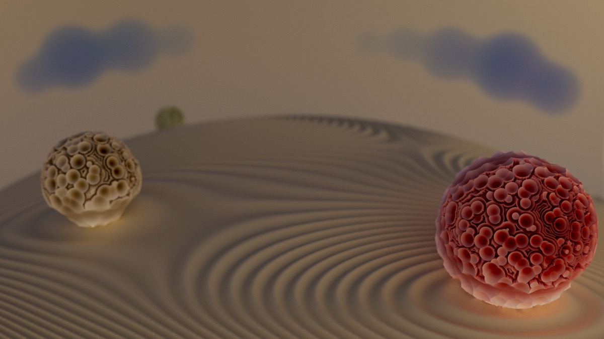
Marcoizzo: Simplicity of spheres
I really like the color palate you chose. The texture you have on the sphere’s is awesome. I would love to see that animated, seems like a bunch of mini explosions are going off but yet it still looks organic. I would like to see your node set up for that shader. Good job on the sand too. I would of liked to see some harsher shadows coming from the spheres to match the sand, to better lead my eye to the next sphere. Great Job.
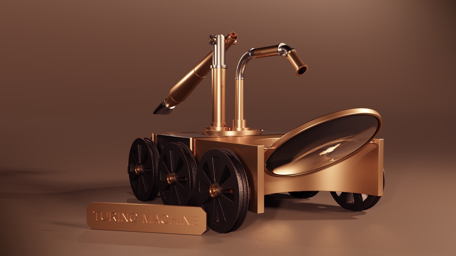
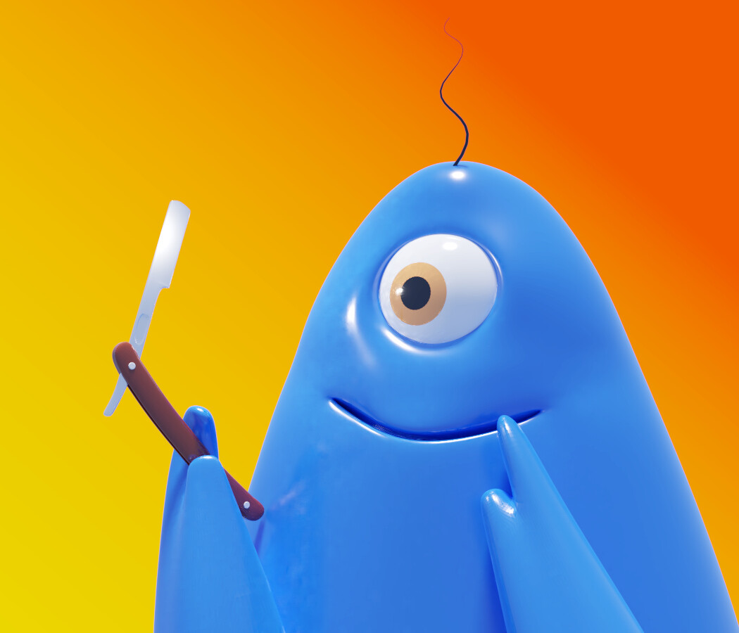
Helge: Occams Razor
The simplest explanation tends to be the correct one. Funny how that translates to art too. The images I spend the most time on seem to get a minimal amount of likes, yet the images that just go with the flow and not too much thought put into, people like the most. So weird. I guess over thinking things is not good. Anyway about your image. Great job, The only change I would like to see is to have some translucency on your character. For some reason I feel like I should be able to see inside him slightly with some small air bubbles. He kind of looks like a gum drop. Lol
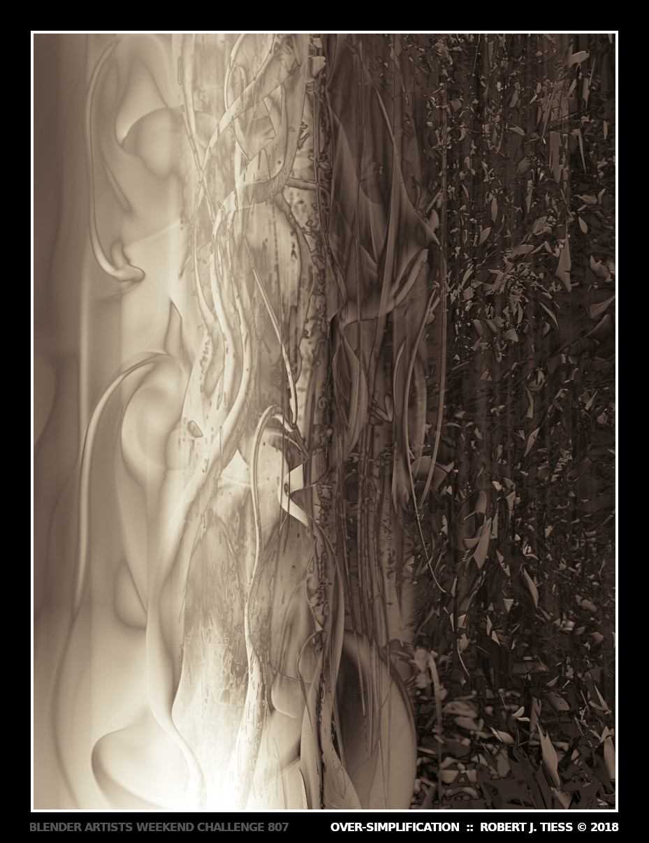
RobertT: OverSimplification
Looks very cool, I have tried to find the meaning in your image this week, alas I have failed. I just see chocolate and vanilla (blame photox) lol. I don’t have much to say about it, other than it looks cool. Great job.