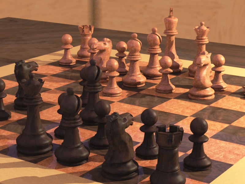
This chess set has spent some time in the Materials Testing lab (ie: Tone and Gamma Corrections) and I think it’s time to release it into the Focused Critique lab.
The white horses looks very happy. Are they so sure of winning the game? :^)
I don’t get the background at all. There is sky reflections on the board, so I guess it’s outside? The light source is low and orange, sunset maybe? Perhaps the sky should have a more orange tang too?
(can you say ‘tang’ about colour, or is it just used for taste?)
From what I see, I don’t have any critics. Everything is perfect. i just suggest to try and show the whole chess board instead of hiding a part of it. its not really important but may improve the look. Everything else is Top-Notch.
Edit: i agree with Rodicul, I don’t understand the background either.
Having pieces cut in half at the edge of the composition is very jarring and some DOF would bring the scene to life.
You can see some texture errors in the table and the background. Blue sky or green bushes would add a nice contrast to the lovely orange colours in the foreground.
Nice colours, nice soft models and materials. Would it look nicer with softer shadows too?
The black pieces’ material is improved from earlier versions but the white pieces look a bit ‘noisy’ - is it depth of field?
The chessboard looks like it is set into the table top, but the shadows suggest otherwise. Maybe change the table’s texture size or add some nor mapping?
The yellow colour cast might be too much - it could be a sunset but there’s nothing to suggest where it is(I’m guessing beside a window), - what ^ they said on the background.
I might turn the camera a little bit to the right, but otherwise it looks good.
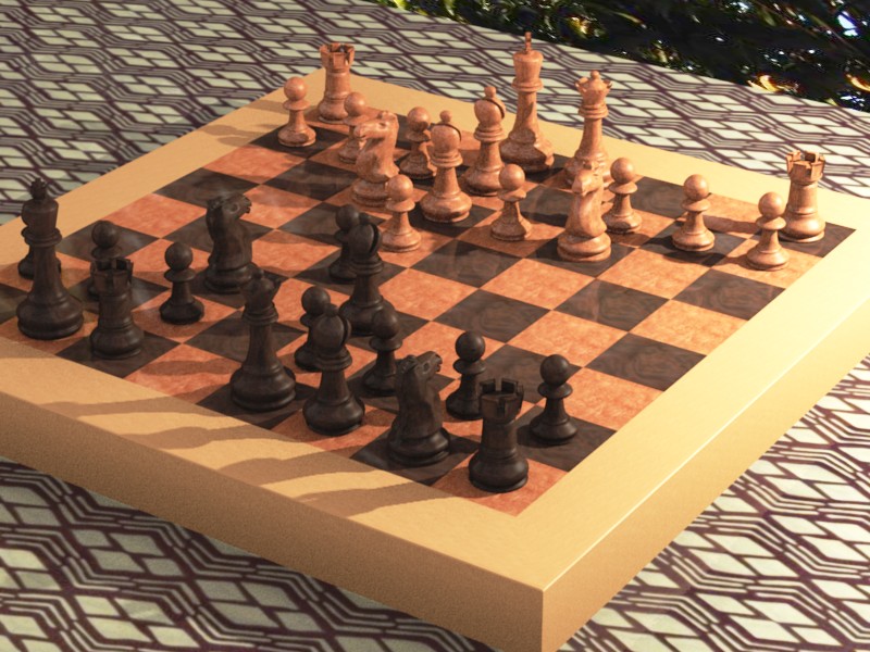
The black horses are happy too. Knights always believe they can win at the beginning of the game. Changed the background, included all the pieces in the composition. Put a cloth on the table. No DOF (yet.)
I think the previous composition was way better. Maybe needed to be shifted a bit but the new composition is not a composition IMO. I would return to the previous low angle and rather close-up composition but move the camera so we start to see a hint of the chess board borbers in the bottom of the image. And I would move the top table border so the chess board overlaps the border so it does not look like the chess board is part o the table.
The tabletop texture is too busy and competes with the chess set for our attention. And the background is still undefined.
The composition is unbalanced now. The top portion is much heavier than the low portion. It is not necessary to show the whole corner. Just a hint of it with the table surface will do. Also, add a bevel on the bottoedge of the board so it creates a dark lie where it meets the table.
Much better that the first picture. I agree with yves. Also, I think you would be better off modeling something for the background than using pictures. Doesn’t have to be anything advanced, just the bottom of a building or something, and maybe a chair.
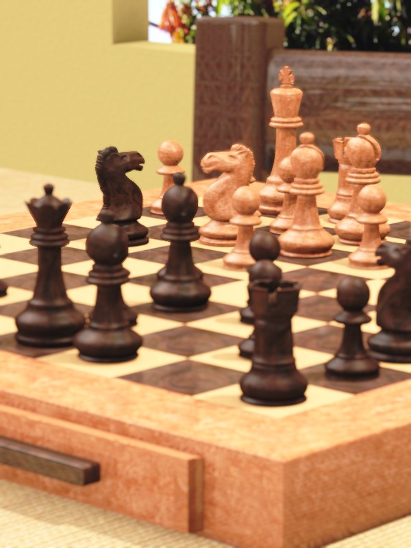
Looking good so far. One thing that bothers me is the frame of the chessboard. The actual checker pattern looks nice, but the frame and the drawer look like they are some sort of composite. I think the “white” wood from the checkers would be better as the texture for the frame. You also might want to pick a new wall color. Right now the wall and the table top seem to blend together.
You know, I like chess, that’s why I can tell you that it’s impossible to achieve this position in the actual chess game. White made one move too much, but even so, it looks like an awful opening, bishop on d6 square stand awkward, only patzer can make such an ugly move. C’mon man, pick some interesting position from http://chessgames.com and do it like a real GM! :eyebrowlift2:
@popski, you’re right, I miscounted. White had an extra move in there. So I gave Black another move. Not a good one, I’m afraid. This isn’t a grand master game. Remember when you were learning chess? and you’d go charging off with one of your knights trying to win with one piece? Well, maybe not, you may have been more sensible.
Thanks for the reference site, though. If I use this in a larger setting, I’ll get a better game on the board :D.
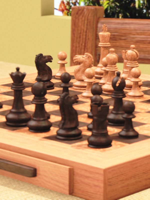
@DichotomyMatt, tried the texture switch: white squares for box material and vs. versa. I think if it were in focus, it would look too busy, but with the DoF blur, not bad.
Well the box looks more like wood now, but you are right that texture didn’t fit as well on the larger piece. Maybe you can hunt up a third wood texture that has a color somewhere between the “white” and “black” texture you have now.
If you are looking for a new arrangement of the pieces IBM has all the match details for 1997 when Deep blue bet Kasparov here: http://www.research.ibm.com/deepblue/watch/html/c.shtml
Would be an interesting nod at the fact that this is a CG chess set.
I really like the materials and textures, very well done!
I think it’d make a cool contrast to put the board onto a circular table, not sure how it’d look though.
Also, I liked the table cloth.
last thought is that I’m not sure what kind of room we’re in. If it’s legitimately an inside room, open to the outside, the wall isn’t nearly thick enough. I considered it taking place outside, which would be nice considering the earthy colors of the chess board, but it doesn’t look like that’s where you’re going.
keep it up, i like how your projects turn out, i’m a fan : )
I think where I’m going with this is a semi-enclosed patio. In Florida, they have rooms that are basically outdoors, except screened in to keep the bugs away and roofed to fend off the midday sun. So, this is similar to that type of room, except without the bugs and the need to put screens in the openings in the walls.
The wall in this one is thicker. The earlier wall was very thin, more of a vision block than a real wall. The table is also round (well, oval.) It’s very hard to tell the shape of the table, so little of the edge is showing.
I liked the old tablecloth, too, but it was too busy for the scene. I used the same cloth to dress the model in Another female model (link in sig.)