A shot from my current WIP. Not enough progress to add to that thread.
4 Likes
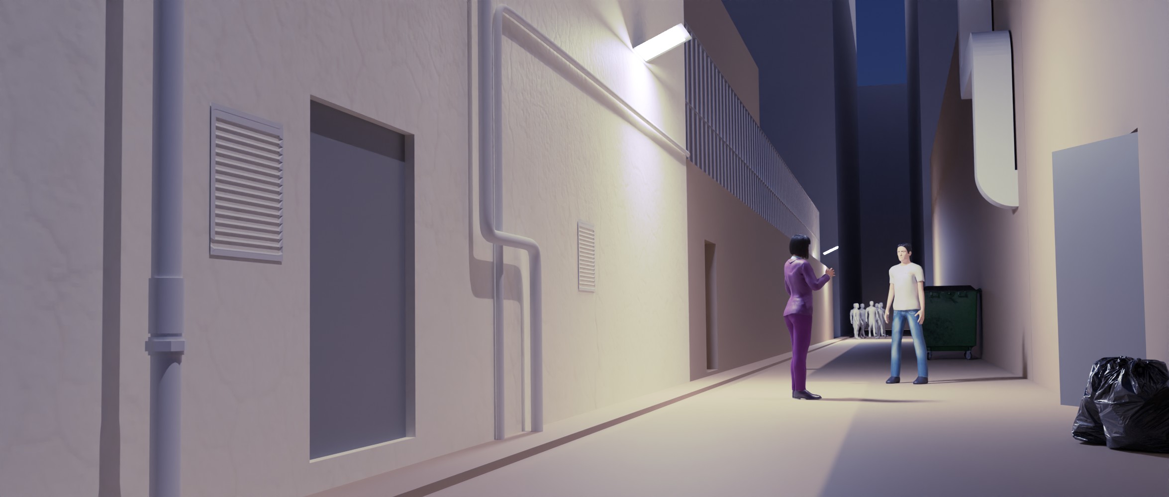
The city looks pretty cool.
2 Likes
Love the wide shot.
1 Like

A simple technique of modelling with freehand curves. In front view add a bezier curve, add screw modifier, go to edit mode and delete all vertices. Still in edit mode select the freehand spline tool from the toolbox on the left and draw a curve with it. This will be the profile used by the screw modifier. If you use a graphics tablet you can get even more freeform results.
4 Likes
There’s been some discussion lately regarding the verbosity of sketchbook (and other) threads. Since I’ve been studying data science a lot recently to support an activity mention of which is pretty much proscribed on BA (I’ve had posts flagged and deleted concerning it) I’ve adopted a more data driven approach to how I present things. A primary measure of engagement on BA is the Like to Post ratio. In the over 200 threads I’ve started since jointing BA only 1 had a high LtoP ratio until the last few days (now 3) and this thread, started n 2015, is one of the recent ones. So, to save anyone having to scroll through pages of text to scan a few images I’ve saved the verbose versions for my blog. Takes two to tango as they say. BTW this thread is about to hit 25k views. Maybe I should celebrate. I’ve actually deleted a lot of posts that had no engagement and didn’t really have anything different to offer so reading it may give a false impression regarding engagement.
@piranha4D didn’t want to hijack your sketchbook to discuss this topic.
4 Likes
Interesting. I did ask once in my Sketchbook about using the “details” method to hide the deeper excursions into my psyche, which I am sure are not of interest to the casual drive-by visitor. My more constant ADHD visitors were in favour of not using it. I don’t know about LtoP; I have more engagement than I expected, and I’m fine with it as it is. Only my first post has “serious” numbers – well, not really all that serious either. ![]()
Part of why my Sketchbook is so talky is that it’s about my directed learning. If it were an actual sketchbook it’d likely be less so. Yours strikes me as more of a real sketchbook in the spirit in which the feature is presented on BA, and how most people treat theirs. But I would still appreciate a bit more information about the imagery people post, since WIP images alone don’t really tell me much. I don’t ask because it’s your Sketchbook and you can post as you wish, of course – I feel these spaces are semi-private unless explicitly declared otherwise. But my general tendency is that I get more engaged with WIPs and am more likely to come back, keep track of things, offer thoughts about them (if wanted) if I know things about them and about their creator – purpose, process, problems. Otherwise they’re just disconnected images without much meaning and impact.
You have a blog? :duh: it’s right in your profile. :rolls eyes at self:. Oh yeah, that’s cool – that’s the sort of thing I would like to know. And it’s not even that verbose! You really feel that’s too much for here?
4 Likes
I only recently included the link to my blog in my profile. As for the verbosity, it adds up once the number of posts gets large. I don’t think many people who come across my sketchbook for the first time would bother to read through it if it was two or three times longer due to text.
The main reason I maintain it is because for quite a while there were very few people on BA doing landscape imagery, which is what I was mostly doing, and some diversity is not a bad thing. A lot of that work wasn’t in Blender anyway. It has become more popular over the past year or two, probably because of CGBoost and similar trainers. More recently I feel I’m perhaps offering something a bit ‘grittier’ that few people are doing, but I’m probably deluded about that. I also use some techniques that few people seem to be using, so maybe I still have something to offer.
Like to post - where BA shows the number of posts in a thread if you mouse over the ones that are in pale orange the tooltip will say ‘high like to post ratio’ and the ones in bright orange are ‘very high like to post ratio’.
3 Likes
Just wanted to say that I’d definitely read through your texts if you’d decide to post them here, too. I like your blog! Helps so much to get to know other techniques. It’s like a little window into the studios of other people and I absolutely enjoy it (okay, now that sounds a bit strange, hah). Anyway, I like your work and especially the yellow tinted render with the apocalyptic looking buildings. Reminds me a lot of Blade Runner or similar movies/books.
On your blog you talked about leaning more into Color Grading nowadays - are there any books/tutorials/courses in specific that you’re learning from?
1 Like
I’ve started a course on Udemy on Cinematic Color Grading - not sure how useful it will be as it’s mostly geared towards movies and I do primarily (or exclusively) still work. I’ve had a terrific book called Dream Worlds by Hans Bacher (production designer for Disney) for a while, which goes into detail about cinematic looks and color scripts, which I find interesting. I believe there’s a more recent edition perhaps with a different name. As a long time Photoshop user (now Krita) I know a lot about the techniques of colour adjustments but don’t really understand the artistic decisions needed to get great rresults.
I found a YT video of someone flipping through Dream Worlds (commentary not in English but no matter). Gives you some idea https://youtu.be/O_J7AP_1M6c
1 Like