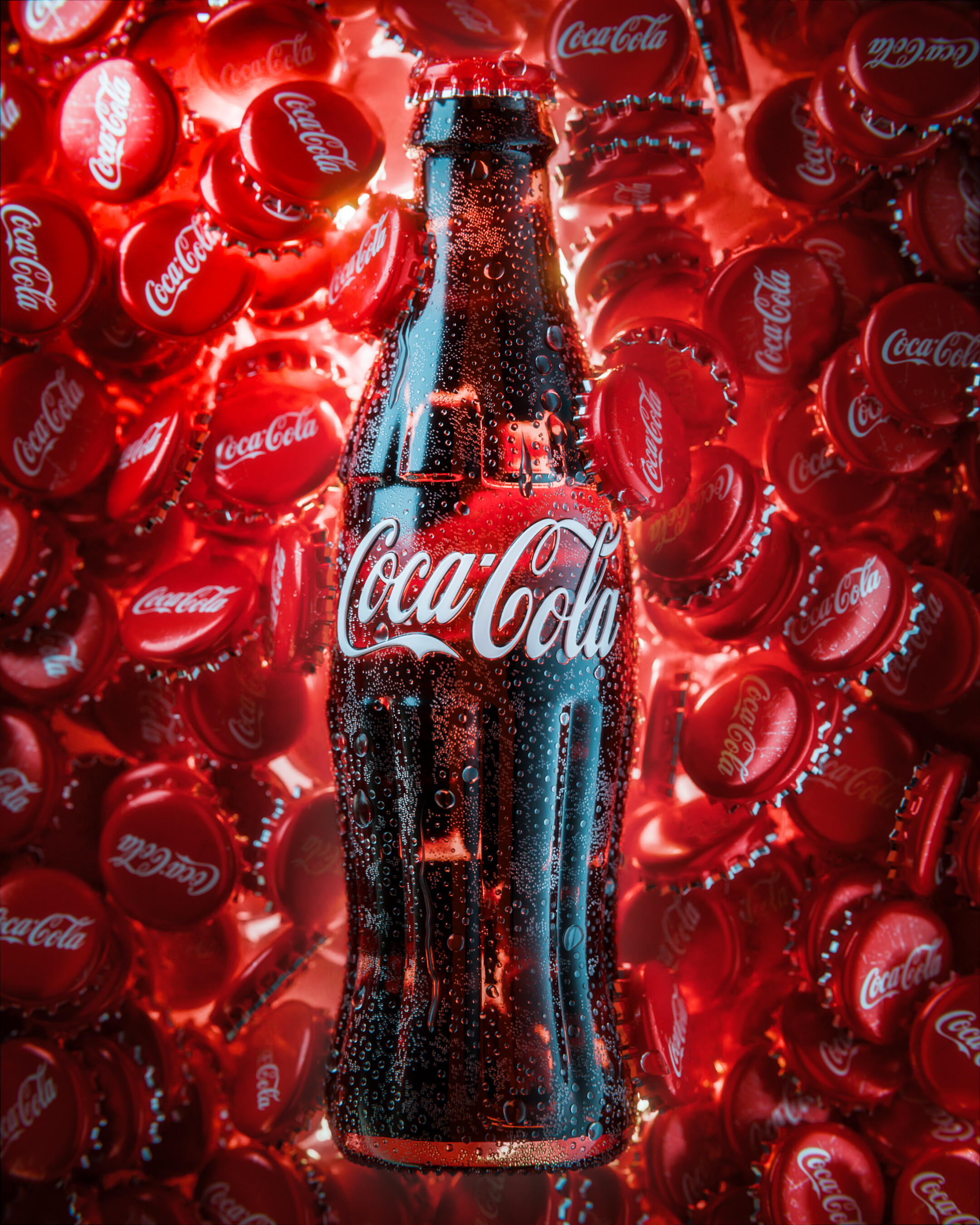
Another in the Coca Cola Bottle Series - As I come up with more ideas I’ll keep posting, but the main idea here is to challenge myself to use the same simple asset in many different situations.
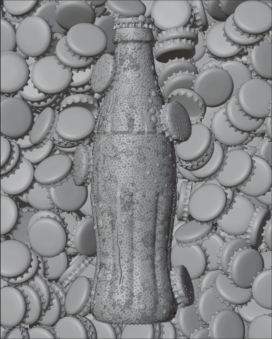
This one came around from me playing with Rigid Body Simulations with the bottle cap - lesson learnt, use lower poly assets before you start as in the end all these bottle caps in the sim added up to around 8 Million polys!!!
Why does it always look so tasty?
I don’t drink Cola, but now I want it!
As always it’s a beautiful render.
Maybe I would have made the liquid itself less transparent. I’m not sure, though, because I’ve never checked it on references.
@engart Yeah, things add up quickly esp when you’re not watching whats going on or planning ahead. For me here I was paying around with the bottle cap and Rigid Body Sims, next thing I know I’m 8million polys in playing with lighting and don’t really want to start the scene again!
Hey @Chalala I try not to do anything too complicated as I’m not that intelligent, so I always keep it simple.
The Coca Cola text was that largest I could find off the internet, I than scaled that in Photoshop to a good size. Scaling this way sometimes makes the text soft so I clamp the colour to help sharpen up the image, it doesn’t have to be too sharp as the next stage is to convert it to 16bit and then give it a small blur. The size of the blur will depend on how much of a bump you’d like on your object as we then use this to create a UV’d Displacement Map on the glass bottle.
You can also model this kind of thing into the object, but I find that unless you’re going to be really close a really good displacement map works just as well and its much quicker to do.
Hope this helps? If you have any more questions please feel free to ask.
@bhibb Thank you very much for your comments! Pleased you like the composition its sometimes one of the hardest things to get right…along with lighting!
Wow, simple yet super effective and powerful. It works like a charm. I always ask myself how to approach these kind of engravings. I often go for displacement or normals too, but never had that kind of results
Lighting work are also really impressive, I really love it.