http://gallery.mudpuddle.co.nz/kansas15/0063_G?full=1
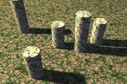
A little something I whipped up
you really need to work on your lighting skills
You saying I can’t light anything or something? Then what would you suggest for normal daylight then?
you pic almost never have shadow…or really bad shadow. It’s you weakness I guess as it’s been for me (and still is a bit)
I dunno what you’re using to light your scene, but a spotlamp would help. So at least you can have shadow.
some few tips (I can’t explain everything, it’s all about tweaking)
1- Never place your main spotlamp directly overhead pointing down, that would kill a “shadow effect”. It’s better (visually) to have your spotlight at angle with your scene
2- do not light your scene only with normal light and sunlight (as primary light source at least) and never use hemilight (well that’s my opinion, maybe others have found use for it). It’s always better to have let say 1 primary spotlight, and 2-3 other secondary light to soften your shadow.
as I said, I can’t explain everything…there is no perfect setup for every scene…each scene need to have its own setup. It’s all about tweaking, making test, retweaking etc…
you can search for tutorial about 3 points lighting, it can explain the basics of having primary and secondary light
you really need to work on your textures
they are all the same in every image and are all really bad
like the wood and the brick.
and you use brown waaay too much
Just a simple hemilight and ray shadow shadow only sun light approach in which I used for a lot of my earlier images but used it for this one to shorten render times.
And I always have the lamps at an angle like you said. Though directly overhead isn’t always non realistic either as you can find in the tropics.
One thing is though is that I seem to get flooded with image complaints while 2 thirds of other members several even newer to blender get perfects on their images, they even get good comments about the lighting and it deviates little from the setup which I described.
The Hemi light does not cast shadows (you probably know this) and cancels out shadows from all other lights in your scene (probably don’t). This may be your problem. 
kansas_15,
it’s not about being newer or older to blender…it’s about getting it rigth or not…
and it’s also about personality, people are trying to be partial…but when they know all the spam you made…people tend to be harder…it always has been like that…and it will ever be…the first impression buddy…that’s what count (most of the time)
I know it doesn’t cast shadows and I do know it’s possible to have shadows if you’re using a hemilight.
i was thinking if you wanted to you might be able to post the .blend file in the works in progress section and let some of the blender masters (not me of course) take a look at your work and rework it a little. such as textures and lighting, your modeling i think is very nice, such as the flower scene. i think it is mostly just your lighting and textures.
improve these and i think you would be on your way. it seems you have the drive and passion for 3d and with the basics down you could really crank out some nice work.
so give it a try put up a .blend of one of your works in the works in progress section (i think the flower scene would be a good choice) and let a few people rework it (lighting and textures) and then give you feedback on how they did it.
Posted a slight updated version with darker shadowing and a slight blue tint to the lighting.
hmmmm…just my opinon, but ,Kansas i’d have to say you make the stupidest sh!t ive ever seen…maybee i wouldnt if i knew what thats supposed to be…no further comments :Z
I think with a little work, your renders could improve significantly.
The things that’ll really help your images are textures and lighting. For procedural textures, its really important to layer textures to get a better/more complex effect. single procedural textures (especially wood), usually end up looking cheap/cheesy.
Lighting is probably the most critical. It’ll make or break the image. For outdoor type images, directional light and defined shadows usually help tremendously. Slight changes is energy and RGB values can change the mood of a piece. color your lights a little more than you think you should, the effect is usually better.
heres a few really quick examples. these images aren’t great or anything (about 5 minutes worth of work), but you can see a clear light source and shadow.

heres the blend file if you want to look at it. Play around with the light settings/values and the textures.
No lighting scheme will be perfect or good the first, second, or probably even third time you try (unless of course you’re one of the blender demi-gods ;))
Right now, I would suggest using z-buffered spots more so than ray-shadows. It only takes a little longer to set up and renders much, much, faster. This is important as the key to improving an image is tweaking and test rendering. Try all different types of settings. Even if you plan on using ray-shadows later, blocking out your scene with z-buffered spots will let you find the “look” you want much faster. Don’t usually test render with ray-shadows, area-lamps, etc. at least not initially, until you’ve gotten your basic lighting scheme down.
keep at it, your sure to get better with time and effort.
one last, general comment. You seem to be putting out images fairly regularly. This is good but its probably better to stay with your works and improve them.
http://myfilelocker.comcast.net/donkim/teststuff.blend
on a side note, I like hemi lights alot for fill lights and stuff. They obviously cant be the only or main lights, but good for a cheap GI fake. Low powered and slightly blue hemi lamps are good to have in outdoor type scenes, at least thats my personal preference.
Try modelling a few simple scenes which are recognisable objects, this is simply a few walls with some textures applied, it doesn’t say anything.
Find an everyday object, and try to model/texture/light it as accurately as you can, and then just by looking at the object you can easily see how well your interpretation looks like it.
I also noticed your lighting setup is often weak. If you try to work on it you’ll see it’s not that hard.
Another weakness in your renders is the colours. You should desature them a lot. If you look around you, you’ll notice saturated colours don’t exist.
About the lightring, try http://www.3drender.com/light/ or buy J. Birn’s book. It’s worth it.
Keep it up.
-IS-
Kansas,
You keep going on about how lighting relly is outside, but you don’t take into account the fact that even when there are no clear shadows, some parts of the scene don’t get as much light as others.
It’s that ambient occlusion thing…
Now I know you’ve said that you don’t want to use ambient occlusion, but with the type of lighting you are attempting (cloudy day style) it is essential. So cut the crap about realistic lighting, 'cause yours isn’t.
Since you have nothing close to a realistic lights setup, you need to start thinking about what will look good and convinicing. Your main trouble is a complete lack of contrast.
Human eyes see on a logarithmic scale w.r.t light intensity. If you take a picture of a room and an open window on a mildly sunny day the window will be washed out or the room very dark. These kind of contrasts exist in shadows outside, although you don’t notice them so much because of your eyes.
But if you take a picture with a camera the difference is very noticable.
POINT1: More contrast is much more realistic, no matter what you say.
POINT2: Your light setup doesn’t even approach realistic, so don’t complain “but it’s how it is”
You saying I can’t light anything or something? Then what would you suggest for normal daylight then?
Answers:
Yes
See above
Alex
(I’ve tried to be as straightforward and plain as possible, as you have repeatedly shown a complete lack of improvement. We want the best for YOU.)
Crossworlds: abstract work I whipped up in only a matter of hours, as a result the lighting setup is as simple as you can get.
I totally agree with the different crits you get for your light, colours and textures, but hey, it’s abstract. And is there a right or wrong with abstract work? Not for me to answer, but it has to look appealing. A better question would be: if you’d improve those points mentioned above, would this work look better? I don’t think so.
Like Aquaglow said, make scenes with recognicable objects, then work on the light, colours and textures. Don’t do abstract, it’s just not your thing. It’s just not the right exercise for you, 'cause then it’s harder to see if your weak points are progressing (in the right direction).
Ps. Whipping something up in only a matter of hours also isn’t very helpfull for getting quality-images.
EDIT: All content in this post deleted and is now obsolete
Your choice of course, but I wouldn’t say you can’t make anything, this image showed promise: http://gallery.mudpuddle.co.nz/kansas15/0055_G
Listen more to the critiques, otherwise you won’t improve. People have given you lots of good advice here, you just need to use it.
I edited the post above if you didn’t notice.