Blender Artists now has a customizable ‘slide out’ menu that gives you quick access to the site areas that matter most to you - click the pencil icons next to the categories and tags labels to customize them to your need.
Note that this sidebar is optional - click on the ‘hamburger’ icon on the top-left to collapse it.
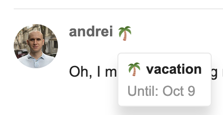
With this announcement, we’re making publicly available a new feature that enables you to set a custom status message. After setting, that message will be shown next to your avatar on posts, in chat, on your user card etc.:
You can use it to let everyone know that you’re temporarily unavailable, are on a long vacation, or just to share your mood.
I’m experimenting a bit, I’ll move it to a private theme for now. I’ve always wondered if our homepage should be more graphics oriented instead of having rows of text. With the new sidebar presenting our categories, I think it may be time to try this.
That feels like a huge change which takes a little time getting used to. The first impression after trying it out for a few minutes is surprisingly good though.
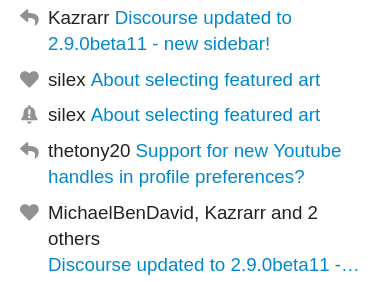
Also, is it a bug or something ? when I get a notification for a topic I follow, when there’s a new reply, he’s showing the “bell icon” instead of what used to be the “reply icon” :
I don’t know if I made myself clear, sorry if it’s the case
Hmm perhaps it depends on how the reply was made? This is what I just saw when you replied to my topic. I think that if you’re watching a topic and it gets a reply, that reply is not made to you, and it might show a different icon?
I understand what you mean, but before, when you put a topic as “watching” it’s saying that you will get “a count of new replies”, so I had in my notification bar the “reply icon”, with the respective number of replies since I last came.
But now it’s changed up to the bell icon, and it’s a bit annoying as it is harder to make the distinction between new topics and the topics you’re following…
Does any other users here had the same thing or am I talking crazy ?
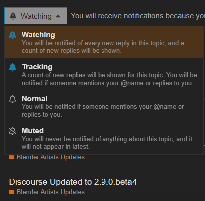
I don’t like the sidebar because now that menu has nothing in it I use and requires a click to open and another click to close. Before, it had Latest and I used a greasemonkey script to add Tracked and re-arrange the menu. I don’t know what “Tracked” is but it’s definitely not the posts I’m tracking.
edit: Tracked seems to be the landmine posts I run into now and then that I hate: Once I enter them it automatically tracks them, even though I have automatic tracking set to never.
edit: Oh, if you track a tag then only these posts show up there, not the posts you’re actually tracking from this link. Also, tracking a tag is what causes the behavior of automatic tracking if you enter the thread, even if you have automatic tracking off.
One thing that didn’t really bothered me before is (as also on other sites): the (html) pages doesn’t use the full width of the screen… now with this menu which i think is a nice idea (and optional for everone who doesn’t want it…) i’m going to inspect some more into greasemonkey i guess… (or is there an option to switch this menu to the right side ?? Ever thought that it is a bit weird to move the mouse across the whole page while most of the time my mouse pointer is on the right half of the screen… ??)
I don’t get this… The priorities feel upside down… On the one hand, we get a sidebar which doesn’t introduce any new functionality, as it just duplicates buttons found on the landing page. On the other hand, we still can’t get geometry nodes category everyone is asking for, because it doesn’t align with the “philosophy of categorization”.
There were so many times already, when I wanted to ask a geometry nodes question, but realizing I don’t know where to post it, I just gave up and went to discord instead.
They’re two different things though - one is provided by Discourse, the other by us. @Fweeb are we still on that position? Given that Geometry Nodes is such a big part of our community now, perhaps it warrants its own category?
I know, I am aware. I was trying to make a point that adding a new forum category is probably even less work and hassle than just updating to a new discourse version and getting new feature.
At the same time, I strongly believe that the added GN category would be much more value to the visitors of this site than this sidebar will ever be.