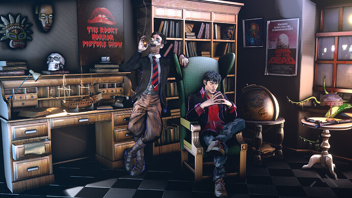
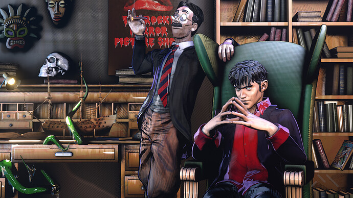
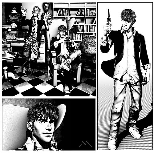
Personal tribute to the italian comic “Dylan Dog”.
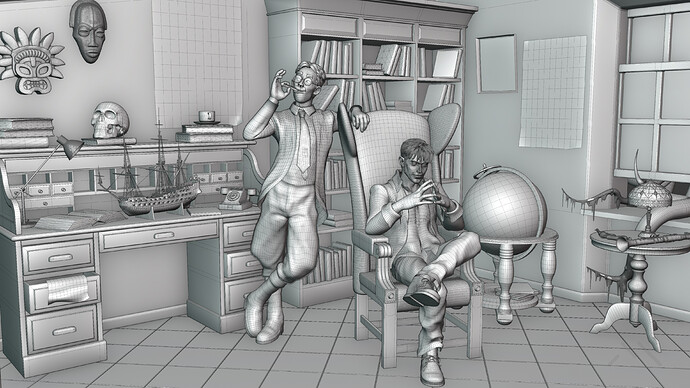
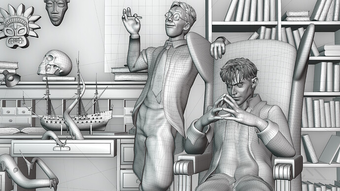
Created with Blender, rendered with Eevee
Nice.
B&W look better for me, not only because I read Dylan in black and white… more that color versions have some strong reflections - specular hot spots… all look somehow plastic. Maybe to try different approach, there is many ways for stylized color. Again this is just my 1.5 cent.
PS. and of course more dark, grim mood, less light ,more volumetric 

Great work, congrats.
Thanks for you feedback. I also prefer black and white and I had a lot of fun recreating it.
As for the colors you are right, but I wanted to recreate the 90s cover effect typical of Dylan Dog. I agree with all your observations except for the volumetric. They attenuate the comic effect and I preferred to minimize them.
Heh, Bonelli mostly use simple flat color because print limitations ( read this as cheap ), and time constrains… From time to time some editions like Ken Parker has more elaborate prints.
Anyway, I guess that authors will go with fog, mist and much more delicate light - mood. But time constrains and cut of all kind of ‘unnecessary’ costs force them to do bare minimum. This approach have his beauty, but in this case you can afford some ‘artistic’ freedom. Just imagine cover for some exclusive ‘limited edition’ where publisher don’t economize with costs.
Y’know in 3D you don’t must to start from scratch, like in 2D  so it’s relatively easy to make many iterations. Talk someone who biggest part of his life deal with gouache, ink, Ecoline, pastels.
I featured you on BlenderNation, have a great weekend!
Of course you’re right. I am in a phase where I am experimenting a lot in NPR to perfect it. One step at a time I try to create my own style 
Thank you Bart 
 thank you
cool work! I’ve read too many Dylan Dogs at my aunt’s place when I shouldn’t have because I was a little kid  But I loved them
Good old memories! Nice work. I can just try to imagine the fun you had doing this piece…
btw, did DD read NN? Really??
Thank you 
DyD is my first love in the comic’s world 
Thank you… it was really fun. I always have so much fun making my personal projects 
Dylan Dog reads Nathan Never of course, but also Dylan Dog 


And I’m sure that Nathan reads DyD
Wow, Dylan Dog! I read the comics in original Italian during our trips to Italy in the 80s and they was my favorite comics.
Interesting is the octopus coming through the window in the first image and in the second image attacking the model ship. I agree too, the black and white looks better.
Bravo Mauro! Una bellissima arte!
Thank you so much 

 I love the B/W version
The poses and faces are expressive. I too prefer the black and white versions here, though I’m sure that very little work would be required to improve those coloured images. Toning down the specular highlights isn’t always easy but I think that would help the coloured shots. All in all it’s great work though, nitpicking aside.
I really like BRAVO. I too prefer the black and white versions here. A little bit of constructive criticism, I’ve read books on ink drawing, there are basic rules, what’s important is black, what’s less important is gray. The closer it is to black, the farther away it is more gray. In that sense, the tiles on the floor should be gray. The shoe in the foreground should be smaller than the head and gray because it is less important than the head.
I use GMIC filters in KRITA program to manipulate color images from blender to comics image. GMIC LINK
https://gmic.eu/gallery/artistic.html#menu
Thank you very much. I think I must work better with my colored npr shader… Thank you for your feedback, I will treasure it 
Thank you so much. Thank you for your feedback but I have to make some clarifications. there are no grays in the black and white image. In the original comic grays are not usually used and so I tried to do the same. What you see gray is actually a crosshatch that has been flattened by compression in the upload. As for some details such as the black tiles I made full reference to the original comic, where they are made like this.
BTW I really appreciate some constructive criticism like yours. I’ll treasure it ![]()
