I’ve always wondered if our homepage should be more graphics oriented instead of having rows of text, and how this might affect the acivity and engagement of our community.
With the new sidebar giving an easy access to our other categories, I think it may be time to try this.
After some initial testing, I’m now enabling this as the default view for the weekend while collecting your feedback - please use this for a few days and leave your / in the poll below. Comments/feedback are also welcome, but please do use the poll as that’ll give everyone a much easier sense of the sentiment around this idea.
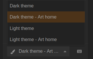
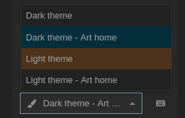
If you want to go back to the original text-based theme, then you can so so by selecting the appropriate theme from the bottom of the sidebar:
The homepage is listing the latest in Artwork - there’s no popularity filter in place. I considered using the ‘daily most popular’ instead, but this feels more democratic and organic to me. I’d love to get your feedback on that.
Testing DEV … – Arghh im blind now… (should have switched to light first… ) no… i’m not…
But i was a little fast… the new menu shows the new and unread threads… i meant more somthing like to have the avatar menu static on the right… okay that’s more an discourse thing… no stress…
I like this a lot. If there was a dark version, I’d switch over immediately and permanently. I like the idea of showing recent artwork- I agree that featured art is already prominent and I think the duplication would be confusing. This should also help artwork get more visibility - hopefully helping with the problem of unanswered, unliked, ignored posts in #artwork:finished-projects
And now something totally offtopic just because i’m happy now :
While experimenting with userstyles i discovered : using the main page in a sidebar to use as an global menu… (via right click open in new tab because otherwise it would be opened in the sidebar ) is perfect for me… (scrolling this down would also show me the latest posts…)