Thanks Mackraken! No these are just Blender renders. Not got into using Yafaray or Lux render yet.
Thanks Mackraken! These are Blender renders, not really used Yafaray or Luxrender yet. So for the double reply, my other reply didn’t show at first.
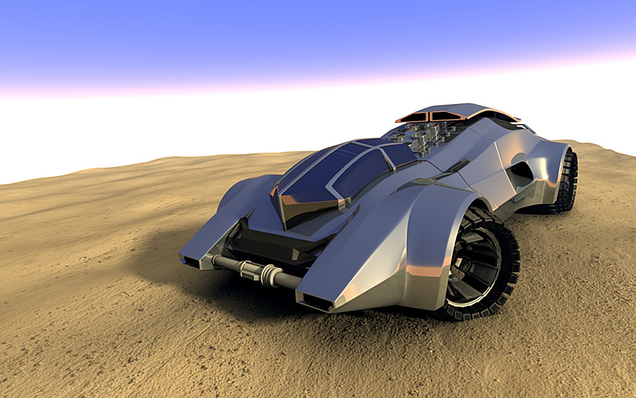
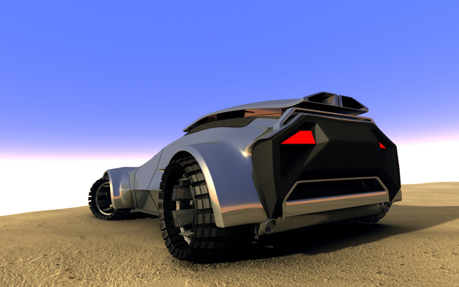
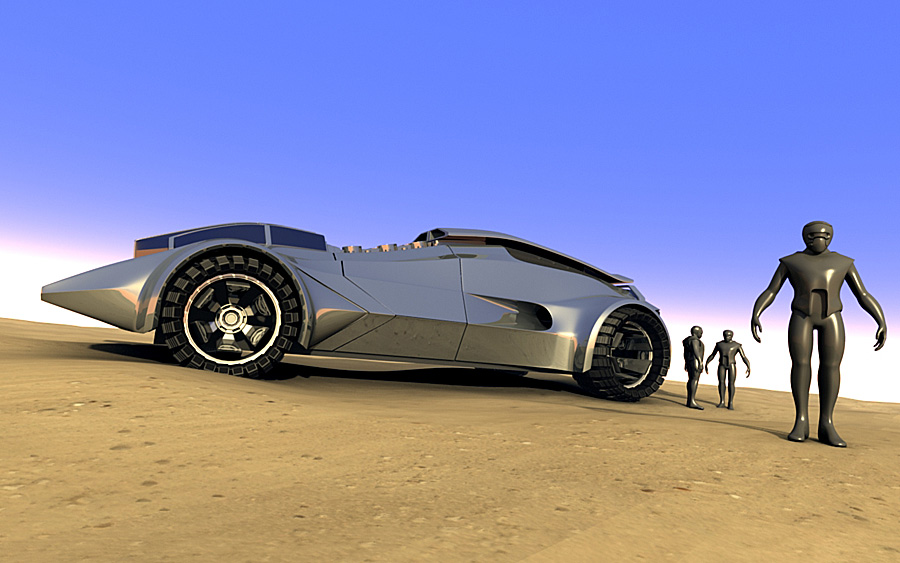
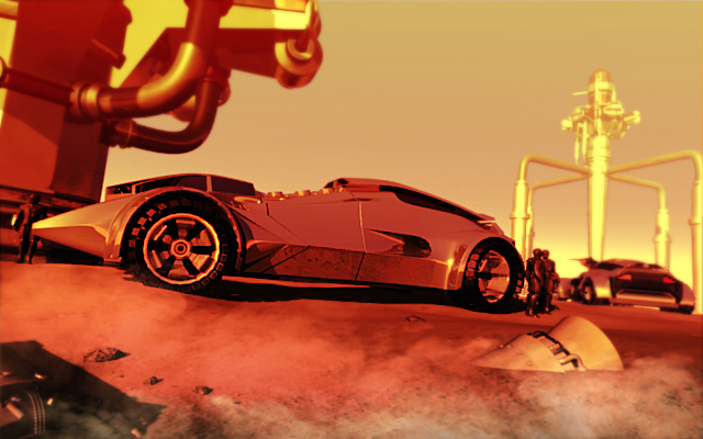
Hi, bit of an update, mainly in terms of the lighting, environment and rendering. I’m just starting to think about the composition for the final image now and once rendered will do a pass in photoshop adding dirt, textures etc.
I decided to change the ground/environment as the other terrain was really buging me, I think this simpler approach puts more emphasis on the vehicle.
Rendered using blender render, characters are currently modified versions of Jonathon Williamson’s free base mesh over on blender cookie.
Thanks for looking.
Chris.
Attachments
Absolutely gorgeous car. I like the new ground, but the scene seems too plain, what if you added some hills or something, and extreme version i guess would be the grand canyon…hmm just throwing ideas out there.
Thanks for the feedback DDD. Yeah I’m defo going to add some more detail to the scene, I have some hills on another layer but turned them off for these test renders. A grand canyon style scene would be cool!
For the competition illustration though I need the vehicle to be the main focus so I’ll need to think carefully about the overall scene.
How did the car get onto this sand?
There seems to be no car tracks…
wow, masive car!
Thanks for you concern FreeMind, but these are just test renders at the moment and not final.
pretty sweet, can’t wait to see the final product, has gone beyond ‘match box car’.
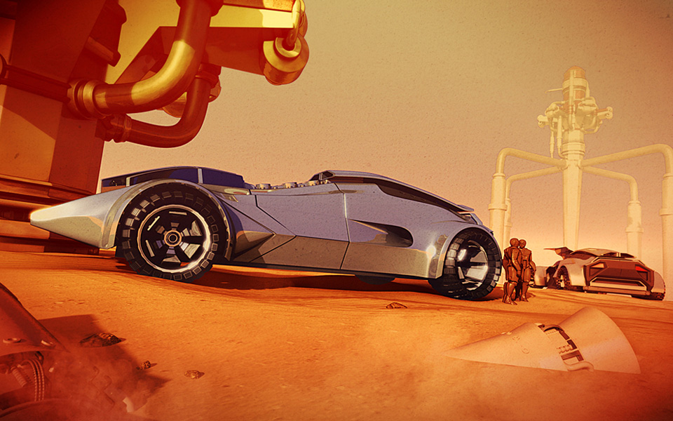
Cheers for the comments guys. Here’s another quick update, added some debris to the foreground and changed the characters (sorry for low res render at the mo). The proportions of the image are specified for the competition so I’m trying to make the best use of them for my final composition. Still trying to keep the emphasis on the vehicles but build up bit of a narrative in the image.
Attachments
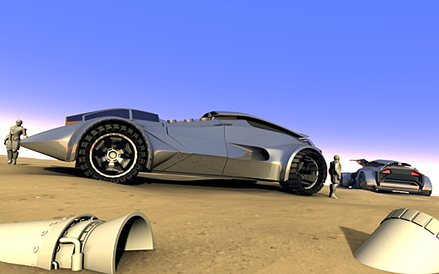
Hehe, i like the debris…
I might have missed you say it, but what competition are you in?
Here’s another update. Sorry for the low res image but render times are building up the more complex the scene gets. And there’s no ambient occlusion in this render.
Just adding more elements, getting pretty close to rendering everything full size now ready for a final pass in photoshop.
Attachments
WOA the redness argh my eyes, lol. Mars? understandable, but something is wrong with the red. bright? too much hue? i dont know really, but some thing is wrong. makes me not want to look at the image. I do like that you have background buildings, but i think that huge one on the left takes the attention from the car. but i like the size though, so it is kind of a paradox there. Anyway that is my opinion.
And wow cool competition u r in!
@DDD - Heh heh! I know what you mean about the red, although I must have my monitors set darker than yours as I don’t find it too off putting. Still a work in progress though, I will probably knock the buildings back quite a bit in the final render and turn the opacity down etc. I think you are right about it being too red at the moment though, I’m going to try seperating the main vehicle from the red a bit to make it stand out more.
Thanks for the feedback DDD.
Bit of an update, I think I’m more or less done with the 3d side of the artwork now and will do a final photoshop pass. Here I’ve started layering up different renders and working on making the main vehicle stand out from the image more.
Attachments
Hmm, try this.
Move the one in the background a bit closer in. then move both closer a bit.
Because you removed the red from the car, the buildings now look too red, especially the one on the left, and put a little on the car. the one in the back has good color
The model is nice, but i think that you should think about a different angle/scene for the presentation.
At the moment we only see the side of the car, and a back shot in the background. Somehow the whole scene seems unbalanced and its not a problem of the camera-tilt.
I’d completely scrap the other car lurking in the back and the two guys, they shift the weight of the composition too much.
Secondly id probably move the camera into a more dynamic angle, front left, something like that.
im thinking like this:

not exactly like that of course, but a sort of dynamic that is shown here.
If you look at the winning Blender F1 Challenge entries they usually present a dynamic composition while showcasing the whole model.
In contrast to DDD i think the colors are fine though.
Hey guys, thanks for the comments, I’ll take them all on board.
@DDD - I think I’ll slightly tint the main vehicle a bit more but I kind of like the overall colours/atmosphere.
@Adam TM - I defo see what you mean about the angle and was planning on doing a couple more shots, was thinking of doing one where it’s in motion, possibly jumping off a sand dune or something. Think I will finish this one off first though.
Sand Dune jump would be fantastic