It’s beautiful modeling and texturing. All the pieces for a beautiful artwork are right there at the tips of your fingers. 
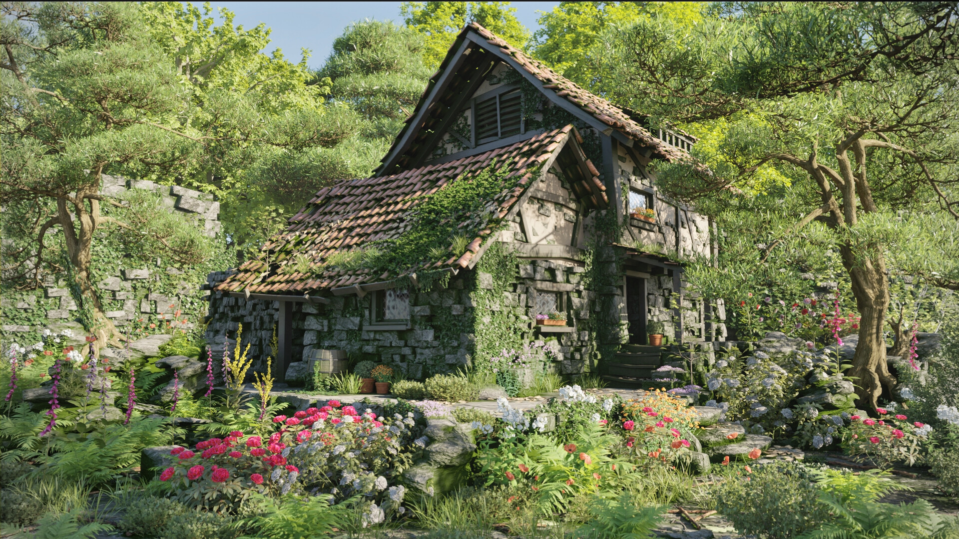
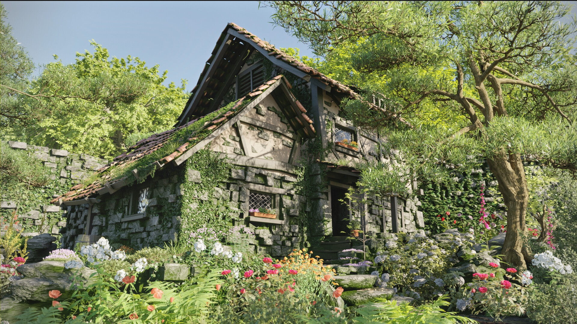
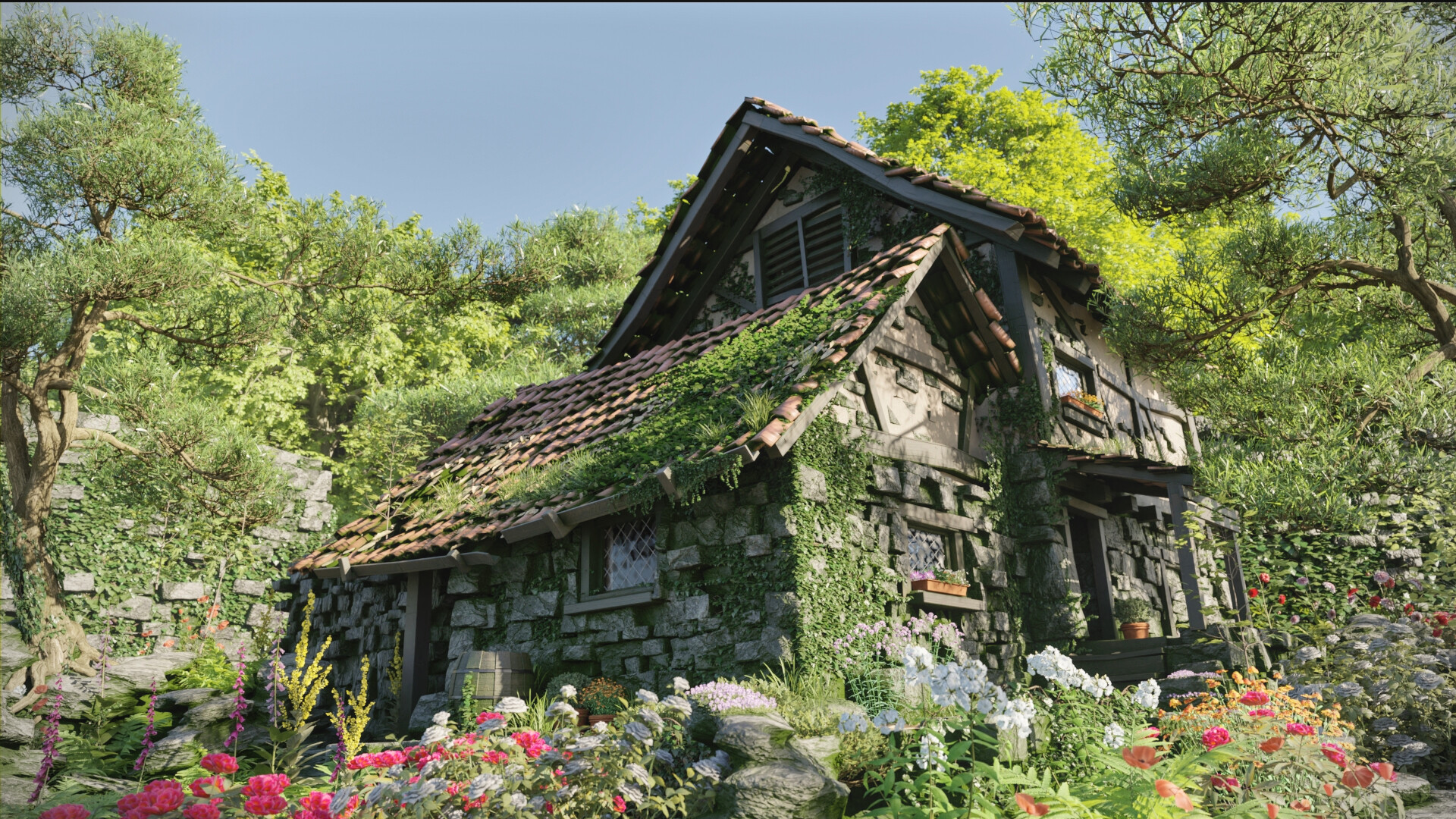
The first three images look great.
!warning! @Peter_Cerny If you are not looking for constructive critique, then stop reading now.
I do agree with @Davide_Miozzi that the lighting is mundane, and the addition of (dramatic) contrast-rich variation to establish more depth and visual hierarchy would take it to the next level. Not only lighting, but also variation in use of colour throughout the piece.
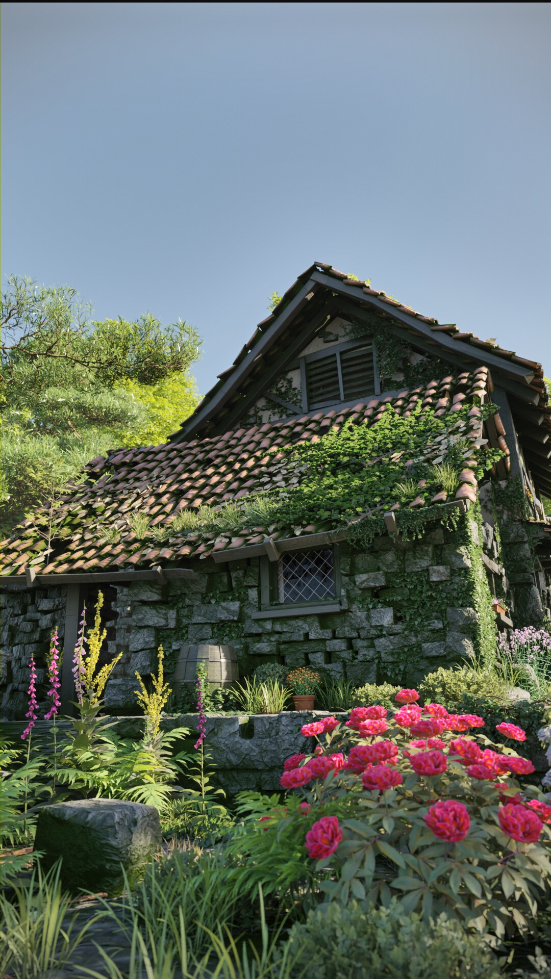
Secondary to this “flatness” is the underlying (lack) of a sense of composition. The gardener’s cottage is dropped in the center and in the first image the trees on either side reinforce the symmetry too much, resulting in a boring composition.
Greenery surrounds the cottage on all sides, with nothing breaking through that monotony, and all the detail, rather than strengthening the piece, is lost in the monotonous noise. There are almost no resting points for the eyes to focus on and without clear focal points and a visual hierarchy assigned to the various focal points the viewer is hard-pressed to discover a visual order.
“Horror Vacui” - the fear for empty spaces can lead to overly busy layouts. It is not so much “real” empty space that is lacking, but rather visual resting points that help tie the composition of an artwork together. Contrast-rich variation in lighting and colour assist. Without, a piece can seem flat and compressed --lack of depth-- even if the parts of that piece are wonderfully executed and prepared “an-sich”. Which I feel is the case with your work here.
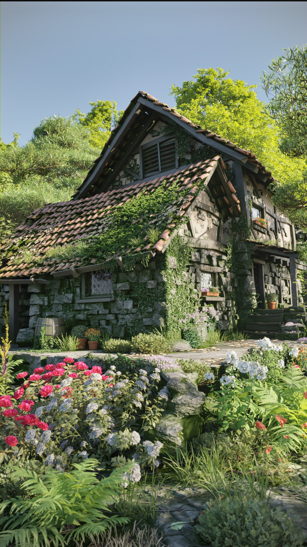
The second version improves on the first version with the sky breaking some of all that monotony, and the single tree on the right helps to establish a more pleasing composition. The sky is lacking texture though (clouds for example) and that space doesn’t flow or help in bringing more harmony to the overall comp. We call that “dead space”: it doesn’t contribute in any meaningful way.
The angle of the path towards the door works better here as well, but again the greenery and lack of lighting/colours/contrast fail to assist in establishing and reinforce that visual depth of the path leading up to the cottage. The diagonals that would help bring dimensionality and dynamic lines/shapes to the composition fizzle out due to lack of visual contrast.
In that second version the shapes of the dwelling work against the composition compared to the first version, though. The first version has more contrast and interesting shapes (the lower roof yields an interesting dynamic shape) which the second version lacks, and the shapes do not help the viewer to understand the comp much, resulting in an entangled mix of shapes that have much detail, but the larger shapes do not convey the overall visual intent of the cottage.
And since those shapes take up the majority of space (which works much better in version 1) the overall composition feels overly domineered by that mess of unclear lines and shapes.
The lighting again doesn’t assist to clarify the intent of the composition.
Similar composition and lighting issues exist in the third one. You hit some good things, and weaken the composition in other areas.
All this said, the compositions are not terrible! They look quite attractive. Yet they do lack that depth and compositional control that would elevate your work to the next level and beyond. To really effectively showcase your individual elements a clear compelling compositional strategy is absolute key.
(And don’t forget to check the focal length of your camera: Blender’s default of 50mm is sort-of similar to that of the human eye. But it is probably better to avoid that focal length to create a more interesting image. A shorter focal length can be effective for a more dramatic looking shot - and be helpful with the portrait “shots”.)
In short: the ingredients in these compositions are all beautifully crafted by you. It merely requires a bit more understanding of light, contrast, and visual composition on your part to extract the full potential from those wonderful pieces to create stunning eye-catching art instead of “great” looking art that people enjoy looking at the first time they see it but otherwise forget about and never return to.
Check out the old masters in landscape and architecture painting. For a better understanding of the impact of color and light: the book carrying the same title by Gurney is a brilliant reference.
My two cents.
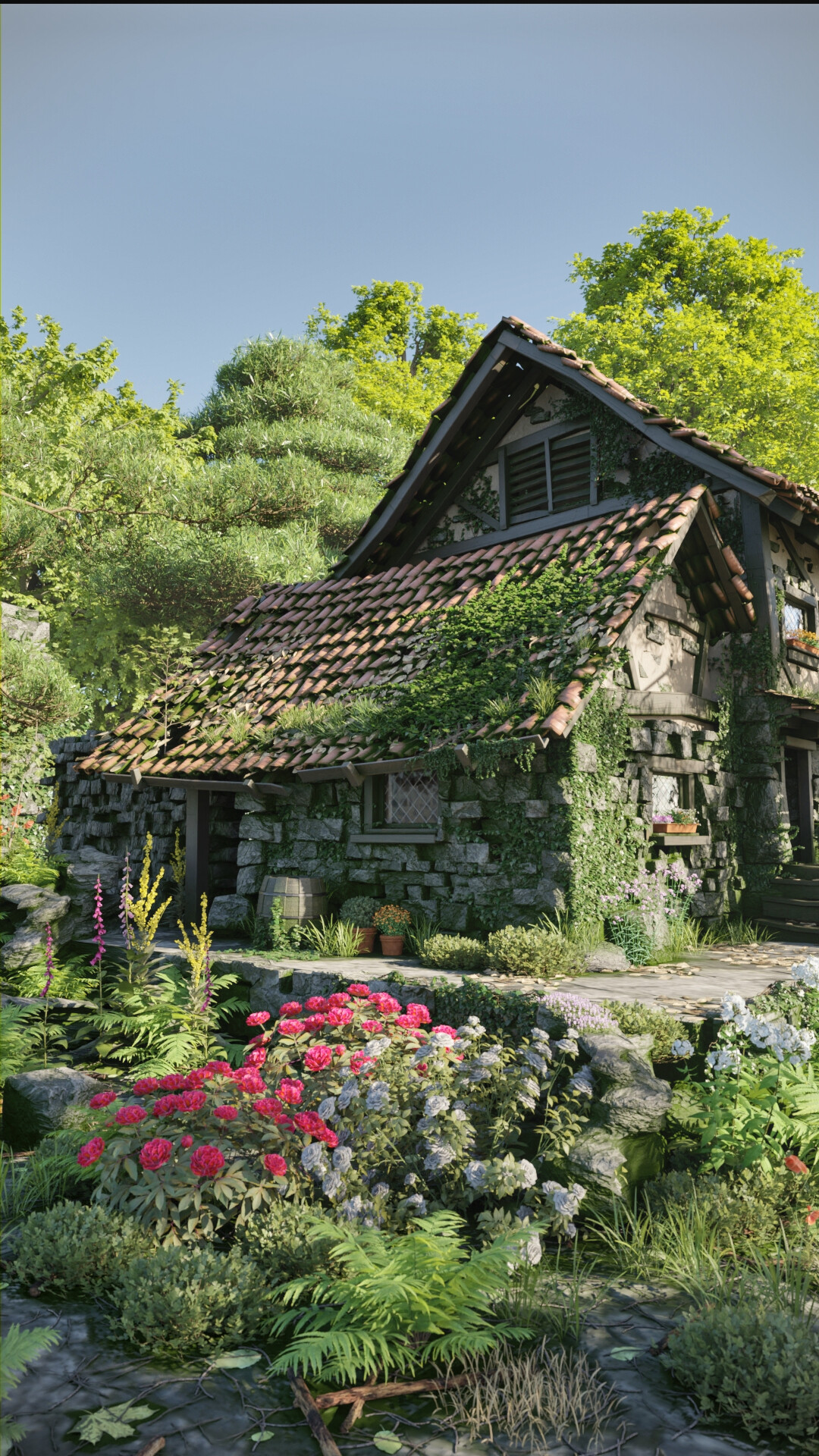
(The portrait ones are not nearly as successful compared to the landscape versions in my opinion. It is more challenging to create portrait compositions – in particular with this topic. The crops are awkward. A detail shot of the path and doorway may work better here, for example,)