Hey all,
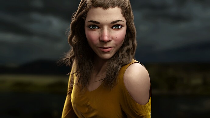
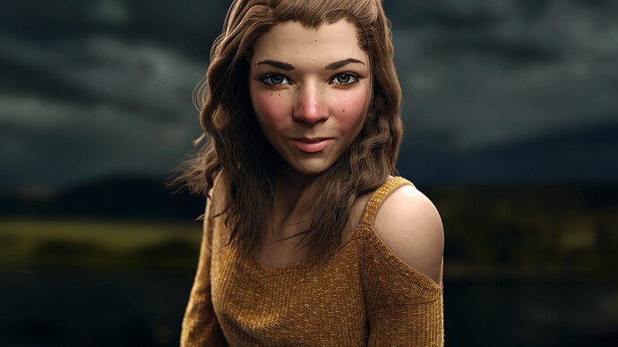
Obviously I’m quite a ways into this project, but I thought I’d post it here since I probably still have a long ways to go before I call it finished. Hopefully this will keep me motivated to keep working on it. I’d love any input you might have – first impressions, detailed critiques, whatever comes to mind.
My first impression was that she was part lion or feline.
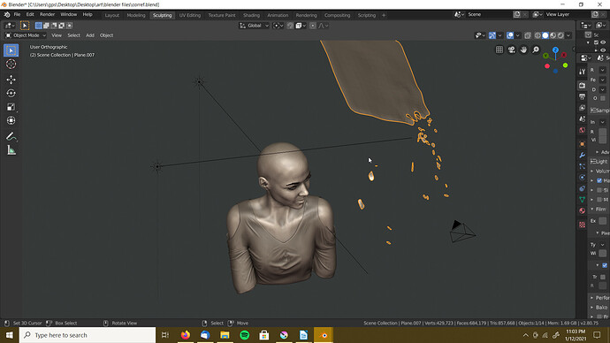
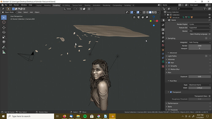
What is your lighting setup, how many lights? (I’m also curious about the camera angle - maybe you could give us a screenshot with Solid Mode Viewport Shading and not in camera view).
Thanks for your input! I can see what you mean about the feline features, especially in the eyes. This is based off a real person down to the specific locations of most of the freckles, so that wasn’t and artistic decision on my part. But still, good to note.
I have three lights right now. I’ve got a sun lamp for the light blue sheen in her right cheek and shoulder, and another sun directly opposite the camera adding some glow to the hair from behind. And then I have a mesh lamp up above her head.
Here are some screenshots (the viewport renders weren’t turning out great)
The falling-apart plane thing that’s selected in the first image is the key light. It’s shaped like that to create a more interesting reflection in the eyes.
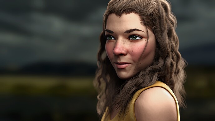
That’s a cool looking light. More interesting than just a plane. The ortho views really help to see the geometry. Image 38A is really giving the “mane” effect (e.g. https://pixels.com/featured/the-lions-mane-attraction-tish-wynne.html) partly because of the camera angle but also just the way her hair is (which is cool). Obviously if you tilt down you can get more of the body. How long are your renders? Can you pop out a render somewhat like the viewport angle in the last one / maybe even turning up the camera’s focal length like 10-15mm / and dollying back like a foot?
The renders are 5-13 hours, but I can obviously do lower resolution as well. I actually tried a different angle just last night before seeing your comment.
I’m far from happy with the roots to the hair. I’m thinking of a way to try to fix that still.
It’s the eyes that are letting it down. Do some hard research on eyes and try to get the subtleties. The whites are to strong, looks like black eye liner all the way around her eyes. The eyes are always the focal point. You get that right and she will look awesome.
Nice work 
Sweetie, always make “your sweetie” look beautiful. Right now, she has acne.
Looks a bit like Thomas Anders… I love it
Thanks for the advice. I tried darker whites and that’s definitely an improvement. It still needs some work on the eyelashes for sure, though.
Those were meant to be freckles. I do want to keep them, but maybe they would look better a little lighter… is there anything specific that you think is making it look like acne?
I’ve fixed the edges of the shirt since this render… they look a little weird here. I would still appreciate any input on the general look of the shirt, though. And anything else about the image, of course.
Hello GPS14,
I saw this portrait for the first time today. It radiates a very special atmosphere. It’s very intense.
Still some remarks: I find the hard lines from the corners of the mouth to the chin rather strange. I don’t know anyone who has that that strong.
And in this latest version, a nice but slightly unnatural drop shadow falls on the skin of her shoulder, next to the strap and also above her sleeve.
But above all a very special portrait! Well done!
Thank you! That’s really encouraging to hear.
I think I fixed the edge of the shirt now. It wasn’t actually a drop-shadow, it was the light gray fuzz material that I had over the knit material that was malfunctioning at the edges. Anyway, let me know if you think this fixed it or if you were referring to something else.
And I checked the reference photos, and you’re right about the creases from mouth to chin being too distinct. I softened them a little for this render, but not enough, so I’ll do that before the next render.
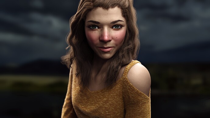
And here’s the updated render, with a better cloth material and fuzzier hair (although the fuzzier hair was an accident so I’ll be changing that back)
Yes, you have indeed completely solved the problem with the shoulder. Nice!
Are you aiming at photo-realism or lightly stylized (Alita type) ? If not the later, I would say the eyes look too big ; and in general the whole part over the mouth a little too wide compared to the part around the lips. Maybe make the eyebrows and hairs thinner and better combed. Otherwise the skin coloring and shader and the face expression all look convincing.
Give her makeup. She looks like a real girl, all right, but every picture of a woman should flatter her.
“Yeah, call me old fashioned,” but it always works.
@Yuki_Taiyo I’d say probably lightly stylized. My goal is more making it look a way that I’m happy with than to make it indistinguishable from a photo. Thank you for drawing my attention to those things, though. I’m looking carefully at the reference photos to see whether that was a mistake.
And yes, the eyebrows do need work… I’m trying to decide whether or not to just be lazy and paint over them afterwards or whether to go through the work of doing them right.
@sundialsvc4 Thanks for the input. I don’t want a super made-up look for this portrait, but I will likely overlay some subtle colors in post-processing. The final version of this will be lightly painted over. Also the lips were looking very matte, so I added a little more glossiness to them.
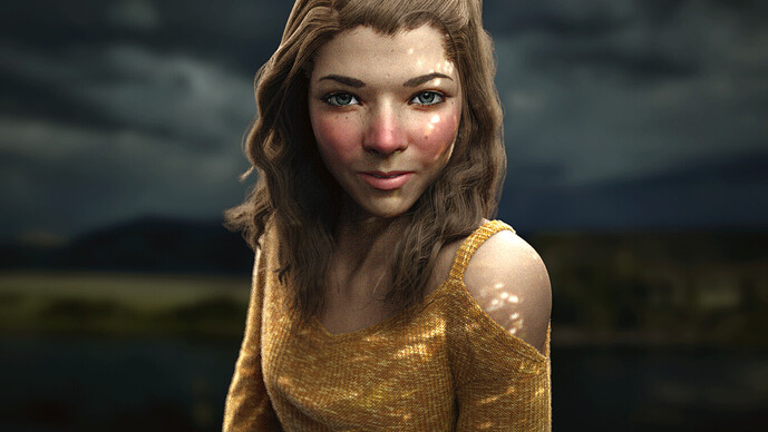
Here’s my updated render. Let me know what you guys think of the new lighting.
I find if I’m ever getting frustrated its better to quickly finish up a project and move onto the next. A lot of lessons get carried forward that allow you to make better decisions during the early stages leading to a better end result.
The new lighting doesn’t make much sense. It looks like hard sunlight coming through a tree but the background image implies a stormy day. These should be unified.
The model looks good, but I think the eyes might be too large and possibly too far apart. Try to line up the pupils with the edge of the mouth.
I think the skin looked better as a more even tone. Now it looks grainy. Is there Ambient Occlusion on the face too? If so I’d tone it down. I just feel like she looks a little grimy. Maybe it’s just me and my monitor.
I do like this! But theres something red going across her face, on the cheeks and on her nose, don’t know what thats supoosed to be and I feel that it’s ruining the picture quite alot. Try to remove that and it’ll look way better 
And I’d maybe try to add some random reflections in her eyes to make them more “alive”. Throw in an hdri in the eye shader somehow maybe?
And someone suggested more makeup, but I’d say don’t! There’s already to many pictures of women in to much makeup. Natural always looks better imo 

