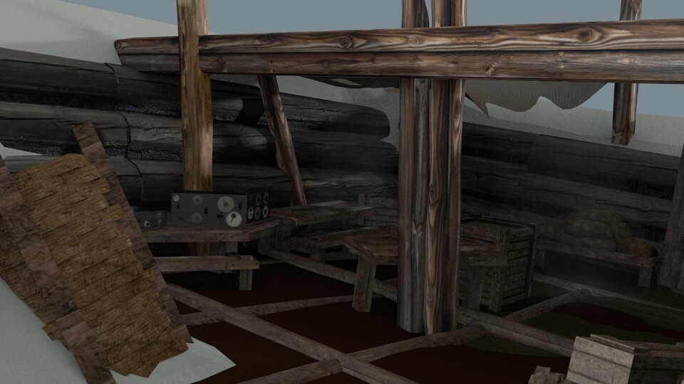
Hi guys, been struggling with this for a couple weeks, trying to make the scene look optimal. I can hardly tell the difference between objects, any suggestions as to what to do?

Not sure what this “optimal” is but for the looks of it, objects don’t cast any shadows on the floor nor on each other and the existing shadows are crap. Too obvious?
Edit: quick doodle with a soft brush in gimp, using a mouse

also you have massive textures on your wooden objects. that is drowning out your scene too
What they said…![]() But I think the main problem is that it looks like it’s a gray rainy day, with gray wood and no sunlight. So more dynamic light, and some more color in your woods.
But I think the main problem is that it looks like it’s a gray rainy day, with gray wood and no sunlight. So more dynamic light, and some more color in your woods.

Is that a green specular you drew on there? XD
and as I forgot to say, lighting is not included. I’ll make some lighting and get back to this.
I’m completely lost -_-
unless I just need more sleep. What exactly should I change to fix this? I can add more specularity to everything, colorize the wood more, change the lighting somehow
So it’s a snow scene…? Still not sure where are you going with this.
If it’s a snow scene and that is some sort of collapsed base, the ground would have snow, grass and dirt. The ground would not be that visible unless it was a heated area that has just collapsed. In that case it would be dark and wet.
If it has collapsed some time ago, everything would be frozen and less saturated.
Another quick doodle with gimp. (still using mouse and no skills, so the result is crap).
It wasn’t intended to be a snow scene when I started, I just haven’t textured the ground yet. I like your idea though, and maybe I’ll add snow. Your picture is awesome btw. My trouble is, that the wood tends to blend together and I don’t have any idea what to do. For example, see the tables in the lower right third? Hard to tell em apart. What can I do to fix this?
They need some contrast. Either one of the tables need to be darker. More shadow and/or different texture, or other items breaking the color or light.
If the scene is going to have overall diffused lighting, you could perhaps put something above the back corner to have more shadows there (there seems to be some cloth already). That way there would be less light coming from above and more from the foreground, making the foreground brighter.
The light you have in your latest pic seems to cast very clear shadows, which suggest that there is sunlight. If you’re going to keep that, you could direct it so that the horizontal support beam and whatever you might add puts more shadows in the back and puts some variety on the tabletops and whole scene for that matter.
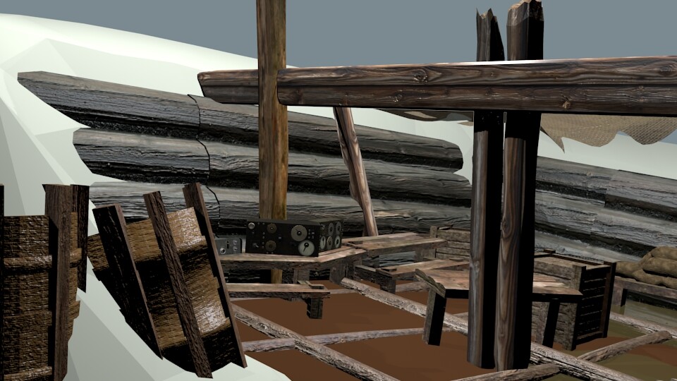
Ok, so the next step is to set up the lighting so that one table is darker - I’ll post a pic when I’m done.
To add more differentiation between objects, you can also utilize a more complex lighting setup along with all of the suggestions so far.
You will have to use a light rig to do this in BI, but it’s much easier in Cycles where you can just set your primary lights and let GI do the rest. If you really need to use BI though, then don’t forget to turn on the AO and add a sunlamp with very soft shadows (because even on a cloudy day there’s some light coming through).
Well, heres my next attempt:

Think I need more tonal range? And needless to say, I need to watch some more lighting tutorials.
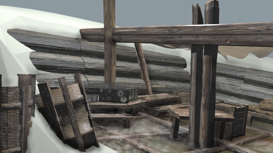
The lights just went out! You might want to look at the spectroscope and histogram features in the imag editor to get an idea of the overall stats of your picture. But yes you need more contrast, and brightness. Just posting a sample file no textures, might help in getting lighting ideas, are you using cycles or BI?
Is that a green specular you drew on there? XD
Lol, I was thinking moss… just to get some color in there! I was going to put in some red and white spotted mushrooms too…
Good wood texture is all in the bump and spec, not in the color. Using a color map for wood makes it look like Formica in my opinion.![]()
Its BI, and sure I’ll check those nodes out- that is if I can find them. Where are they located in the node editor, materials or final render?. As for the sample file, any websites that will take over 30mb for a transfer?
Yeah I looked under the entire “add” panel in the node editor, guess its somewhere else or a denomination of one of those options.
It’s a dark image but most of the information is there. Too much full black (0 value) and full white (1 or 255 depending on scale) pixels in final render can make it impossible to change the final look in post-processing.
If you watch out for those however, adjusting levels in compositor or image editing program is faster than rendering again. Can easily change too dark, washed out, too bright render to its final look.
Of course could use image format such as exr to have all the rendered image information saved for post-processing.
After telling this guy in past threads how easy it is to texture wood I tried it and it is not nearly as easy as I thought. I try to do most of my work without using image textures. I recently downloaded Crazybump though and that really made the process much easier. Its a free 30 day trial that can either be cracked or redownloaded every 30 days. I recommend it to anyone working with wood.
Robert I think your renders are getting better every time. Just keep at it and keep asking questions.
JA- I’ll adjust it when I find the spectroscope or histogram and get a good idea of how much to change it.
Brent - Now you see how hard it is lol. I wanted to get a cracked crazybump but the risk is too much, and all the “trial cracks” require a download that is probably a virus. As for my renders improving, thank you. I have gradually remade the models and textures, because I gave up on my render deadline so I can afford more detail.
Anyone - know where to find this spectroscope or histogram?
UV/image editor scopes panel (T). Could use waveform display to view how the values are distributed on the image