Help with interior lighting - lack of quality

Hi there!

I’m an interior visualizer and I’m having a hard time with natural lighting. I have tried HDRIs, as well as the nishita sky (with slightly better results).

However, I can’t achieve the quality of lighting expected. My interior scene lacks volume, so to speak. I would like to emulate results like this:

Some of the spaces I have to work with have only one window, but that can’t be an excuse, right?

1 Like

Window size isn’t really that important.
In my experience, best way to achieve realistic interior lighting is to use a combination of HDRI and area lights outside the window.
If you need more light, avoid increasing light sources intensity too much (HDRI and area light in this case). Raise the exposure instead.
If you want the background to be visible out of the window, you can always disable area light visibility to camera.
Also, keep in mind that your models and textures need to be of high quality - no light setup will save your render if the models and materials are of bad quality.
Here’s a very useful tutorial by Riley Brown that might help you: https://www.youtube.com/watch?v=dLZEmfqob7k
From this website you can download some free interior scenes and analyze how pros light their renders.
Some more scenes can be found here although you should keep in mind that this aren’t free.
High quality assets for a small price can be found here.
For some nice lighting reference I usually go to this guy’s page.
Hope this helps! :slight_smile:

3 Likes

Are you allowed to post images of the problematic scenes? That would help us a lot to tell what the problem is.

In the meantime, I can offer a few suggestions and possible causes.

  • In the color management settings, what contrast level are you using? Have you tried changing the exposure settings?

  • Are you using light objects inside the room? If yes try removing them and lighting the scene only from the sky and sun. Using too many light sources will flatten a scene, shadows are just as important as light. I have to warn you though, Cycles isn’t fast for interior scenes lit from windows, so you will need to use portals in windows (and if there is direct sunlight entering the room, you will need lots of samples).

  • Are you using the shadow trick for your windows’ glass material? If no, you should give the glass this shader:


    This will remove shadows from the glass material (Cycles struggles with glass shadows) and allow the sky light to properly enter the room. The transparent shader can be darkened if you want a little bit of shadow.

3 Likes

Excellent advice in my opinion.

1 Like

Hi there!
Thanks for the thourough answer. Unfortunately I can’t post images, they are from the place where I work.

1 - I normally use medium/high contrast, and control the brightness of each camera with the addon Photographer.

2 - I’m using one or two light objects inside the scene, but no more. I usually avoid them, because the “fight” with the exterior light, and everything becomes flat, like you said;

3 - My material for the glass consists of a principled BSDF with metallic all the way to the top, and alpha down, because I use this nodes for World:

This allows me to use the Nishita Sky as the only source light, use a HDRI as the backplate and avoid the the white reflections of the Nishita Sky on shiny objects.

P.S.: P.S.: I tend to increase the amount of brightness of the Nishita sky in order to light the scene, but then the curtains become blown out. Is there any color mapping like Reinhard in Max, where one could control the highlights?

1 Like

Thanks for your answer and all the links!

In what position should I set up my area lights? Turned straight forward to the window or at an angle?

Imagine I want the light of an HDRI but the backplate of another one. I use the method pointed in another answer - is it the best way to do it?

P.S.: In the Chocofur site I’m not able to find free interior scenes, unfortunately…

1 Like

Straight forward is usually fine.
Yes, you can use whatever plate suits your scene the best.
Here are the direct links to the chocofur scenes:
Scene 1: https://store.chocofur.com/chocofur-free-scene-01/blender_model/
Scene 2: https://store.chocofur.com/chocofur-free-scene-02/blender_model/

Some more ideas:

  • How are the “clamping” and “filter glossy” settings? These settings help reduce noise, but they are a compromise on realism. You will want to have your “clamp direct light” at 0, so it’s deactivated. The “clamp indirect light” should have the highest number that looks good (ideally deativated too, if it works in your scene). The filter glossy should be as low as possible, though it can rarely be set to 0 in Cycles, because this would generate sharp caustics, which Cycles is terrible at resolving.

  • If you can, activate both types of caustics. Those have their realism affected by “filter glossy”, which blurs them to reduce noise.

  • In the “film” section of the render settings, have you tried different filter widths? It affects how crisp your image looks. By default, it’s set to 1.5, which is a tiny bit blurry.

  • How many light bounces are there? This could help spread the light in the room without blowing the curtains. If you want to remap the color of the render, that is done in the compositor and will be applied to the image only after the render completes.

  • Are the scenes well modeled, with realistic proportions and textures? No lighting could save a badly made scene.

  • Do the materials have realistic bump and roughness textures? Are there a variety of surfaces with different roughness levels? Do you have a good understanding and experience of what the different material settings do?

  • What are the materials like? Are they all using principled shaders? In Cycles, the principled bsdf is not 100% realistic, it makes some slight sacrifices for greater artistic control. If you seek something fully realistic that doesn’t make any compromise, you would need to use an other renderer. In the free renderers, Luxcore matches that description well. It’s generally slower than Cycles, but has more realistic lighting and materials. Also, It can work easily with hard lighting scenarios and can resolve noise very well in interior scenes thanks to its photon cache feature. Of course, there is a bit of a learning curve when it comes to a new renderer.

I find it a bit weird that you use Metallic for the glass shader. Generally, metallic should be used only for metal materials.
I recommends trying this glass shader instead.

By the way, can you at least share some older images that you did (or at least provide a link to a page or something)? That would be quite helpful.

Thanks again for your help.
What size should the area lights be? Window size? Bigger, or smaller?
Thanks you again for the links; I think, however, that those scenes are not very good examples, I’m afraid…

1 Like

They should be window size, that should be enough.

  • My clamping settings are as follow: Direct light 0.00; Indirect Light 10.00. The filter glossy I leave it at 1.00.

  • The caustics only affect transparent and translucid objects, right? But I can see when it can increase realism, like when having a glass on a table.

  • No, I haven’t tried different filter widths, thanks for the tip!

  • I have found that the Blender defaults to be good values (diffuse 4, glossy 4, transmission 12…) Do you think increasing diffuse bounces would noticeably improve the dynamic range of my scene? I try to use light as neutral as possible (5500, 6000 kelvin), so I don’t normally remap the color of the render.

  • Yes. I and my team use high poly models and model ours own furniture.

  • I try to be the best I can be when texturing, but I know I can always improve with better node structures.

  • Yes, we use principled shaders. I was under the impression that with Cycles it was possible to achieve full realism, like with V-ray and Corona, but it seems is not true. Unfortunately I can’t change to Luxcore, because sometimes my colleague needs to access some of my files (and vice-versa), and he only knows Cycles.

From all of your answers, it sounds like you know what you are doing, at least on the technical side. I can offer only a bit more advice without seeing the images, but it sounds like they should be really close to realism based on your descriptions.

I can think of something still: camera effects. Are you using depth of field in your renders? Just a very small, subtle amount can make an image more realistic. Also, Blender’s compositor has options for lens distortion and glare (aka bloom). This sounds silly, but adding very subtle amounts of such effects can make your photo seem like it was taken from a real camera and make it much harder to identify as cgi. I would not be surprised if the kind of images you linked used that kind of trick.

The reflective caustics also affect metals, making them cast bright reflections on surrounding objects and creating highlights on their contact point with the ground.

I find the default of 10 for indirect clamping to be a bit aggressive, especially if you are using Nishita sky, which is very bright. Try setting it to 30 or 50 instead, you might be losing some light.

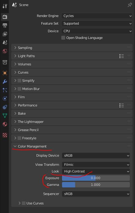
Every 3D render in existence is already color corrected by its very nature. When a renderer outputs its result, by default the image is made of values that can’t be properly displayed on a monitor (if you change the color management from filmic to raw, you will see the real values, and they are unusable). In order for the render to be useful, it needs to be passed through a color space, which will remap the brightness and colors, squeezing them into the value range a normal RGB picture can display. Blender uses its own “filmic” color space, many other renderers work with the more industry standard ACES. Lots of people find that filmic tends to output a somewhat flat result. If the render is already always color corrected, why not tweak the contrast and exposure manually and get something more pleasing?

Also, the same thing applies to real life cameras anyway, color spaces and all.

Cycles can get really close to realism, close enough for your use case (especially with a bit of color correction), but many people who do still renders find that it lacks a tiny something compared with other renderers. Cycles is optimized for speed and flexibility, but sacrifices a tiny bit of physical accuracy for it. The principled shader especially is known for calculating roughness in a way that’s slightly off (as far as I know this is intended to get improved at some point with principled version 2).

Also, the way the “specular” parameter of the principled shader is handled isn’t very realistic. That setting is included for artistic control, but there actually is a correct realistic specular value for each material, based on its IOR:
https://www.blendernation.com/2018/11/05/blender-3d-tip-realistic-specular-value-in-principled-shader/#:~:text=The%20Specular%20value%20of%20Blender’s,%2B%201%20)%20)%20%C2%B2%20%2F%200.08
But really, that can be a bit advanced, if you really want the maximum realism possible.

4 Likes

damn, this makes huge difference, I wasn’t aware of IOR and specular relation, I was working on gold material, now it looks much better, thanks.

1 Like

To me this looks unnatural, but I usually work with several temperatures within a project. I assign color temperature on the lights as specified, and do a simple color correct on the HDR if it’s obvious that it isn’t balanced for 6500K film. So if I have a bunch of fixtures in the 2700K-3600K range, I go for “I want to semi-neutralize this point”, my approach is:

  1. Measuring the color in a test render.
  2. Putting its value in an RGB mix.
  3. Setting its value to 1.
  4. Copy its color to slot 2.
  5. Desaturate slot 2 somewhat (I want to retain some color cast).
  6. Copy the RGB values of slot 2 into color management white point.
  7. Switch to false color.
  8. Adjust the top end of the curve to get the gray close to where it was without CM.
  9. Go back to filmic. For what I do I don’t have any need for anything more complex.
    I will stick with this color balance for all shots, even if some become warmer or cooler, for consistency and feel. Otherwise I’d have to render out and do color correction in post for every shot, something there is never time for.

I have just found a video that explains an other realism problem that Cycles has: apparently, the principled BSDF adds its reflection on top of the diffuse instead of replacing it like it should. This causes low roughness non-metal materials to glow at glancing angles, making them look too flat.

This is probably going to be improved too by principled V2 when it arrives.

2 Likes

Yes, I was struggling with strange glows, that makes sense now, will look into that video. Thanks.

Be advised that if using the fresnel method to darken diffuse, it will not work properly with inverted normals. The video completely forgets to address that. He’s also wrongly obsessed with IOR value. Observe the material you want to recreate and use specular slider artistically. Due to microscopic micropores in the material, specular energy can get “lost” and never bounce back to the eye, leading to loss of specular energy instead of “maintaining energy conservation at all costs”. Also if putting topcoat (principled or manually like in the video) on a dielectric material, always reduce specular of the substrate.

1 Like

Here is an elaborate system that may work if obsessed with energy conservation. Has some trickery that may be used to compensate for reduced light transport if not using caustics. Sheen is missing since it can’t be simulated in any way, and for the rare event specular tint is used you’ll have to set it up yourself by modulating the white that goes into glossy. Only uses default Diffuse, not DisneyDiffuse available in principled. This setup will confirm perfectly in a furnace test for any normal value of IOR and roughness. Translucency (for thin geo) and SSS (for thick geo) uses a darker and more saturated color as color is absorbed more as the ray bounces around in there, so using these will darken the output. A furnace test is a fully white world background rendering a sphere with this material - the object should blend fully in with the background as energy is conserved (reflected light from absorption and specular equals incoming white light, not going darker or brighter anywhere).

The dummy bump node MAY be needed if dropping parts into a node group and exposing normal. If normal is left unconnected, it used to be the case that the connection would produce garbage data. Not sure if they ever fixed that, but the bump node will fix it.

1 Like