I’m of the same opinion. I like the new art landing page, but I feel like I’m missing out on the rest of the board, since I spend 99% of my time here browsing whatever pops up on the landing page.
Like i did here ??
I (/ you can) have two tabs with different settings… one with text and no left-side bar/ normal theme and one with images via Art Home theme…
I like Magnavis’ idea, because it’s a default setup everyone will see, and is a nice combination of the two styles. It’s about as close to a happy medium compromise between the More Art v. More Talk camps as you can get.
Though I’d want to see it work in practice. Alternately, Bart could make the Everything button on the new side panel a little bigger to draw attention to it, and have it take you to the old default landing page.
Never mind, this is a different thread than I thought it was. Stupid sick brain
Yeah I’m thinking that a hybrid approach would be best here. I like the increase in engagement that Joseph already mentioned, and perhaps it’s worth the investment to have someone develop a custom homepage that has the best of both worlds for us… It would have to be pretty darn good though ![]()
I think the biggest problem would be doing a hybrid approach that isn’t so busy that it ends up being confusing.
Maybe the best thing to do would be to make the page semi-tabbed. It defaults to the art landing, but you have two big menu entries placed in the always-on-top bar at the top of the page, one for Art, which could be the default, while the other leads to something more akin to the old landing. It necessitates an extra click to get to the latest posts, which I know is greatly frowned upon in the UX scene, but it’s probably the cleanest, simplest, and most direct solution.
If anyone suggesting alternate homepages has Photoshop or alternatives, whipping up a quick mock-up of what you’re thinking might be a easy way to visualize what you’re thinking ![]()
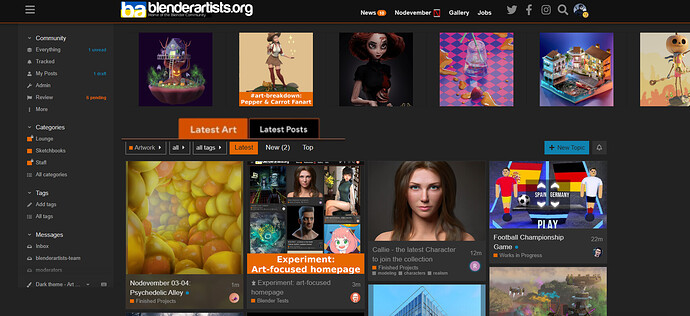
I made a rough mockup of what I was thinking the other day.
I didn’t see that, that does look good ![]() possibly a bit busy, like Renzatic was saying, there’s definitely a delicate balance between information and readability at play here
possibly a bit busy, like Renzatic was saying, there’s definitely a delicate balance between information and readability at play here
Something like this, maybe? The active is obviously orange, the inactive black. If you click off onto another page, both tabs go black (or disappear entirely, since you only really need to see them on the home pages).
This seems like a nice solution to the clutter problem, I can foresee some issues with responsiveness across tablet/mobile, but conceptually it’s nice ![]()
Yeah, but those mobile people are totally lame anyway.
I like the idea to add two buttons to switch between “Latest Art” and “Latest Posts”.
But I think that they could be slightly placed on the right, replacing “Gallery” and “Jobs”.
- Gallery is redundant because members can already click on “Artwork” on the left sidebar.
- Jobs: not sure all members are interested (I guess there are more hobbyists than indie professionals who browse the forum).
I tend to think that “Gallery” and “Jobs” (at the top) could be replaced by “Latest Art” and “Latest Posts”.
Getting rid of the Gallery button would make sense, since it’s redundant with the Art Home page being the default. I’d keep the Jobs button around, even with it being available on the overview bar, since it’s apparently important, and having multiple points of contact might help draw more attention to it.
This is another interesting idea- I personally like the gallery, as it’s a collection of all featured images over time, but I agree about “Jobs”, I don’t think it’s that relevant to most users.
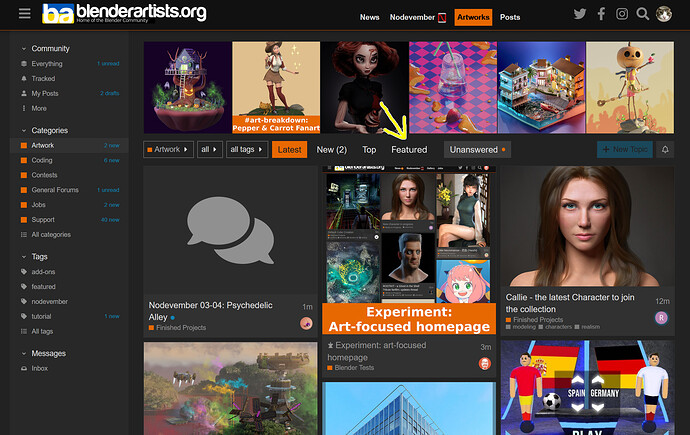
Personally, I wonder if the tabs would make more sense down here:
I like that idea a lot and it seems more achievable than a complete homepage makeover on the short term too ![]()
The Jobs tab is more strategic: I feel that with the Blender community rapidly becoming more professional, it’s important to facilitate companies who need people, and to show there’s a ‘marketplace’ where they can leave jobs. It seems to have a fair amount of traffic these days (I’m sure the top nav item helped with that).
To make the Featured Gallery still accessible for members, I suggest to simply add a “Featured” link on the Artwork page:
I think it makes more sense up top (and I’m not saying this just because I did it that way.) I think it keeps the main brunt of the forum less cluttered, and it being on the always-on-top bar makes it seem more, er, tabbish.
Though you could try to see what making the Featured Art bar two rows deep on the Art Home page would look like.
Hey folks, I split this discussion off into a new topic.


