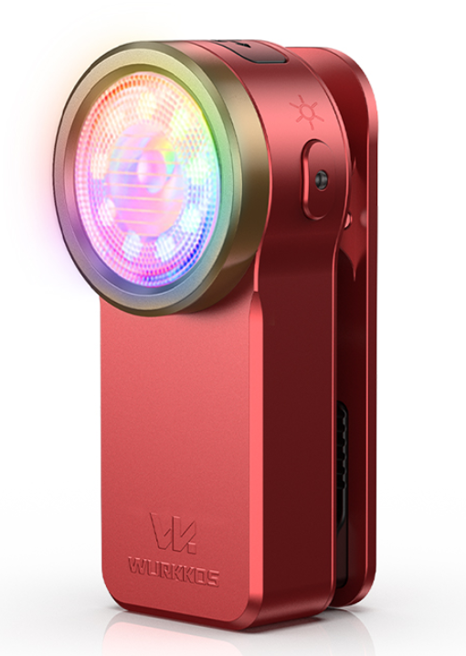
Im comming from Inventor / Fusion 360 and Im learning how to model products. I found this one in an ad it stood out to me. It’s not as realistic as others, it looks cleaner, in my opinion. I’ve been trying to achieve the same look with my CAD models, but they always end up more on the realistic side. On YT I only find tutorials for realistic renders. How do they achieve this style? Thank you for any advice and sorry for low quality photo.
Welcome!
This is about the most simple render possible. You just need basic, untextured materials and basic lighting.
Could you show an image of your renders? It would be easier to tell what the difference is if I could compare.
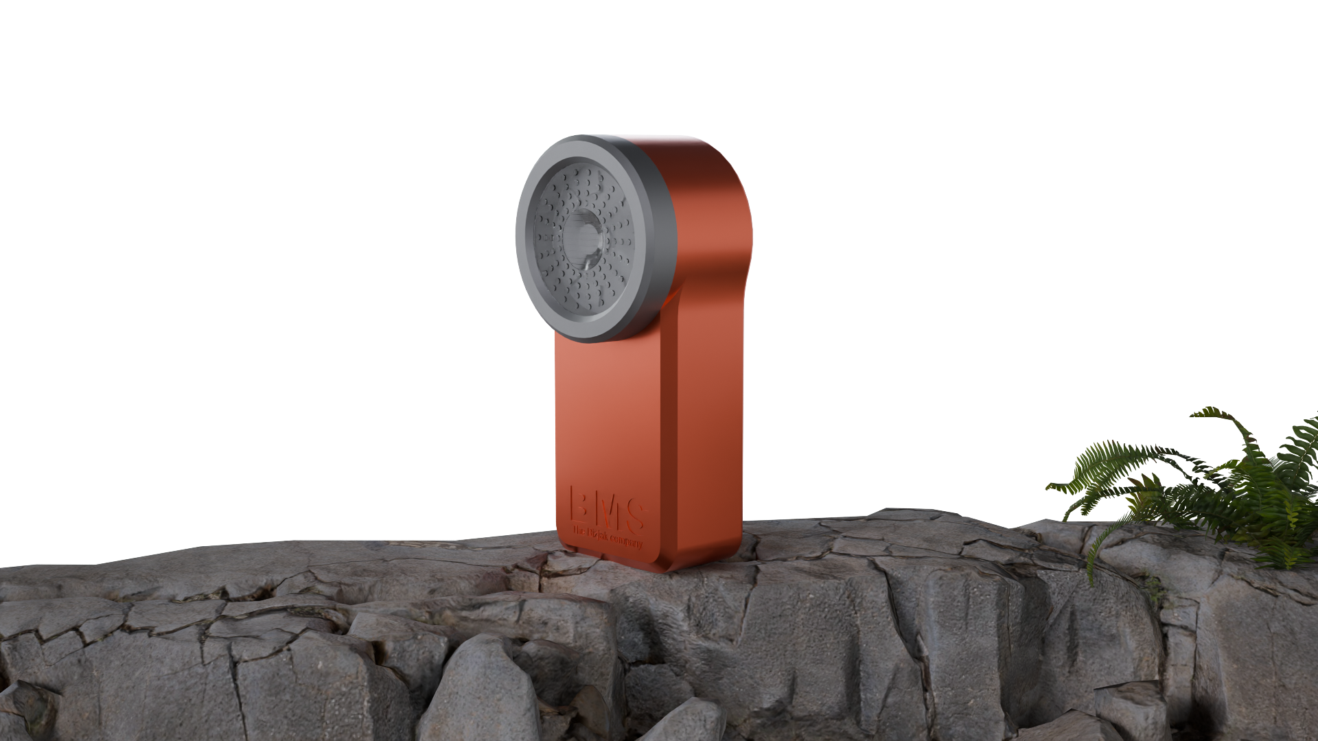
Comparing the 2 images, it’s not so much a matter of realism, but rather presentation. There are a few differences I can name directly.
-
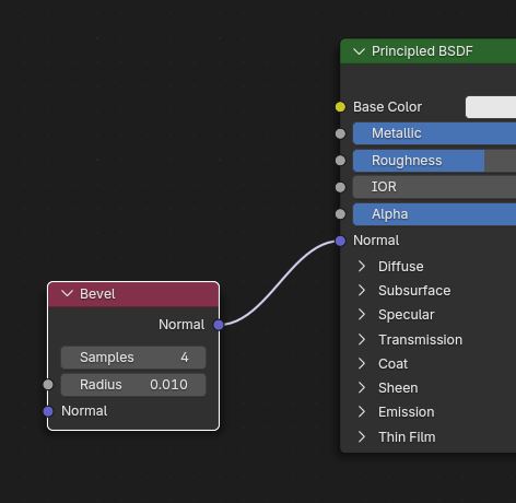
Your model has razor sharp edges, while the reference has very slight bevels. Bevels make metallic objects look much better. If you don’t want to alter the model itself, you could try using the bevel node in the materials (assuming you are rendering with Cycles). It’s good enough for this kind of subtle edge detail. Adjust the radius to the size of your model, you just want that tiny, barely visible edge detail.
-
Are you using an HDRI background? If you aren’t, you should look into it. Metallic materials need something to reflect to look good. Light objects do help, but they can only get so far.
-
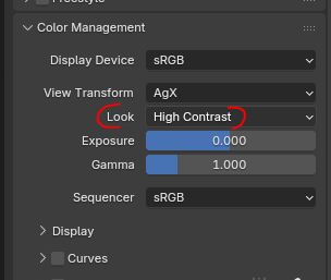
The default color management settings in Blender tend to give slightly drab results. Go to the render settings, color management, and try a higher contrast look. You could even try adjusting the exposure and gamma settings, the original is likely color corrected to look better.
-
The image composition is surely not helping. The reference has only the product filling the image, it’s the star of the show and there is nothing else to distract the eye. In your image, it’s small and lost in the middle of the image, with a random plant to the side that attracts the viewer’s attention and hyper detailed rocks with lots of details that attract the eye. The main product itself isn’t strong enough to stand through this.
-
The original has a bit of camera bloom. I’m not sure if it would do as much in your image, because the light isn’t on, but maybe the rim light at the top would glow a bit. You would need to use the compositor to do this.
-
The original looks to me like it was originally taken on a dark background, which was replaced with white after the fact. I can tell because the reflection is too dark for that white background. I am not saying this is a good or bad thing to do, but it is part of the look.
Thank you so much for your answer!
I didn’t even know those settings existed. Is there anything else I should know - like lighting tips? And if you have time, could you maybe replicate it using a cube? Also, you mentioned the material is basic and untextured, but how do you make it look glossy like that - It seems matte and glossy at the same time. Do you recommend any tutorials?
Thanks again for your effort!
It seems to me that it’s a realistic image and it looks like a studio shoot.
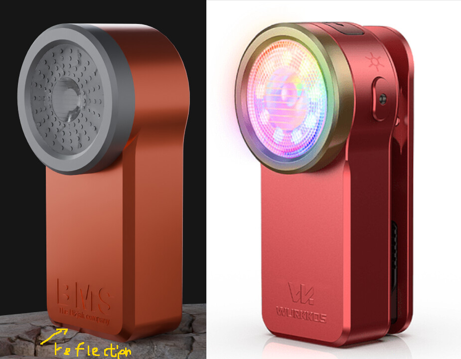
If you compare the two images, you can see a problem.
Basically, it is not easy to find different parts of the two images on the same basis because the background of the two images is different.
If you want to do the same rendering, you’d better create the same environment and render it to improve the lighting and material problems and use different backgrounds.
In terms of surface reflection, the two images look the same, but as you can see from the marked part, they are completely different.
Unless you use two materials, it’s a wrong setting.
The display of illumination highlights on the object is related to the reflection of the material.
And there are also features that aluminum has.
Even if it’s metal, it’s not all the same.
I think you have replicated the material correctly, it’s mostly just the lighting that’s different. Maybe the head part on the original has a less rough material.
Also, it looks like this in part because the original has smaller details you don’t have, like the button on the side or an extra crack between the main body and golden head. Those extra details catch light and add extra glints that a big flat surface won’t.
I was wondering if there could be a car paint effect going on. I don’t think there is, but it’s easy to test. Assuming your material is the default principled BSDF, go to the coat section and activate it. It will add an extra layer of lacquer on top of the material (that’s what car paint is, rough metal with shiny lacquer). Does that make it look closer to the original?
Your lighting doesn’t look bad, just a bit even. Having brighter and darker areas can be good for guiding the eye to the important spots. The background is a bit too gray and flat, something with more of a gradient, or a scenery that’s relevant to your foreground could be nice. The light on the product itself is pretty nice.
Maybe you could benefit from knowing about camera effects.
Real cameras add some imperfections to an image, but 3D renders lack those. This can make a render look too perfect and sharp and easy to identify as fake. It’s possible to purposefully fake those to make the render more convincing and cinematic.
Those imperfections include:
- depth of field
- motion blur (if something is moving)
- lens distortion + dispersion
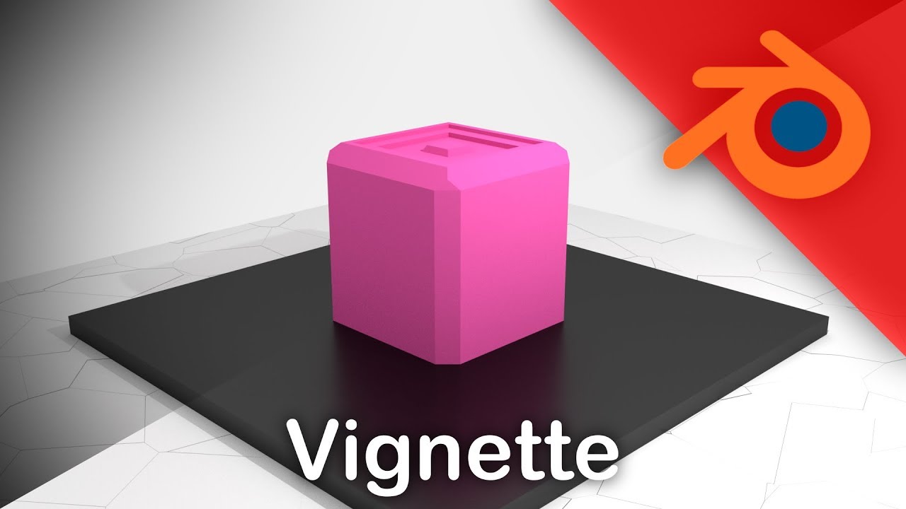
- vignetting (a darkening that appears on the edges of lenses)
- lens dirt or condensation if the environment would cause it (visible as defocussed smudges over the image)
- grain (different from render noise, not the same pattern)
- bloom/glare
- film halation (if using a film camera as opposed to digital)
- lens flares
I haven’t found one single tutorial that explains all those effects at once, so here are some of the more important ones.
Depth of field

lens distortion and dispersion (aka chromatic aberration)

bloom/glare

vignetting
grain (important, grain must be introduced after the previous lens effects, as it’s caused by the sensor, which is after the lens)
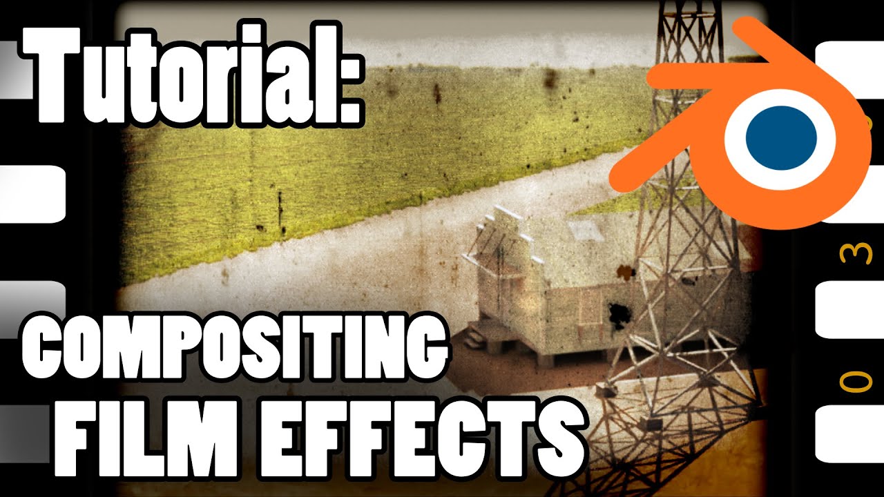
By re-creating those imperfections, you can give the illusion that your render is taken by a real camera. Keep them subtle though, real life photographers try to limit those imperfections.
Thank you for all of that and you time!
I’m going to try a few things out. When I get decent results, I’ll come back and show you… hopefully I get something, lol.
Thank you again.

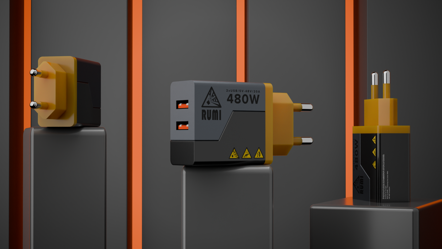
The presentation is pretty nice on those pieces!
One thing that could be improved is the materials.
-
The metals and plastics could have a little bit of roughness variation. Search for a scratch texture and use it in the roughness channel. Maybe use a color ramp or any other means of altering the brightness and contrast to keep the effect subtle, because only a small amount of scratching would be needed. This is optional though: it would make the materials more realistic, but maybe you could also want to keep them perfect if this is a product being displayed.
-
The lava rock feels a bit plastic. Giving the glowing cracks some actual depth through displacement could help this. Also, it looks like the amount of detail varies over the surface, like the texture was mapped with inconsistent scale.
The second image is pretty nice overall, I would just try moving the background or camera angle so the device on the right isn’t so perfectly aligned with one of the background lines, it makes the image harder to understand.
Thank you!
Yeah, I agree that lava looks off. I used an existing texture and layered lava over it using voronoi node and white noise. I’m not sure how to make proper 3d canals yet…
The metal does feel a bit flat, but I did use a pbr material, I just changed the color. I’ll try to beef up the imperfections.
I’m planning to make some new renders soon. I’ll show you when they’re ready.
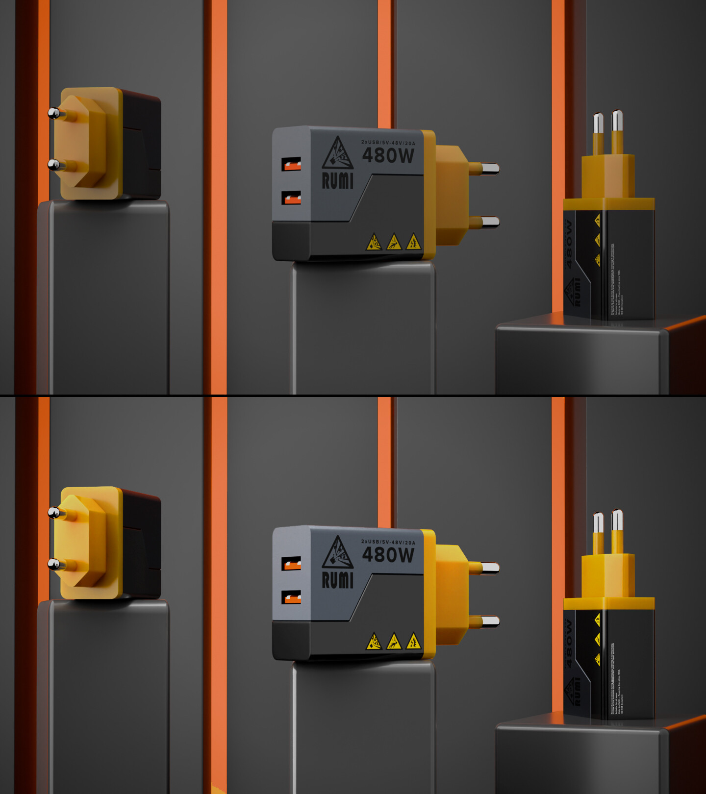
Yeah, I agree with that, it is too dark, in first one it pops out but here I used to simillar color, I could also add backlight, maybe it would help… but otherwise it is good?
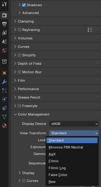
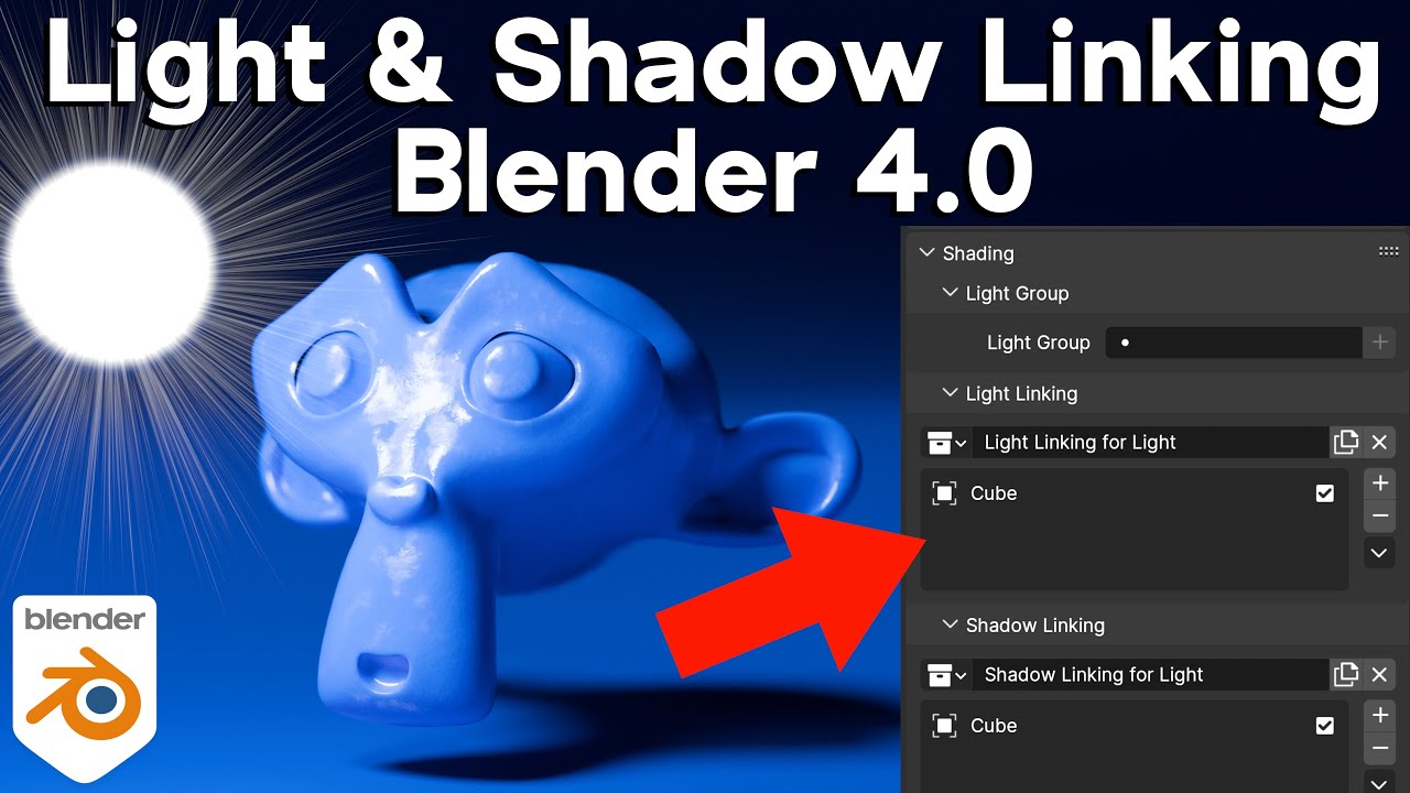
Objects used as backgrounds can also be placed out of the influence of the light.
And you can focus the light on the product.
Alternatively, you can disable some lighting on some objects.
It’s a way to handle lighting, and in 3D, we use a number of tricks.
To learn how to handle basic lighting, refer to the video about installing lighting for photoshoots.
There is more material than 3D.
Yes! I still remember back in the day where I was puzzled with these kind of questions… I relate to this 
I think there’s very good clues here already, it’s indeed the fact that if you want to replicate something you have to do it the exact same way. The rest is color grading, bloom, compositor work and such.
I’ll give you an example, everyone complains that they can’t do an Hollywood look on their renders… but that is because people don’t light the scenes like Hollywood
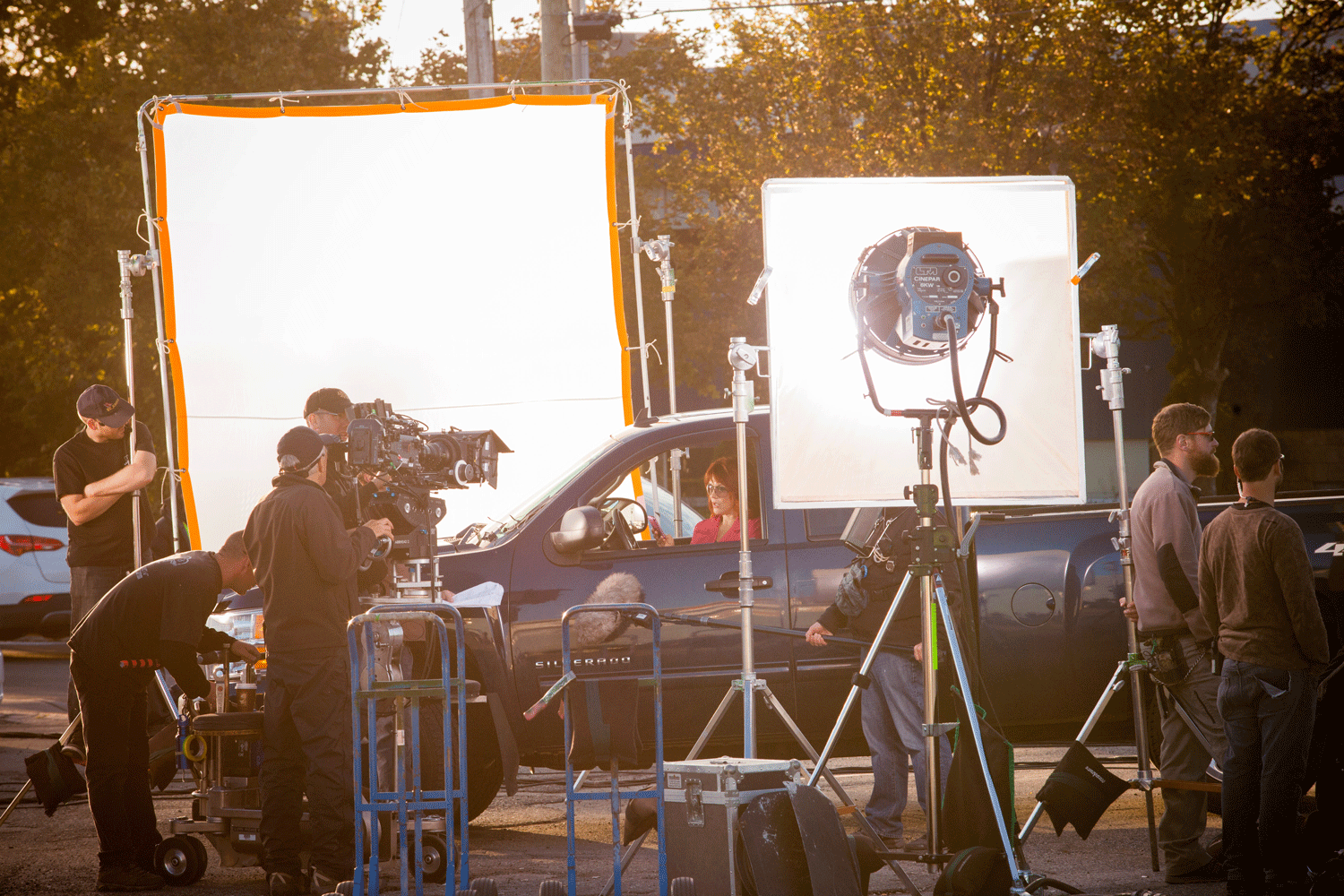

So the only thing you need to know is how they did it  but without the original autor sharing how they do it it becomes a puzzle for the ones that are learning. That’s why we are sharing here all the steps we take to make COLP, in the hope that will be usefull to someone like you
Keep asking and keep learning!
Thank you! But what could I improve on my charger renders? Are they presentable?
tbh I didnt know these setting existed, lol… Will implement it! Thank you!
I like your style! They are presentable, yes! 
You can improve but what you have is nice!