Okay, I’m ignoring you Namssil, thats just immature.
Here is all the layers sorted out in the node tree and in the correct order, but does it look okay to you?
If not please excuse the the shadows"As this was the trail & error render I did earlier, with all the high specular but now fix I think and edited, such a horrible thing to try sort out.
And Then the other layers, made my bump/normals disappear completely… this was a little Frustrating, but I think for now the test was worth a try.
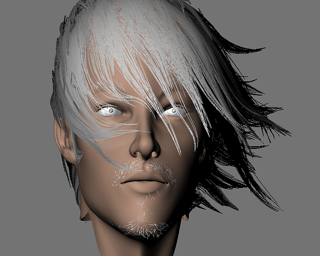
Layers normals - 2, specular’s - 2, epidermal & Sub-Dermal and color map all applied, does this at all look like it should?Where is the realism in this?Do you see it…:(U’v maps are a bit off I’ll tweak those so there isn’t grey areas around the model.:spin:Hm Lighting is the hardest thing to understand right now.:eek:I wont be doing a render this big ever again 2 hours is a long time to wait just for this!.. is it not?
Any body! Know how to set up better lighting?With these shader’s.:ba:
If you have suggestions please help with giving me links and tutorials, I’m not really interested what people think of the shaper of the model or the texturing right now, I just want good lighting set ups, I’ll start a post in lighting and Materials and update this if I get good reply’s.:eyebrowlift:
HAPPY BLENDING:evilgrin:
Attachments

I do my lighting this way: Create a colorcard that have squares of color for Red Green Blue and Black, from 0 value to 255. Also place a photo of a human face (a girl better) and another photo of some vegetation or something with colors.
Then you apply this colorcar texture to a plane and the material must be without any reflection, only diffuse. Now place the colorcard in the place of your model and hide your model. Place the lights and render. Check the values of the render and try them to match as close you can the values. I always check the box with 0 for black, the one with 128 for black and the one with 255 for black. I usually only check these three ones.
When you have the lights corrected that is the “default” light. You create your model with this lighting. Then for your final render you can up or down the lighting a bit to go for a “not default” lighting as in the case where sun is lighting your model, or a clouded sky is present or the model is inside of a house with only a light bulb. How you know how to change your lights?
In the case of sun I go outside and look for a place where sun lights asphalt for example or a rock and shadow is also present (a building projecting his shadow on the asphalt). Then you take the photo, blur it and look what value has the shadow part and what value has the sun part. Imagine there is a difference of 40. Well, now you can decide your default light is the middle between these two values so you know you need lower 20 to match the shadows or up 20 to match the sun.
Rough explain, I was planning to write a tutorial but I have not time that I want to waste. Perhaps Blender Cookie guy if reads this can create one.
Edit: I am going to post my colorcard tonight in my Neytiri thread and explain a little more with photos.
The benefit of using colorcard is of course that you know that if there is a problem with the textures colors it is the texture that must be corrected (and of course you must correct your textures before using them!!!) because the lighting is perfect.
In max forums two years ago I was to create a tutorial and I was said that it was ridiculous and impossible and such. That is one of the three reasons why I left max. Second one was the reaction of the sect crowd when you point that one master is doing something that is wrong (and ever you explain it they don’t pay attention to what you explain: the Master is always right even if their renders are green isntead of normal). And first one is because if the dollar loses value and you expect your max going low and be much less expensive you know Autodesk is there to fuck you always.
Try a HDRI light probe.
This is for the eyes or for everything could you upload a simple object using this method it worked well with your model, I can see the eyes on your model as lighting never satisfied me only with the skin being well lit then the eyes in an other render then again hair in another but all together they never work well.
Good suggestion tmcthree! I’ll do a study on this as I herd Weta uses this, which I live in the very city they live in silly me I should just ring them and ask-not lol.![]()
no can do, I’m afraid.
Because of the bit-depth, hdri images are big, too big to upload. But just do a google search. You’ll find everything you need.
No Problem, TmcThree I asked around blender-artists-forums, about HDRI tried some of there methods, they didn’t work for me, then went and did a few tests, now I know what to do.
Thanks.
Okay Here is the new render a long side the ones with the problems I’ll redo the color map my self as I don’t think the projection paint looked good it creates pre-specular & pre-lighting, which takes away the whole Idea of learning to texture my model myself, so I’ve got the base color applied for now, sorry about that.:o
“THINGS I AM GOING TO DO”
:evilgrin:
I’ll look at doing sculpting for the wrinkles around the eyes and creased area’s of the fore head and smile lines, lips will be corrected they need those lines to show there actually lips.
I need some guidance on those epidermal and sub-dermal maps and why they effect the rest of the shader’s so much, I asked Ben Dansie about the specular and will finally add those tweak in tomorrow, maybe if I do that tweaking the detail will show with the shader’s then I might be happier with this project.:o
Lighting will be continued after I do some more particle layers for Iden, I’m also going to add Eye brows again and Eye lashes and add hair color to the color map so I don’t have to set up materials.
His bride over the eye will be lowered for the sake of making him more “Manly” Which I do want him to look tougher have a but more stress in his personality.If you do feel the need to critique him more! I’d Appreciate it!
Updates Coming soon.(Sorry to be confusing you all, going backwards & forwards with files, as there just to do test… Trail and Error’s excuse them.):spin:
Attachments


First up, I’ve seen most of this thread and really like your hair experiments…
this one is my favourite! very three musketeers meets leonardo di-caprio… but also fits your own taste with your love of the final fantasy series…
It’s your work so do it your way, but don’t get so upset when some people think it’s a bit “he-she”! that’s just their reaction!
YOU know what you’re trying to achieve!
Ultimately though, your work goes out in public and your intent,the context in which the work is shown and the audience reaction come together to complete the work… that’s what makes it fascinating, especially when the part you don’t control (the audience) surprises you
I think sculpting will help your project massively… if you can get the confidence to be really bold! That can be tricky though… i think you may have “fallen in love” with the smoothness!
You can add a lot in the sculpting phase where you can really start to differentiate and hint at the thickness of the skin… if your strokes are directional and bold you’ll be able to make parts feel hard and bone, others fleshy with sub-cutaneous fat… the clay brush (used at very very low intensities can be used to add and subtract in very subtle ways (it fills in the low spots first so can be good at fillling in fat and skin over muscle and bone…)
Save versions often and be as bold as you can… maybe take it further than you think is necessary, because as you work it more the boldness gets subdued… go further and push the forms!
It’s easy to go back and forth and feel that you’ve not moved things forward, but iteration is the key to learning and pushing things forward… remember the scriptwriters mantra “writing is re-writing”… nothing comes out fully formed but you can push harder and take bigger risks…
I say this because it sounds like you’re trying to get each stage perfect and then move on (like leaving texturing and lighting until you’re really happy with the modelling and topology… but often you only discover the flaws when you start texturing or a new light setup highlights some flaw in the shape…
My topology is often truly awful, even for “finished” works…
Finally on texturing the face, laying out some colour zones could really help! He’s suffering from too uniform a skin tone!
to illustrate; for caucasions:
forehead is usually yellower, cheeks and neck more reddy, beard/stubble area (even when clean shaven) greyer/bluer…
the nose can go either way! old drunks having redder noses right through to the yellower tones of thin cartilage…
there’s also localised variations and discolorations so you can use large scale blotchiness right down to fine grade freccles… a lot of this you can get using photo refs, but I think that painting can be more rewarding and easier to understand! (photos are plagued by the lighting conditions they were taken under and the fact that the subject isn’t flat!)
Now i need to take my own advice and get on with mine!
PS At aardman where they do a lot of claymation, they’ll work and pose the plasticene characters for at least a half hour before begining to animate them… it warms the clay, and gets character as the fingerprints and smudges"bring the clay to life!
work along and across the forms using cross hatches… both to add and subtract… a “rake” brush will add directionality to the strokes and change how the surface reacts to the light (sort of “anisotropic”)
I guess I;'m saying work the whole model, don’t just treat the sculpt as adding the microdetails…
I’m always amazed that even going back to the first subdividion after a sculpt how much stronger the models shape looks everytime! That doesn’t happen if you’re only adding fine details!
finally get some reference of old people, it’s easier to understand wrinkles(old people have more of them!) and muscle vs bone ( older people have less sub-cutaneous fat in the face) It makes great reference on where to put your stroke directions even on young characters like this one!
See your words of wisdom were, Exactly what I needed, oh I’ll be bold and have fun with this!
As you will see, I go backwards and forwards with modeling, texturing and lighting because nothing is ever perfect ha ha ha, but it does advance in bad ways and good ways …certain things that come out good are added to the old file that is the main file, to better the model and the tests are burnt to disk to show my progression as I do all of the above, just like all that has been mentioned.
Thank you, Thank you …THANK YOU
Okay here is something that has nothing to do with Iden just testing out 2.49’s sculpting, theres only 1 multires applied, this model is completely not what I am going for but shows you the skill in sculpting I guess, please tell me what I could correct on this sculpted head.
:yes:
This gives me a little break to refocus and then when I go back to Iden, I’ll be more focused on shaping him, the lighting is just a throw over to see how it would look in warm and cool lighting with spooky area lights, But This actually could help me, find the right lighting choices.
He looks like a creep.:eyebrowlift2:
.
Attachments

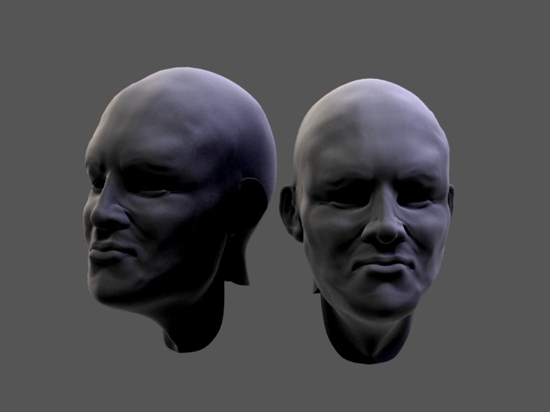
Hey, nice sculpt!
Not creepy, just sad or thoughtful!
I’d try to use 2.5 if you can, it’s way more memory efficient, more responsive…
He’s a little soft and pudgy,which may be the look you’re going for… but a good exercise eould br to use the clay brush subtractively to try and toughen him up… tone up some of the facial muscles…
another good exercise is to sculpt a skull then layer the muscles over then fill in the fat and skin over that…
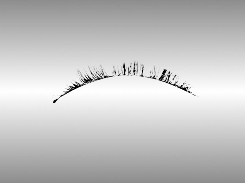
(Quick 10 minutes eye lash making)
I just wanted to also test polygon eye lashes as they render in seconds with alpha and there shadeless.:yes:
I will do particle tests with eye lashes to compare the results, I think materials is always an issue with these things.
If I actually tried really hard to make the textures better it would look better in the render but hey just a test.
Attachments
I like the model and the hair are very well combed and illuminated in interesting way
Hey Marcolorenz, hows everything going for you lately?Yeah it can be better combing, this is the style I want to do again, sadly this was just a test and all done on 1 layer, I will redo each area on different groups and different layers, so each layer can be edited in materials and children property’s without effecting each other, I think I fixed the lighting for now.:yes:
But I forgot to lower the aspect and resolution, it’s taking a long time to render.:rolleyes:
Here is what I did to correct the lighting and the specular, the eye is off still didn’t move anything oops, I’ll try doing a RT a.o instead of approximate or no a.o this has a.o I think.
All objects had x2 sub-surf on them so it took a bit longer to render sorry.
This is just to show materials.
Attachments

1, 2, 3, 4, this just shows the changes you think its finished, its never finished. …More updates coming soon.
:D:spin:
Attachments

Hi Frank. I am fine. I am still working for the contest.
Your new skin material is very warm and realistic.