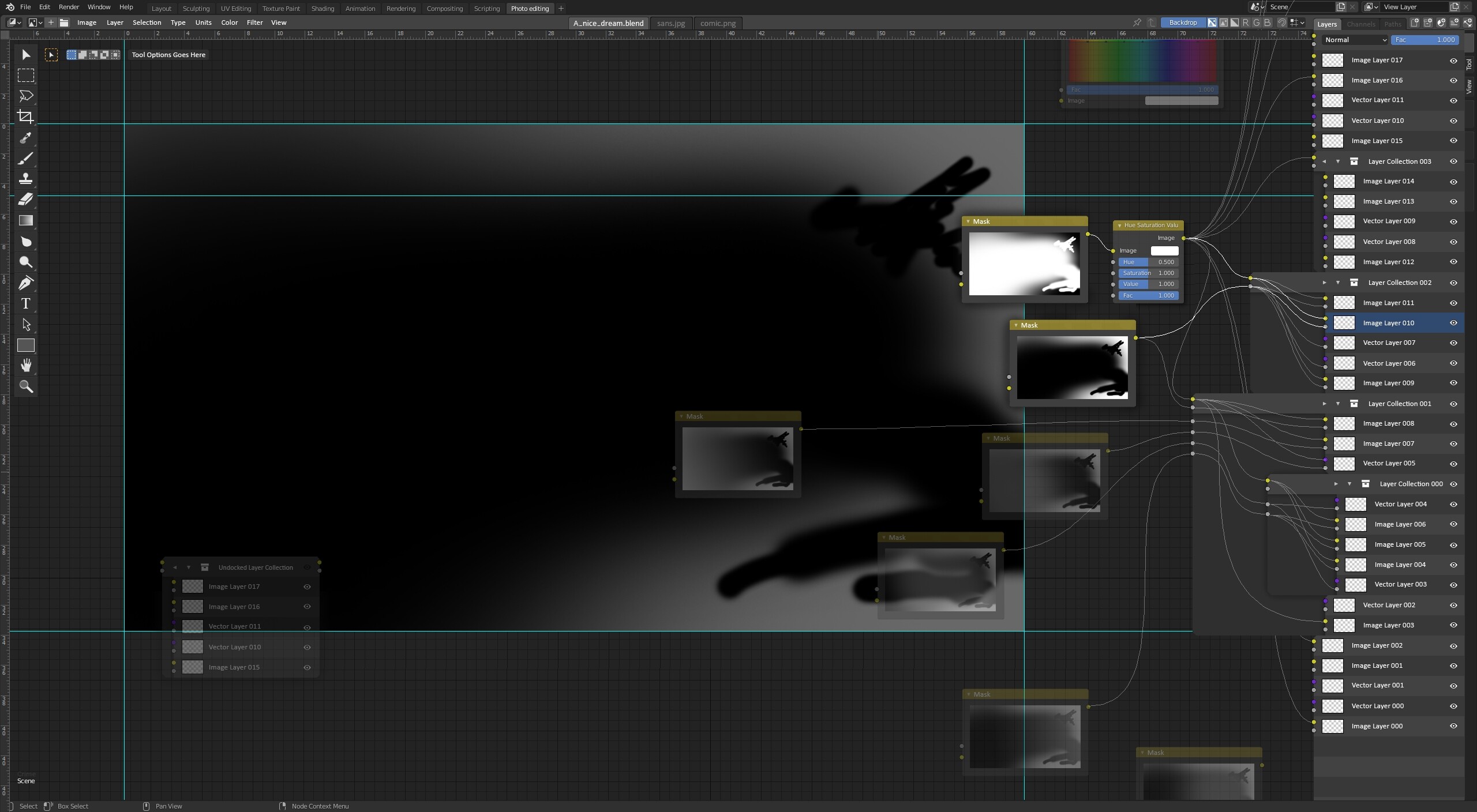
So here is next wild idea. There is a lot going on the mockup, so please let me explain, the best I can:
-
How the information is flowing, how to read this interface?
The flow is going from bottom left to top right. This decision was made by merging left → right node direction taken from Blender with bottom → top layer stack direction taken from most popular 2D softwares. I think it’s pretty intuitive and overall feels familiar for sameone with basic 2D+3D experience. -
Why one window?
The main idea is to not multiply editors and utilise existing solutions - example main layer stack is heavily modified ‘N’ panel, which in theory means - whole layer stack can be easily hidden. One editor window also maximises working area. Missing color palette functionality could be incorporated at the top of layer stack or left for pie-menu-like palette like in Krita. Missing properties are redundant with nodes so this is easily solved. -
On the bottom left I can see floating layer section which is undocked from panel on the right, right? Yes. This could serve two purposes. First is to disable group in layer stack, and second one is the ability to incorporate layer groups inside more advanced node trees.
-
My Lord what are those abominations with wires stickng from layer stack?
Yes I know they are ugly, but bare with me for a sec. For the lack of better term I’ll call them switches. If you don’t use layer groups/collections you won’t encounter them.
The idea is to use these retractable panels for managing complex node connections that otherwise would require a lot of time to set up and would permanently clog the viewport with a lot of wires. Simple example case is connecting adjustment node to multiple layers in a group. With switch you just drag the wire to group color input (yellow) and it automatically connects all layers inside to it. And if you want to exclude one of the layers from adjustment - no problem just expand the switch and disconnect it manually.
In the group header there are 2 arrows - the left one expands/collapses the switch, and the right one expands/collapses layer group in layer stack. Example of collapsed switch state is Layer Collection 003 in the mockup.
Switches also could be resized manually in horizontal direction with draging their left edge. -
What about navigation?
Layer stack and node layout can be navigated independently. Node wires will always guide the user where it wants to go. -
Visibility?
There could be couple options how to display the node-layer stack as nodes, switches and layer stack could be hidden independently - ideally with shortcuts.
I havent touched tools, tool options, layer creation, other N panel tabs and a lot of other small things.
Feel free to leave your opinion.