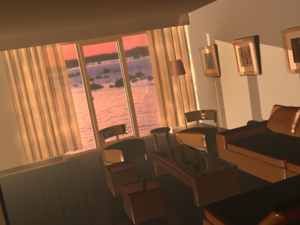
this is a test from a render chalenge on another site I would like a little less cartoon look but I am having a hard time. any sugestions ?
this is the thread
http://www.3dallusions.com/forums/showthread.php?p=15225#post15225
Attachments
this is a test from a render chalenge on another site I would like a little less cartoon look but I am having a hard time. any sugestions ?
this is the thread
http://www.3dallusions.com/forums/showthread.php?p=15225#post15225
The skewed camera angle is sort of throwing me off, but I’m not sure if your background image matches the angle of the model. Anyway, I’d just use textures with more detail, probably procedural (for example, stucci for the wall, set to Nor). Get some bumps and roughness to make everything less smooth and perfect.
Yeah, some nor mapping would really add to the realism.
The foggy effect takes a bit away from the realism as well. If you weren’t going for real I’d say it’s a done image, it looks splendid.
I would probably put a porch or something outside the door, in your image the water looks like it goes right up to the house.
The more I look at it, the more I think the background image doesn’t work. The horizon is too high, it makes it look like the entire room is tilted towards the water.
That is a nice render.
A couple of observations:
The image for the background has alot of red in it, along with the orange. You have matched your scene to the orange very nicely, good job! Now, Now, if you add a red ambient tint as well, it will be even more convincing.
The background is indeed off a bit.
This scene, as rendered is basically a two-point perspective scene. This means that there are two vanishing poins (the point at which the receding angles of everything in the scene converge at two different points on the horizon). The vanishing point determines your horizon line. Now, if you have a tall object (building, mountains, etc.) the horizon line is obscured. As your scene is at the ocean, or a lake, your horizon line is almost totally un-obscured. thelonesoldier is right. Your horizon line is too high and it is off axis from the room. I’ve put together an image that shows what I am talking about:
Converging lines #1
Converging lines #2
Vanishing point #1
Vanishing point #2 is off screen.
Horizon line
incorrect horizin line
I came up with the horizon lline by continuing the green lines past the image, then drew a line from point #1 to point #2.

Note that your horizon line for the background is off-axis just a bit…
well I hope this helps! it’s nice to use something from art class every once in a while… 
Btw, I like the choice of camera angle and most of the composition. It might be nice to have something “coming into” the scene from the left (another chair, a standing lamp, etc.) to give some balance to the scene. Just a thought…
thanks
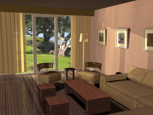
you are right about the back ground I kept moving it around and couldnt get it right. Your perspective lesson is apreceated. I have changed every thing around now and will soon add an update.
render done
I like this the bigest problem I see is the dark celing I think I need one more light.
 WOW! i really like the feel from the scene thanks alot for shareing and really great work!
Problem now is that the lighting in your background doesn’t match the lighting of the room. 
It’s bright outside, high noon, clear day. Inside it still looks like sunset. Light coming in through the windows and hitting the wall should be much brighter.
The scene itself looks perfect, there’s nothing to suggest fixing really.
every time I turn up the light the wall gets realy way to bright I think I need to adjust the material then turn up the light. ? not tonight it will have to wait till tomorow.
thanks
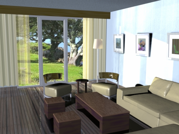
Using yafray?
Try tinkering with the gi power/emit power in the GI tab. Hard to say exactly what your scene needs but it seems to give me a little more pop when I need it without torching the scene.
this is what I mean I think the wall mat needs a tweek ?
this is all with blender yafray dosnt have transparent shadows (look at the curtain shadow)
I think you need more ambient light in the room, not more light outside.
Gah, I hate how severely more light effects transparency.
shr1k,
You are doing a good job. Take a look at the lighting tutorials here
to give you some ideas on how to improve your scene.
They are not Blender specific tutorials, but the use of lights in those tutorials might give you ideas. Good luck.
It looks to me like the main issue with the light in the scene is not the intensitiy (brightness) but the tone. Your background image looks like a bit whiter light than your scene, imo.
I like the background, it looks to be placed just right!
Doll House
Yafray + Blender
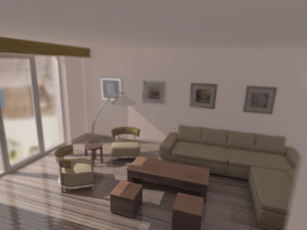
You shouldn’t have any DOF in that last shot, the angle is too wide and the scene too small. It looks good otherwise.
its suposed to look small in this render dof is a little extreme but I was trying for a doll house look
It doesn’t look like a doll house. I don’t have any idea what you could do to change it, there’s something missing but I don’t know what.