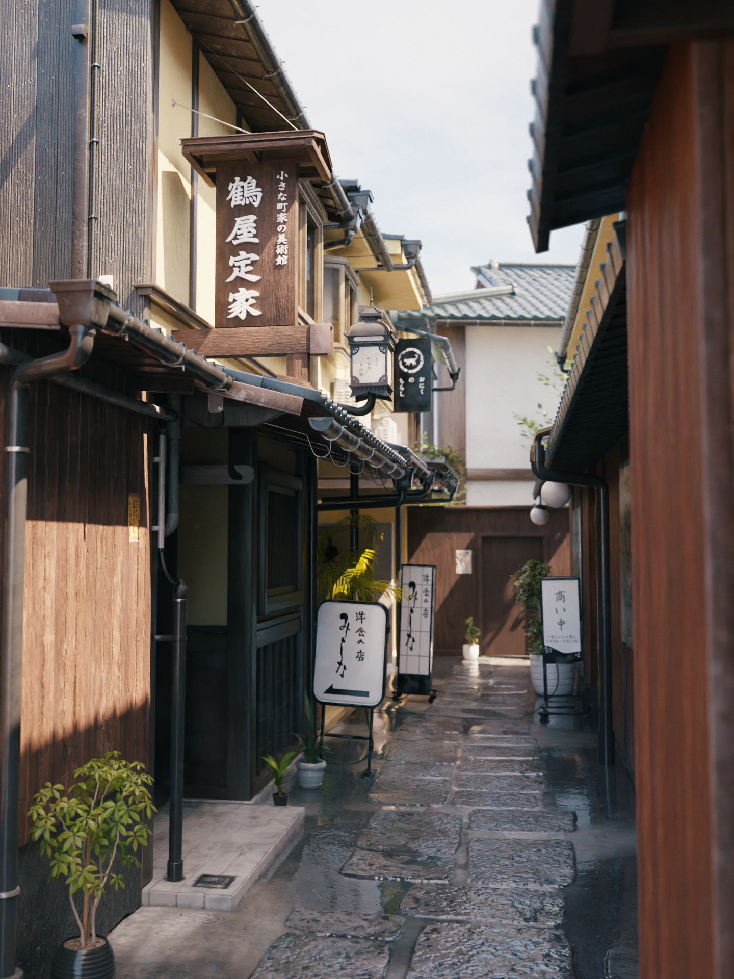
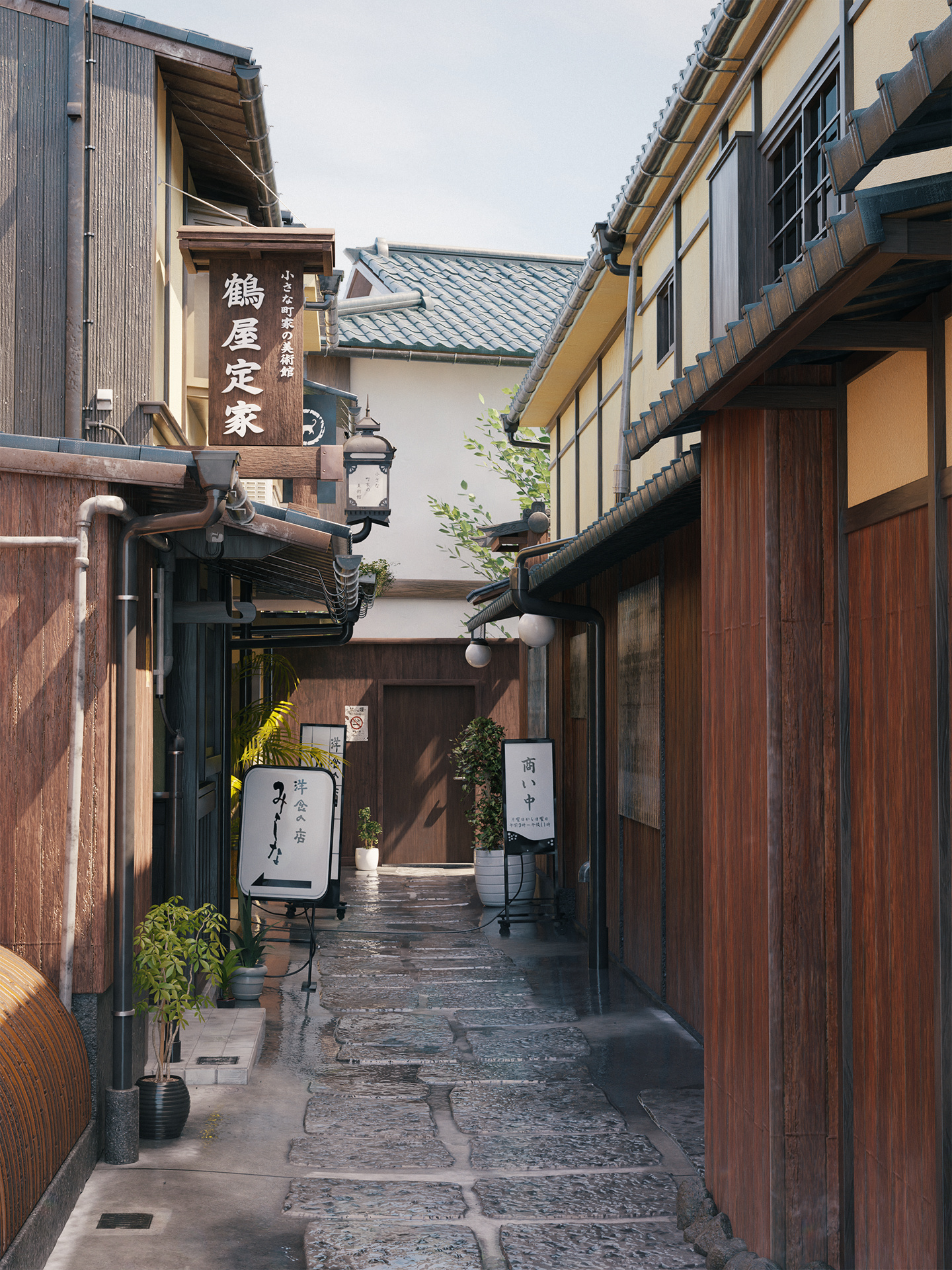
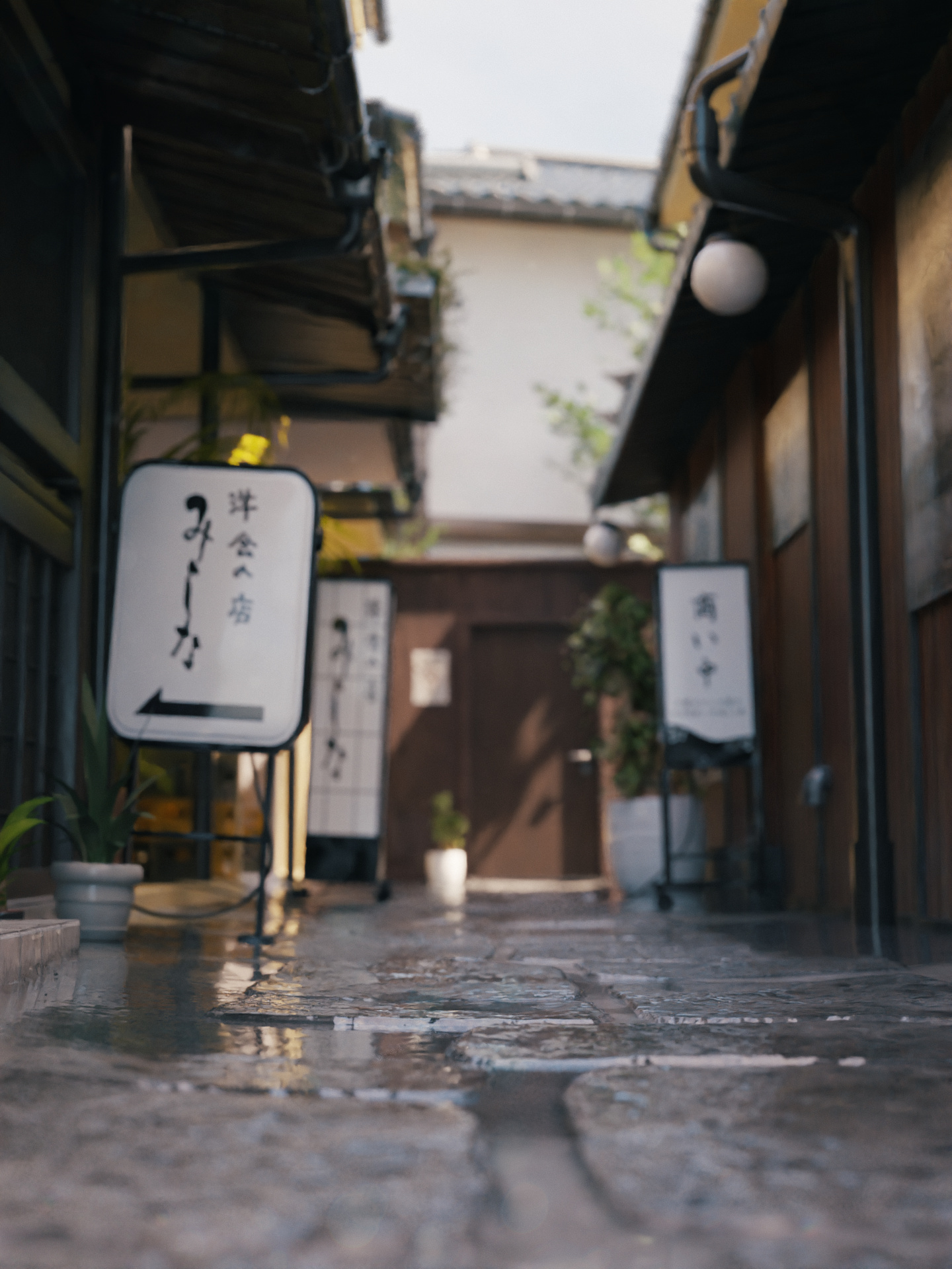
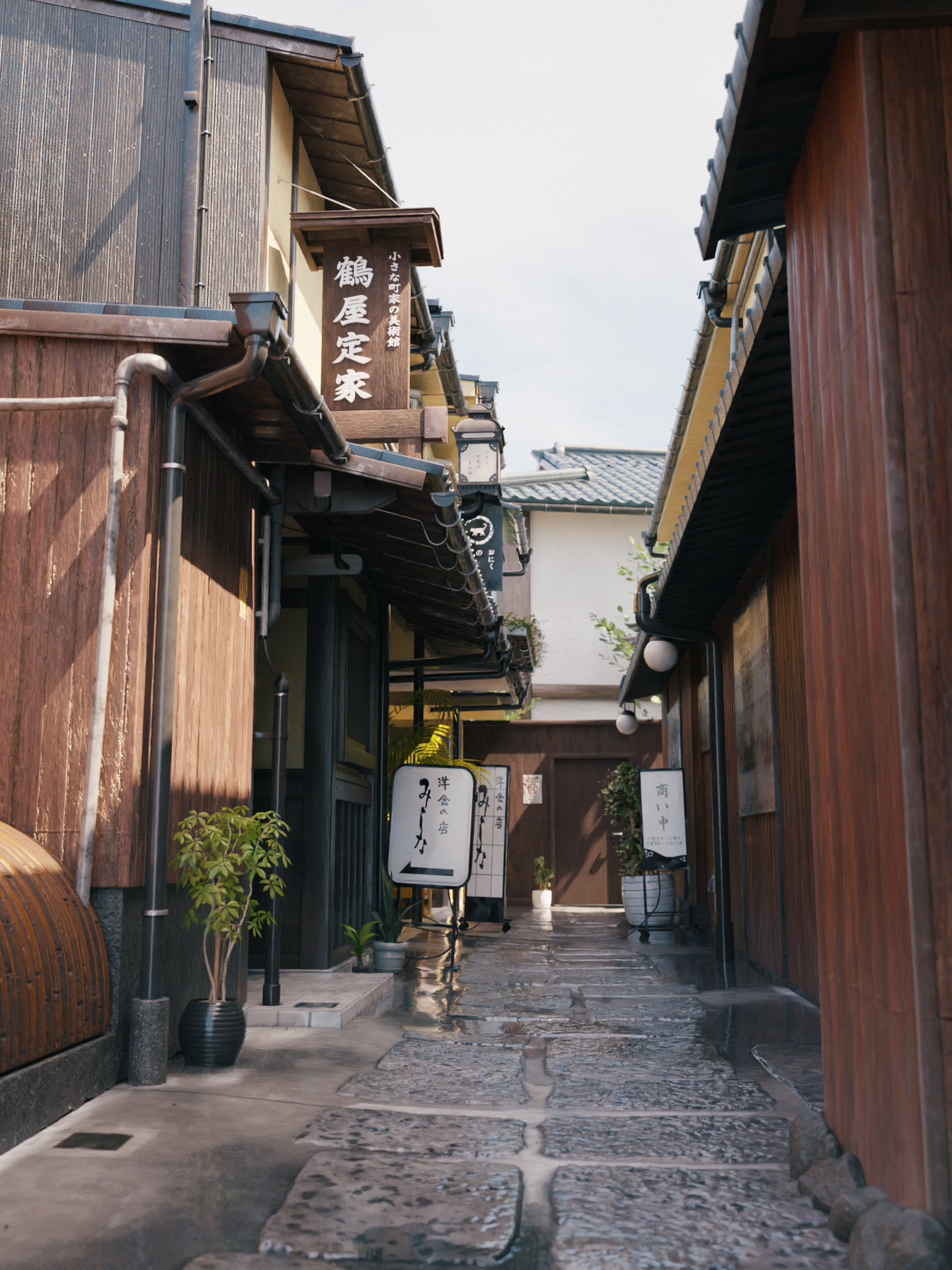
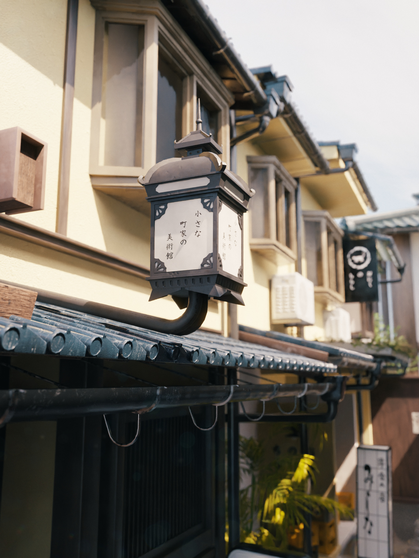
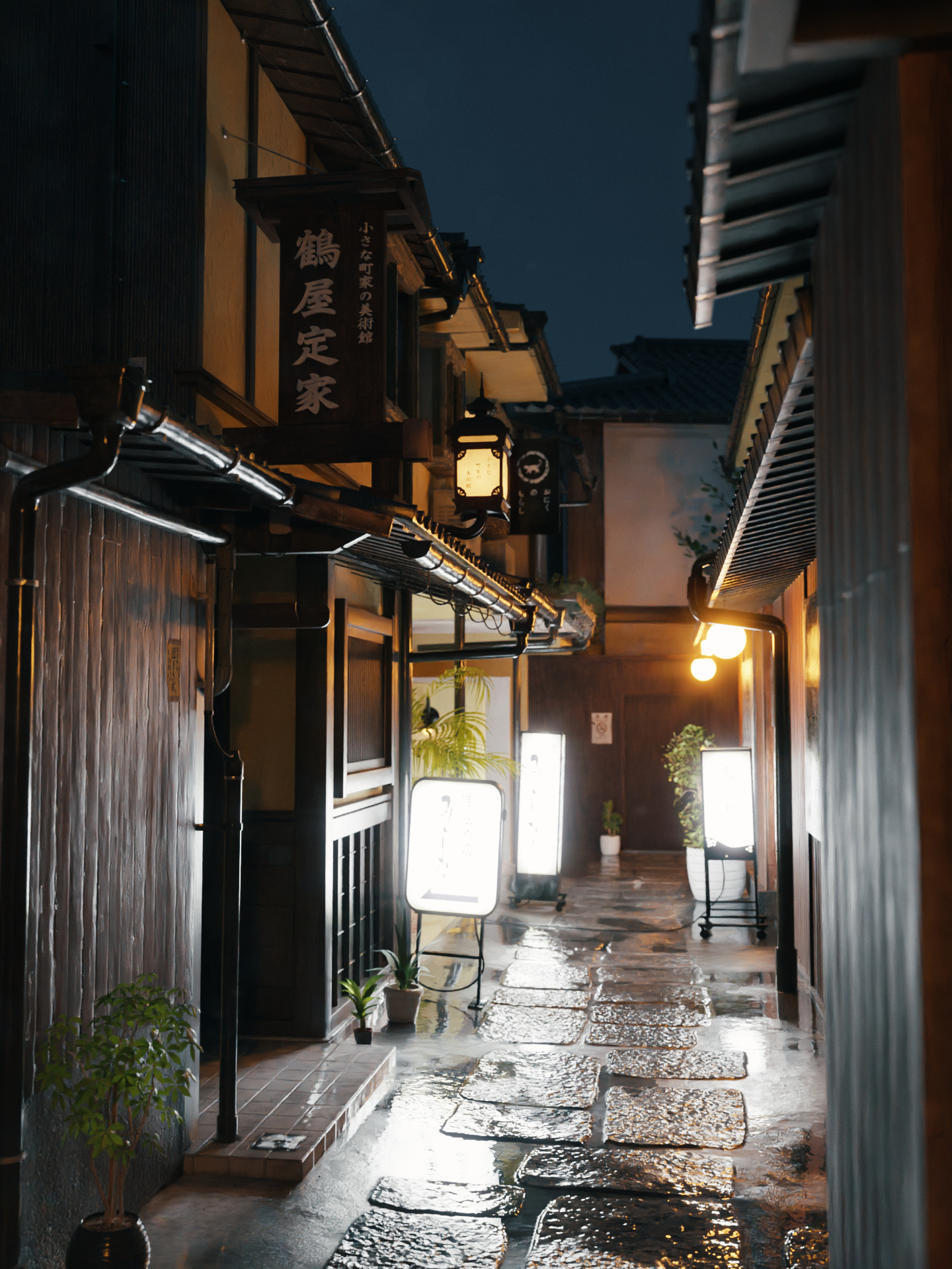
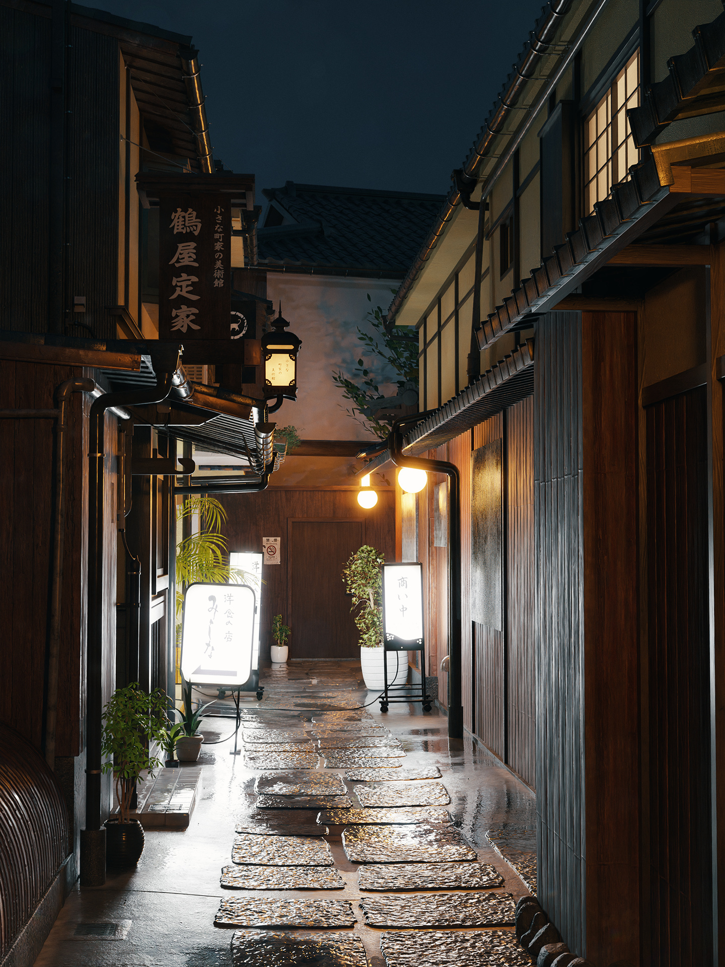
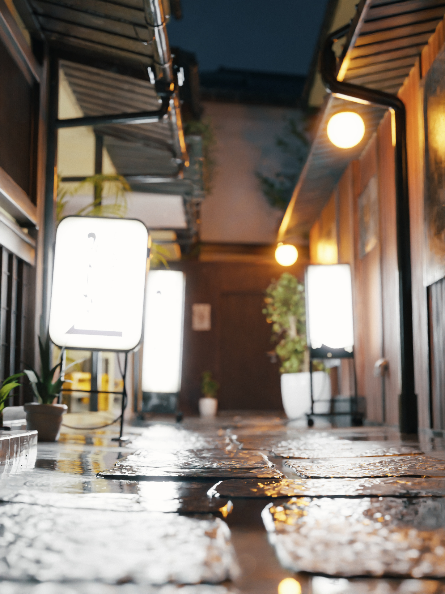
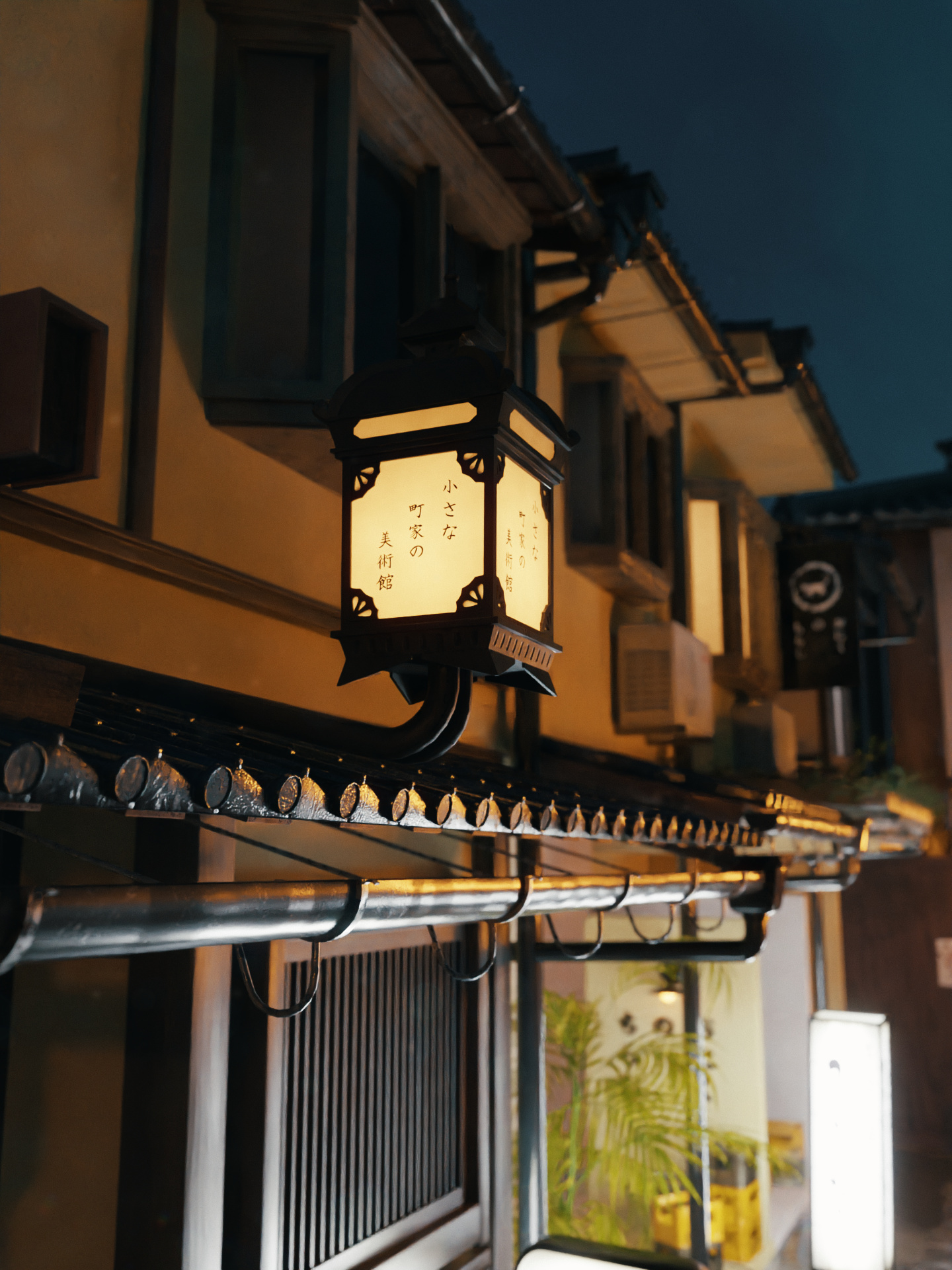
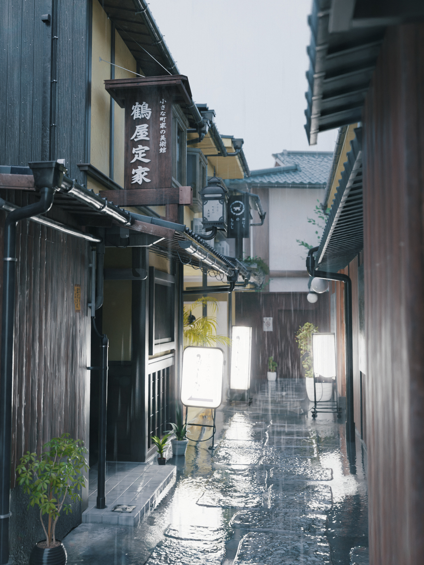
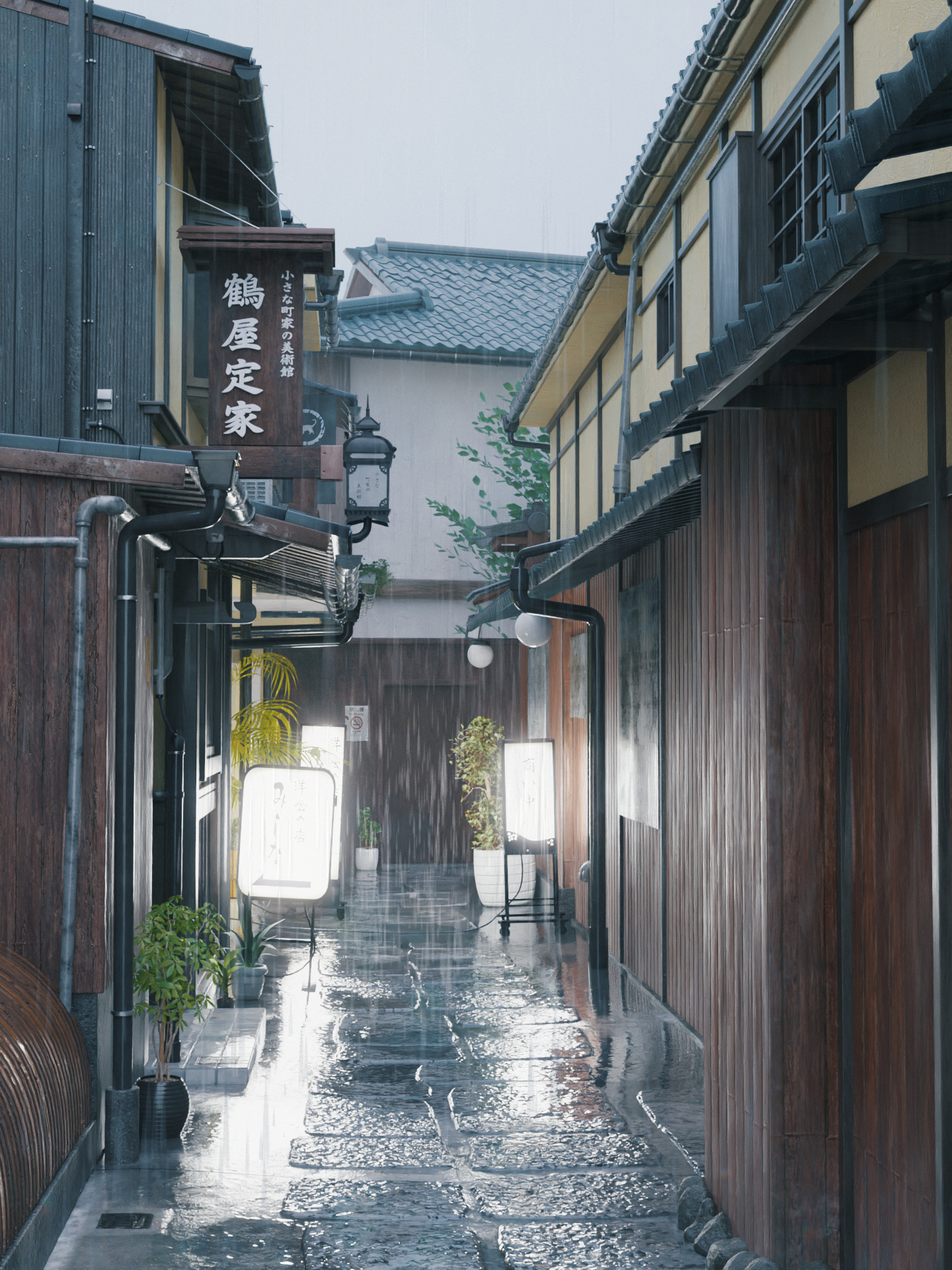
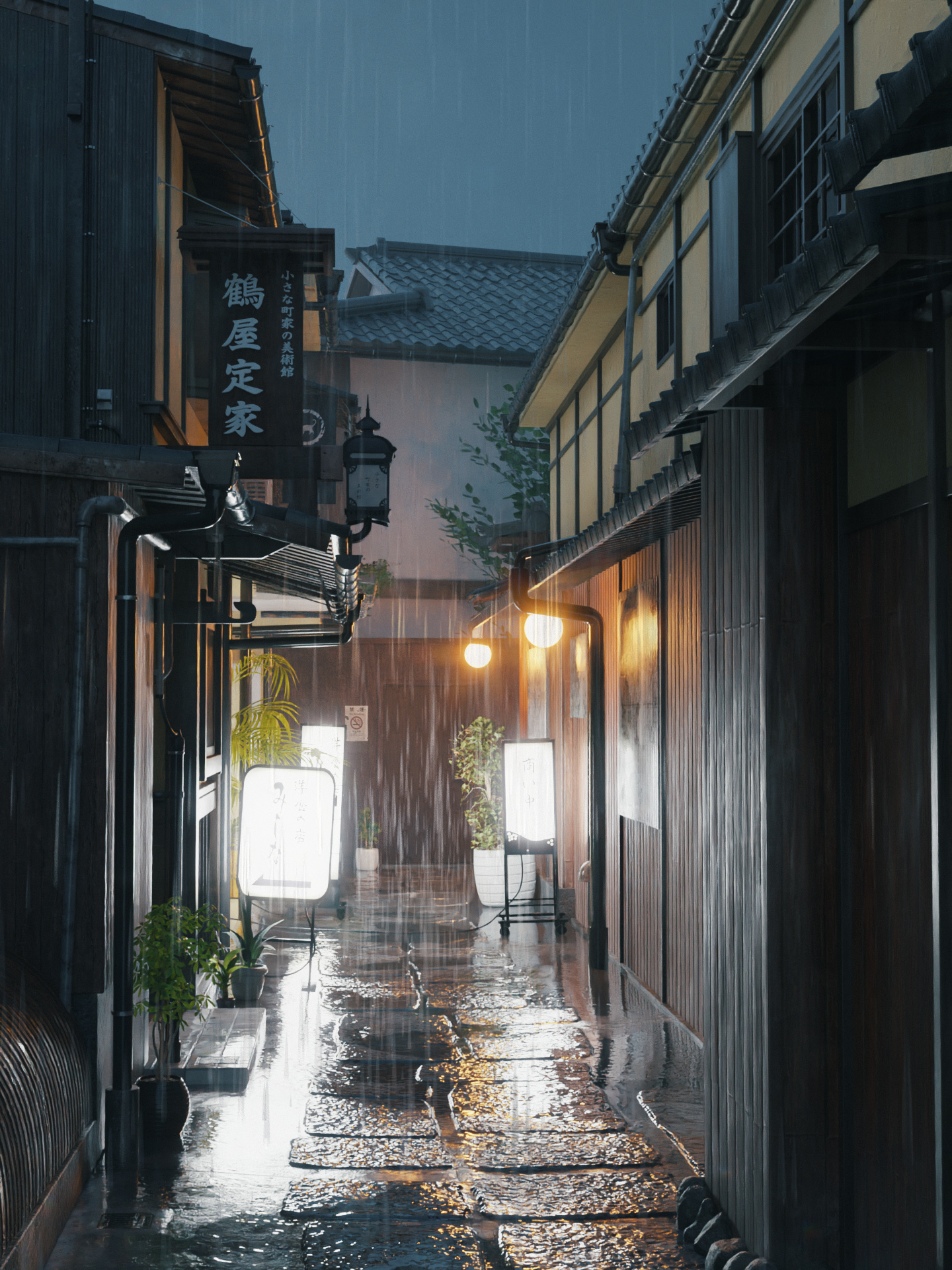
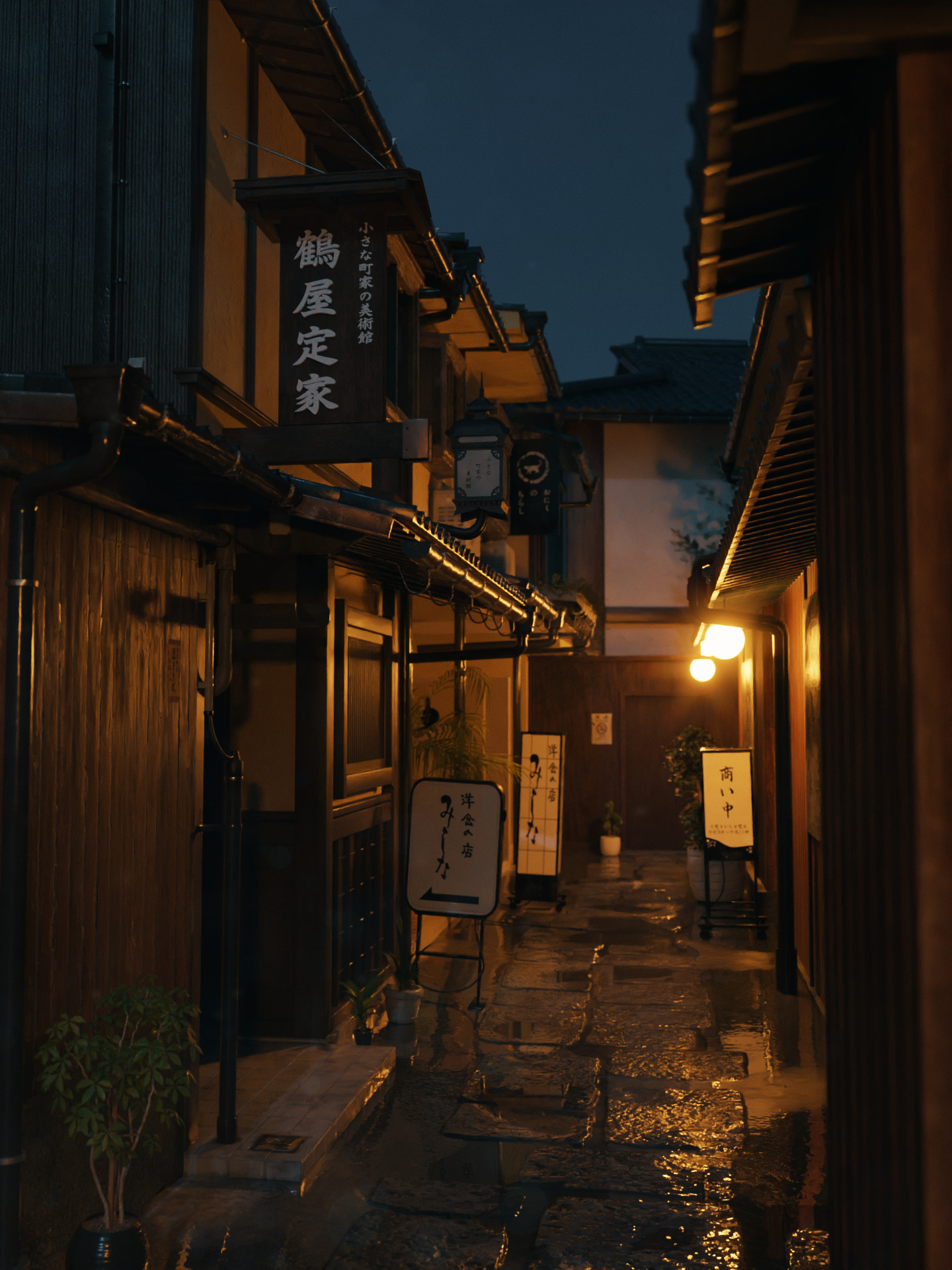
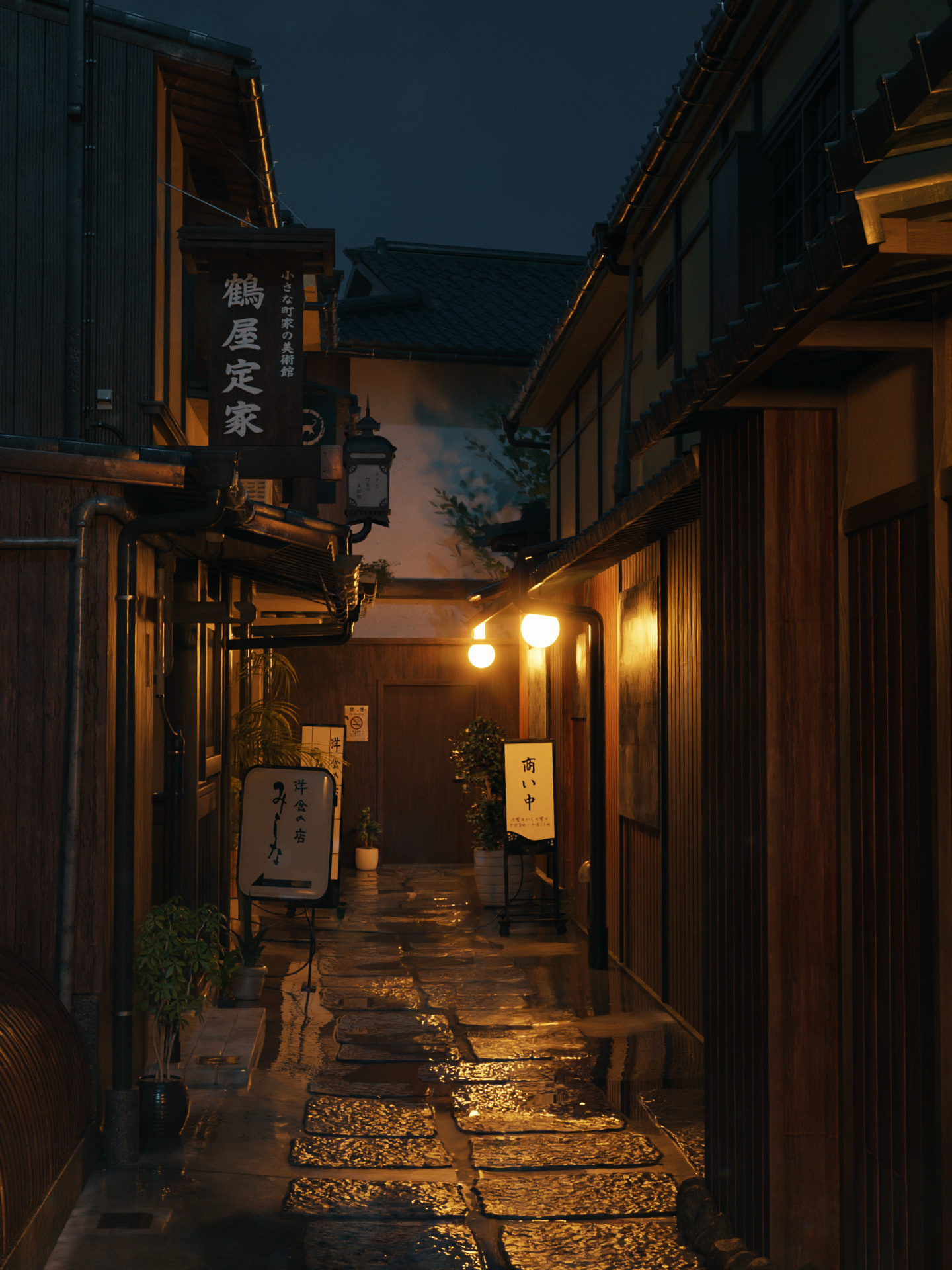
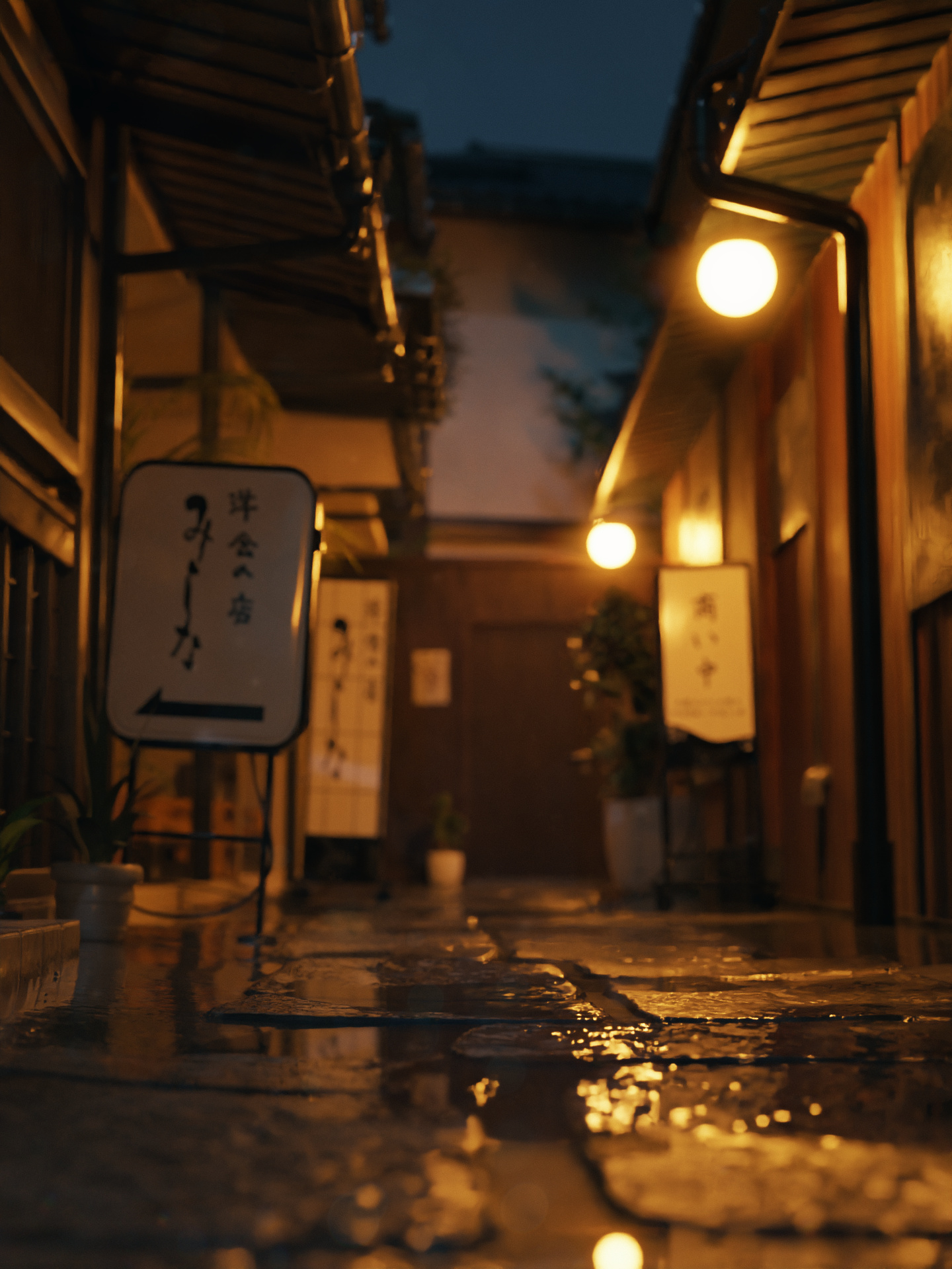
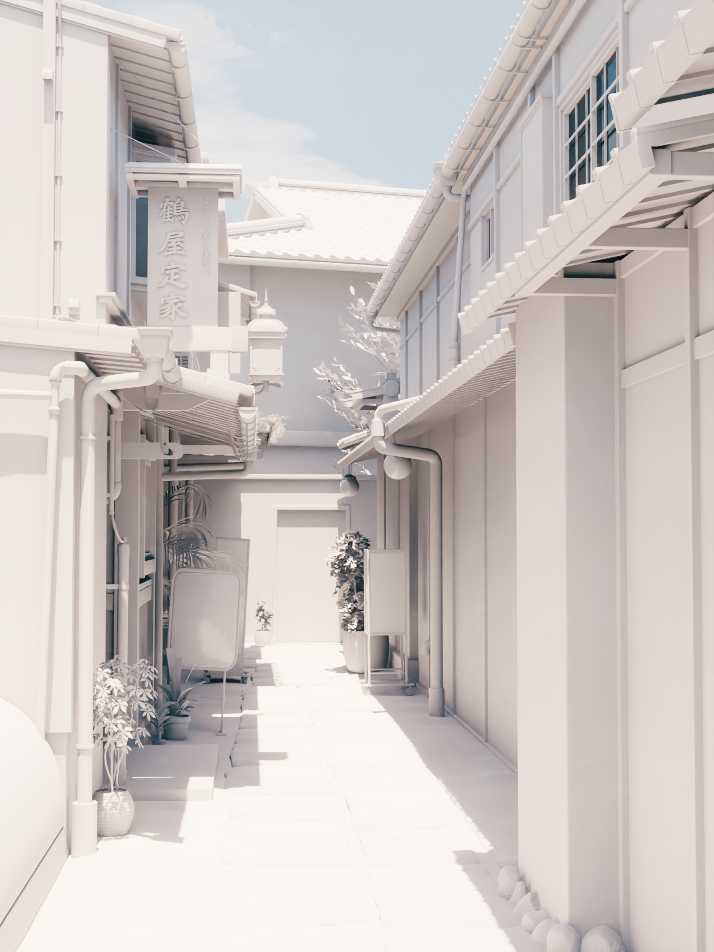
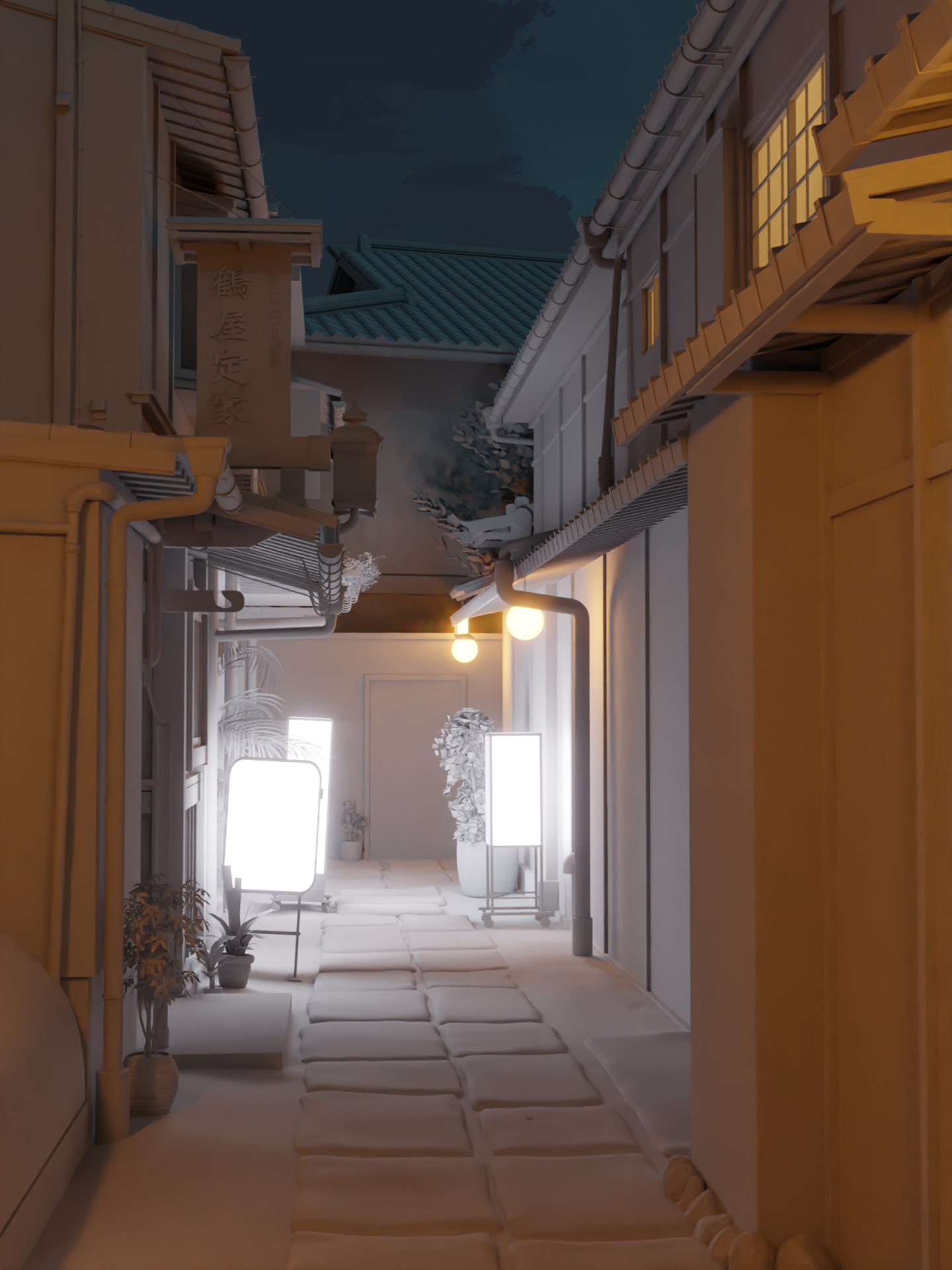
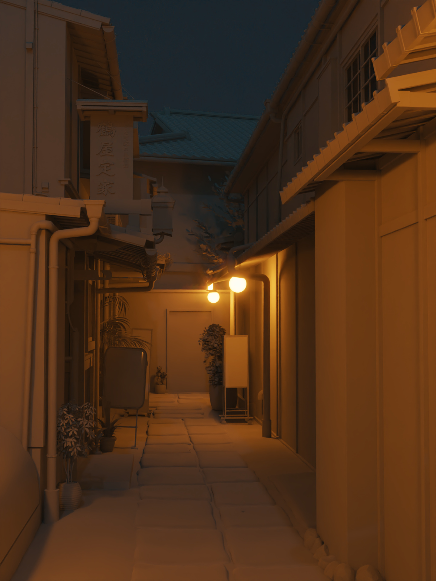
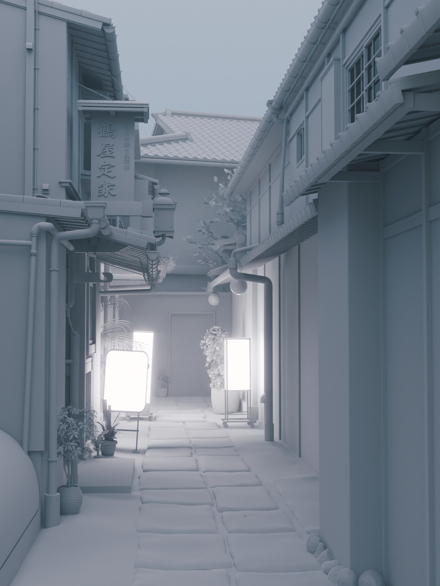
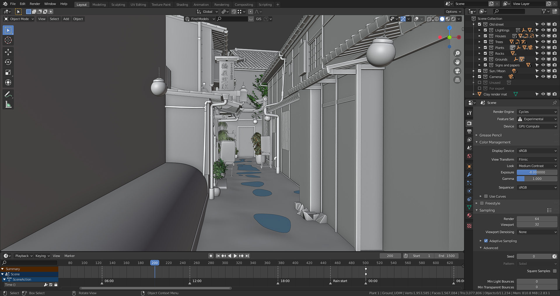
Based on an alley in Kyoto. Everything else except the plants is modeled in Blender 2.83. Some large or important objects (ground, wooden sign, wooden wall, lamp, etc) are textured in Substance painter, while others are usually either texture from cc0textures.com and textures.com, or custom made textures in Photoshop, or are just made from blender’s procedural textures (the yellow walls for example). Color grading and audios are added in Premiere pro. This is rendered at 64 samples also with intel denoiser
Besides, I have written 2 little posts on wall and water puddle shaders as well as the day night cycle in here and here
Very very nice, thats awsume. The animation is great… if it was mine, only thing i would change is how much and how long the wind hits that tree… going alittle cazy to me
The video is very inspiring - I had never thought of using a video to show the progress over a day like that in a 3D render. I like the lighting and the mood in the evening hours - I’ve been to this area in Kyoto and this feels spot on accurate. Beautiful!
Thx! It’s just by eye, the strength for the sun is around 50 at noon for example. Though for the colors it’s based on real color temperature, I used the blackbody node for all lights, the sun around 5200K at noon, and around 2250K at sunrise and dawn, while the signs are at 6500K, and lamps at around 2500K. I used the photographer addon also for the camera settings.
That’s really, really, I mean… reeeaaally awesome. It’s fun, because I’ve just spent the last two weeks modeling a japanese street too! And mine now looks shabby in comparison The lighting is top notch and the atmosphere is so lively and realist that I could almost walk into it. Bravo.
So do you just adjust light strength or do you play with exposure also?
And what is your workflow for choosing material look, especially values of diffuse maps.
Mine sometimes feel they do not match and are all over the place.
Thx! I just adjust the light strength and the exposure is fixed. For the material look, I usually just look at the reference photos and finds a suitable pbr material for that. I used color ramp or math multiply nodes to adjust the roughness, and the hue/saturation node, gamma node and color ramp to adjust the color if they don’t look right.
Uh oh what… This is truly outstanding work. I know that Blender splash is landscape and this is portrait but this should be on the splash of the next version of Blender. Stunning!
Yes, I think this is better. I use exposure + light strength to mimic photographic workflow but it just isn’t practical, because material preview becomes unusable and some passes like AO are not good. Blender should fix that. Btw. if you use hdri, do you desaturate the light?
Do you use passes for compositing or you just do basic color grading at the end?


 The lighting is top notch and the atmosphere is so lively and realist that I could almost walk into it. Bravo.