Was fiddling around with some of the modifiers and got this as a result. To me it looks like it could be a pretty cool logo what do you guys think?
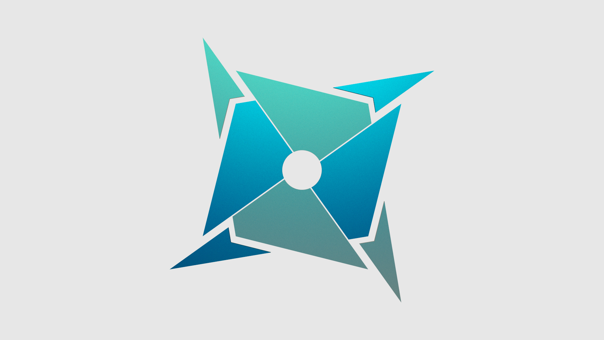
Sides are amazing, but that circle in the center is the only non-sharp part. What could you put in the center instead?
This looks really cool, I don’t see any real problem with the circle however you could replace it with a triangle or something sharp.
I like it !
I like the shape.
You should maybe give it more “volume” to make the logo less flat…
And for the colors, i think something like dark colors could be better (to give it a more “serious” impression ). You can take a look at the ironman logo,https://www.youtube.com/watch?v=EuobUmmifa8&feature=youtube_gdata_player : this explain what I say… The dark colors give a “more serious” effect. Immagine the dark knight rise (i don’t know if you have seen this movie, but you should) immagine it with more white than black… It will not be as serious, as “strong” as the black version… So I don’t know if you understand what i mean, but you should have a grey-dark background, and other dark colors on the logo. Not blue or green or just dark-blue…
But anyway, it’s good (except the colors I think. But it’s only my opinion)
Black background with a triangle, done. Though I didn’t quite follow you on the black thing heol(kind of lost me.) But I tried making it a bit darker.
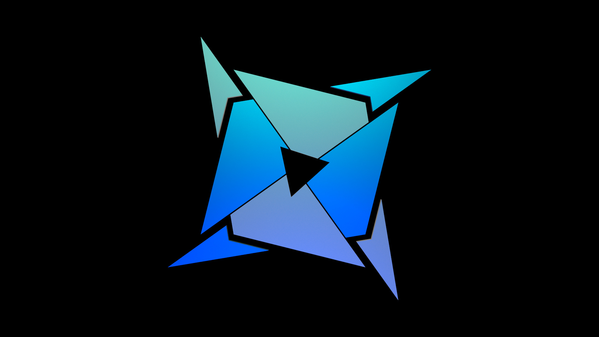
Improvement?
Almost. lol who said triangle. Your whole logo is based on 4 symmetrical sides and then you have this triangle in the middle. Make it a square or some fancy shape that’s equal on 4 sides and it will be perfect.
Triangle looks cool but its impossible to make a triangle that’s equal on all 4 sides.
you could take the overall silhouette and place in in the middle or simply a quad, where the corners of it face to the lines that meet in the center. or keep the middle blank. For the colors it depends on your taste and what you want to use it for.
But i can tell you my impressions for the bright and the dark version.
When i saw the bright logo i thought it could be some kind of buisniss logo with it’s bright and soft colors (like Internet Explorer 9 logo), but the shape with it’s sharp edges look a bit playfull to me. Together with the circle hole in the center it reminds me of a ninja star.
The first moment i looked at the dark logo it reminded me of old company logos from Nintendo64 Games. (Rare for example with simple Blue+Yellow)
However, the overall shape is not giving me the information that i want. Most logos aim to clearly give a message (brand name or purpose of the logo)
Most of The Logos use atleast 1 letter or 1 Symbol to give an explicit message.
As example for logos with letters, Rare uses a stylistic R or All Microsoft Office Applications like X for Excel, W for Word, aso.
And for symbols just imagine the Windows logo, which is very catchy. Its just a silhouette of a window with crossbar. Or Soundcloud Logo which is just the silhouette of a cloud with some cuts on the left side that reflects the visualization of the music on that page.
And as a Sidenote. With some slightly changes it could be a E-Mail service Logo, as the general shape of the first logo already reminds me of envelope with spikes.
Sorry if you get lost, but what I mean, is that you shouldn’t make a solid black background. Tou should have a texture on it. Take a look at this logo, that’s exactly what I want to say :
Not a solid black backgound, but a dark one, and some dark colors on the logo, no blue or green.
And I also think your logo is maybe too flat…
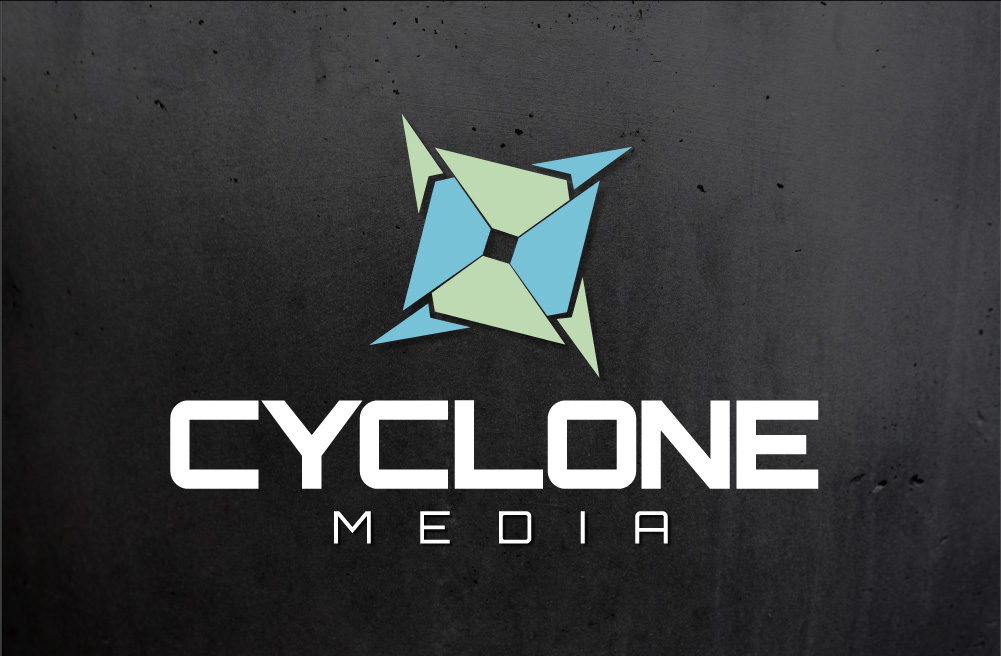
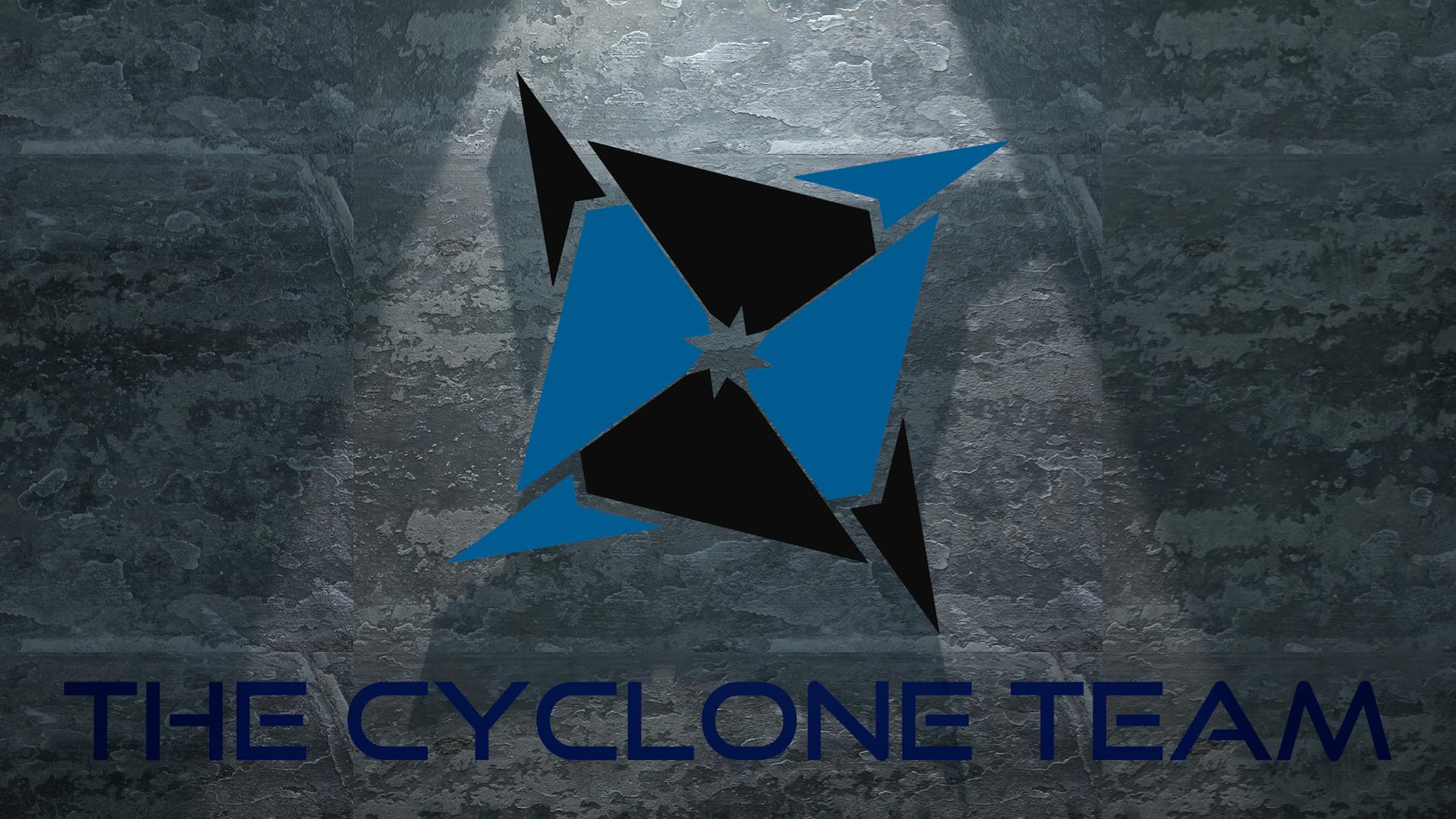
Hey everyone. Thanks for the great advice! So from the begining I thought it could look like a cyclone, vortex, tornado, etc. but didnt bother to mention it at the time. Now I think it is kind of necessary to throw in a fake name: the “Cyclone Team” (I know it wasnt the best font or in the name possibly but its just a place holder with a font I had on file.) Still having a hard time setting up the materials according to heols advice but its getting there. And I dont know were I got the triangle thing though I thought I was 100% sure someone had said triangle but maybe it was on another thread I was looking at. Now its an 8 point star. 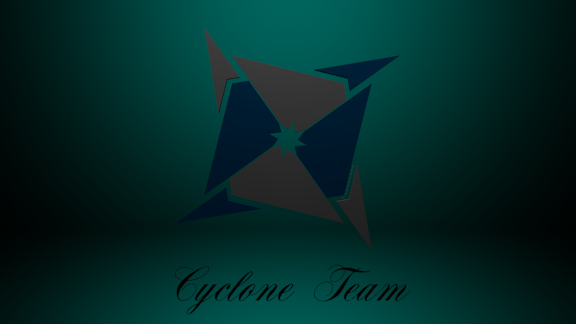
I know im taking a step back on this post but still,critiques?
It’s good. I like the new shape.
For the background, you should add a plane just behind the logo, not a “wall” and a “ground” like you done… Just a plane facing the camera.
For his texture, i suggest you a grungemap with a normal map on it. That will add details to your render.
Actual shape looks awesome. Text not so much. I actually think you could do without text, depends on the goal.
Ya I know. Just trying to explain my original ideas. and really I dont know I if I’m going to need it for anything. I might but I dont know. So not really much of a goal that Im trying to accomplish.
Thanks though.
Nice, but you sholod now add a huge vignette effect work a lot with the lighting. You sould also add a bump map on the background texture.
The logo looks clean, but from my perspective, you were better off with the circle.
Looks cool, but a (rotated) square would be better for the middle imho.
ok thanks XeroShadow
Homestly, the first and second renders were the best. You had that nice simplistic feel and a nice material on the main logo. I think you should try putting the mode lfrom the second render into the background fro mthe first. Then get an electric font and put a text below the model.
Here’s your logo. Done in Adobe Illustrator. I’m a complete blender NooB, but I’m kinda puzzled as to why you’d make a logo in blender? A vector can be scaled infinitely, can be used by sign people, embroidery people, easily edited etc etc. I know you are just doing this an an exercise, just wanted you to know. Like I said I’m a noob, but I’m pretty sure you should be going from vector program to 3D program. Less work anyways.
Anyways, The name should take priority over the symbol. Also, keep in mind contrast as well. Logo’s need to be read. All your versions had really low contrast.