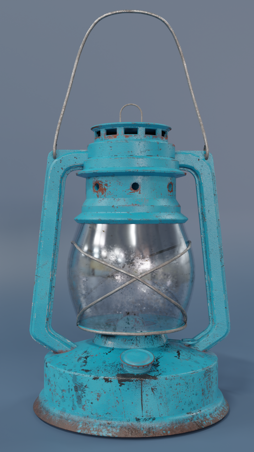
This was made as game asset, but goal is to look as real as possible. Wanting feedback on modeling and especially texturing, since this is some of first work of “advanced texturing”. Texturing done in substance painter.
Modeling would probably better with denser and more precise topology, but what is wrong about texture? Thanks in advance!
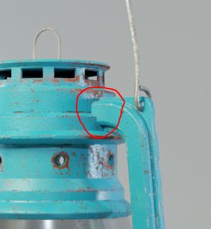
Yeah, sure. Gonna add it. Also, maybe some weld will make it more appealing, but will need clean topology flow. Maybe gonna try it and see how it goes. For handle - yes, I moved the lantern but forgot to move handle. Thanks for feedback!
Thanks! I just look at those PRO arist at Artstation and something seems off, but can’t say what. I’m glad you like it!
1 Like
Renzatic
(Professor Emeritus Billy H. Wafflesmith XIV Esq.)
6
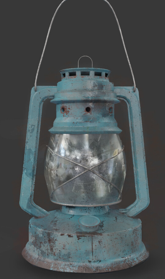
I’d say it’s not the quality of your modelling or textures, but your presentation that’s falling a little short. Give it a darker background, use a 3 point lighting setup to really bring out the contrast and shadows. Go for the drama, like it just escaped a bunch of traps in a ruined temple.
For example, I went googling on Artstation for some lanterns to use as a contrast, and came across this:
Could it be the color? It’s hard to tell just from images, but you seem to have picked a very bright shade of cyan. If the color’s brightness is close to the max, you should darken it because that’s unrealistic.
Don’t look at what other artists do when texturing, look at photos of real lanterns. If I compare with real photos, most lanterns seem to have fewer scratches and instead get covered with dust and rust, which leak and spread, because they are used outdoors in the rain. Also, looking at those photos makes me think the scale of your texturing may be off. Your rusted metal is realistic, but maybe the scale of the scratches and rust patches looks more like how a much larger object would rust.
Are you using a principled material? If you intend to use principled for realistic texture work, then you should know it has known energy conservation problems, especially with glossy non-metals like your paint. Here is a video about it and how to fix. https://www.youtube.com/watch?v=kgORQ5tMe2I
I see. Right lighting is surely more important to present models than I thought. Gonna tweak it a bit, maybe put it on some wooden table with some fire and so on. Thanks!
About color, maybe you are right. I made this all “non destructively” so I can change color and keep everything other in place. I was looking at reference and there is really a lot of different colors, since they are all metal and then painted over, so you can have any color you want. About brightness, it could be better if it’s darker.
About scale, not sure how gonna I achieve it, but will try scaling it down so we can see.
I did texturing in substance painter, so I’am not very familiar with blender texturing, not sure if this you sent can be achieveable in Substance.
Is the result not rendered in Blender? I assumed you were using Cycles in the images. If you aren’t rendering in Cycles, then please disregard my 3rd point.
It’s rendered in Blender Cycles, but I thought you think about blender texturing. But at the end, I assume it’s same whether it’s done in Blender or Substance since you import it in Blender to Princliped BDSF and tweaked. Gonna watch this video so I can understand what exactly you are talking about.
The texture is going to be the same. However, Blender’s materials have a known problem that affects the reflections (materials reflect more light than what should be possible), which can make a model look less realistic than it should.
Renzatic
(Professor Emeritus Billy H. Wafflesmith XIV Esq.)
13
You can usually fix that by setting all your materials except for the diffuse to non-color.
No, I’m talking about a different problem that’s inherently present in the principled shader and that most users don’t even know about. But the Blender developpers know about it and plan to fix it with principled v2. Here is a talk where they explain the problems and how they plan on fixing them. https://www.youtube.com/watch?v=DQeP363Xmn4
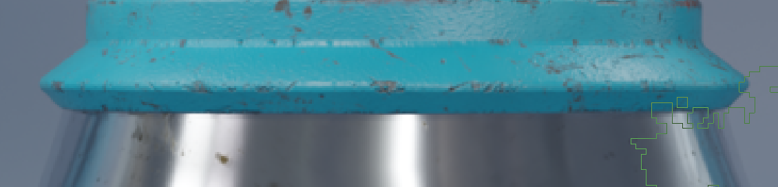
If “someone in a coal mine had just whacked this thing with gray paint, maybe a year or more ago,” then this model would be “all set.” After all, “lamps” were perfectly-utilitarian objects. The only thing that you really cared about is that they didn’t rust. Therefore, you might very well be done.
In fact, your treatment of the irregularity(!) of the gray paint, and the way that it “plausibly” tends toward the bottom of the physical object, is actually quite persuasive.
5/ I tried to broke the paint bit more by adding more dirt, it’s no mandatory, I really like what you did with the rust, there is a good balance with parts very rusty and other untouched, but you can make the same balance in other areas with another elements, like dirt, another paint color, dust, burnt marks…
It’s just about breaking the uniformity a bit more , adding a bit more contrast.
6/ in the same fashion it’s probably possible to mix a slightly variation of the main color, before adding everything else, to make in less uneven.like so :
Feedback is always welcomed. Those are some good points, thank you very much for your time! Gonna go back to this project after few weeks and give it one more chance to improve.
Photo references are your best friend. You can find tons of images, try to find interesting details, but don’t put them all.
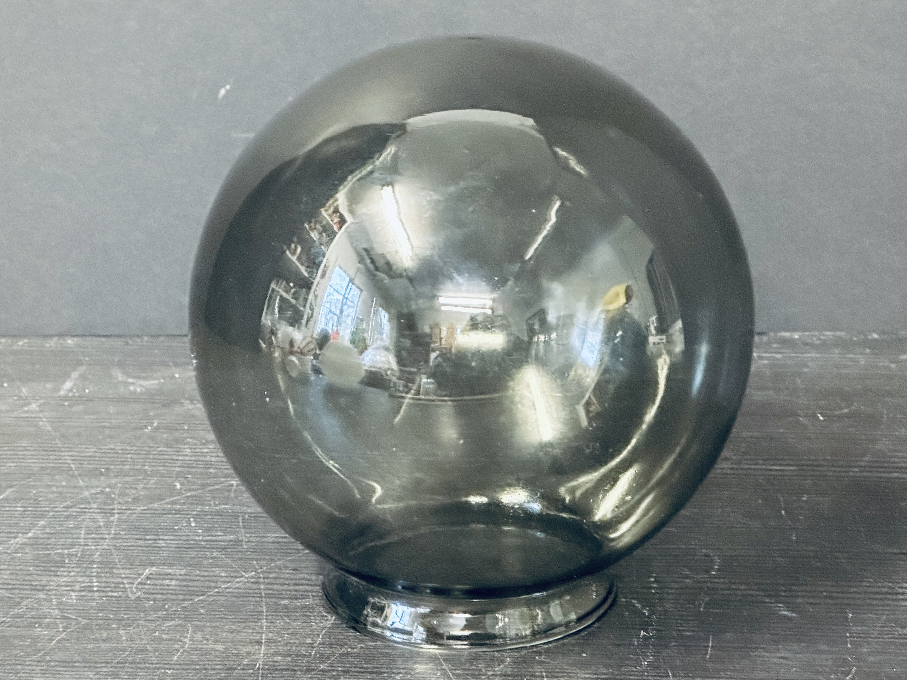
Also, my personal advice. Avoid making glass dirty from both sides, or at least make one side much cleaner.
In this particular case, inside is always dirtier, with a layer of soot on top. Outside is usually cleaner, its easy to wipe it, but to clean inside… this is serious job
… know this from experience…
I made mistake in modelling because I didn’t give thickness to glass and assume that doesn’t give me that realistic look, but I see what are you talking about. Nice tips!
I see you have experience with gas lamp thanks!