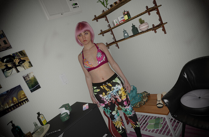
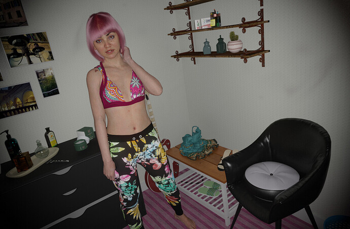
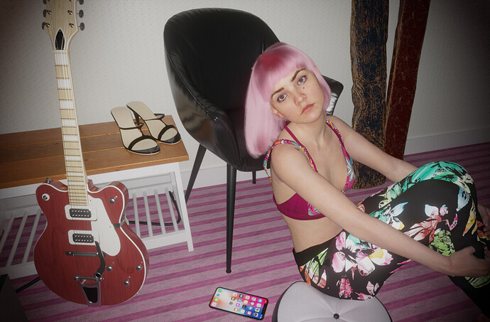
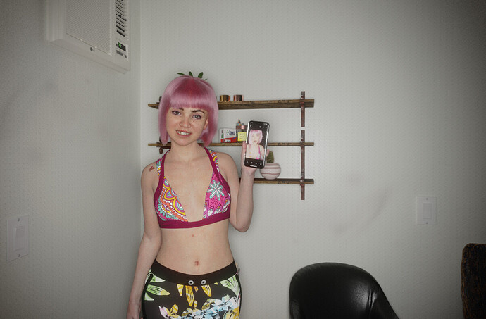
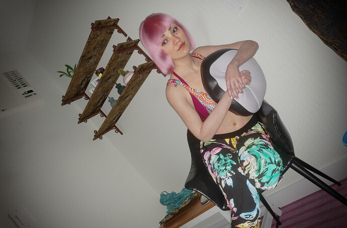
Here’s another series of ‘realistic’ renders done in Blender; tried to achieve a casual non-staged feel in both the posing and composition. Each render took about 4 minutes on my 2080ti with samples set to 1000. Many of the props in the image were imported from BlenderKit (which is amazing!). I want to try doing a male character next time…always proved harder for some reason. Anyhow, comments and suggestions to improve always appreciated.
rad eyes and front light are making their jobs.
great
Some of the most realistic work I’ve ever seen. Simply amazing.
Yes, second photo stage with this models and you do it again. There is just little line between photo and render. As previous I have one “but” about her hair. When you’ll improve it we will ask you every time for viewport screens to prove that is not photo 
Once again these are very nice renders. Although it feels like the shadows are missing.
This is especially noticeable in the fourth picture: the flash from the camera should make the chair cast hard shadows on the floor. Also, the flash should be visible in the girl’s eyes like it is in the next picture (same thing in the last picture).
I’ve seen his work. It’s also very good.
Can you please post these as separate images instead of one huge collage?
I featured you on BlenderNation, have a great weekend!
This looks crazy real. The only thing that gives it away is away is the complete lack of shadows.
I am especially impressed with the face materials and posing., but also hands. Amazing stuff.
amazing! reminds me of lilmiquela from instagram but this is way way better! great job!
Seriously guys…
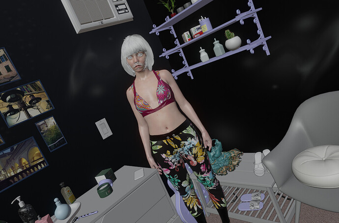
These are interior renders with a photomontage to add a photo of person onto it. Since You can even see on the “proof” second image that the model does not have the same face, and that there’s some overpainting on eyes and cheeks to obfuscate the trick.
The model’s not even showing on the black wall that is somehow reflecting the scene… ?
Photo 3 her back is inside the cupboard. Her feet is not in the floor’s perspective.
Photo 4 you can clearly see for her face in relation to the background seat that she’s partly inside the seat
She is not even lit like the rest of the scene.
Photo 5 is obvious she is not casting any kind of shade .
You can really see that there’s not the same depth and shadows from the background rendered environment than on the phone picture montaged over.
Phones, especially when flash is used really flatten a lot of details.
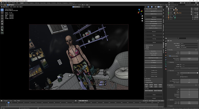
Wait, are you proposing that the girl is a photo and the background is rendered? I like all your confident logic and examples… however, it is all incorrect. It’s 100% rendered, all 3D elements. Virtually all of the interior items are from BlenderKit, and the model is a modified Daz Genesis 8 figure with custom textures/shading, lighting, etc.
Below is a screenshot of the project in Blender.
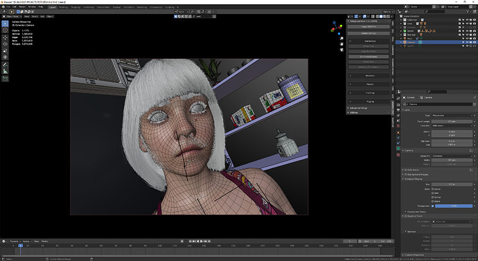
Close up of face with hair particles on in Viewport:
Real-time EEVEE viewport of same scene. Hair is white because I’m using Principled Hair which isnt supported in EEVEE, and pink blotches on wall are the grease mark that don’t render right in EEVEE.
I think they’re just a troll. Their only account activity is bashing your artwork!
 You’re probably right
Please don’t respond to that kind of post. Not Blitter or anyone else. In this case, If you can’t stop yourself, the only appropriate one is, “Thank you. This is the ultimate compliment!”


I’m so ashamed ! I want to disappear…
Somehow the result jumps as a photomontage so obviously. The background does seem to render drasticly differently from the character. Even the reflected light on the leg on the right side when you compare the first images is showing how “flattened” the character looks.
We can see like a strong lighting on the character that is not in relation to how the environment is lit. Maybe as if the character was not casting shadows.
The last three feel really off. The sitting one has so much light on her legs, yet nothing equivalents the environment to tie them together.
I don’t want to stand for a troll but I’m still not 100% convinced by the geometry of the character’s face
as that does not seem to match the geometry of the rendered face. Also some areas like the clavicle look less less defined on the model than on the result.
Same with the knees on the other post (part 1).
There’s no shame, we’ve all been tricked before. For something like this, it is quite unusual, and it tricks us into believing something. Something real. I’m sure seeing these brings many strong emotions for many people.
I that is the best appreciation a person can get “not believing it is 3d”
really nice work man

