A video of one of the elements that I am planning to use for the final render for the entry “Neon” for Blender52.
January 2024 - Luxx_pa_3d
A video of one of the elements that I am planning to use for the final render for the entry “Neon” for Blender52.
January 2024 - Luxx_pa_3d
Very cool, I love it!
Thank you, Julian. I really appreciate your comment ![]()
Very convincing. It looks almost real to me.
Thank you so much ![]()
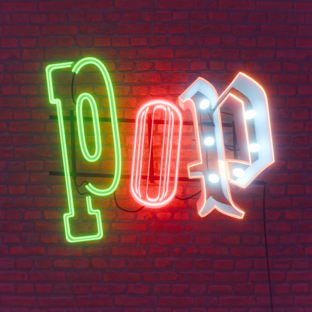
The serif P would not have 90 degree sharp corners or sharp corners at all … neon tube just doesn’t do that. And as the leading letter the blackletter P dominates it in hierarchy. The O looks droopy and diminished almost incidental. The chunky blackletter P looks ok, but doesn’t have the same power cord connection as does the serif P to the O.
And why are the letters at such an awkward angle? Is the drama all about the POP … or does that require help?
Seriously, add a glitch.
Or sequence the bulbs lighting up in the blackletter P.
Hey Neil, thank you so much for your comments - very eye opening ![]()
You got a great point on the serif P and the shapes the neon can take. I have made some adjustment to round some corners on it to make it more believable. Still some “sharper” corners in there, but I am sure the virtual neon blower who created this knew how to fuse different pieces to perfection.
I also added the power cord to connect to the last P, I was so engrossed on adding all the various connections to the single bulbs that didn’t see the big picture. Thanks for noticing.
The awkward angle was more of a personal choice, but I made some adjustment to make it more “structurally sound” and actually make those back support do something ![]() Also the difference in letters, shapes, and total disregard of hierarchy and lettering dogmas is just mirroring some of the admittedly out-of-placeness many neons in the real life display. I am sure the gods of typography will understand
Also the difference in letters, shapes, and total disregard of hierarchy and lettering dogmas is just mirroring some of the admittedly out-of-placeness many neons in the real life display. I am sure the gods of typography will understand ![]()
Finally, what do you mean by “add a glitch”?
Here’s the new still render (no time for a new video render just now):
Although the neon sign’s wall mount frame should be adjusted to be inline with the bricks and mortar, the overall typography is much better!
Adding a glitch … having a letter with a dynamic element such as a letter just about to light up and then not lighting up and then lighting up … glitch effect.
Forgive the visual, but to help define … this is one of my own from a culinary project …
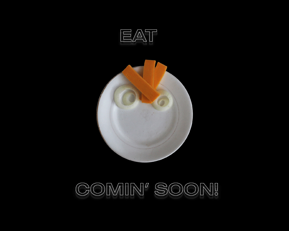
… where I added a dynamic typographic element.
Oh yeah, I know what you mean now - and some of the neons I am preparing for the final project do have glitches indeed. This POP one was the first I worked on, and surely it suffered from the “novice eyes”. I am sure you will like the other ones better.
I will make sure to add the link in here for you to have a look ![]()
Thank you so much for your critics and suggestions so far, Neil. I appreciate you dedicating your time to help me ![]()