you’re wrong, the colors, their vibrant distinction, helps to identify the position of what you’re looking for even before identifying the shape of the icon.
1 Like
Personally, in 2.79 if I want to set a particle system, I directly press “yellow stars” icon.
But in 2.8 I iterate through every blue icon (maybe except “wrench”), until find a right tab by its context.
Icon shapes are not very distinctive, so if you’d change them to chinese glyphs… well, won’t make a big difference, still be clicking every single.
1 Like
If only you actually quoted what I said, instead of cherry picking a sentence… But you know what, fine, come back when you can paint Suzanne with red so much that she becomes a cog, then we’ll have a discussion.
1 Like
Do you remember “bell bottoms”? The fashion industry is always trying to make something look “new” so what you currently have looks “old”. Microsoft is not above playing those games, and Windows 10 shows that they’re in the “minimalist” phase of the cycle.
But beyond fashiion trends, it’s clear from some comments that perception of color varies very widely between individuals. Maybe if we could look through each other’s eyes we’d say something like:
“Oh my gosh, so that’s how it looks to you!?!”
Given this apparent disparity, we’re left with two choices: optimization over the group or customization for the individual.
I favor the second (customization) whenever possible. But when it’s not possible we should strive for objective performance measures to determine the best “one size fits all” solution. That’s what my simple test was intended to show.
Several have criticized my test, and their criticisms have varying degrees of merit. That’s fine, but then please propose a better test. Or please research the subject of perception and tell us what experts have discovered. Psychologists have been studying people for a very long time. They must have dealt with this issue in designing everything from fighter jet control panels to flashy television advertisements. In fact, isn’t that what Blender itself is designed to help people do better?
My main point is that rather than just yelling at each other, we should try to come up with objective tests of performance and participate in them. My simple test is just one data point. It shows what it shows. It demonstrates the value of color in finding needles in haystacks. If you want to show something else, then please propose some other test. Objective tests like these can help us find common ground where it exists and discover fundamental differences where they exist.
2 Likes
P.S., just so we’re all in agreement on at least one point, is there anyone - anyone - who believes that they will have slower performance on the “needle in haystack” test with the older color icons? Please speak up otherwise we should consider that point settled. Thanks.
sorry, but what does this have to do with it?
With you misquoting me, twice? Nothing at all.
We are talking about the most immediate way of identifying icons
if it’s better monochrome or colored shapes …
And you wrote that the shape prevails over the color …
And I replied that you are wrong, that the colors that are more vibrant and more in contrast are more immediate to identify than the forms
And you came out with painting a red suzanne …
Tell me what has got to do with it 
Please pardon the interruption, but we’re not arguing which is more important between shape and color. That’s a “red herring”. 
We are arguing which is better between shape alone and shape plus color.
1 Like
just to clarify …
I’m not saying I’m right, maybe human minds work differently
there is an blender openmovie on this theme … 
1 Like
Cute movie and a great point. Thanks. 
Nope, that is not what I wrote. At all. I wrote that shape and context prevail over color, though color can be used to define context. And I agreed that in that particular test, color indeed helps. You just cherry picked the first part and threw everything else away, is all. Maybe I should’ve written the second part in a different color…
I’m assuming that’s meant in good humor, and in that context, it’s very funny. Thanks. ![]()
Is there a situation (other than absolute color blindness) where color wouldn’t help at all … for anyone?
Even if you only had two choices, wouldn’t a color difference be helpful to distinguish them more quickly?
Of course, as the number of choices goes down, the benefits of color also goes down. But are those benefits ever zero?
You could start by making some easy changes to make it a better test.
For a start, first ensure that the backgrounds of each test are identical. The 2.80 sheet has a background color that approximates that used on the default theme. So change the background color the the 2.79 sheet to match. Currently the 2.79 sheet is using a lighter color that is increasing contrast.
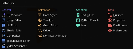
Many of the icons in 2.80 are, in fact, colored. So color the icons on the 2.80 sheet to match how they are shown in the UI.
You’re welcome ![]()
Wouldn’t help at all… with what, exactly? What would the color even convey?
Let me put it this way:
In this very discussion, we’re all dealing with shapes. These shapes are organized into groups, which are separated by other (smaller) shapes. They’re (for the most part) monochromatic: one color on a uniform background. Do you have any trouble, at all, figuring out what these shapes are and what they mean? As in, is it difficult to read and understand this text?
For most people, it isn’t, though there are always strings attached.
But, that’s reading. What about searching? Well, ctrl+f notwithstanding, when you have some random text, how do you find a particular word? With an index, it’s very easy. Without an index? Can be difficult. Depends on what the word is, and what the text is. In one sentence of three words - no problem. In an essay or a multi-page address?..
That’s why it’s (was) common to highlight passages or words in written texts with colored markers, mark off sections with (colored) tabs and/or bookmarks. For easy reference. Nowadays we of course automate such highlighting for structured texts (e.g. code).
If you were to make the whole UI for a program like Blender monochromatic, you’d have no problem “reading” it like text, but good luck finding a particular tool or button quickly. So of course color is helpful. Thankfully, the UI is (at least somewhat) organized, so you usually have context for your search: you look for selection mode in the header, for tools on the toolbar, for property buttons in the Properties editor. This already narrows it down. But to further narrow it down, color can be used, and is used. In a three-word “sentence” (selection modes), color is useless, so they’re monochromatic. In larger “sentences”, color becomes a tool to differentiate intent. E.g. in Properties, globals are gray, materials are red, effectors are blue, etc. This is why your test isn’t at all representative of a UI, or even “the” UI: we’re not searching for a needle in a haystack, we’re searching for shapes in organized groups. Organized by color, or by location.
So, back to the question, is there a situation where color wouldn’t help at all? Yes, of course there is. When color is meaningless. When it doesn’t represent anything other than itself. If I understand the current vision correctly, that’s exactly what the new UI is aiming to avoid.
Oh, and on another note, since no one pointed this out yet, the screen.region_flip() operator hasn’t gone anywhere, at least yet, although it’s no longer bound to a key by default. So you could run it on the toolshelf and sidebar and flip them, achieving a tabbed bar on the left side ![]()
1 Like
I like to think of something …
If the shapes were more important than the colors, the colors that are a certain refraction frequency of the light we perceive, nature would not have created these senses, or the colors of the flowers that attract the attention of the bees, would have been monochromatic…
to better distinguish the thing then:
colors attract attention first
the shapes are symbols, you recognize the symbol and you give it the meaning, or you recognize its meaning.
The bees in this case distinguish the type of flower with the shapes …
but they are attracted by far from the color then they recognize the precise flower when they approach the shape.
Ok i’m saying obvious things … but better to highlight them …
You’re conflating instinct and rational thought. We’re talking a program UI here, not how to find food and not get eaten in the process
Color + shape will have the strongest effect on the brain’s ability to identify->process->react. This is the series of events our brains go through when interacting with everything around us, though it takes in all senses (sound, smell, sight, taste…ect). Since this is software we discussing, we are really only limited to audio and visual.
With regards to the visual, the use of color is inherent. For example in nature we see it used to warn of dangerous insects or plants. In society it is used with our traffic lights as well as our road signs. Color is just too effective in identifying and processing on a cognitive level.
A good GUI will balance color with a focus on generalized pattern recognition. When we are looking for something in the GUI, even in a list of text options, it is through pattern recognition (or rather our brains is going to look for a recognizable pattern even before reading the text itself). A certain shape of sliders next to a bit of text will be seen as a pattern before we even get around to reading and processing what the text says.
One problem I have with Modo for example is that a decent chunk of the GUI is either list based (text based panels) or property tabs that all look close to identical. The result is it becomes hard to to find what you are looking for. Thankfully the other GUI elements are fairly strong on a visual pattern level, so its not a complete mess design wise.
Blender is strong in this area. There are so many parts of Blender that are visually unique and show different visual patterns. The most recent choice to use color tabs in the Properties editor highlights this. It makes navigating through the various levels of the editor quick and on a near subconscious level. There are very few text based lists to dig through, and when there is text it is in a panel with very unique patterns around it.
So what is the point of saying all of this? To suggest bringing back the old style of multi-color icons ? NO! I think the monochrome approach is a big improvement over all, though perhaps a bit too extreme in its usage. If too much color (especially non-themed) is spread around a GUI can actually result in visual noise, which only ends up making it harder to identify what you are looking for.
Remember those Where’s Waldo books where you have to find a particular cartoon character in a sea of cartoon characters? Well if he was the only one drawn in color, and all the others were in black and white, finding him would be near instantaneous. However if the entire scene is full of various colorful drawings, which makes it harder to identify the character you are looking for. That’s the point of the book’s challenge to begin with, to make it hard to find something on a page.
Thus some color in the right areas can still result in quick pattern recognition, not just for the interface element itself, but also those around it as it serves as a visual marker which leads to something else. For example, I might know a certain slider I want is about two inches above a colored icon that has nothing to do with the slider I want, but I know where the slider is based on the proximity to that colored icon. The colored icon is always going to be easy to find in that case.
Autodesk’s Maya seems to have figured this out as well, as the newer version’s GUI changes address that. Instead of full colored icons with different color patterns for each one across the GUI, they limited it to a few colors, which are part regional, part function based. This creates a lot of visual patterns to pick up without too much visual noise. Granted, I still think its a bit too much on their part, and prefer Blender’s GUI approach more, however I can say Blender could use this approach just a bit more.

Have some monochrome Icons have a color outline or component based on what they are for, and let the themes themselves dictate which singular color goes along with those icons. Use it sparingly but lets the themes drive the occasional color based on function or category. They could also easily be one color (thus monochrome) at the user’s choice, giving the best of both worlds. Example:
5 Likes
After 578 replies, I’m not sure I can contribute much to this thread
Just know, that I am new to Blender 2.8, and I missed the golden age of UI design that was 2.79 (sarcasm).
I am enjoying it, but obviously I am customizing it to my liking, because honestly, blender 2.8 needs a LOT of addons and customizations to be considered… up to the standard of say, “maya”, “3ds max” or “cinema 4d” and even then, I’m not really 100% sure.
There are some great features in all of these programs, but to say Blender 2.8 is unusable because its UI is trash would be a stretch. I suggest, just getting used to it.
1 Like
Hehe, download 2.49b. Now that, that was a UI with a capital U.  Only half-joking though, it was, after all, a thing of its time. Mostly.
3 Likes