Found this on google.
Obligatory meme response:

Initially colour may make it easier to find where to click, however, with repetition the learnt position of the icon is probably more important. I find myself already moving the cursor towards the general area I need before my search for the individual icon begins. Consistency is probably a better goal than what the actual icon looks like. I have been clicking on a floppy disk (stiffy tee hee) icon for save as long as I can remember, so changing the icon irks me as it confuses me, but if it is in the same place I can figure it out quick enough.
That said, I have always prefered trying to memorize keyboard shortcuts, no mouse or hunting tiny, often obscure iconoglyphs involved. Sadly, pain in my hands and wrists is forcing me to use my stylus over keyboard and mouse. The Blender UI is this regards is a little lacking, to say the least, but I now have something to contribute to Blender if my UI experiments pan out. Better integration of multi-touch/stylus input in the Blender UI python API and integrated, OS independent settings for touch and stylus would be a godsend. Three finger pan and zoom anyone?
Thanks. The rest of your post is very good, but that opening sentence makes the key point.
Hot keys are great and people will generally learn them as they go. But the initial experience is all about what can be seen and learned.
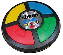
Maybe the next fun test should be a Blender Addon version of “Simon” played with both monochrome and colored icons to test their memorability.
They should remove that op so there will be no way back to 2.79 sweet left toolbar ![]()
It is really strange that many new features comes with options to toggle but left bar is replaced without any options…
I’ve been a 3DSmax user for almost 20 years and Blender 2.8 UI is one of the main reasons why I switched.
3Dsmax is a thing of the past, let it die in peace.
I have been using Maya for over 15 years, and Maya’s UI has pros/cons, same as blender’s UI has pros/cons. For instance, Maya has a superior quad view, whereas blender’s prefab quad view is extremely limited, and you must set up multiple 3d views, and split your interface into multiple windows to make the quad view functionally useful, imo. Otherwise, it’s just so limited that 99/100 times people don’t use it, which is exactly what I see when I watch certain Blender users on Twitch.
In fact, I recently just discovered that blender’s stock “View Selected” feature relies mostly on 3d Bounding box, which is great for when you’re trying to frame an object in a 3d viewport, but not so great when framing it in a 2d orthographic viewport. This means, that stock blender behavior, is to zoom the camera out to inconsistent and sometimes wildly unusable distances when framing objects with geometry length that is disproportionate in one or more axes. In other words, if Blender devs ever hope to make quad view useful, they’re going to have to start addressing a lot of things that are not necessarily linked to quad view, so that everything works harmoniously.
Blender is more reliant on pie menus, popup menus, context menus, and keyboard shortcuts than Maya. Yet, customizing these things is really difficult to do because the keymap preferences needs a major overhaul due to keymaps always conflicting with each other, and the existing UI is barely able to address this.
In addition to that, lots of options are scattered around in areas where they probably shouldn’t go, which negative affects usability/efficiency.
Some of the tools have their options shown at the top, whereas some have their options shown at the bottom in the status bar, which is a design inconsistency, and telling that the UI is far from being complete.
So, to me, Blender’s UI is like a fresh coat of paint. If you wait for it to try, then start chipping at it, you’ll find mold beneath it. It seriously needs some improvement. While the UI is what drew me in to use blender 2.8, the more I use it, the more I realize it is superficial and in a lot of ways, not that good of a UI.
Aside from that, I am really enjoying Blender, enough so that I have dedicated the past 6 months of my life to improving it with add-ons, and trying to help others move to Blender. It is the future, for sure. 
they tried to adress that with quick favorites but the problem still and even worse with the sidebar & Addons that are crammed since everybody is putting them there.
Maya have Shelves & a Shelf Editor with tabs and u can put hundreds of commands,Menus and plugins in a clean way, I hoped to have something like that but i guess we have to deal with “the Blender way”.
How is the keymap conflicting? I use a pretty standard keymap with only slight modifications and rarely have problems.
Something like this would be great. I don’t know if it’s possible via scripting, but it is a little annoying the way regions need to be split in order to get a 3d view and the shader graph, and something like what you have would be awesome. Some kind of popover region (basically a floating window that locks to Blender, which I think a lot of users have been requesting for a long time) would make this and many other things possible. I’d also love to see it possible to make the outliner float like this, for example.
Pie Menus and popups are notoriously annoying when it comes to keymaps, because sometimes add-ons will conflict with each other, sometimes blender treats Shift+(Letter) the same as CTRL+SHIFT+(Letter)… sometimes you have to put keymaps in “Generic 3D View” as opposed to “3D View” to get around conflicts.
And, if you’re developing add-ons, if you want to provide a way for the user to easily customize the keymaps from say, the add-on preferences, as opposed to the keymaps, then you have to jump through hoops and do all sorts of crazy stuff that I still don’t fully understand, because I’ve had to seek help from more experienced community developers who understand it.
Sometimes, if you intend on having multiple keymaps for same name operators, blender will try to combine them together, so you have to be careful about not letting that happen.
Sometimes, if you are editing a keymap and you search for it by keyboard shortcut (i.e. SHIFT+F) and then you change the keymap to (SHIFT+T), it just instantly disappears because you’re filtering by “SHIFT+F”. This can sometimes give you the impression that the keymap was wiped from existence if you’re not paying very close attention.
As an add-on developer, I would like the ability to customize the keymap name so that keymaps that share the same operator can be differentiated somehow. Blender keymaps always show the operator name, which can be useful sometimes, but limited/confusing other times.
Long story short, modifying / creating new keymaps in Blender is severely problematic, limited, annoying, and confusing. There should be a visual keyboard representation, similar to the way Maya does it… where you can see, at a glance, which keys are free, and which keys are in use… etc etc. This is a major league learning curve for new users to Blender, and it is going to require a dual pronged approach to resolve it (i.e. better UI and better functionality).
This is not me suggesting blender should become more like Maya, this is me suggesting that when a feature is good, it should be used, and right now, Maya has a superior hotkey editor, so it’s worth understanding why that’s better, so that blender can learn/grow from it.
If the developers do not treat this as a problem, then it will never get resolved, and that would be a shame.
I can answer that, since it literally took me months to customise Blender keybindings to my liking.
Not only doesn’t Blender warn you about conflicting keys when changing one, but you have to customise each mode separately to ensure that the same tools have the same keybind to retain UX consistency. Then there’s the issue where the Keymap names don’t actually reflect their actual names in Blender itself, so you have to activate and deactivate the keybind to double and triple check that you have found the right one you want to change.
You also can’t R click a tool, menu item, etc. and search that keybind up so it directs you to the correct Keymap section. So unless you get very familiar with the Keymap naming system it can possibly take hours to just find everything you need. Finally, if you happen to remove an important keybinding in your Keymap by accident, you then will have to find the proper RNA code to write it back into the Keymap. My solution is to open a second Blender window and just copy parts from the default Blender Keymaps, which you may see can be annoying.
Luckily for me I don’t have to make sweeping changes anymore since I am now mostly satisfied with my Blender, but it sure as heck was very annoying having to deal with this system.
The one thing I can say being a very positive aspect of Blender keybinds is that it gives you nearly 100% control over what you want to change. I was able to customise my mouse to contain nearly every selection tool and command as well as the most important menus and pie menus I need to work efficiently while using modifiers and tweaks. Still, Blender sure could make the Keymap experience a lot less obnoxious.
Neltulz also brought up some additional points which I have experienced as well.
Hmm… yes. Good points.
I came from 3ds Max and found it awesome that in Blender you can change nearly everything to your liking and loved it. Also that the defaults were not as absurdly stupid as the 3ds Max ones.
But, yeah, things like no warnings for conflicting keys and disappearing when changing in Blender can drive me up the wall as well.
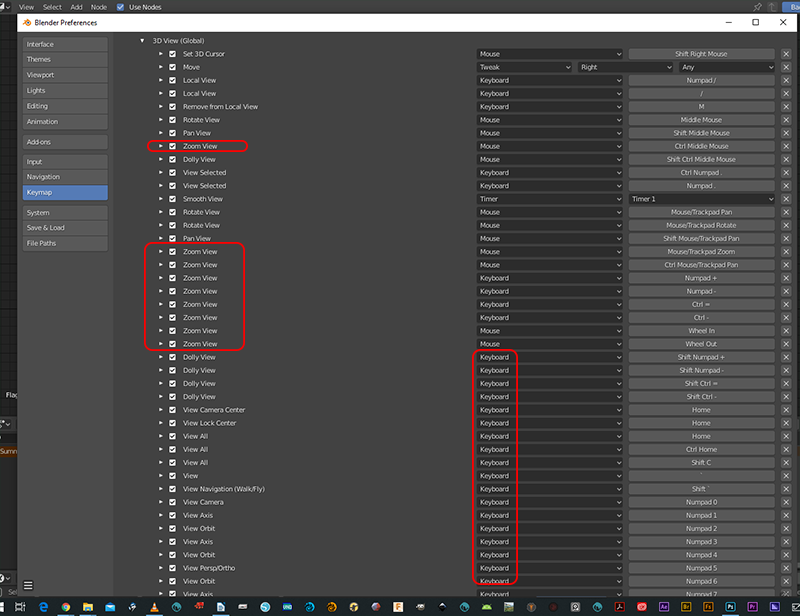
I’m not a developer, but I will put in my $0.02 that the g.d. keymap UI is virtually opaque to this newish user. It’s massively confusing. Besides every window having its own keymap, the design is NOT conducive to actually finding a given function. There’s 25+ different main categories – in sheer confusion it is reminiscent of the dozens of fields in theme configurations, but less understandable. The design is cluttered and repetitive. (The points above about conflicts are on point too.)
It won’t be easy, but IMO it needs a complete re-thinking.
Signed up just for this thread.
Do you know how much time I spent learning Blender? It wasn’t easy and I was proud of my achievement. “The Blender UI isn’t easy to learn, but once you got it, everything makes sense”, that’s what I heard many times.
And now you change it. I just noticed after coming back from a break. I’m angry and disappointed. Blender is now going down the route of “negative improvement” updates (Verschlimmbesserung). I’ll be using 2.79 forever.
I can’t say this more polite: You are complete morons if you didn’t know that a huge part of your product is the 10000000000000 helpful forum posts about whatever problem someone might run into which describe every solution in great detail with screenshots to the right buttons and shortcuts.
Blender may exist for a long time still, but clearly you’ve taken the path of self destruction, so good riddance. Maybe not now but in 10 years. I bet next every button is getting gender-neutral descriptions. Another one bites the dust.
wow, such a short glossary? ![]()
keeping bond to 2.79 is perfectly fine, Blender can do amazing things, all of us have done great stuff in the pre-2.8 era.
You’ll only miss every new bit of awesomeness, and you’ll feel out of time once the majority of tutorials out there will be done in the new UI.
I felt a little like you in the beginning, using 2.8 was hard. Then I forced myself to actually use it for work. For a new project. Then another and another one. Now it’s quite easy and, incredibly, i feel a little strange when I open 2.79 for older files
That’s the slowest self-destruct I have ever heard of. You sure you’re not overreacting a bit? Maybe write some bug reports or leave feedback on RightClickSelect and Devtalk if you feel like something isn’t working? Have no idea what you actually want when you leave out any specific criticisms of the newer design.
IMHO the best path of self destruction is sticking to obsolete 2.79 and watching almost everyone else disappear in the distance in front of you as you are left behind in both terms of quality and efficiency of your work.
Suffice to say if you consider just learning Blender to be a difficult achievement to be proud of, then you probably never had a chance in the first place.
I miss baking of displacement maps,
I miss the advanced features in blender internal render.
I miss shortcuts that were remved and the keymap editor is pain
I miss undo performance
I miss material override in render layers.
I miss a lot of other stuff too.
you can still bake displacement maps.
What advanced internal features?
Shortcuts can be added back inn
Performance… Im sure they’ll improve that as time goes on, not just with undo. All though i havent experienced any issues with it.
And they removed the material override with layers all together. What function did material override serve you? I think you can perform the same task in the collections tab.