Not only US keyboard layout. Any keyboard that uses QWERTY will tend to have the same key between ESC and TAB. UK keyboards such as I use for example.
What is that?
Sounds like a perfect place to map that pie menu then. (Since it’s not being used.)
Note that in US/QWERTY boards it’s not literally the tilde, it’s the “reverse accent” character, the tilde is the SHIFT version on that key.
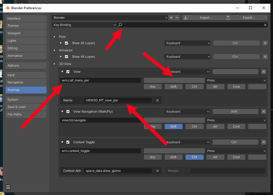
Here’s a screengrab of the keymap for that: w/any luck you can just plop this into your keymap and get that particular pie menu. Good luck!
1 Like
Face step defaults to on, but if you disable it, then expanding the selection will work a bit more like how it works in Maya, so if you are in vertex or edge mode, then expanding the selection will select only directly connected edges and verts, not all verts and edges connected to adjacent faces. To be honest, I probably won’t use it much, but it’s nice to know it’s there.
Tnx. I think “OFF” for me.

Why floating panel for available tools depending on selection( vertex,edge, face) near cursor is not by default like Maya ?
Like tools options is another floating panel displayed near the cursor for fast acces.
It’s lot more practical, more quickly accessible, and lot more friendly for those not using all shortcuts keys.
Why is not those great floating quick access panels default ?

the UI is better but some really stupid choice were made but this is too long to develop. good bye reynish that’s all… one: click on nothing deselect in edit mode. lol
and another. menu like alt c were the answer to less shortcuts. but they deleted it by default. lol
and so much on. improvements + regressions. wtf?
leaving my opinion here, I used to love the 20 layers thing. it’s much easier on my brain to remember the position of a layer on a grid rather than remembering and searching its name through the mess that the outliner usually becomes when working on large files.
I’m glad he managed to sort of keep it even when removing it.
And I dont think it’s a waste of space, at least not more than the toolbar and the already top bar wastes.
5 Likes
Leaving one more opinion here.
I think the toolbar and active tools are useless and I never use it. and its kinda mildly annoying having to hide it every time I add a new 3D viewport.
3 Likes
That seems like a complaint. If you ask about how to do it there may be an answer.
I’m glad QCD helps you. 
@BlackRainbow
For the record, because I didn’t state this very clearly before, disabling QCD in the addon’s preferences will remove that widget from the header, leaving you with just the collection management via the main popup.
Since you and @BlackRainbow seem to work with complex scenes I invite you to leave some feedback at either my feedback thread here or the development task. The Collection Manager is designed to make working with very complex scenes as quick and easy as possible, so if there’s some cases it doesn’t work that well or if there are things you can think of to improve it, I want to know.
1 Like
Terrible, I am sick of developers “improvements” that reduce my productivity because I need to completely relearn the software interface. Not exclusive to blender for sure. I can’t afford the time to relearn.
1 Like
You must be kidding. Blender isn’t well known for changing its UI. Before 2.8 the last major UI refresh was with 2.5, which according to wikipedia was way back in 2011. Actually, for years it was criticized for the exact opposite. There was even a fork of blender that tried to address UI concerns before 2.8 was released.
6 Likes
What exactly are the problems you’re having?
I’ve noticed a lot of people try “figure out the new UI on their own” instead of just describing the problem and having someone tell them the workaround or actual solution.
You don’t have to switch to 2.80+ - I hear there are a few places that use 2.79 and have no intention of updating for at least another 3 or 4 years.
I’m an amateur who started using Blender in 2019 so I don’t have the first clue about professional productivity. All I can say is I started in the last days of 2.79 and then added 2.80 and then continued using 2.79 because the bulk of tutorials at the time were still for 2.79 (or earlier). I’ve done 2.5x tutorials in 2.80. I’ve done 2.80 tutorials in 2.79. To me, 2.80 is just a more sanely rearranged version of 2.79 but lacking performance in a few areas.
In the meantime I had a voice conversation with multiple artists on a Discord art server the other day who said that they didn’t even want to touch Blender before 2.8 came out and made the software more accessible to them. I was also one of those people and I probably wouldn’t be here using Blender if the shift in design philosophy didn’t happen with 2.8.
The changes might not have worked out for some, but Blender is nowadays a more popular program because of those changes. I hope the devs keep tinkering away at the UI and try to improve the user experience, since so far the majority of changes have been a great success.
8 Likes
honestly 2.8 was such a drastic improvement - I see that with the 90 plus students I teach Blender to each year !
poor students I pushed through pre Blender 2.5 10 years ago …
some actually are so stuck with it they cannot move on to the new UI - face palm
5 Likes
I guess I can understand this for people who have been making a living with Blender for more than a few years. But for beginners once you’ve done the donut tutorial in both 2.79 and 2.80 there’s really no difficulty bouncing between the 2 versions. I’ve helped people who use 2.80 at home but their computers at school or the library can only handle 2.79. For beginner modeling, beginner sculpting, beginner animation, and cycles rendering there’s no big difference. Many people if their 2.90 computer dies they can grab an ancient laptop with 2.79 and still get some work done.
1 Like
So funny to read this. Because I am trying to use 2.79 since Blend4Web is not supported in later versions. And the old interface is so different it is completely unusable for me. I know I’m not used to it, but as far as I’m concerned it’s outright terrible. I’m finding it very frustrating to do anything with it.
3 Likes
I can help. What’s annoying you the most?