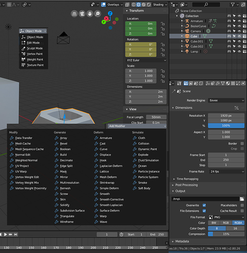
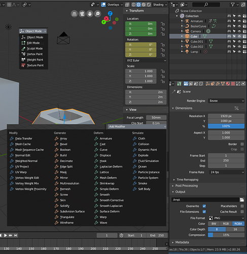
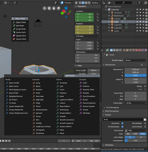
First off, I really like the new icons! In most places, they are a clear improvement. Seeing stuff like the new Incremental Snap icon in 2.8 is great, it just makes me happy. I do see that’s there’s quite a bit of discussion on colors. So, here’s a bit of a mockup!
When multiple icons are shown close to each other, having them all be pure white can be a bit confusing.
However, colors should not be random. Colors should have meanings. In Blender, Orange is used to show selected objects, selected vertices and so on. So, Orange could be used as a symbol for things that only affect the “Selected object”.
I’m not great with colors, but here’s my 2 cents, a screenshot of 2.8 as it currently is, and a quick edit to show my take on what it would look like if icons had more color.
Other colors in the current 2.8 UI are:
Black         Background, Overlays,
White         Neutral color
Blue          Selected tool, or Z axis
Green         Editing tools, Mesh data, or Y axis; Animated property
Yellow        Keyframe on selected object or property on current frame

Orange        Selected object, active object
Red           X axis, (material data and lamp data in Outliner)
Green is seen in the Tool Shelf icons when you’re in Edit Mode. It is also used in the outliner for Mesh data and Armature data.
However, Red is used in the outliner for Material and Lamp data. I don’t know what the logic is, there.
Deletion icons and/or destructive tools should be red, but I haven’t seen any icons for them yet.
Modes are Object, Edit, Pose and Sculpt (changing the mesh, curve or bone data), Vertex and Weight paint (changing object data), and Texture paint.
Modifiers are divided into four categories: Modify, Generate, Deform and Simulate.
Tabs in the properties panel can be divided into several categories: Tools, Global settings, Object Data, Object-specific settings, Shared data (materials, textures), and… whatever Constraints, Modifiers, Particle Systems and Simulations go under. These could be divided in a few different ways.
First off, Tool Settings should be green, because it is the tab used to get more options when editing things. It isn’t only used in edit and sculpt modes, but it’s very useful for them.
Object Data at the very least should be orange, since that’s also Orange in the outliner. For visual grouping, let’s just make all the first four icons in there orange.
Materials are red, for whatever reason, so maybe the icon for materials and textures could be red too.
If more colors can be considered, then maybe some sort of hot pink / magenta would be useful for all that weird 3D stuff like simulations, or normal map editing, or that sort of stuff.
Of course, things do get a bit trickier when you have selected something (blue highlight) and the icon itself has colors.


