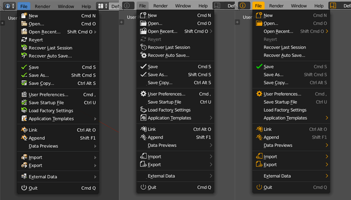
In this example ignore icons design and used orange color. I just want to show that
- not all items need to have icon its much easier to read the list with “breaks” empty space
(used icons here for most used ones to attrack user attention first) - its much easier to “read” screen if text or icons use different color (it can be even grey text and white icons, just do some difference between these two things)
- less dominant shortcuts
