Honestly, for me it does not matter what the icons will be.
I can agree with any icons, provided that they will be more convenient than the old ones.
1 Like
Does not look like a proof of anything to me. This looks terrible to me - it’s confusing as they are all too similar visually, they are not easy to remember. I like grey stuff and it looks more pleasing in general without color but as far as functionality goes, I think this is absolutely terrible. I need to stop and concentrate to distinguish them, this is not something that I want to do 100 times a day. If they do not help to spot stuff quickly why keep them at all then? This seems like it defeats the purpose of icons. Color is very important in remembering them and distinguishing them fast. Bad idea. There should be more of color coding going on there, not less.
7 Likes
Discarding color as information forces greater mental exercise by comparing value-only based wiggles to one another. It’s can be tiring depending on quantity. Personal preference is context based coloring in vector style (flat, maya like).
Basically if other leading applications don’t have it, don’t do it. Example where orange color tells user exact context:

3 Likes
@cgstrive
And that’s my goal! Colour codes in places where it’s needed, with assumption, that chosen colours are global across UI and are bound to most important operations, such as (random colours):
- blue - modifier;
- green - creation (new geometry, new item in the list etc.);
- purple - modification of existing geometry;
- red - delete / erase / remove…
and so on.
So far I made small bunch of pictograms for items that hasn’t particular global function and are not operators, but their icons are widely reused across UI causing it looks stupidly colorful in a purposeless manner. Colour will be back, but it will cover whole icon, and will be restricted to icons crowded spaces.
On the other hand, it’s pointless to colour “Add Mesh Primitives” icons in a special way, if they’re placed in a menu, that One has to enter intentionally and He exactly knows where He is - every icon will be the same colour, so it doesn’t mater if they’re grey or orange.
People don’t like changes cause have to learn new things and modify their habits. That’s understandable - humans are really lazy animals…
This project isn’t official icons redesign. No one says, that my job will go to the Branch. I do it just for fun.
So far I enjoy it more and more 
7 Likes
Understandable and please don’t get me wrong, it’s very well designed, just commenting on color aspect. I was a bit lazy with my example (quick google, infact blender add prim menu is same). Should you open black and white icons in IconViewer or use in some more populated context, it can be mentally fatiguing to analyse.
My personal preference is reflected well by @TheRedWaxPolice. Clear/minimalistically well defined, context based, flat, modern.
Subjectively I think it could be cool if this feature is something that can be toggled in preferences. I have a feeling that new users will find color based visual cues informative. Experienced users with muscle memory might want to design cool themes where these colors are out of harmony, preferring minimalistic style.
1 Like
That’s one of my goals - to avoid mental fatigue. WIll do my best ![]()
One last word about colours - what I plan to get rid of, is all colour that imitate real world - brown wooden chisel handle, coloured refraction and reflections in magnifyin’ glass, all stylized reflections and so on…
Great to hear your ideas on color will match the 2.8 toolbar icons.
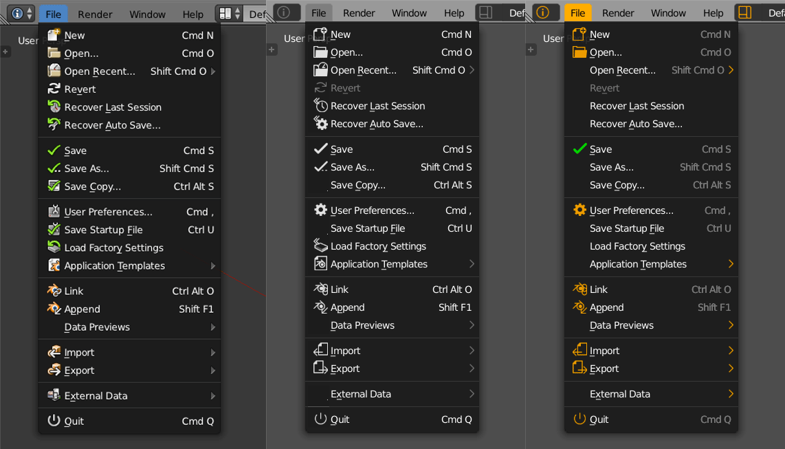
Your file menu example was still hard to read (for me atleast) but perhaps adding small colored parts will improve that, like adding a green ‘+’ next to a black/white file icon makes things clearer then the current blender icon set.
Great that youre sticking to your idea, but are open to suggestions
Cant wait to see what you come up with 
1 Like
I like the initiative! Quite a few of the samples shown so far look pretty good although some of them are a bit too flat i think: take for example the icon for the graph editor: if the lines would have different tints of grey or even a subtle gradient, then its visual ‘weight’ would be more in line with rest. You did this already for the last icon in the editor row (the two wrenches == options?). Same applies to the icons in the mesh row, for example uv-sphere and ico-sphere. Also I would say that the 3 element selection mode icons are over simplified: the cube illusion is gone, leaving just a flat hexagon. This again might benefit from some extra grayscale cues?
In general i would say flatter, monochrome icons are an improvement, especially if some consistently applied color hints about usage are used.
The big question for me is how well these icons stand out in a really light theme?
In this example ignore icons design and used orange color. I just want to show that
- not all items need to have icon its much easier to read the list with “breaks” empty space
(used icons here for most used ones to attrack user attention first) - its much easier to “read” screen if text or icons use different color (it can be even grey text and white icons, just do some difference between these two things)
- less dominant shortcuts
29 Likes
Agree about the dimmed shortcuts, and the less systematic use of icons !
1 Like
The good thing about monochromatic icons is that they allow for easier anticipation of both light and dark overall UI layouts. One would only need to invert the values to suit any need.
Color coded icons makes this a bit more tricky. In fact, colors don’t work well with most light schemes (which, despite their decline in popularity, are still in use).
Personally, I don’t make much use of icons when using software in general, so I think an option to have both colored and monochromatic iconography would be a welcome addition, if possible.
I don’t know about you folks, but I don’t need to spot where the modifiers are that often. I don’t go looking for creation buttons as a group either or something that deletes stuff. I need color coding where there are loads of similar buttons together to distinguish them one from another. Color coding would make sense if stuff like panel or modifier icons were different among themselves. I understand this would make Blender look like a rainbow, but if one is looking for good design one should explore this direction in my opinion and try to find a balance between useful color coding and good overall looks.
2 Likes
@MartinZ
I get the feeling, that we talk about different things… I don’t know about many places in BLender interface, where icons of operators are mixed with symbols of tools, modifiers and common UI pictograms, with exception for Outliner.
Would You mind, if I asked You to provide us screenshots of Blender’s UI, picturing problems You’re concern about, with descripion what works, what doesn’t and what will be broken with the very design we discuss?
This makes me think if the icons could be done so that they have a color(any single color).
And then have in user preferences ability to change hue and saturation (similar to how mat caps can be changed in 2.8)
To add to the customizability, maybe even have separate categories of icons based on functionality to control hue and saturation of whole groups…?
1 Like
That’s my dream, but it disqualify use of colour codes… It really bothers me as a designer. Good design shouldn’t give much ability to change colour of every part of UI. Too much freedom ain’t good thing
I mean I think it would make sense to make modifiers better distinguishable among themselves and then panel icons among themselves.
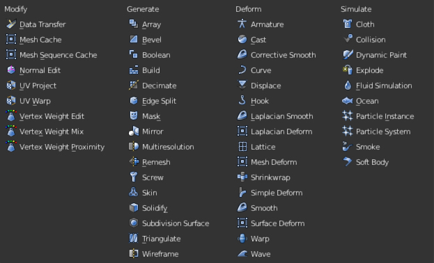
Here is a huge list with similar icons. I dont care about identifying them as a group . I already know these are all modifiers when I access the menu and it is completely useless information at that point, so I don’t care if they are all blue or yellow, however I do find myself in situation where I need to spot boolean or bevel modifier in a split second and that requires mental processing power, no matter how small, but unnecesary since that would be processed in my eyes instantly if there were color diferences.
6 Likes
Too much freedom maybe, but some freedom is nice, especially if can help people with visual impairments, like color blindness etc. Changing color and contrast is than something that is very nice to have. Likewise, someone mentioned that light themes are not much favored anymore, but again for some people a lighter theme is easier on the eyes (presumably because it makes your pupils contract more, which enhances your focus depth and reduces the impact of cornea irregularities).
4 Likes
Now I get it! But IMHO it’s not the icons problem. Especially, if You take their skimpy size into account. Pictograms should help to localize an item in cooperation with carefully designed dividers and spacing. First of all, list must be split into smaller chunks of data, that are easy to understand at a glance as a separate collections, then icons can help to localise an item in a smaller collection.
In Modifiers menu, each separated collection is way to big - so it must be divided further. This very list should get some white space and inset dividers emphasizing the fact that the list is organized alphabetically.
Here’s simple, draft mockup:
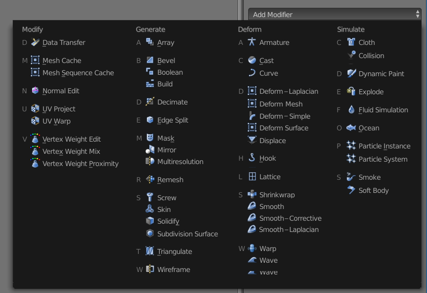
It is quite possible, that groups “Modify”, “Generate”, “Deform” and “Simulate” could be removed in my mockup, making scanning the list by alphabet more convinient.
By the way - I see big incosistency with naming - for instance modifiers: “Smooth”, “Corrective Smooth” and “Laplacian Smooth” should be grouped together, but due to used names they’re located in accidental rows… Their names should note: “Smooth”, “Smooth - Corrective” and “Smooth - Laplacian”. “Mesh Deform”, “Laplacian Deform”, “Simple Deform” and “Surface Deform” are similar cases.
How can I report those problems and proposals to the Devs?
21 Likes
Another very good idea here ! I dig this !