I definitely love what you’re doing with icons, but I’m not very found of the proposal in the modifiers panel.
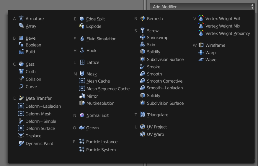
This look a bit more messy to me. Also having all Smooth modifiers starting with the same word implies in some way that they do the same thing in different manners. But Laplacian-Smooth is mainly used to smooth sculpted or 3D scanned objects , and corrective-smooth is intended mainly to correct deformed mesh with armature or hooks and used mainly for animation.
Deform Surface means (to me) that the surface of an object is deformed, where in fact it uses the surface of an object to deform another.
Deform Mesh sound like it will deform a mesh, not that it will use a mesh to deform another.
I’m sure the icons you’re working on will help a lot to give blender a less cluttered UI, and will match very well the new Flatty dark theme that will be by default in blender 2.8
I’d love to see your work on the 2.8 release !
Thanks !
@sozap
My mistake - don’t know how all this stuff works…
If it’s like Youre saying, then pure alphabetical list would look and work better (a mockup contains wrong Smooths and Deforms though ):
It’s fasinating how human nervous system works. Color is actually processed in the eyes, so they send the signal about it being red, or yeallow, or purple to the brain. Alphabet is processed in the brain. So while this is a great optimization we are still so to speak ‘rendering o the CPU’ here instead of the super fast ‘GPU’ Smaller divided chunks are a very good idea in my opinion.
I don’t know. This requires a lot of work and thinking. I am suggesting the use of color coding in the design. I think it’s important to choose what information is coded in the color coding well. These have color:
I really don’t understand why this community tries to push back on everything new. Come on, just look at other software, the whole Adobe suite for example, used by millions of people all around the world, used daily, tested, and optimized since i dont know how many years … they have flat mono icons since forever for almost all their software and it works well. I didnt read once that users suggest they switch to colored icons! Even Gimp that is lagging (or gimping) behind Photoshop since years, now finally switched to mono icons, and people are loving it! But Blender users love to defend legacy, and fear change. Probably the same people that freaked out when Blender decided to remove the horizontal layout in 2.5.
If you just look at the isolated icons alone then yeah, i agree, colored one look more interesting. But that is not the point. They have to work inside the software. Imagine Photoshop or Indesign with hundreds of colored icons … bleh!
I welcome the work from jendrzych, he had made Blender alot more professional and enjoyable to use with his work on 2.5 and i for one have confidence that he could do the same for 2.8.
I got the feeling this was work in progress, not change. My concern for example is difficulty to distinguish a lot of icons in one group. This can be addressed other ways than using color apparently, but I think this is still a valid concern. It would be a very boring forum if we all remained silent and would not say the stuff that is on our minds, don’t you think?..
I like your new flatty design, jendrzych, but I think this is really unnecessary, as the current Icons are great. I mean, don’t fix what isn’t broken, ya kno? Also, I’m a fan of color coding stuff.
What really needs work is the large amount of icons required for tools.
I introduce you a freedom of choice! What if we could choose our blender icon set the same way we can swap themes? We could download an icon pack made by anyone for blender then install it and active just like any simple addon? How cool that would be everyone would be super happy I assume
I like this idea. It might not be a good idea to leave this freedom for the user in general, however if one considers Blender’s specific situation, I think there are a lot of users who have a lot to do with design. It might encourage a lot more people to work on this and we might see some good designs in time that could even become defaults if liked by many users.
That why, TUTORIALS NEED TO SAY THE NAME AND EXPLAIN THE FUNCTION OF THE BUTTON.
I found a huge number of people would use a software, and use it well, but never understood what’s actually happening with the work they are doing. That’s why I dislike very much a lot of the addons that are basically just a bunch of macros sequentially put together to achieve something amazing. Sure, it does amazing things, but newbies don’t know what’s going on and can’t trouble shoot. Veterans know what it does but can’t really make it work the way they envisioned. (Unless they fiddle around with script codes and spent countless hours to get things working again)
Sorry for off topic.
I like the idea of having customizable icons. It’s a freedom that needs to be welcomed. (But please keep an easy way for restoring the old icons)
maybe a bit of both? categories and alphabetic separation on each. it creates small “boxes” of options insterad of just three huge “lines” of content to search for a modifier. makes it a bit easier on the eyes
I do quite like the colored icons in blender, i must say. They are easy to tell apart, and they make blender’s interface less like a boring office paperwork and more like a fun party It’s really great that you’re taking the time to work on these icons.
I get that there’s always pressure to follow trends, but in my opinion, those trends do not necessarily apply to 3D packages and such. Maybe it’s fine for mobile apps and music players, but 3D artists shouldn’t have to guess if that circle icon is a material icon or a world icon. As far as I can tell, other 3D apps such as modo and maya still use colored icons. Colors are helpful cues when there are lots of buttons and tabs on the screen. I’d rather we found ways to use color for organizing the UI instead of throwing them out.
If possible, I would even propose taking it further and making them not just colored, but 3D as well. Unreal engine has some of the best icons I’ve ever laid eyes on. They are 3D, colored, and massive. Makes the UI very easy to work with despite having a lot more going on than blender’s UI. You never have to look for stuff.
Good one! Actually, I have huge colored icons in my browser. You get my point though Blender doesn’t need to look monochromatic. If colors help its look, so be it.
Edit:
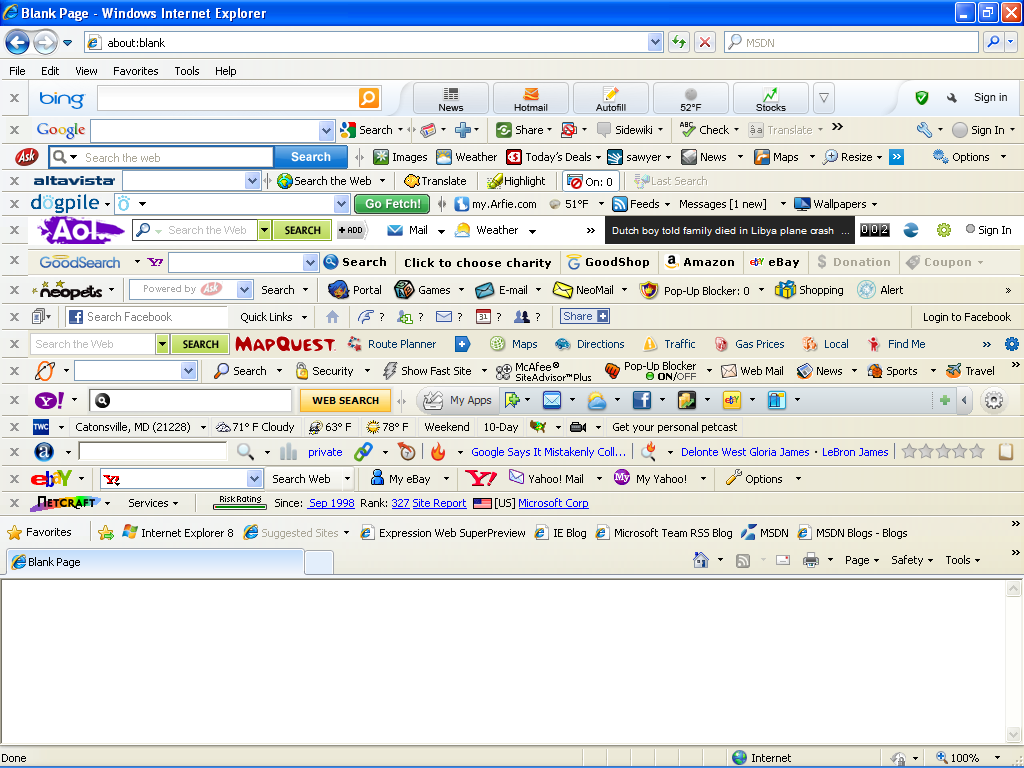
Just out of curiosity, is that pic even real? I know I shouldn’t be surprised by IE, but still
 Smaller divided chunks are a very good idea in my opinion.