Yes, there has been a tendency to add icons in too many places, even when the icons don’t fit at all and when we have descriptive text labels. We could simply remove many of these icon instances.
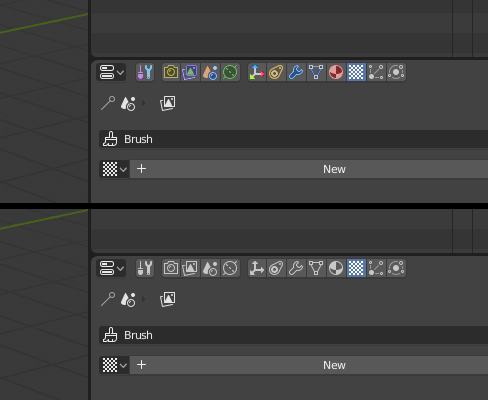
Maybe we should have a distinct icon for ‘duplicate’. Currently we use the Add icon here, which makes Duplicate look the same as ‘new’. This was kindly pointed out by our new UI consultant, Captain Disillusion ![]()

Duplicate icon idea:

How about a possibility to hide texts where both icon & text are shown, is it probable?
Just choose which one You like more - the left or the right one?
![]()
Probably the left one will fit better here, because the plus in the middle is more consistent with the Add ‘+’ glyph. Nicely done!
BAM!
Update in the first post.
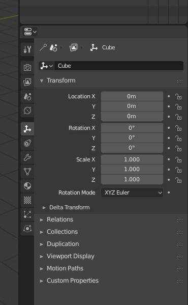
Great job overall. I know color has been discussed at length, but I really think some icons would benefit from it, namely these ones in the properties window:

(very quick test for a few icons, not suggesting these colors, but maybe something similar)
These tabs are used a lot, and at least for me, it takes a second or two to find the right tab with the gray ones, whereas the colored ones just pop and I can instantly recognize the one I want to click.
I can live without this; just a thought.
Edit: Also, I didn’t really take it into consideration in the example image, but slightly different amount of lightness (every other icon slightly darker or something) could also help with quick readability.
The vertical alignment is coming
https://developer.blender.org/D3840
I just want at least an option to have those vertical “tabs” on the right side. ![]()
I just want to point out one thing. The new icons look really nice visually, but it’s harder to navigate because looking from peripheral vision, there are no distinguishable features. I hope in the future logically distinct areas are also visually distinct for easier navigation and readability. Like Yanneyanen version, even if it’s (IMHO) visually garish, it’s still better than no colors or visually distinct features at all.
Yes, location on the left or right should be something customizable.
I asked if it will be possible but no answer at the moment 
O thank god I kinda lost hope for it 
I’m very glad that they managed to get it in. It complements the single collumn design nicely.
Also - as William mentioned, the header now has space free to niclude a search function.
I just tested the patch, and as William Reynish mentioned in the comments of the patch, it is already possible to flip it on the other side. It is really neat to have the tabs on the side, it’s a lot clearer, and easier to access 
Oh, a search function in properties is a cool idea. I wonder how it would behave though.
[ICONS ALERT]
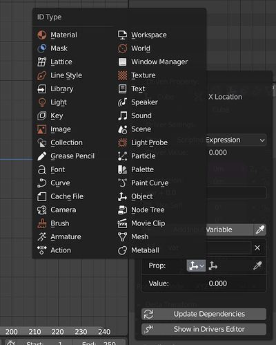
Edit Driver / Single Property Variable / Type of ID-block that can be used.
A terrible mess.
First of all, colours must go.
Some of icons are wrong: the GP, Camera, Armature, Metaball, Speaker - they all should use proper ObData icons.
The Library, Cache File, Paint Curve - all of them should get their own individual icons.
The Movie Clip ought use the Movie File icon, unless the Movie Clip is something different… ANyway its not consistent with other parts of GUI (Scene tab in the Properties editor, for instance).
The Window Manager got its pictogram in the last icon set update.
Besides all above, the Prop’s icon is unnecesarily doubled.
i think flip region can do that, but will this mean they wouldn’t work top and bottom?
You mention a single .svg which contains all icons… can this be user themed from the 2.8 preferences menu? If you want to switch out some of the icons, for instance? (Or… add color yourself…)
No - you have to compile Blender yourself to switch the icons.
If “Movie Clip” refers to a block of movie data in the Editor context, then the clapper board is entirely appropriate as it is an edited movie clip, not necessarily a complete movie file.
To be fair, I’m not sure to which the Drivers option refers though. The name “clip” seems to suggest an editor context.
There is an effort to make that possible, so that a theme can specify a custom icon set.
The old icons cannot be easily used though, because the new icon set has many more icons and have been relocated. It would be a big effort for someone to go in and update the old set and add the many missing icons in there.
As for colors, they are set in the theme already. We are looking at adding more categories, so you can color them more differently.

