Renzatic
(Professor Emeritus Billy H. Wafflesmith XIV Esq.)
2201
Kind of an aside here, only tangentially related to the topic at hand, but after three months of using 2.8 exclusively, I jumped back into 2.79 to do something that doesn’t work in the alphas yet, and…
…I was amazed at just how janky old Blender feels now. You don’t realize how much you miss those cardboard boxes until you don’t have them anymore.
Most people seem to learn how it works only after accidental data-loss. I see no benefit in making it a hassle to set up materials or save your work. The whole purpose of software is to simplify complex tasks so you can get more done in less time.
the early versions used to work very well in my opinion, visible enough but not too distracting …the text is the big issue here maybe a backdrop that is controlled by an inverted color.
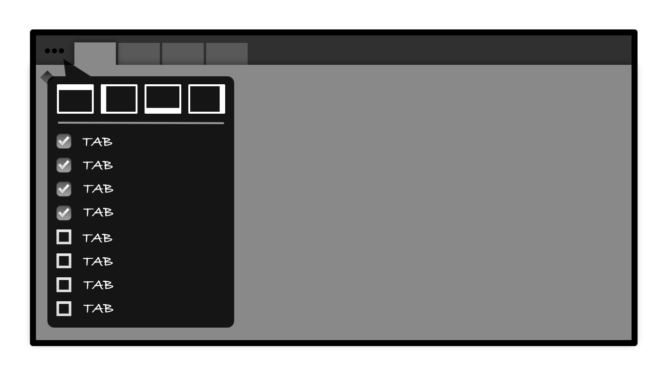
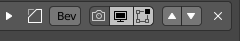
Customize tabs by clicking button to expand tab bar. (Click again to collapse tab bar).
Click the customize button ••• to bring up the popover…
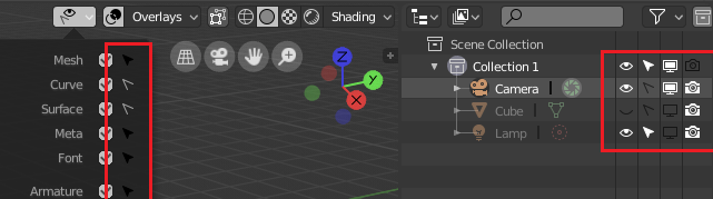
Check the boxes for each tab you’d like to have in the tab bar. Also option to choose orientation of tab bar…
Could apply to properties panel and even make all windows and editors as tabs. Addons could be created as their own tabs too. User could customize their workspaces and windows with whatever tabs they want in whichever windows/panels they want.
Tabs can be hidden or revealed with button as desired.
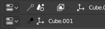
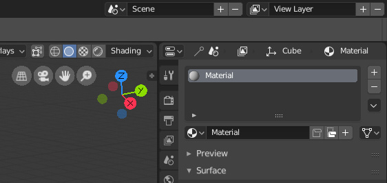
@William there is currently a problem with some icons that have on/off states, their colour is mapped in the regular section of the theme and this works as intended for those that are inside a button, like these ones:
But it creates problems where the icons are used without buttons, like here:
The problem is that you basically can’t have a different colour for selected text in the regular section, otherwise that happens, since the on/off state of the icon is also mapped to the plain/selected text colour of the theme.
I’ll try to explain this better: “Regular themed” icons are used for both dynamic and static backgrounds currently (related to the selected state), so you’re forced to only use the colour for which they look good in the static cases (like the outliner), in my case that would be white, making it impossible to have a bright highlight for the ones inside a button.
I really don’t like the Safe icon because of its unnecessary visual aggressiveness. The symbol itself is very good, but its form and impact is too possessive. In addition, there is no visual consequence in the form of icons associated with data blocks. For this reason, I have designed a different set of pictograms that use a coherent language of symbols describing the attaching and detaching of data blocks.
I made some mockups of proposed changes (the redesigned F-User icons, Unlink data, Add New and Remove Scene and View Layer, new Render Output tab, Add / Substract brush effect).
You’ll find more detailed description in the post I replied to.
Current state
Proposals:
No F-User assigned (and other icons mentioned above):
The F-User assigned (and other icons mentioned above):
Add / Substract brush effects - individual icons in place of the “plus” and “minus” pictograms:
Personally, even knowing what the buttons are, I’m having a lot of trouble figuring out those data-block symbols. All I’m getting from them is there’s lots of paper half folded over.
I like the Fake user ones, but I don’t think the remove one is clear enough honestly, I mean, the idea is great, but I think that the X works better, it’s more immediate.
Same goes for the Add / Subtract icons for brushes, IMO plus and minus are easier to read and in that context it is quite clear what they do.
The thing is, that the button do not remove the data block, hence “X” or “-” icons do not suit at all. It’s all about unlinking (I’d say unsticking) the block of data to / from a user.
“+” and “-” icons must be restricted to “add new” and “remove” type of actions. Add / Substract pictograms can be executed in many different ways, but I’ll defend my F-User and Unstick data proposal, which are a very good compromise between symbolism and the power of visual impact on the GUI composition…
Read this post: LINK - You’ll find a more detailed explanation there.
Fun part is, once you know what they mean, their symbolism becomes obvious.
Says Who?
Why?
The “-” icon reads “remove” in blender’s GUI language. In the discussed context, we do not deal with data deletion, but only with their removal from the virtual user.
Those icons are obtuse. And you’re just trying to design arbitrary rules to the use of icons so generic that they can intuitively be put anywhere, that’s basically why they’re so generic, so they can fill so many roles. Their specific role is determined by context.
I have to agree, I really can’t figure out the meaning behind those icons. In my opinion the best icon for the fake user would be an anchor.
The data is anchored in place until needed, so it doesn’t “float” away.
Also, the brush effects are not only limited to add/subtract:
Designer’s role is to do arbitrary things. Suggestin’ that the block of data will be “removed” ("-" icon) is really confusing.
Ok - Add / Substract proposal is not the best one. But using the “-” to unlink the data block gives rise to misunderstandings.
 button to expand tab bar. (Click again to collapse tab bar).


