Redesign of the Pin icon is on my To-Do list, despire the fact that I like simplicity of current version.
2 Likes
Everything in here is virtual. We are just using a real-world thing, a push pin, as a metaphor for “keep this”. The “this” can be almost anything, but they are all virtual things. Keep this image, keep this image. Besides, in our example usage, in Materials, nobody really clicks the button and thinks “keep this datablock”. They are thinking “don’t delete my damn material”.
Having considered your suggestions, I came to the conclusion that the current use of “X” and “-” icons should indeed be reversed.


3 Likes
Those ‘plus’ icons are just too close to each other in the UI, and relating to the same piece of data (material). Yet, they do different things.
The Captain had the right hunch with the remark, i feel it would be nice to make a new round of ‘duplicate’ icon hunt.
Two top-drawn circles on top of each other perhaps? Or two coins / pancakes in axonometry?
Btw, i really like how your mind works, the paper and duct tape thingys seem really fresh and illustrative.
Just my two cents here, I really liked your idea of using the concepts of “stick it” and “unstick it” for the whole Fake User ordeal. It really makes sense… if you stick it, it stays around. If you unstick it, it can be deleted.
But maybe there could be another way of conveying this idea… like people suggested with “pins” or whatnot.
For example, wouldn’t be clearer to see a paper unsticking if there was something behind it? Otherwise it can appear to be just a folding paper.
Maybe this would be a good time to think of an “make orphan” icon, instead of hiding such a feature behind a shift-left-click-on-X-icon shortcut… or a proper visible “delete” icon just like when you right-click on some data in the outliner and delete it for good.
On the question of Fake Users
I agree with the parallel discussion here (maybe off-topic, since this is a topic for New Icons) that “Fake Users” should not be something users have to deal with. I can’t think of another program which uses a similar system, simply because if the user hasn’t deleted something himself, he probably doesn’t want it deleted. But I understand the reasoning of cleaning the file everytime you close it.
Maybe we should create a topic on devtalk>User Feedback regarding Fake Users and take the discussion there.
yeah I think the stuck or unstuck makes sense, here’s what I had in mind
1.no fakeuser (coming unstuck), 2.fakeuser pin (stuck), 3.bulldog clip, 4.nail
![]()
I’m sure @jendrzych could make somthing more legible.
2 Likes
I think the no-fakeuser icone just don’t work as it is. I still think the fakeuser issue should be tackled in another way, less invasive in the Ui. I’m going to make a mockup on rightclickselect as soon as i have time
2 Likes

your proposal doesn’t look as feasible to me, when the menu is collapsed you can’t see whether the datablock is permanent or not, and “erase datablock” doesn’t exist at all in blender.
It might be enough. Keep in mind the drop down list for selecting datablocks does tell you which ones are marked to keep.
If you want to reflect what’s happening with “erase datablock” just call it “Mark for delete”
Maybe I don’t understand correctly, it seems to me that the drop-down menu looks as a down-arrow when collapsed, it doesn’t give any information.
“Mark for delete” is simply the “unlink datablock” with the drawback of unlinking the block from all other users too, if there are.
This is what I meant.
Yes, yes it is. And it’s a better place for it, where a proper tooltip can be included too, rather than shift+clicking the X button.
It does what it says it does. A user should be able to understand that marking something for deletion will unlink it from everything. Because that’s what would happen when it gets deleted anyway.
1 Like
But this way I have to look inside the block list (material in this case) yust to know whether the current block is marked or not, is not reasonable imho.
Okay, I got it.
Though I must say that this command for unlink a block from all the users always seemed bizarre to me, without of a proper manager where you can verify what you are doing the risk is to let some objects, maybe some unneeded and hidden objects, without a proper block, and this can be dangerous: for instance if you export the scene on some external renderers such as Maxwell Render with such an hidden and incomplete object, blender will crash.
Reply off-topic about deleting something from Blender using the outliner option
I think the “erase datablock” of his mockup is a shortcut for this operation which I mentioned:

Which, if you didn’t know, erases anything instantly and completely from blender.
I actually didn’t know about this operator, glad to know, thank you.
Now I wonder why the Purge Orphan Data still needs to save and reload the file to accomplish the same, which is dangerous and has drawbacks.
1 Like
Sorry guys, this topic derail was not intentional. If anybody thinks it is worth, open a new thread, or just comment in rightclickselect
@sourvinos
The datablock you are working on is permanent anyway because it’s linked to your active object. And the number of users, if 1, already tells you that it has no fake user.
To set as permanent an unlinked datablock you should go to the orphan data panel as well as you do now (or make clumsy temporary link/set/unlink)
1 Like
I also apologize for the derailment but I have to reply here.
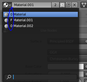
Too much guessing needed, where a few icons, even the good old F, can show the current state clearly. (suppose there are 2 users, are they both real or not?)
Just a thought:

Linked to fake / Not linked to fake
1 Like
I’m a bit tired of Fake User and contiguity.
So…
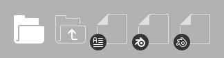
It’s time about for large icons for File Browser. At the moment large icons are accompanied by small pictograms, which indicate the type of file content, in case the file has a thumbnail. It seems to me that there is no real need to create large icons for each of the supported formats when you can use small icons.
A mockup:
What I propose is to use just a general file icon for each of files and supplement it with small type file icon with a circle backdrop (barely visible in the mockup, since I accidentally used colour similar to the backgorund).
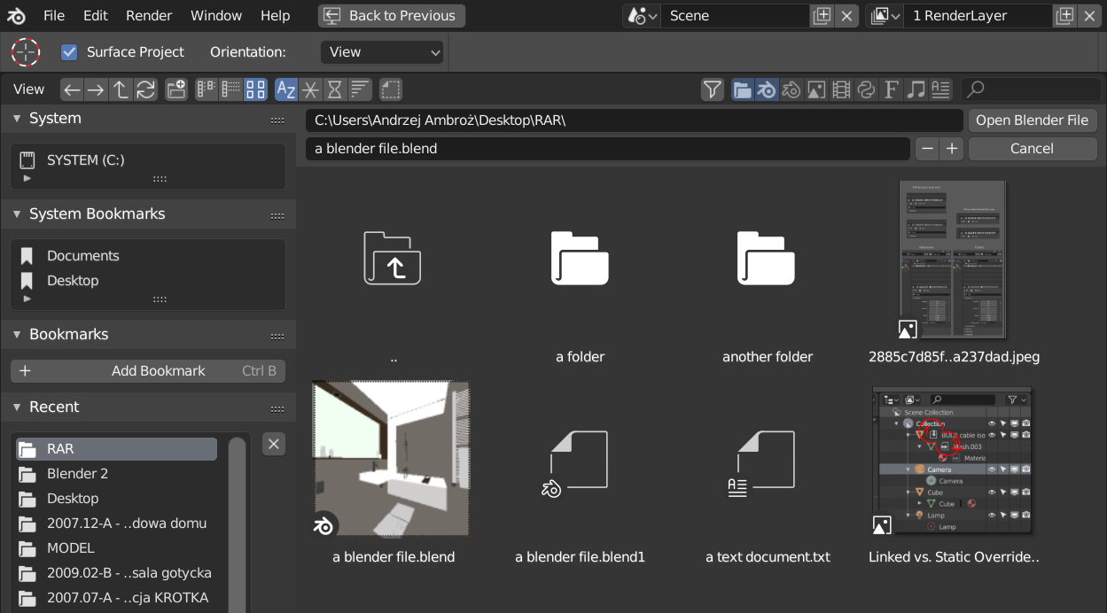
BTW, @William - do You plan to overhaul File Browser’s UI, the way You’ve proposed some time ago on the developer.blender.org?
I mean this one:

6 Likes