Maybe an not object based materialsystem would make the fake user useless.
I kinnda miss some orange and blue highlits in some icons.
Maybe an not object based materialsystem would make the fake user useless.
I kinnda miss some orange and blue highlits in some icons.
I would love an update to the File Browser layout to happen. I’d need help from other developers to do this though.
As for Fake User, don’t worry about it for now. Hopefully we can eliminate the need for this feature altogether before too long anyway.
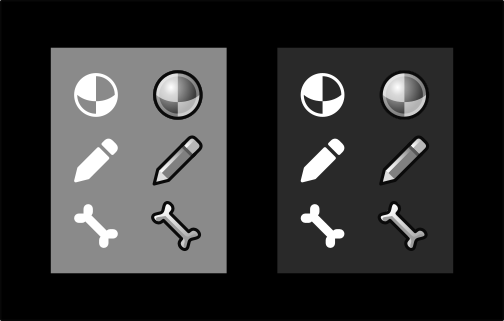
Re. folder icons, they look ok, but seem to have a little strange shape. The back part sticks up a lot higher than the front part.
Did you consider using a simpler outline shape instead? It might fit better with the flatter, simpler style:
I made them to fit proportions of their smaller version. No problem with changing it a bit by making the back part lower, since it’s a no time tweak.

Redesign of both of them will eat some precioius time resources. Not much, but a considerable amount ![]()
It’s not a big deal either way. I think they are ok. The main thing is that these icons now match the others overall. Next time we do an icon update we will include these also.
Ah, was just about to mention the file indicator is very small in lower left and takes up maybe 1/8 th of the icons real estate. But then the quoted part explained that decision. Nice, looks good! and smart! My first gut reaction was to place indicator in center but. If it’s reused icons from the UI it’s mayber easier to have lower left masked out for the type indicator.
Just because this thread is such good bikeshedding…
While making the quick tweak to make the file folders a bit squatter, I’d love to see the “document” icon be narrower so that it is a bit closer to the proportions of a piece of paper.
Once again on the subject of the colored icons:
Which column makes it easier to identify (an) orange?
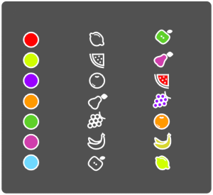
(I know the icons are not great, I quickly traced some random ones I found)
Also, AdamPreisler suggested nice solution o devtalk so check it out.
The AdamPreister solution is incredible elegant. + 1 for that.
I second that Adam’s proposal on colours use is ingenious.
Not a fan. It breaks the continuity of the colors of the tab and the panel. So maybe if those colored bars were on the left? ![]()
Actually it is a great solution because you no longer have a need for said continuity 
Or… Maybe you are right 
they do not like colorful icons, ok, I agree with them, free of their style choices as default theme, but please offer us the possibility to customize the icon colors on the button bar with themes, I have serious problems of cognition deficit, it’s a necessity, it’s not an annoyance
I suggest refreshing the proposal of DanielBystedt on devtalk
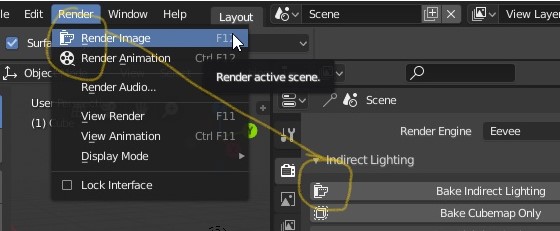
bake indirect lighting use same icon with render image
Sorry to say I find the proposal useless, for 2 reasons.
I love the direction of the solution, but I think this is a valid point. I completely missed the colored lines when I first saw the post. It needs to be made more apparent.
I agree. As an old guy with ‘specs’ I find the new monochrome scheme difficult to comprehend quickly. If the coloured lines were made twice as wide I would be happier - colours help a whole lot in distinguishing between icons without having to stop and examine each one. Really I prefer the old set just because they are easier to ‘grasp’ on the fly but if we do have a new set then I vote for the inclusion of the coloured bar.
Why does it need to be a jump from coloured icons straight to flat-monochromatic?
Photoshop uses monochromatic, shaded icons and it still looks “professional and clean”:
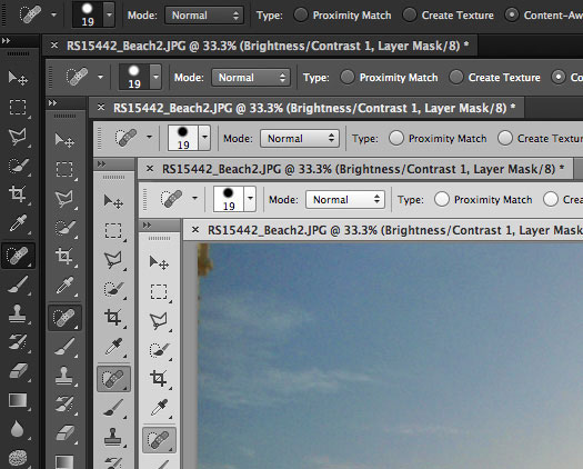
A shaded icon will always have more appeal than a flat one, imo. The shaded icons below are 16x16 (relatively speaking of course, they’re all upscaled).