That’s easier to see, but it still doesn’t help lighter themes.
There’s a misconception that picking colours in a theme will magically allow any theme colour to find a colour combination that works. This is not true.
I’ve said it before, I’ll say it again, Themes that use lighter colours need outlines. Otherwise the only colours you’ll find to work are going to be really dark, and really dark colours don’t hold saturation, meaning they may-aswell be black, completely removing the point of being able to colour things in the first place.
Just wondering if part of the appeal of Adam Preisler’s proposal isn’t actually the colors, but how he uses the colors to separate the (many) icons into groups…
I have to wonder how much correspondence there is between peoples preferences in icons and the quality of their eyesight. I find that as I get older, I need more clarity and seperation in UI elements even with my glasses.
A fair bit I would say. I can see clearly with my glasses but I do need more contrast and saturation to distinguish fine detail. I know the new icons are cleverly done but honestly they are a step backward for me because I need to momentarily study each one. Seeing as how all this is readily code-able how about we have an ‘enhanced visibility mode’ for those that prefer it - increased contrast, saturation and coloured bars included… just an idea… and then everyone can be happy edit: oh and by the way I generally choose a light theme.
Okay, definitely making a suggestion here that I think is kinda dumb, but…
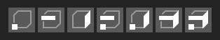
I wonder if there is any utility in changing the edit selection icons a bit so that the modes can add up visually? We don’t strictly need them to but having the full set like this could come in handy one day. we could decide to show them all, rather than force a shift-selection for multi-modes. Or we could make it a popup menu and only show the result. Not for everyone, but they could be options for some people some of the time. There have been quite a few people that have taken a long time to realize they could have both vertex and face selection at the same time for example.
I will not have this in time for the beta. Life has been a little hectic and I frankly haven’t had the chance to work on it properly. Everything from having to refinance the mortgage (with all the attendant paperwork) to one of my son’s friends passing away in the middle of his end of school HSC exams (think US SAT’s or English GCE A-levels) has hit at once… I’ve been a little swamped.
I will get back to it and I will try to get it in before the beta is finished. I was actually enjoying having to dig into Blender’s RNA/DNA setup, but “Life” had other immediate plans.
Hmmm… but that’s what we have now. Or are you just suggesting not requiring “Shift” to select multiple modes at once? Because if that is the case then that would require more clicks than the current behavior for the most common selection changes. As in going from vertex-only to face-only would require two clicks, one to turn off vertex-selection and another to turn on face-selection.
But that is separate from the idea of having the icons overlap visually. It just allows us more options in the future if desired.
So in a “Blender 101” we could have a menu in the header that says “Selection” and a popup, that when closed, shows the current combined selection mode (one of the seven icons above). In the popup menu it would list each item separately - “Vertex Selection”, “Edge”, etc.
It does help indeed. I would take anything at this point because we just got another icon there.
As a side note, I’ve seen people bring up photoshop but in that example tools have shortcuts that most people use. Also, the icons stay in the same spot but blender’s UI is flexible and different workspaces have icons in different places so you cannot rely on the position.
Is there any chance to improve the “pin” icon from the properties editor?
I actually didn’t know it was a pin until today when someone mentioned it on devtalk. I always saw it as a magnifying glass with a very long handle.
Maybe because that’s what the magnifying glass icon (used in search boxes) looks like, except for the dimensions.
Maybe we could try a silhouette like the old one?


 edit: oh and by the way I generally choose a light theme.