I think it kind of depend on the monitor how something looks.
Can I please get the Icon project files to try do something? Original SVG, or AI? I mean from the monochromatic ones.
It’s in the first post. The image is an svg.
3 Likes
posted that in the wrong thread but lets try again
I have never worked with inkscape before. but

change the background to make the working with the icon easer , there is an option to change inkscape background.
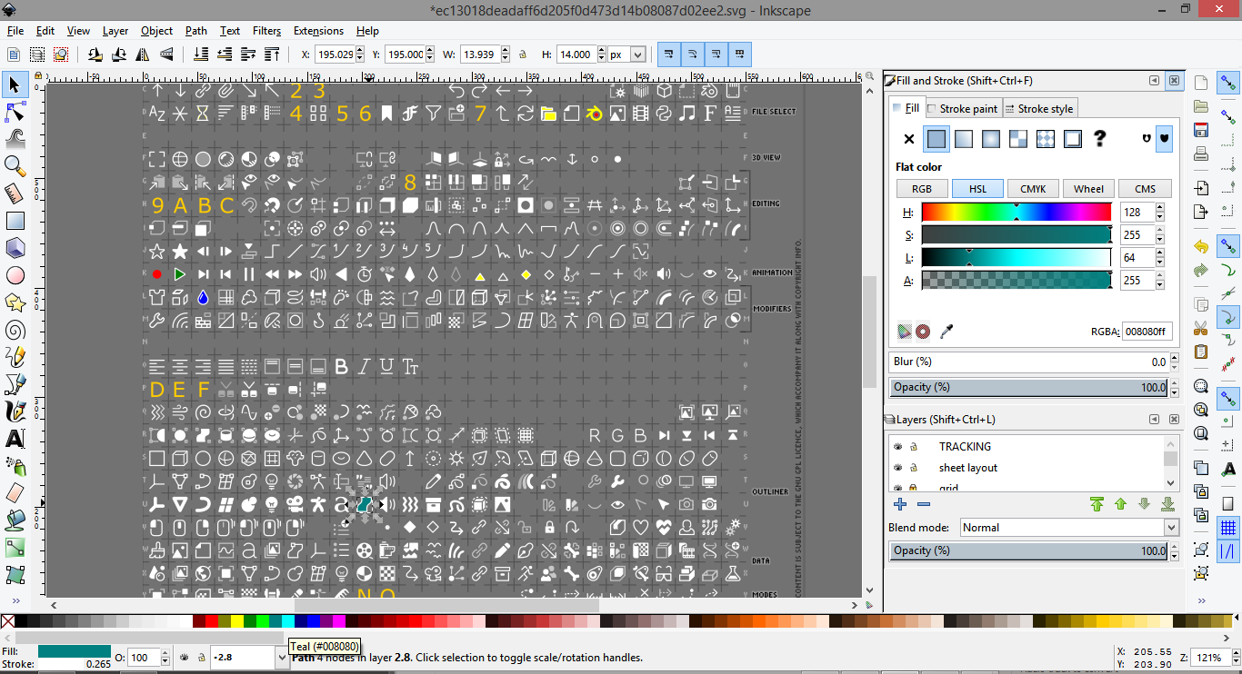
then just select an icon and click a color form the color ballet at the bottom and you will change the fill color
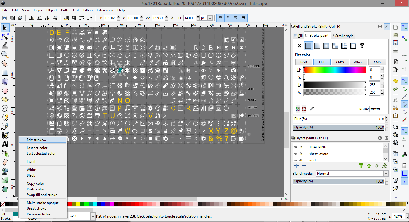
to change the stroke just there in the left bottom corner right click edit stroke which will display the ballet and then change the color for that
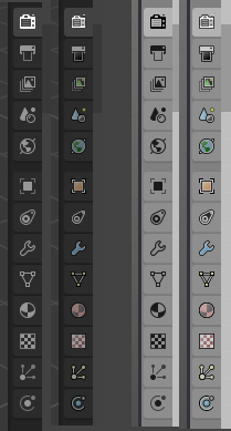
For anyone interested I made a start on a colour/outline adaptation a few days ago.
Let’s see how far I get.
23 Likes
gave the colorization task a try too;
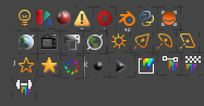
quick realization after trying;
- For the colorization task, for some icons there is a need to either add additional colored shapes or to have a bigger contrast in colors otherwise you get an indistinguishable color soup.
- There would probably be a need to harmonize the colors with the 3D icons.
colorizing and ensuring the readability when its so small is a big task so I give a lot of
kudos to jendrzych for creating the icons in b/w since that too is a big effing task in itself. 
6 Likes
On the same pallet where you change the fill, just SHIFT+click to change the colour of the stroke.
I don’t know why anyone would want to change the icons in 2.8 while the 2.5-2.7 icon set is so refined and close to perfection already. They are highly readable, very elegant and extremely coherent. The new monochrome icons are all right I guess (much better than the colorful previous proposal) but the old 2.5 icon set is so much better in my opinion because the colors are subtle enough not to disrupt the interface and distinct enough to actually help read their meaning. I wouldn’t change the icons if it was me, but I wouldn’t mind if there was a way to keep the old icon set instead of the new monochrome ones for those who prefer.
1 Like
New icons have been made and are required, and icons have moved around a lot. Plus inconsistencies and changes to designs have been made aswell, so at this point it’s easier to adapt @jendrzych’s icons instead of updating the old ones.
2 Likes
What I was saying is why change/adapt something that is already excellent with something that is potentially less so? I’m in love with 2.5 interface icons for their extreme readability and elegance. While I realize some people always want change even when it’s not necessary, because they get bored of anything that is not new, but I just wish there will be an option for people like me to keep those icons if they wish to because they fit the bill above all expectations.
Please read Antaioz’s reply again. The old icon set simply doesn’t work anymore in 2.8, there’s too many icons missing/out of place/portraying wrong information.
2 Likes
The devs deemed the icons in need of an update, because they didn’t have someone available with the time to replicate the style, and they needed new icons, and needed to change old ones that were a bit odd. (i.e. the Fake User, the tool properties tab, the viewport navigation icons etc).
It’s not practically possible to use the old icon set anymore without a lot of work moving icons around, and adding >100 new icons. It’s just not a reality, much as those icons may be great, they were unsupported and hadn’t been updated in too long.
Did you have a look at the properties icons I adapted? I’ve been able to merge the styles pretty close, It’ll just take some time, and effort.
I think these colourisations look pretty good, especially on the light background. Not too bright colors, but enough to make a difference. I still overall prefer the monochromatic on dark background, for myself.
2 Likes
How can it be less work to recreate the entire set of icons instead of just creating just the ones that are missing, apart from matching the style? Anyway, I don’t want to diminish the hard work that is being done here and I know good icons are actually hard to make, so respect for those who are on this task. I guess in the end I will have to adapt. I downloaded last version of the beta, I don’t know if your latest work is in there or not.
Offer to collect money to adapt old icons to 2.8
Is that a suggestion you are making? I would probably support that. Is anyone feelling the same as I do or am I a space oddity?
Can do by myself for free,but have no time.I am ready to pay somebody
And it already looks much clearer, because as I mention few time, work from Jendrzych is great, icons shapes.
I will also try with coloring in spare time, to get this done.
Thank you for doing this instead of ranting or give useless feedback. I’m sure the OP appreciates.
As someone stated somewhere may a saturation slider in theme editor be a practical solution in the future?