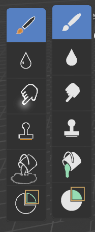
New icons for Blender 2.8

Could work if you dynamically faded between two icon sets, but you’d double your draw calls and add extra complexity. Hm, or add extra time to startup / configuration changes. And you’d need to be able to load multiple icon sets in the first place.
Generally,
Colour + outline - wouldn’t work, a blackout/whiteout version of these icons misses detail.
Just colour - would work, but then the icons colours would conflict with themes again.

If we end up with anything, I suspect it’ll just be a switch.

hehehe
I love the opensource community ^ __ ^

FYI - just kidding ok? ¬
But now can I say I don’t like any of the colored options and can we have the ongoing discussion reversed? The mono addicts just saying that they don’t like color? :joy: )

Btw @Antaioz congrats on that work can I just give some feedback?
As I said before it’s not that I don’t like color. I really do but I believe it should be used more intelligently.

What I mean is… if you look at the toolbar or outliner they use colors to provide quick hints on what your may be able to do. Orange: Objects | Green: Data etc…
Looking at the 2 kinds of green then 2 yellows (particles and object data) that completly overshots the purpose of using color. If we just use it to make pretty icons we lose the design purpose of the well designed icons. Don’t get me wrong. ALL white is NOT the solution. But the rainbows are on the other side of the spectrum.

I know you probably didn’t spend much time on your icons (so don’t view it as a negative feedback). Either way good job. I’ll maybe chip in sometime soon. Having one job is time consuming enough :stuck_out_tongue:

Yeah I thought about this. The thing is, every time you try and over-categorise something (not just icons, could be code, could be anything) you end up stalled and with a bunch of things you can’t categorise, or a bunch of things in the same category, or lots of generalised categories, or lots of very specific categories.

In the end, categorisation is hard, and a lot of the icons don’t benefit significantly from being specific categorised colours. It isn’t a primary concern, especially because shape belies those connections, as well as proximity, already.

For instance, say we try and categorise rendering into greys. The first three icons all become the same colour and then there’s less benefit.

Or, what if we decide grey for rendering things, cyan for scene, orange for object, green for data, blue for modifiers, red for materials and textures, yellow for effects, and… We’re out of significant colours for physics.

The place that benefits from strict categorisation is the outliner, where those categories are much easier to discern, but are also broader and fewer.

So in the end, what I’ve been going for is similar to what I see when I look at the 2.79 icons, merged with the new ones.
Add an outline, so the icons work for any theme.
Add a splash of colour, try and be reasonably consistent, but don’t fret about it because in the end it’ll never be perfect.
Keep the icons bright, but not hugely saturated. This way they blend in with white icons and the rainbow effect is avoided.
Don’t colour every icon needlessly, which can be done if the colours are made to blend nicely with the white icons. We’re aiming for ‘signposts’, not rainbows.

Colours are also reasonably easy to change, it’s the outlines that are taking time, since most icons have to be shrunk slightly to accommodate them. So I am more concerned with what colour goes where later.

I didn’t intend to have these discussions in Jendrzych’s thread, once I have more progress I’ll open another one. Apologies.

For instance, say we try and categorise rendering into greys. The first three icons all become the same colour and then there’s less benefit.

Don’t colour every icon needlessly, which can be done if the colours are made to blend nicely with the white icons. We’re aiming for ‘signposts’, not rainbows.

Agree and agree. Hoping to continue this discussion then on the other topic :wink:

BTW @jendrzych are there still more icons to make? Or to adjust?
I’m seeing that this thread from week to week is repeating itself with people that don’t read it discussing the exact. same. things. over and over again. At one point this should be closed no?

For the VSE, the sliced strip looks too specific in my eyes - it should be used for a soft cut button in the vse.

The 2.79 icon worked ok as an illustration of how it looked, but now it seems the NLA Editor has received this kind of icon. NLA alternative:
image

I think I would prefer for the VSE another spin on how different types of strips and a playhead could look as an icon.

If we should go more abstract, I like the thoughts of trying to illustrate the function of the Video Sequence Editor as the place to combine all the Blender created elements into storytelling. I guess you could say that the VSE is actually the blender of Blender:

image

Maybe too comic… :slight_smile: but the thought of how does a thing look which can combine every element created in Blender into storytelling, could be an inspiring one?
Well, the film/movie metaphor is a bit messed up by calling the tracker “Movie Clip Editor”. I really wish that it would be called what it is, and had icons that went with the functionality, instead of the misleading name. Maybe something like this:
image
Btw. a clapper board is used when shooting a film which would resemble the 3D View, where the shots are generated. The work in the “Movie Clip Editor” is post-work which in the old days would resemble lab-work - in which the clapper board wasn’t used at all(except for syncing sound, but that was done in the editing room). So the clapper board’s only connection with the “Movie Clip Editor” is the word “movie”(which a tracker shouldn’t be called).

2 Likes

Hey… pretty god job!! I’d definitely use them instead of the monochromatic…
Really like and prefer the subtlety of yours pastel palette, in comparison to @myclay 's try for example…

1 Like

One question about this small icon set.
Good to see people who give it a try, instead of ranting all day by doing nothing.

Personally I have mixed feelings about the fully white icons, but the choice to go monochromatic is a very good one. I would really like to see something like maya have, but for now and the future I am totally fine with the current set.

Thanks @jendrzych

But what is for example the purpose to give the globe a green color? Because our continents are… ‘green’? There is no improvement for the readability and I think there will be no green category for all the world related icons.

4 Likes

Since there are blue colored icons in the 3d header to indicate their active state, would it be more consistent if the Proportional Editing icons were blue too? Currently they are very similar to the Disable icon for this tool

Maybe a little bit more seperation between tabs could help.

Peronally i love the new properties.

2 Likes

Hey dude i give you 20 bucks if you make something like this paypal

My colored ui is done

3 Likes

I forgot to ask, have you tried the Material and Texture icons with blacks in the middle instead of grays? Or did you go straight for the gray?

I made another thread for those icons
https://blenderartists.org/t/2-8-outlined-coloured-icon-adaptation/1136992

But no I went straight for the grey, it seemed less disruptive. I think the material one could probably do with being a bit darker, but there’s no grey on the texture one?

Fill%20Bucket%202

Better fill buckt.

Fill%20Bucket%202%20mono

or should i post it in the grease pencil thread.

2 Likes

Hey dude, nice joke.

Looks like Antaioz has some competition as far as colored icons go :slight_smile:

Your designs might have an appeal to those who want a more classic look to 2.8 as opposed to the mono icons or the colorized icons also now being worked on. I wonder how many sets the devs. are willing to ship by default in 2.8 (to present to the user via a menu)?

is there a way to add some color to these icons now ?
find it too greyish
a little color would help find things

happy bl

For the moment you can color icons by changing the text colors.

another bad quality mockup
Paint%20tools%202

1 Like